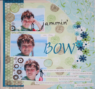
 On this layout, I selected three great photos of my son Zach. Problem was, the one I liked best, the one I wanted to highlight, had this red flag (literally) in it that was really distracting and didn't fit the paper I selected.
 You can see here on the original photo just how distracting that flag is. So I "deleted" it - sort of. I have an old version (3.0) of Adobe Photoshop - I'm an old gal and have a hard time upgrading software - especially when they move all the buttons and icons around - it makes it hard for me to find anything! I loaded the photo in the standard edit workspace of my old Photoshop program. I used the "clone" tool (the icon on the left that looks like a rubber stamp handle) to essentially copy the water above the flag and paste it over the red flag. "Ctrl/Alt" allows you to set the "copy" function. Then you just click where you want to paste the block. You repeat this as many times as you like until you get the effect you want.
I alter photos ALOT - remove the color, change the color, delete unwanted objects (and people!). What I won't do to get that perfect layout!


2 comments:
Great technique - I will have to give that a try - I am learning Photoshop. How did you add the brown circles on the bottom pictures - is that a stamp?
It is a stamp - I bought the cool new Basic Grey Lime Rickey Clear Stamps at the store and used the circles one wiith Timber Brown Staz-On ink.
Post a Comment