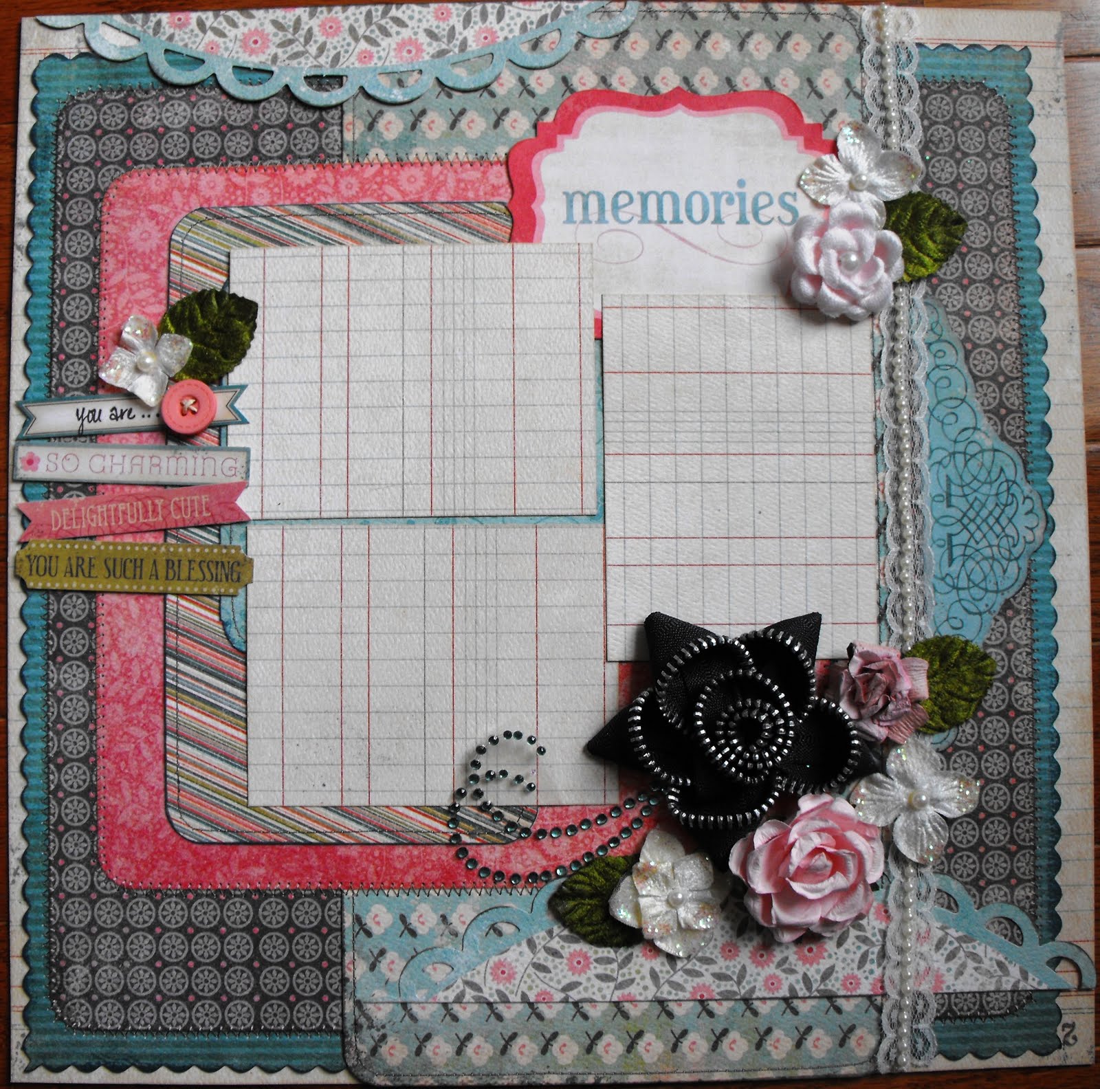
Wednesday, August 31, 2011

Spread the Love With Your Scraps!


Whenever you have extra scraps from one of your favorite collections, look for opportunities to use your scraps. You can use them on cards and even your favorite journal!

Im planning to take Karen Bearse's Inspirational Journal class beginning this month and can not wait to use this altered book for that purpose!


Wednesday Make & Take – August 31, 2011 – by Erica Houghton


Patterned Paper
*2 My Mind’s Eye, Stella Rose, Hazel ‘Mother’ Ledger Paper, 12 x 12 (cut a square from the back of this paper for patterned paper and photo mats, 6 ¼ w x 5 ½ l, 4w x 6l, 3 x 4)
*2 My Mind’s Eye, Stella Rose, Hazel ‘Fancy’ Lots of Dots Paper, 11 ½ x 11 ½
*2 My Mind’s Eye, Stella Rose, Hazel ‘Lovely’ Adorned Paper, 10 ¾l x 10 ½w
*2 My Mind’s Eye, Stella Rose, Hazel ‘Memories’ Lithe Lines Paper, 7l x 4w & 5l x 8w
*1 My Mind’s Eye, Stella Rose, Hazel ‘Mother’ Meadow Paper, 12l x 6w
*1 My Mind’s Eye, Stella Rose, Hazel ‘Lovely’ Bouquet Paper, cut in half

Embellishments
*1 My Mind’s Eye, Stella Rose, Gertie ‘Little Ones’ Buttons
*1 My Mind’s Eye, Stella Rose, Hazel ‘Lovely’ Label Stickers
*1 My Mind’s Eye, Stella Rose, Hazel ‘Memories’ Trim
*1 My Mind’s Eye, Stella Rose, Hazel ‘Special’ Journal Card
*1 My Mind’s Eye, Stella Rose, Hazel ‘Special’ Frame
*1 My Mind’s Eye, Stella Rose, Hazel ‘Memories’ Title
*1 Petaloo, velvet hydrangeas, cream (flowers)
*1 KaiserCraft Paper Blooms, Fairy Floss (flowers)
*1 KaiserCraft Rhinestone Flourishes, Island Lagoon
*1 yard beaded trim

Additional Guidance
*Stitching: use sewing machine to add stitching. If you do not have a sewing machine, use a white pen or stamp to add stitching detail.
*Flourishes: cut package in half and layout according to picture.
*Chalk/Distress Ink: add chalking or distress ink to edges of paper for additional coloring (brand: Tim Holtz).
*Scallop/Rounded detail: use scissors, Cricut, corner rounder or another cutting tool to obtain a scalloped and/or rounded edge.
*Free Element: prima flowers (2)
*Zipper flower: for a tutorial on how to create a zipper flower, check out: http://www.youtube.com/watch?v=4WMz7j5eH8Q

Tuesday, August 30, 2011

Vintage Papers for Modern Memories

My two-page layout for August follows my typical pattern – a layout featuring lots of pictures, usually from some trip and often including family.  I loved the vintage look of the papers.  My

Before finishing the page, I selected a good picture from each key activity and then figured out a way to make an attractive layout around them.  In some cases this involved cropping the photos a bit.  In this case, I had prints so I did it the old fashioned way and used scissors.   I added photo mats of coordinating colors.   I created some chipboard embellishments. I did these in several different ways.  For the photo mat on left page, I had a chipboard piece the shape I needed.  I affixed Off the Record Fabric Store to chipboard (green side up) with a glue stick.  Using scissors, I cut around it.  I then used the Sizzix Tim Holtz Alterations Mover & Shapers Repositionable Magnetic Dies Mini Lock & Key Set to cut the key and lock exactly where I wanted them.  The Mover & Shapers set are designed just for this.  But instead of just having the piece cut out, I thought it would be great to add it with pop dots. Before affixing it, I placed the red paper under them so that where it shows through you see red.  Then I was into the lock and key so I made two more sets.  I just glued the paper to the chipboard and then used the die to cut out. I affixed one to the chipboard photomat with a Tim Holtz jump ring.  For the other one,  I affixed the lock to a paper circle and then using a jump ring affixed the key so it hangs. 

I used the Off the Record Noteworthy journaling tags to tell the story of the day.  Since we didn’t do everything, I used the journaling block that had space for a list to make a list of key Louisville tourist sites and check the ones we went to.  I used another one for a short narrative about the day. I also used journaling tag for the title.   I used journaling tags and stickers to add final embellishments. 

I hope this gives you some ideas for making that special page for your memories!


challenge was how did I fit enough of the pictures in to share a special time my son and I had on a visit to Louisville.  I began by designing a background mixing the black and whites and a little color.  I used Teresa Collins Notations Music for the left background and the Teresa Collins Notation Journal (dictionary print side) for the right.  I then used the Off the Record Village Linen paper, which is a 12” x 12” paper that consists of an  8” x 8” square of four of the prints with the design being smaller than in the 12” x 12” version of the same paper.  On the bottom of the left side I used two of the newsprint squares and on the right side two of the green print squares.  I inked the background and the newsprint with Black Soot Distress Ink.  I added strips on each side cut from the Off the Record Border paper. This is a great way of adding color and interest without using several different strips of paper.  I really like the measuring strip piece.

Monday, August 29, 2011

For the birds


This was a quick layout that came together really fast. I love the lime green of Echo Park's Vintage Linen paper and knew I wanted to use it as a background for my layout. I grunged up all the papers using Black Soot Distress Ink (it is my go to black ink!). For my title I used the letter stickers that came on the Alph Stickers from Echo Park. I cut some Tim Holtz birdhouses out of chipboard and heat embossed them using both silver embossing powder and UTEE. To give them an even more distressed look I covered them with black acrylic paint and rubbed some of it off until I got the look I wanted.

Stop by Scrapbooks Plus and see all the new products from CHA!
Enjoy
Lisa

Sunday, August 28, 2011

Simple Pages


First, I hope everyone came through Irene with their houses, electricity and everything else intact!

Today's layout is a simple design - just a few selective pieces of this month's paper on a Tim Holtz's Kraft Resist background. It really showcases the photo instead of competing with it.

In putting this layout together, I cut two pieces from the "Noteworthy" paper, lining them up on top of each other next to my photo. I liked the red circle in the soda water piece and decided to repeat the red color in the layout by using the red polka dotted section of "Vintage Linen." Everything lines up to make a rectangle - but as a twist I added a small embellishment at the bottom with a small sticker for my title.

Saturday, August 27, 2011

Art Journal Club #1

As I somehow did not take a photo of my last DT layout of the month, & it is almost 1am, I am blogging about Art Journal Club instead! We held our first class/meeting this past Wednesday & it was great. I was quite nervous with a class of 20 but everyone was wonderful & eventually I settled down. Once I started playing/demo the fabulous gelatos things got fun. Especially once everyone got to start playing with their own gelatos. A whole lot of creativity going on. I was totally impressed with the talent in the room & I am very excited to see where this club goes once we all get the hang of it. This was 1 of the layouts I did for the class with a back ground of gelatos, stamping & painting also-all with the gelatos such a versatile product. We even discovered some neat new ways to use them totally by accident!

I will be posting the dates for next months club very soon so keep an eye out for the class listing. I will be doing 2 classes as this group is large & a number of people did not get to participate this time around :(. Next month we will be playing with Distress Stains-another totally versatile product with many cool uses!! Have a safe weekend, hopefully Irene will pass us by!

Friday, August 26, 2011

Travel mini book by Esther


This includes all of the papers in the August kit. The chipboard Travel book by Bo-Bunny was assembled in the following steps:

1-When planning for overlapping of pages and staggered letters, start by choosing the contrasting layers. Some longer pages were color-blocked to give coverage.

2-Trace around the pages to cut and adhere to chipboard. I used StazOn black ink for the edges first. Cover edges of chipboard and a little in from all edges. When completed, the book will look more finished.

3-Cardstocks were adhered with Scotch Quick-dry Adhesive. Make sure to get the glue on the edges to have a good finished edge when dry. Let dry thoroughly or edges will tear.

4-Sand the edges and finish with black as needed.

5-After covering the first sides, punch holes. Now adhere cardstocks to back sides in same manner & punch holes.

6-Attach with rings large enough for easy turning of pages.

Decorate with stickers, buttons, tags, ribbons and metal pieces. Add photos.

Wednesday, August 24, 2011

Tough Guy

This layout was an inspired by my son's first year of football. It came together really quickly. I loved the blue Fancy Floral paper from the Echo Park For the Record line. For my mat, I used the harlequin paper from Theresa Collins. I grunged up the background of the paper by splattering it with some black acrylic ink and some white acrylic paint. I dipped a paper roll in some black acrylic paint to make the circles on side of the layout. I painted the chipboard with some black acrylic paint and used some of the Rock Candy Crackle paint to make is look aged. I have to say I really love the new larger sized container of the Rock Candy Crackle paint!

Make sure to stop by Scrapbooks Plus this week and enjoy the store's birthday celebration!!

Enjoy
Lisa

Tuesday, August 23, 2011

Measuring Your Progress


When a visitor commented on a picture of James and I saying “neither of you look anything like this,” I immediately thought of scrapbooking the pictures to show our weight loss. The Teresa Collins Notations Ruler came to mind as the proper background and the Tim Holtz Idea-ology Ruler Ribbon as a good accent. This brought to mind the title – Measuring Our Progress.

I cut letters for this title with my Cricut from the For the Record Red/Cream paper. I cut shadows from the red side and the letters from the cream side. To make the letters more interesting, I stamped them with the Ruler stamp from the Stampers Anonymous Tim Holtz Collection Curiosities set . Mostly I used Black Soot Distress Ink, but I did a few stamps with Fired Brick. Some were stamped with lots of ink but I used each stamp two or three times without re-inking so the print is of differing depths.

I used tags to create a platform for the picture labels. I cut them from the same paper as the letters using the large tag from the Sizzix Traditional Combo Tag die. I stamped each tag with a variety of stamps from the Stampers Anonymous Tim Holtz Collection -- Creative Textures & Curiosities with a variety of Distress Inks (Black Soot, Scattered Straw, Frayed Burlap, & Vintage Photo). I put metal eyelets in the tag holes and put ribbon through the eyelet. I used jump rings to attach Tim Holtz Idea-ology philosophy tags with the words “Cherish” and “Altered.”
For the giant ampersand, I began with a plain chipboard ampersand. I glued Notations Journal paper on it and cut to the right shape. I inked it with Black Soot Distress Ink and glued a small piece of ribbon near the bottom.

The top photo is on a photo mat cut from the Red/Cream paper (cream side) inked with Black Soot Distress Ink. The bottom photo has three photo mats – two made from the Red/Cream (red side) and one from the Notations Journal paper. All were inked with Black Soot Distress Ink.

Don’t forget to scrap your achievements. The Notations Ruler paper and the Tim Holtz Idea-ology Ruler Ribbon are great visual tools to use to show progress.

Monday, August 22, 2011

Surrey With The Fringe On Top by Esther


"The Surrey with the Fringe on Top" is a show tune from the 1943 Rodgers and Hammerstein musical, Oklahoma! " It was also in "When Harry Met Sally". From Wikiedia.


The papers gave me the right combination for this photo layout of a surrey at the Winmill Carriage Collection. The carriage reminded me of the song and the theme. White cardstock was used to mount blocks of Chandelier, Noteworthy and Fabric Store cardstocks. The red fringe is actual fringe from a fabric store that was cut to fit the space.


The red corners were made with squares of Echo Park cardstock that were shaped with scallop scissors and applied to the photo. A second surrey is pictured and mounted on a tag by Echo Park. Circular accents emphasis the wheels of the surrey.


Just imagine riding in style in a fringed surrey.


Sunday, August 21, 2011

Tags & More Tags!

Anyone who knows me knows I love tags!~ I made 3 this month but this is my favorite. I took a black tag which I made from card stock with a THoltz die cut & than spritzed it with perfect pearls mist-this mist turns black into an awesome glimmer/shimmery extravaganza (which doesn't show up in photos). Next add stickers from the cool Echo Park sticker sheet. I embossed a stamp with black & put a row of flowers at the bottom. Than tie it all off (get it? heehee) with a ribbon & wee charm.
Supplies:
Tag die cut-Alterations by Sizzix
Stickers-Echo Park
Mist-Ranger
Stamp-Unity

My ode to America tag was technique filled! I glued some of the journal paper onto a tag & misted it with glimmer mist. Than I ran it through 2 emboss texture fades. One of my favorite emboss techniques is to hit the high points with metallic paint. ScrapbooksPlus has just added Viva paint! This is perfect for this technique as Viva is a very thick acrylic which is like a rub'n buff. Just use your finger to apply over the embossed portions & you get this wonderful metallic sheen. Next cut butterfly's with chipboard covered with book paper. Distress edges with with the new great distress stains! So easy to use. Finally added a sticker. Voila-now I can send this as a card or add it to a scrap page.
Supplies:
Paper-Teresa Collins Notations journal paper
Tim Holtz Texture Trades-Playing Games set
Glimmer Mist-Jack Frost
Viva Inka Gold-Lava Red
Die-
THoltz by Sizzix- butterfly mini
Distress Stains-Fired Brick, Broken China
Sticker-Echo Park


Tag #3-super simple. I started with a tag & covered it with gesso & dried it. Covered it with Distress Stains & once dry simply added stickers from the sticker sheet. Added a thick netting ribbon-done. Just tons of fun!!!!
Supplies:
Distress Stains-scattered straw, wild honey, spiced marmalade
Stickers-echo park

Saturday, August 20, 2011

More Notations!

Black and Cream papers! Oh MY!!! I could not be any more giddy right now! In fact, I know I will need more of this paper! Its just classic and traditional! Awesome!!

Whenever you cant figure out what to use in a layout, always get more papers in the collection and just mix it up! This layout is all about the mix-up but it works well - IMHO!


Friday, August 19, 2011

Summer Layouts


I liked the bright colors of the Echo Park collection this month. And, coincidentally I had all these fun photos of my kids on a mini roller coaster - that's red and yellow - from a county fair.

I took some of the Echo Park paper as my background on top of a piece from Teresa Collins. Then, I layered it with bits and pieces and strips of paper and a few Tim Holtz gears. I used a length of Tim Holtz's ruler ribbon to divide my photos and went through my drawer to pull out lots of old black Thickers, mixing and matching what I had left to make my title. It's a good way to use up all those leftover alphas!

Thursday, August 18, 2011

Art Journal Club Supply List

Art Journal class supply list-basic kit plus: white gesso, paint brushes- a couple of larger (1" & 1/2" are my favs) maybe a detail smaller paint brush. Jar for water for paint brushes & rag. Black staz-on, journal pen, 2 or 3 of your favorite acrylic craft paint colors, decoupage glue (we will have my fav-decoart for sale during class), helmar 450 or glossy accents or equivalent. A water spray bottle. You may also want to bring another basic art journal to play in -multi-media paper works best for this. We will talk about them in class. If you have bring -brayer, heat gun, a few of your favorite stencils & large image stamps, a few glimmer mists. I will have a hand out for supplies for future classes to give you during class.

I have been finalizing the techniques & pages-very excited! See you next Wednesday!

Easily Embellishing your paper

I was excited to see this paper in the Design Team kit! It was black and white and had this great scroll design on it! I knew right away I would be pulling out my Copic markers. I used a caribbean blue green sea color Bazzill cardstock which matches one of the borders from another paper in the DT kit (used on the second page of this layout) as my inspiration and chose a similar Copic color and a pale blue to blend. For those of you that use Copic markers, this is surprisingly great paper for blending!! --An added bonus!!
Here's a close up of the completed coloring above and below is the completed two page layout. You could really use your Copic markers to embellish any scrapbook paper. The markers are transparent so you can slightly alter (or significantly alter by layering your color) any paper of any color! I hope you find something creative to do with this fun paper!

Wednesday, August 17, 2011

WDW- page map


I am so excited about this layout I made using Erica's beautiful page map. It is the first page in my Disney album. Even with all of the specialty Disney papers that are at the store I couldn't help but make this fun layout with all of the polka dot papers.


I added a few fun embellishments that were in out kit and a few that weren't. I love the little Mickey silhouette that I added to the tab on my journaling card.


Since I had a lot to say for the journaling on this page I decided to hide my journaling. It was too much to place right out on the page. The journaling would have taken away from the photo so I decided I'd slip it into a sideways pocket instead.


Notice the difference between the red polka dot paper on the left and the strip of red, dotted paper under the photo. They are both the same paper. To make them look a bit different and to add some texture I wet a strip of the dotted paper and crumpled it up, then I unfolded it and dried it using a heat gun.

Tuesday, August 16, 2011

What I Love About You Make & Take


When I first saw these papers, I knew I wanted to make something with them. The bright colors appealed to me.

This Make & Take provides a special page to highlight someone you love. The colors work whether that person is male or female, young or old. I used the title “Key Memories of You” and accented the page with a chipboard lock and key, which you are provided as your free element. Using the alpha stickers you can adjust the title to fit your pictures. There are lots of letters so you can also use them to label your pictures. The journaling card provides space to list what you love about the person.

So head to Scrapbooks Plus tomorrow and make this 2-page layout. Don’t forget your 40% off coupon.

stamping on a layout

Are you a stamper? Do you often use stamps on a layout or card? If someone asked me these questions my answer would be no. I’ve only a few stamps…I’m not even sure why I have them, because I’ve never used them. However, I recently saw a layout by one of my favorite designers were she used several stamps to add dimension, texture and embellishment to her layout. I was impressed that she managed to make such a gorgeous layout using only stamps. So I was challenged this month to pull out my stamps and give it a try. Looking at my layout you may only see the bird/branch stamped on the gray circle; however, if you look close I’ve also stamped around the edge of the cream paper. I realized that the cream paper seemed so ‘bright’, I thought I’d tone it down a bit by adding gray stamping around the edge. I’m really happy with the way this layout turned out and am excited to use my stamps on future layouts…who knows I may even go purchase a few more stamps for added inspiration!


Monday, August 15, 2011

Card


I love how versatile patterned paper can be, especially when you have lots of strips, tickets and boxes like Echo Park's Off the Record collection. I used several of these, along with a bird sticker to make this card.

I wanted the bird to stick out, so I adhered it with pop dots, but not before deactivating the sticker by using the Perfect Crafting Pouch.

Sunday, August 14, 2011

Using the Page Map to Create a Special Page

This month I used the page map almost exactly as designed by Erica and love the result. You can make a great page quickly by using the page map.

The Teresa Collins Notation paper goes great with the vintage look papers of the Off the Record line so I combined papers from these two lines to create my page. Just pick the papers you want to use and cut them into the various shapes shown on the page map.

I did a few things to make this page unique.

The circles on the page map screamed flowers to me so I made flowers using the Tim Holtz Sizzix Tattered Flowers Die. The die cuts four flowers and I cut a couple of times using the Fabric store paper. When putting the flowers together, I used some on each side of the paper and used different numbers of flowers for each one. To finish the flowers, I added red buttons from the Doodlebug Boutique Button ladybug garden assortment. Before affixing them to the flowers, I threaded them with black string and tied a knot on top.

I made the accent lines on the page map by sewing. As a seamstress in my younger days, I fought against sewing in my scrapbooking saying that if I wanted to sew, I would sew. But the lines on the page map, suggested flower stems and I thought they’d look best if sewed. For me this meant buying a Sew Easy Stitch Piercer. This tool creates holes in the paper so sewing is a snap. You simply use it to put the holes where you want them. I made the flower stems. Using brown floss, I sewed the stems. Two great things with sewing. You don’t need to invest a great deal in the supplies. Scrapbooks Plus has a wide variety of floss and many can be purchased by the yard. You are not limited with straight lines like I have used. There are 7 different heads for the Sew Easy Stitch Piercer at Scrapbooks Plus so you can sew a variety of patterns. I’ve already got another one for my future pages.

For the background, I used a circle cutter to cut a partial circle in each corner to create tabs to slip another piece of paper in. To make each circle the same size and in the same location, I put making tape on the circle cutter to line up with the corner. (This sounds harder than it is. It is really quite easy.) I inked the tabs, inside and outside edges with Black Soot Distress Ink. I wasn’t quite happy with the little flowers on the tabs in two corners. I fixed that by coloring them with Copics. I used YG63, YG67 and R29.

I used the Tim Holtz Sizzix Tattered Banner die to cut the title. Since the die also includes smaller banners, I used these smaller ones for my journaling.

Check out the page map. This one really allows you to create a great page in no time at all.

Saturday, August 13, 2011

Stand up Card Set and Card Box

I created this card file box with this month's Design Team kit.  It was a lot of fun to create!  The kit this month is really fun!  It has lots of images, stickers and 'card blocks' (my term for a cardstock page that is broken into individual blocks that you can use as one or cut into blocks).  I created dividers for each month so I could note the birthdays, anniversaries and other occasions I needed to remember.  This was the last project I created from my Design Team kit this month and I started looking at all the cool things I still had left and decided to make a set of cards.  One of my goals is to try to avoid having left overs of a kit once I've created my main projects so I typically make cards from the leftovers.  That helps me use what I have and create cards to have on hand at a moment's notice-- or add to my new box!

I had a friend give me a card that stands up on its own.  It is really simple but so unique.  Here's how you make them.  I created smaller scale cards for this but you could adjust the size quite easily.  Essentially this is a card with a diagonal line scored in the front.  Here's what my blank card looks like after I scored it.
I used a 3 1/2" by 8" piece of cardstock for each card.  Then I scored a center line at 4" and then a line diagonally on one side of the card- which will become the front.  Then fold on each line.  I decorated only the bottom right triangle of my front.  It makes it easier to fold the front and work only on the folded triangle so you don't adhere your decorative paper to the other triangle.  Then create a 1 to a 1 1/2" strip (this doesn't have to be exact- whatever scraps you have) and adhere it on the inside right side of the card, lengthwise.  I used foam tape to pop up my sentiment which makes the 'stand up' part easier but thicker cardstock would make the stand up effect work as well.

Here's a photo of a few of my finished cards.  I'd encourage you to use up your scraps when you complete your layouts with some simple cards!   

Enjoy!
Laura

Friday, August 12, 2011

Purple!

This layout was inspired by a class I took with Dyan Reavley. It is using distress stains in a cool & fun way that can be used for all kinds of applications. I started with the beautiful Teresa Collins paper & inked it up! I started with a gesso white wash & once dry put random stripes of distress stain using the wonderful new colors Bundled Sage & Stormy Sky. I painted the circles using a bottle cap-one of my favorite stamps to use & also one of ways Dyan likes to use them. I sprayed the tag using a stencil & Glimmer Mist. Adding some stickers from the Echo Park Elements sheet. I stamped & cut out the birds using Dyans new Dylusion stamps. I used some pictures from flowers in my garden.
Supplies:
Teresa Collins-Notations paper, Journal & tags
Echo Park-Fancy Floral paper & Element stickers
Distress stains-bundled sage, stormy sky
Stamps-Dylusions, Tim Holtz
Black Staz-On
Distress ink-peeled paint
Dabbers-black soot & picket fence
Letters-creative imaginations

Thursday, August 11, 2011

Remember This


I love this photo of my husband and our son. It is one of those photos that pulls at my heart strings. I am so grateful that I was taking photos of them goofing around, checking my white balance to set up the camera for a family photo. I saw the photo coming together so I mentioned how handsome they both looked and they turned to give me the shot!! Flattery will get you everywhere;)


I used the black and cream papers to make the vivid colors in the photo stand out that much more.


I loved the diecut paper for this layout but I liked the top of one side and the bottom of the other so I pulled out my craft knife, cutting mat and gridded ruler. I cut the top off (photo to the left) and flipped it over (photo to the right.) Problem solved. I covered the seam with a length of black ribbon.

I have several gridded rulers, my obsession with them started in college in my fashion design classes. This gridded ruler by Tim Holtz is my absolute favorite because of the dual edge. The metal edge is great for cutting paper without risking cutting your ruler and the bevelled edge is perfect for drawing a straight line.

The title opens up to display my journaling.

And even though this is a layout about the men in my life I included some flowers and bling. The flowers have Prima Pebbles in the center and a little Tim Holtz film strip piece underneath.


Wednesday, August 10, 2011

PageMap and Teresa Collins' Notations Collection


I love this collection by Teresa Collins. If you know my projects, you know that black, browns and creams are required for all of my work in some form or fashion. This is no different! To really enjoy this layout, you have to see it at the store! There's tons of dimension and extras (hidden) in there that I could not capture by photos. One of my new favorite embellishments now are the pearl pens by Viva Decor! You can find them at Scrapbooks Plus! They add so much and are a quick solution for dimension dots, brads and button.