Thursday, September 30, 2010

Back to School

Although this paper was fall-themed, the apples also lent themselves to school-themed layouts. I posted my other one earlier this month and here is the second one.


For this layout, I die cut the Bazzill Swiss Dot Paper with an extra large die that you can use at ScrapbooksPlus. I paired it with a strip of apples cut from Autumn Splendor and the woodgrain print from the reverse. I accented them with a torn strip of Changing Leaves, which was a great place to add my journaling. I felt like the layout was a little dull... too much tone on tone... so I matted the photo with the fun dots from the reverse of Fall In Love. The dots reminded me of marquee signs with little flashing lights. Since this layout is all about flashing signs, it worked for me! A tiny piece of the reverse of Cinnamon Sticks holds the title.

thanks for stopping by!
erin

My Little Turkey

For this layout I decided to use the Changing Leaves paper from Imaginisce as my background. I used the Upper Crest border punch by Fiskars to shape the edges of the background paper. I then layered it onto a piece of green cardstock in order to make the new border pop. I used another piece of cardstock in a burnt orange color in the center of the Changing Leaves paper. I cut a strip from the Autumn Splendor paper that repeated "Give Thanks" and "Happy Fall." I used a decorative stitch along the edge of this strip and added that underneath my photo block on the layout. Just above this I added a strip of mustard colored cardstock and a length of twill ribbon on the center of that. I added a knot to the ribbon on the right side if the strip to create a place for my metal embellishment as well as my jounaling tag. I used the mustard colored paper again as a background for my photos. I used the Tim Holtz Plaque & Postage punch on brown cardstock to create a title block both above and below my photos. The lettering was done using American Craft Thickers.

Wednesday, September 29, 2010

Using White Space


White space or negative space. It's the empty space in your design -- the part without photos, embellishments, journaling, etc. It gives the eye a place to rest and emphasizes the items that are there. Although in my layout I used white cardstock, white space doesn't have to be white -- just empty. I have a large amount of white space on this layout, which really makes my elements stand out.

Cathy Zielske, the queen of simple design, says about white space:

White space is about letting what you have to show and say stand on its own. It's about the drama of a good photo shining in all its glory. It's about giving the eye a much needed rest. It's about purity of intent. It's a calm in the storm of visual life.

Tuesday, September 28, 2010

Apple Picking


While reading the latest edition of Creating Keepsakes, I ran across an amazing two page layout by Suzy Plantamua.  Every now and then I come across a design so amazing that I want to scraplift the design. Scraplifting is simply using another designers layout idea and making it your own.

The papers and embellishments are from The Apple Cider collection from Imaginisce.  The background paper is from Bo Bunny.  Bo Bunny, and Scrapbooks Plus, has a fabulous selection of double dot papers.  These papers are my go-to as opposed to plain cardstock.  The lettering was cut using the Silhouette digital cutter.  It is always fun to create your own title and die cutting machines make it nice and easy.

My journaling was created using Microsoft Word.  I added single letter stickers throughout my journaling to make it stand out and to add a bit of whimsy.

Thanks for joining me today.

Robin

Monday, September 27, 2010

Fall Fun

For this double page spread I used the striped paper as my background. I used the red dotted paper and light green card stock to mat my photos. For my title I made rosettes using different papers from the kit. I then used a borrowed Slice cutter to cut my title, which I then inked using Tim Holtz Walnut stain ink available at Scrapbooksplus. For my first page I cut a frame from the tree paper and placed leaves behind it. The pumpkin was "painted" in Tim Holtz walnut stain ink and then covered in patterened paper. This double layout came together very simply and quickly. These "Apple Cider" fall papers were a delight to work with. Hopefully we will have some fall weather soon. TFL.

Sunday, September 26, 2010

Movie Posters Page Map by Esther


This inspiration was from the collection of sheep with Movie Posters I found in west Texas for the Imaginisce Apple Cider patterns. My pictures were very busy because of the saddles with old movie posters in many colors found on the sheep. The page map was turned several directions to get the best angle for the pictures. My sheep were landscaped so they needed to remain standing. The green side of Apple Cider was the base.

The journaling and embellishments were mostly to the left of the pictures. The pictures were mounted on a dark red Apple Crisp cardstock. They were placed with the sheep's heads facing inward to the layout. Strips of Cinnamon Sticks, Changing Leaves and green flocked ribbon circles were placed to the left.

The computer was utilized for the title and journaling. Brown toned down the contrasting biege paper with brown ink for the rectangle of the title. A brown background with white lettering was set for journaling. That was mounted on to the rust cardstock with Chomper rounded corners to balance the weight of the pictures. Kraft cardstock was used to make die cuts of flowers and squares. The flowers have stones adhered to the centers.

Saturday, September 25, 2010

Enjoy the Ride!


It was fun creating this two page layout this month. The Imagince Apple Cider paper line was perfect for my photos. The beauty and colors of Skyline Drive in Front Royal, VA in October worked really well with this fall line. I wanted to add several photos, so the best way to do this is size them to 3" x 3". I use this sketch a lot when I want to add several photos.

My favorite element on this page is the tree. I cut the trunk from Autumn Spendor then embossed it with Tim Holtz's embossing folder. I punched 2" and 3" circles from the Changing Leaves pattern paper. Then I distressed each circle with sand paper to give it some texture. Without adding a lot of bulk on the page, I think the tree adds some depth to it. I also added a small fence at the bottom of the tree using Martha Stewarts punches. I added a few little friends and called it a day.
You too can make a cute layout like this after purchasing your supplies at ScrapbookPlus. Stop by soon and see what other great layouts the Design Team will post.

Friday, September 24, 2010

Family Time

I admit it, I had the hardest time with this months kit. I was in the process of refusing to let summer go, so the autumn leaves paper did not help matters. The paper is quite busy-another challenge I had. I went with sepia colored photos to let the paper do it's thing. I got quite techniqy (yes a new word) which was really fun. I have started playing with the Glimmer Glam-in the beginning I didn't like it & didn't get how to use it. Now I am starting to love it! It is really good to use with a less detailed stamp. It is quite opaque & filled with good glitter. Tip: pour some in the lid & swirl it around when you use it otherwise the glitter settles to the bottom. I took a dictionary page, covering the "fall" definition with a piece of paper & sprayed the page with glimmer mist, than stamped the Dirty Martini (got to love the name) glimmer glam. If you look closely you can still see some of the book text come through which gives that layered look. The photo doesn't show how super sparkly the combo is.

Come into ScrapbooksPlus & check out the Design Team wall to see. We also have a great selection of Tattered Angels product. If you don't see what you want ask us to order it! Ok so next I border punched the edge, adhered it, & added this cool webbing ribbon that comes in a bunch of great colors. The dictionary page looked too big so adding an alcohol inked acrylic bracket with a couple of eyelets, as well as the distressed title box fixed the problem.

The title "Autumn" is cut from the Autumn Leave's collection & glimmer misted. The journal box mat is cut using Tim Holtz's Alterations, glimmer misted than embossed. A couple of eyelets were added to the edges, which were distressed & stickled, brads were used to attach it to the layout. The journaling was done on the computer, glimmer misted & pop dotted it on the mat. I added this cute little rascally raccoon (see I can do cute).
Finally I added some cut out leaves from the collection with pop dots & the swirly bling to create movement. The great thing about glimmer mist is, it gives you the freedom to change the color of your paper & keep the design, plus add all that great shimmer. So go get a bottle & play!

Thursday, September 23, 2010

I *love* this line!

I have a thing about lining my pics all in a row. Something about it just feels good. Whether it's a series of action shots or a grouping of similar photos, lining them up next to each other is a great way to show them off.


In this series, I had several photos of my daughter and a couple of her cousins. Even though I like to scrap single photos, scrapping only the one of these just wasn't an option. I needed all three to tell the story of how much my daughter loves her cousins.


Now all three shots didn't have the same importance. I wanted the photo of all three of them together be the focal point, so I put it right in the middle. To give it a little more importance, I bumped that photo up just a little bit. I added different strips of patterned paper to pull your eye towards the photos and kept lots of white space on the rest of the page. The large, green mat... even though it's not white space, gives everything a nice calm place to sit.

For embellishments I used some Bazzil jewels and Jenni Bowlin buttons. Her buttons are great since they are nice and light and not too bulky on the page. I painted my plain chipboard letters with some of the new Claudine Helmuth paint in Modern Red, and then spritzed it with some Coffee Shop Glimmer Mist to take away a bit of the brightness. The paint is so nice that I want every shade. It is very smooth and creamy and quite easy to work with!

thanks for stopping by!

erin

Wednesday, September 22, 2010

Wednesday 9/22 Make and Take


Here is the beautiful Wednesday Make and Take LO from Robin Shakoor. It is available today at ScrapbooksPlus.

Tuesday, September 21, 2010

Apple Crisp

An apple a day... I made this card using this months DTeam "Apple Cider" collection. I cut the apples with cricut & distressed the edges, than layered them. For the back ground of the card, the bottom edge was cut with a border punch. I swirl stamped the card & attached the kit ribbon along the bottom. The apples were placed on top. I stamped the sentiment, & used the same punch along the bottom. The other edges of the sentiment were torn & distressed, than pop dots were used to attach it to the card. Finally a beautiful butterfly was added. Happy Fall!

Monday, September 20, 2010

Cards!

Card making was easy with this paper. Grabbing my scraps and armed with a few extras from ScrapbooksPlus and I was ready to go ....

Fall days make me think of nice weather, outings and generally spending more time outdoors. And I had this really cute bicycle transparency from Tattered Angels I wanted to use. I started with several layers of paper and cardstock, distressing the edges. On top I used a Basic Grey journaling block sticker and these new Cosmo Cricket tiny type letters for my sentiment.


I *love* this woodgrain paper. Here I used a diecut to make a small tree, then cut out individual leaves from the Imaginisce paper, adhering 2/3 of them with pop dots. A small border at the bottom finishes it off. I was planning to use just the "Autumn Splendor" line, but my daughter insisted I include the squirrels and raccoons, too!


For my third card I started with a layered base again. I added a border strip of apples and this fabric strip from Bo Bunny (from the "new" wall). The chipboard pumpkin was inked with several colors of distress ink then coated with a layer of UTEE to give it a nice bumpy texture.

Sunday, September 19, 2010

Treat Bags

I love how these very easy to make treat bags turned out. I used half of a 12x12 piece of "so grateful" and "apple crisp" for each bag. I then made a few easy folds using my Scor-pal, inserted a plastic bag with treats & then punched holes with my Crop-a-dile. I threaded ribbon through the holes to keep all the treats in place. The tag on the "so grateful" bag was made with a Halloween stamp by Impression Obsession, which I purchased at Scrapbooksplus. I made a rosette which I decorated with a rhinestone and apple brad. These were a lot of fun to make and very hard to keep away from my boys! TFL.

Saturday, September 18, 2010

Yummy!

I am sure that many of you have photos much like the one above. Whether it is picking pumpkins or visiting your local orchard, there is nothing quite as wonderful as this time of the year. The Apple Cider collection from Imaginisce is perfect for all of your fall projects.

I used the wood grain patterned paper from the collection as the background. I added a piece of green scalloped cardstock to use for the base of my layout. I cut a strip of striped paper and glued it vertically to the left side of the page. I cut another strip using the apple design and adhered it just below the center of the page. I cut a circle using a template and then I cut the circle in half. I cut apples from the patterned paper and adhered them to the circle using foam squares.

Next I added the photos, detail cutting the top photo.  I used the Martha Stewart Crafts Daisy Fan punch to make an orange border. I used red ribbon from the collection to add interest to the top of the border. To create the title I cut two strips, one slightly larger than the other, rounded the corners and glued them together. The chipboard alphabet stickers are from the My Mind’s Eye Lush collection. Once the title was glued down to the paper strips I used foam squares to adhere them to the page.

Thanks for joining me today.

Robin

Friday, September 17, 2010

Happy Thanksgiving!


The paper line we used this month, Imaginisce Happy Harvest, can be used to make great Fall/or Thanksgiving cards. I cut a strip from one of the pattern papers for the bottom border, then sewed it on the sewing machine for some texture. I have a lot of different elements and textures going on on this little but cute card. As I said, I sewed the paper border on the bottom, used small Fall colored brads in the upper two corners, added a Thanksgiving sticker, a rub on tree, and to finish it off, I used pop dots to add depth to the chipboard sticker (Give thanks). I think all of the above worked well together, to make a simple but cute card. I know I would be happy to receive it. : )

Thursday, September 16, 2010

Inside the Cards by Esther


The inside of a card can be decorative also. This was a light orange cardstock cut 10 & 1/8" x 6" with a crease at a little more than 5" down the center to make a 5" x 6" card. Use the other piece of cardstock to make a second card. Use the fold at the top of the card and round the edges of the front corners. An EK Success leaf punch was used in the right lower corner.
On the inside I adhered the Fall in Love side to show the dots through the cutout. The inside top of the card will show the reverse of the cardstock. Because I like to decorate the card's inside, the trees were welcome on the solid cardstock. The ribbon ends were brought around and adhered underneath diecut leaves. The bottom portion of the card is used for the sentiment.

For the embellishments I used a strip of apple printed ribbon on the front that adhered inside the card. The sentiment was printed on the computer with white fonts on brown background. The placemnet is absolutely up to the creative hands that place it. Mine is off-centered to balance the leaves.
The second card is using a piece of cardstock with the worded Autumn sentiments and inked with brown on the edges. The bottom corners of the accent is rounded. Inside the card, the sentiment is centered on a pumpkin cardstock with inked edges. The fronts of the cards can be seen on the ScrapbooksPlus Design Team Wall.

Wednesday, September 15, 2010

Reusing Pagemaps

Don't throw away those sketches! Reuse them. You can reuse the same sketch over and over without your projects looking the same.

Our pagemap this month:

And my first layout:

I decided to use three blocks of the Imaginisce paper across the top instead of photos.

My favorite paper from this collection is the wood pattern. I was dying to use it to make a tree accent. So I freehanded a shape and grabbed a complementary green scrap of paper for the leaves. After trying different options I decided I liked it best layered over my paper blocks.

I added a small photo collage, a couple of strips, title and a bit of journaling.


And here's the second layout I made from the same pagemap. I added a piece of die cut paper over my background. For the three blocks I used two photos and one block of patterned paper. I still have the borders -- one of them is a stick from my yard.


How else could I use the sketch? Use one of the blocks to hold journaling. Turn it sideways and flip it around. Merge one or two of the blocks and use a longer photo. You're only limited by your imagination!

Tuesday, September 14, 2010

Happy Fall!


This was a fun layout to do since I was working with happy faces. The Imaginisce Happy Harvest paper line was perfect for these photos. Great colors to use and pattern paper that helped bring out the event. This was my granddaughter's first trip to the Pumpkin Patch, having the right embellishments made the layout work. I thought adding the sun (Cricut die) would make the layout even happier. I used the Fiskars border punch for both the gold and orange paper. Anytime you do this, it adds texture without adding bulk. I also added fall colored buttons and tied a knot in them with twine to make them pop. I love creating pages with these great colors. It's just fun stuff!

Monday, September 13, 2010

Taking a Walk

When I first came across these photos, I didn't think that they would work with this paper line at all. After all, I'm wearing a hot pink jacket and really we are walking in March... so it's almost spring and definitely not fall. But the more I looked at them, the more I decided that it was okay to go with them as is. The So Grateful paper has a lot of non-fall words on it like family, friends, and gratitude, and even though it's a fall line, it's also about togetherness and enjoying time as a family. I decided that my little pink jacket was just fine immortalized with the fall colors, but I placed that photo directly over the title to pull your eye in that direction.

I had a lot of photos from this walk, so I tried to pick a few scenes along the path to feature. I can always make another layout later about skipping rocks on the stream or looking for shells in the stream bed. To fit in an extra shot, I put one photo with my hidden journaling. I stuck together two tag shaped stickers and sandwiched them in between my photos to make it obvious that the story was underneath... just lift to see! I cut out a couple of trees from the Fall In Love to serve as embellishments.

thanks for stopping by!
erin

Sunday, September 12, 2010

Birds a Humming.


I admit it I have become a hummingbird stalker. I am totally enamored with these little flitty wonders. I got some fairly good photos of my feathered friends hanging out at their feeder & that became the basis for this page. Following Erin's page map (perfect for these pics), I mounted the photos on Imaginisce limey green print. Using the pre-cut scallop circle, I painted it white & adhered it under the photo block. I added layers underneath the block with brads by Lush & the new blingy pebbles by Prima. My journal box is a My Minds Eye punch out, which I got at ScrapbooksPlus for a Wednesday make & take. I added a little close up punch photo on the journal tag. Going back to my white scallop I stamped the swirly design & used American Crafts "remarks" letters for my title. I stamped a hummingbird with archival ink & painted it using glimmer mist. Just put a few squirts of mist on your craft sheet & use it as paint. It goes on well & is nice & shimmery. I cut out my little friend, added some Lush bling & pop dotted him to the layout. Of course he needed a flower to sip from. Another cut out stamped hummingbird & my happy memory is immortalized.

Saturday, September 11, 2010

My Pumpkins

I really enjoyed working with this month's paper choices - although it was a little hard to scrap fall pictures when the temperature was 95!!! For this month's sketch layout I used brown cardstock as my base. I then cut my pumpkin paper 11x11 and adhered it to the brown paper. I matted my pictures with the backside of "apple crisp" and light green cardstock. I used ribbon as my line elements. I used "changing leaves" for my title which I raised with pop dots. The pumpkin is by Making Memories, purchased at Scrapbooksplus last year and sprayed with Glimmer Mist. My journaling was done on a piece of scratch paper and sprayed with Glimmer Mist in Walnut Gold, which I purchased at Scrapbooksplus. TFL.

Friday, September 10, 2010

One Inspired Hokie!


Fall in Love is one of my favorite papers from this months design team kit. When I first saw it, in particular the orange and maroon trees, it reminded me instantly of this bumper sticker that I saw on every fifth car when I was in college. I smiled every time I read it: "If God isn't a HOKIE why do the leaves turn orange and maroon in the fall?"
There was something so inspiring about the campus of Va Tech and anyone who knows me knows I'm all about inspiration. The Fall in Love paper and Erin's page map together inspired this layout. I decided to make a replica of that bumper sticker to title my layout. I used a quote by Lee Corso {a sports broadcaster on ESPN's College GameDay} as my journaling.
I used the dotted side of the paper as my background and cut out the orange and maroon trees as embellishments for the title block. I used a strip of the striped paper underneath my photos of the beautiful VT campus! I added dimension to my layout using Prima leaves and pop dots. All of the leave were orange so I inked some of them with Distress Inks. I used both Fired Brick and Brushed Corduroy to make them Maroon. I also used the EK Success Binding Edge Punch on my journaling block. It is one of my favorite punches because it always adds a little whimsy... a throw back to school days and whether it is preschool or college it just works.

Thursday, September 9, 2010

Warm Memories - Mini Album


This is a fun little mini I created using the Bo Bunny Cascading Chipboard Album. The cascading pages allow you to see each beautiful piece of patterned paper. I love the versatility of this album because it allows me to add or delete pages. Scrapbooks Plus has a great selection of mini albums in different shapes, sizes and materials. I consider it my one-stop-shop!

One of my favorite types of flowers comes from Bazzill. Their grosgrain flowers are stunning. I added Cinammon Stickles to the middle of each to match the book. I attached the flowers to the patterned paper using my Tim Holtz Tiny Attacher. Painted my staples using my Copic Markers, then I placed them in the stapler. You will see how I used the staples on the next few pages.

The scallops were made using my EK Success punch. This punch also embosses while it punches which is terrific. I added a ribbon from Webster’s Pages and finished the page off with a chipboard sticker from the Apple Cider collection.

I love using the family themed tags from 7 Gypsies. I used them last month in my Tim Holtz family album and thought they would also be great for this album. I am a big fan of Tattered Angels glimmer chips. I used the dragonfly from the Nature collection. I used Glimmer Glam from Ranger Ink to give a subtle shine to the dragonfly. The beautiful tag was made by my daughter. She loves Tim Holtz and made this tag last year after seeing a demonstration at the Great American Scrapbook Convention. I added the ribbon so that you could see it from the front of the book when it is closed.

Kaisercraft has the most fabulous mini envelopes! I used one on this page and surrounded it with Stickles. I left the right side empty to allow for numerous photos or momentos.


The chipboard pumpkin was painted using chalk ink and a light spray of gold glimmer mist. The butterfly is from K and Company as well as the "Laughter" sticker. On the right side I used Kaisercraft envelopes and a beautiful fall wreath from Jolee's.

Thanks for joining me today.

Robin

Wednesday, September 8, 2010

September Calendar by Esther


This calendar was designed for smaller spaces such as near a computer space. The base is chipboard covered with a pattern cardstock, such as Fall in Love, where the trees are vertical. The other elements were cut from Bazzill cardstock in brown and rust to contrast. Two ovals were cut on the Cricut. The calendar sheet for the month of September was printed on a cream paper for easy readability. The table was printed in brown with highlighted areas for the month and year.
For the accents: orange buttons were threaded with twine; leaves of cardstock were formed on the Sizzix; Stickles in copper for swirls over the sides; Timber Brown Staz-on ink was used for the edges. ScrapbooksPlus has a new Tattered Angels ink with glittered added in several colors. I used the copper one to add a small amount of shine to the leaves. That is a neat product.
The back was covered with a rust Bazzill oval. For the stand, a triangle was cut from black chipboard. It was scored about one and a half inches at the top to have a portion adhered to the back of the calendar in the center. That tab was adhered to the back of the calendar. Once the stand was constructed, I had to find the placement by experimenting so the calendar would stand properly. Ribbon was glued underneath the top and looped to the bottom of the stand to be glued again inside the stand. Look for the loop of ribbon near the bottom in the picture.

Tuesday, September 7, 2010

Page Map for September!

I like the pagemap that Erin chose for the month of September. The Imaginisce paper line was fun to work with too. It had great colors for the fall. Fall is one of my favorite seasons. So it wasn't hard for me to chose some great photos that would work with this line. I tried to keep my design close to Erin's pagemap. (on right) I thought it would be cute to add the limb as one of the embellishments instead of just strips of paper. Of course, adding the squirrels, birds and the cute little raccoon made the page come to life. I chose to sew a solid paper on top of the printed one. I like how this frames the layout. I also had two "Autumn" titles so I cut out some of the leaves on one and adhered them to the other. I think it makes the title "pop". Thanks for checking in!

Monday, September 6, 2010

Skyline Drive by Esther

The Apple Cider papers were great for the fall leaves and these pictures. A sheet of green Bazzill was used to place a rectangle of Changing Leaves that is 5 & 3/4" x 3 & 3/4" in the lower left and Fall in Love in the top right for the title. The leaves and trees lend a vertical direction so the placement was to complement the direction of the trees.


A text box was made on the computer using a brown color for the background and changing text to clear. That is mounted inside a fold with Tin Holtz's die "On the Edge" for the flap. Green lettering was welded on the Cricut and Gypsy from one of the cardstock patterns. A small amount of glitter dust was added to the title.

Please see The Design Team Wall for the image. Thanks.

Sunday, September 5, 2010

The Big Apple

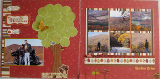
When I saw the papers for this month's kit the apple patterns really stood out. And as luck would have it, we took a family trip to New York City over the Memorial Day weekend.

So, I used my Slice to cut a large apple out of the paper, which I then sprayed with glimmer mist then Rock Candy crackle paint. Along with strips of the Imaginisce paper I added a few things from August's Tim Holtz Kit and Karen's uber-fun Capture the Moment class (umm ... featuring tons of Tim H!). And some of those really cute Cosmo Cricket tiny type alphas that ScrapbooksPlus just got in.


And if you're like me, you take tons of photos on trips and keep tickets, programs, and other mementos. I have lots of photos I wanted to use, but there's only so much room on a page. So, to complement my layout I took an American Crafts divided page protector and added photos, paper, and more embellishments - both front and back.

Here's the front side. Don't feel that everything has to stay in the pockets! I have journaling tags, chipboard stickers and half my title adhered on the outside of the pockets.


And here's the back. I included a ticket from a show and the Empire State Bldg. program on this side (although I had to fold both of them).


The chipboard sun was inked with Distress Ink and then coated with a layer of UTEE. Not only does it make it shiny but it will help the embellishment last. I added a bit of paper, part of our receipt and more of the Tim Holtz tape.


Saturday, September 4, 2010

Just say no to fall.

We moved this summer & between packing & unpacking, organizing bla, bla summer slipped through my fingers. I have enacted Operation Extend Summer. Getting this months very pumpkiny kit is not helping my cause. Hence my page - NO! I refuse to participate in fall, it is still summer & I will do summer things.

I started by distressing my title with a stencil & spiced marmalade. Leaving the stencil in place stamp on top with brown chalk ink. This will put the pattern in the shape only. Cool! Taking a tag with the pumpkin paper on it, I ran it through the circle Texture Fade, scuffed it with sand paper & distressed with vintage photo. I just ran the ink pad over the top of the tag to pick up the embossed parts. I printed the coffee picture from online & mounted it on the green patterned Imaginsce with a punched border. After positioning the pieces I used a stencil & black soot distress ink to add the spider webs, then a swish with a glitter pen to give it a shimmer. Time to start layering. I adhered the polka dot paper, photo & tag.

I used the pumpkin chipboard cut out that came with the kit. First I painted it white so my colors would show up better. I used water color crayons once the paint was dry. I embossed the pumpkin & then used water to blend the color. Again I used the sanding block to pull out the embossed parts more. To add a pretty shimmer coat with a thin layer of Glimmer Mist. A 7gypsies stamp was perfect for the words, which I cut out & added to Mr. Pumpkin. A rub on from my old stash was added along the bottom, along with one of my favorites -the Holtz film strip, which I added bling to. After adding my journal boxes I added the raven. This is one of Tim's new stamps from his set Haunted Mansion. I stamped it with black soot & cut it out, using pop dots to make it look like the raven was drinking the coffee. The great thing about having a local scrapbook store is I was able to order this stamp & receive it before it has arrived anywhere. ScrapbooksPlus will order product for you! Call & ask them how.

I finished this page by distressing the edges with vintage photo. Now I am going to go to the pool, read a summer book, eat popsicles & stick my head in the sand & pretend it is still summer!

Skyline Drive by Esther

The Apple Cider papers were great for the fall leaves and these pictures. A sheet of green Bazzill was used to place a rectangle of Changing Leaves that is 5 & 3/4" x 3 & 3/4" in the lower left and Fall in Love in the top right for the title. The leaves and trees lend a vertical direction so the placement was to complement the direction of the trees.


A text box was made on the computer using a brown color for the background and changing text to clear. That is mounted inside a fold with Tin Holtz's die "On the Edge" for the flap. Green lettering was welded on the Cricut and Gypsy from one of the cardstock patterns. A small amount of glitter dust was added to the title.

Friday, September 3, 2010

Pens & Buttons To The Rescue!


I am a big fan of buttons. I like that they are so versatile... they can be used for sleek, vintage, modern, really any kind of layout. They don't get squished in your albums, so they always look just as good years later as when you added them to your layout.


I finished this layout and it was just missing something. I laid some buttons out on it and that helped... but I knew I had finally gotten it when I added the black pen line around my kraft mat. Before, everything still felt like it was floating. Adding the line grounded it and helped connect the Jenni Bowlin journaling circles.

Another way I use buttons is to test out my idea when I'm thinking of using dimensional adhesive. I just place a button or two underneath the item I want to pop and see how it looks. This gives me an easy way to move it around before I glue it down for good with the actual dimensional adhesive.


thanks for stopping by!
erin