Monday, August 31, 2009

The Winner of the August DT Challenge is...

..."Winter at 13", a lovely 2 page layout created by... Nicole! 
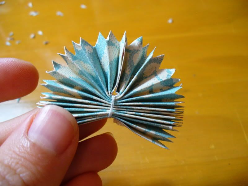
She did a great job working with the beautiful patterns in the Lily Bee papers. Nicole, be sure to check in with Debbie to pick up your prize - a gift certificate to Scrapbooks Plus!

Thanks to everyone who entered our challenge this month. Be sure to check the blog on the 1st of September - Lisa will be revealing the September DT kit, which featured 2 different lines from My Mind's Eye.

The papers should be available in the store starting Sept. 2nd, and you will also be able to view all the projects created by the Design Team. Get some inspiration, pick out some papers, and start working on your submission for next month!

Saturday, August 29, 2009

How To: Folded Flowers

Last month when Esther made her Birthday Badges, I was reminded of flowers I've seen on some layouts online. I decided to try making some of my own... and ended up including one on each of my layouts. I guess they were a success!


It took me a while to find instructions online... so I thought I would put some together to share with you.

First cut your paper into a rectangle that is at least twice as long as it is wide. The largest I made was 3.5 inches in diameter (from a 3.5 inch by 7.5 inch rectangle) and the smallest I made was 2 inches in diameter (from a 2 inch by 4.5 inch rectangle).


Begin accordian folding the paper on the short end, making the folds as close together and even as possible.


Take a short length of sewing thread (about 3 to 4 inches) and wrap it around the middle of the paper folds tightly. Tie the loose ends in a double knot and trim the ends close.


Working with a few folds at a time carefully trim the edges into curves or points. Continue until all the folds match


Bring together the loose edges and glue with strong adhesive on each side. Carefully fluff the flower to spread out the folds.


Here is the finished flower!


Decorate the center of your flower with punched paper circles, buttons, or paper flowers. I made quite a few of these and ended up adding them to almost every project I made. I love making embellishments from my patterned paper since they match perfectly!


thanks for stopping by!
erin

Friday, August 28, 2009

Placing Large Letters by Esther

The larger blue chipboard letters in our August kit were an inspiration to make this two page layout of a vacation tour in California. We visited the Hearst Castle in San Simeon. The blues were great with the pictures showing the pools. The Castle has both an indoor and an outdoor pool. I started with a solid cardstock so the letters would pop.

Attempting to place the letters became a task, since they were larger than the space to go across the 24". My solution was to run them down the left side and then the bottom. This gave the theme I desired and used the large letters.

There are probably some croppers that would object to having the letters on two edges of the page. There are very few hard and fast rules for this craft of scrapbooking. Using acid-free and ligin-free products are basic for preservation. Otherwise, there are some basic rules learned in school. Darker and larger items to the bottom; plan in thirds; avoid the focal point floating in the center; and use an odd number, when possible. Otherwise, move the paictures and letters around on the page until you are satisfied with your design.

If you are really wanting to learn more about design and how to make pages, go to Scrapbooks Plus for classes and SDU. Make the page the way you want. It is your creation. Enjoy the art.

Thursday, August 27, 2009

Tag Albums - from Scratch!

Remember how your mom could make cakes from scratch (I still can't get anything I try to bake from scratch to rise!). Well here's a different twist. Making mini albums from scratch, meaning not buying and using commercial bare/blank precut chipboard/acrylic albums, but instead make it from things you have around you.
This little tag album is just that. The chipboard cover and back are pieces of thin chipboard from my cat's wet food box (those little separator sheets that come between the cans of Fancy Feast cat food boxes.) After I cut them using a Sizzix tag die I recently purchased (Scrapbooks-Plus has a similar die for the Accu-cut that you can use), I painted them with brown acrylic paint. Once dry, I used crackle medium, then antique white acrylic paint to achieve that distressed look. After the entire thing was completely dry, I used a little matte varnish to seal it. All this paint is in my garage from the hundreds of craft projects I have engaged in over the years. All the "pages" - the interior tags - were cut using the same tag die from different leftovers of the double sided paper from Lily Bee. Once I got my photo mats and pictures on, the pages were quite sturdy. The only thing I purchased for this album was the ring at the top - but since I had that on hand from yet another project last Christmas,I really didn't have to buy anything. Everything used to make this were things that I had in my garage/storage room - with the exception of the paper and embellies that were in the DT kit!
So get creative this weekend...there are tons of things hanging around your house that you can use to make minibooks from scratch - wait to you see my project next month (it involves a HUGE seashell!).

Don't forget to go by Scrapbooks-Plus to pick up your Lily Bee papers.(When I was there on Tuesday, they were nearly sold out!). And don't forget the anniversary week celebrations. There is a new make and take EVERYDAY, with an accompanying layout you can purchase to incorporate your make and take and photos.

Wednesday, August 26, 2009

Beach layout...


I really didn't know what to do with my paper, but I had this great picture of my son, from when we went to the outer banks early this year...and I wanted to use it...on something anything...just wanted to see it on paper and not sitting in the pile of pictures that are mounding up on me.

The Orange and the Blue were perfect mats for the picture of my baby boys bold colors. Plus all the little embellishments in the kit were the perfect additions. I wrote right on the picture "Always leave enough room in your life to do what makes you happy". And on the swirl I wrote Naggs Head May 2009. Because even if I do not journal it is important to me that I at the least date things...cause I am already forgetting little things I can't imagine what it is going to be like in 5 years from now :)

Tuesday, August 25, 2009

Back to School- ACK!

Tomorrow I head back to work to get ready for a new school year. I start at a new school and have lots of unpacking to do, setting up a new, organizing, and planning ahead of me. I don't know about you, but when things get crazy, I start to make lists. I love to be able to cross things off as I finish them, it helps me stay focused (not easy for me to do). Something that will be coming with me to my new school is this clipboard I altered using the paper from this months kit.

With some paper and Mod Podge, you can makeover any clipboard. This one came from a dollar bin somewhere and was bright pink with kid characters all over it. I sanded it, and then applied the paper with Mod Podge. A trick I have learned is to roll over the paper with a brayer after you glue it down, it helps get rid of any air bubbles and spreads the Mod Podge underneath the paper. Once the paper was down and had a minute to dry, I sanded the edges to smooth everything down before sealing the whole thing with a layer of Mod Podge. I then added a strip of patterned paper to cover the top of the paper pad so that it would coordinate. Add a little ribbon and it makes a great gift!

Monday, August 24, 2009

Hello fellow scrappers! This month I was really trying to step out of the box and try something simple. I love simple scrapbooks, but I can never get the desired affects of the magazine at home. I think that my biggest problem is that I love stuff! I love to add and add and add. So here's my simple layout.

I love the lace! I think that I will get some more and start using it more. I always thought that lace was kind of old and not in my style range, but I love this thick lace!

I also love that the letters are really worn! I'm starting to sand a lot more then I use to!

What do you think? What would you have done differently? Any help with my quest to become more simple?? (Not that I think I can let my brain into this, but I"m trying!!)

Sunday, August 23, 2009

Happy Birthday... to You!

Scrapbooks Plus is 9 years old and YOU are getting all the presents!

There has been a lot of excitement around the store as we prepared for the upcoming WEEK of celebration. The Design Team has Make & Takes planned every day, so come in and see what new idea or technique we want to share with you. (I saw Kim putting the finishing touches on her design at Saturday night's crop - do you like flowers? Can you say CUTE? Come in and see for yourself!)

While you are in the store be sure to check out the Daily Special! Debbie has something different on sale each day - stamps, albums, stickers, punches, etc. Whatever it is you need to finish your current project, it will probably be on sale this week. And if it is not, there will be a Balloon Pop in the store one day for a Discount when you get to the checkout! Oh, and for every $5.00 you spend at the store this week, you will receive 1 ticket for Sunday's Grand Prize Raffle!!

And please plan to come to the Cookout on Saturday night from 6p to midnight. Bring a side dish to share and get ready to win a Door Prize! Yes, those grab bags you saw being filled at the store the past couple of weeks are for our celebration, too. Lots and lots of yummy product sorted into individual bags for the hourly Door Prize Drawings at Friday's and Saturday's crops.

I'll see you at Scrapbooks Plus!

Saturday, August 22, 2009

A Fourth Layout

I had these blurry photos from the Fourth of July (note to self: don't wait to take sparkler pics until it's dark. Kids won't stay still!) that had orangy undertones. The orange in this paper just jumped out at me and I thought it would be a good complement with my photo. A strip of the floral paper behind my photo helped lighten things up, and the acrylic paisley added a nice accent.

Friday, August 21, 2009

Back to School Gifts

The new school year is just around the corner, and I thought I'd get ahead of things for once. My children are in elementary school, so I came up with a decorated lunchbox perfect for an elementary school teacher, complete with extra glue, crayons and a tin for aspirin!


On the outside I used the Stella paper to cover the box and the Fashion Show paper for an accent strip. I'd been dying to use this new edge punch. The apple shape was cut with my Slice. I had bought these Imaginisce brads at Scrapbooks Plus when they first came in and had been saving them for the perfect project.


And what's a lunchbox without goodies? I used scraps of various Lily Bee papers to wrap the contents and make a hall pass. Feel free to open the pail and check out the rest of the supplies that aren't displayed on the shelf when you stop by the store.

Thursday, August 20, 2009

Goin' Out on a Limb

In June I spotted some really cute Welcome Home signs at the Great American Scrapbook Convention. That's also where I picked up Rusty Pickle's giant chipboard bracket book. Although the book idea was cool, I knew that I wanted to pull the book apart and use it a bit differently. Eureka! Combining the two ideas together was perfect!


I used my ATG to adhere the Lily Bee papers on the the base. Then I flipped them over and used Fiskars little finger craft knife to cut the edge shape. A little sandpaper perfected and distressed the edges. Then I was ready to decorate. I used the Heidi Swapp foam letters and carefully colored the foam aroung the edges to make them stand out a bit more.


For the decorative elements, I used some Maya Road chipboard pieces. For the paper covered ones I just ran scraps of patterned paper through my Xyron and trimmed just like the sign base. The roof of the house is actually made from strips of paper cut with decorative edged scissors, overlapped and staggered until the piece was covered. A little Tim Holz Crackle finish paint was perfect for the branch. I wanted to add a chipboard tree, but it was too bulky... so I traced the chipboard shape onto patterned paper and cut it out instead. Now I have the tree shape, but not the bulk of the chipboard. A couple of paper flowers, a ribbon, and a hand-cut heart finish it off. I can't wait to find a place to hang it!

thanks for stopping by!
erin

Wednesday, August 19, 2009

Focus on Titles


As scrapbookers, most of us are focused on highlighting our photos in our layouts. And we all know the importance of journaling on our layouts and in our books to capture the story behind our photos. But sometimes the title itself can be just as important, and as inspirational as wonderful photography and well crafted stories.
I remember a post that Susie made last year regarding her struggle to come up with the perfect title for her layouts. I find that I, too, struggle sometimes with titles. But other times, like in this layout the inspiration for the layout comes from the title.
This two-page layout was inspired by a tee shirt that had a similar phrase imprinted on it. I saw it for sale in one of those little shops at the beach and it reminded me of the fun my son and I had the day before wandering around with our dog, Maggie, at Smith Creek. The phrase would be a perfect title to capture those memories!
To create the effect I wanted, I needed different sizes, colors, and fonts for the words in the title. I used my Cricut to cut the smaller elements. ("Stamped" and "Opposites Attract" were the two cartridges I used). For the most important words like 'wander' and 'lost', I used the large Heidi Swapp foam letters, but any large alphas would have worked (I could have easily cut them on the cricut and popped them to give them dimension). To give the title the feel of the beach, I wrapped a few of the letters with raffia and added sea oats that I collected from the beach grasses growing at the shore (Zip Dry adhesive did a great job of holding them tightly in place).

There are a ton of alphas (large and small) for sale at Scrapbooks Plus to create the most amazing titles for your layouts and projects. And, inspiration and ideas can come from so many places - even a tee shirt shop.

Tuesday, August 18, 2009

Keepin' it Simple


I tried to keep things simple with this layout. My layouts usually aren't that complicated, but I've never just stuck to solid cardstock as the main content. For this layout, I used the Bazzill Swiss Dot Scallop 12x12 paper. If you haven't played with the Swiss Dot cardstock yet, you need to! I loved it when it first came out, but now they have started making it in scallop squares and 6x12 rectangles. Love it!!!! I used the foam letters from the kit but sanded and inked them with Distress ink so they would match the rest of the lettering. I didn't want the lettering to take up too much space on the layout so I chose to just use the foam letters for the first letter and then used my trusty Cricut for the rest. I added a few strips of patterned paper to add just a little something. I like how this turned out, although I think the journaling will be hidden next time.

Summer is quickly coming to a close for us teachers, I'm off to spend my last few days of summer to catch up on some layouts. Enjoy!

Monday, August 17, 2009

Working with what you like


This month we were given these foam letter sheets that are about 1/4" thick. I really liked the pattern, but I just wasn't digging them as letters so I chose to use it as my background. After I pulled out all the letters that I thought I would use, I then chose paper to go with it!


Here's the finished project. I took out the "u" in the background of the sheet and put a piece of neutral paper on the back. I then free handed a heart and added the "i" from the other sheet (after I sanded it) with some flowers and a button. The rest of the paper I wanted to adhere differently so, I stapled the paper on. It added a cute little embellishment to all the papers while holding it down. I used the new tim holtz mini stapler! I LOVE IT!! They're just tiny little staples that add just a touch of fun!

Enjoy your day!

Sunday, August 16, 2009

A Place for Everything - Scrap Oranization by Loretta Cooper

One of my grandmother's (many) cliches... "A place for everything, and everything in it's place". This is the first essential rule of organization. And it was an absolute necessity for my grandmother, as she never threw out anything.

In this, she unwittingly taught me the second essential rule of organization: Be willing to part with anything you 1.) don't use 2.) don't like 3.) can't remember why you bought it in the first place.

One of the things I've observed about scrappers as a group is that we are all collectors. It's part of the hobby. It's a little impulsive and and little obsessive... and frankly, that's why we love it. But it's also very easy to get overwhelmed or frustrated if you can't put your hands on "the stuff" you need when you finally carve out those few moments to play.


For this blog, I'd like to invite you into my scrapping space-- a small extra bedroom upstairs -- and show you some of my organizing tips. As you can see, I use every inch of space. I added the little daybed because somebody is always coming in to chat. ( It's the perfect resting place. Stiff as a board so nobody stays too long! )


My workspace is a standing workdesk I found at Ikea eons ago. I am certain they have much nicer things now, but I'm afraid to look.

Underneath and to both sides storage of the things I use the most... cutters, inks, distressing tools.

Good lighting is important too! This room has two huge windows. But I scrap a lot at night-- and I am really particular about color, so I have three lights in this room -- the two you see here and another on the opposite side of the space.


Above the work space I have a magnetic bulletin board also covered in tools and a few published projects that inspired me.

Again, I try to keep the tools and materials I use most within arms reach. If I have to take even a few steps away, I get distracted...

Storing supplies get's complicated.
I used to keep all my paper, sorted by color in paper racks. I've pretty much abandoned that. It got too complicated trying to figure out where all those multi-colored prints should go.


Now my card stock stays sorted in racks and most of my paper is is sorted by manufacturer in these very cool paper bins.

I have discovered I really like this system. Even though I can't see it all, it's fun to flip through the files and discover all those wonderful prints.


I have several of these bins. One with only holiday or special event papers (Christmas, Halloween, Summer, Fall) Another holds project categories (Sports, Travel, Family, etc.)

In the second closet I keep all the other goodies separated into drawers.
Brads, snaps, flowers, chipboard ... Basically anything that can be used to embellish a page lives in here. This is also where punches and circle cutters live.

And finally, there's the computer center. I've only recently moved my old laptop up here.

I use my computer a lot (unloading and retouching photos- printing out journaling -- you know.) Running up and down the stairs to the desktop was really cutting into all that good "scrapping karma" I had going. I also moved my good Cannon Printer and my wide body scanner up here too.

And in case you're wondering ... that big thing full of stickers is called a scraprack. It's a new addition to my organizational system. The jury is still out on it's usefulness for me. Let's say I like it a lot "in theory".

I'd love to hear (and see) how other scrappers are organizing their loot! A well organized stash means there is that much more room for more!

Happy Scrapping!
Loretta

Saturday, August 15, 2009

Different Shapes come together...

I had so much fun with this layout. Typically double layouts are not my thing. In fact I may have mentioned before (and may so even do it again) it is a task which I really just struggle completing each month. I am not sure why this is, except that maybe I don’t have enough pictures of the same event or maybe I just don’t see the vision. Whatever the reason may be for it, I know that I struggle with double layouts. Not this month. I really liked the way my layout came together. Instead of using (1) 5 x 7 photo I decided to do a collage. I took a bunch of different pics from my most recent OBX vacation and collaged them into a 5 x 7. It is fun to go back and look at all of these little tidbits from vacation all in one spot – they bring back memories and put me right there in that moment of time.

ANYWHO…back to my double layout. I enjoyed the colors, the patterns, they were all a little different but still blended well. I enjoyed using different shapes, such as circles, scallops, rectangles. Even though all very different they all tied together quite well. I even did some embossing on my journaling circle – I thought it would help the lines “POP” on such a loud colorful background. I’m not sure how effective it was in doing that, but it was still fun trying to execute that thought.


Friday, August 14, 2009

I love Lily Bee


I have to say that I really enjoyed working with the Lily Bee papers this month. I had a LO in my mind but didn't know what pictures I wanted to use. Normally when I do a LO I have the pictures I want to use then I pick out the paper. This month I did it differently- paper first, then pictures.
I really like the shaped journaling spots that came with the kit, but when I put the one I used on my LO at first it didn't pop quite the way I wanted- so I put some of the brown Ruche paper that came with the kit and cut a small border around it and it gave it the look I wanted.
The flowers that came with the kit were a little to bright for the LO, so I stamped an image on them and voila! It toned the down. Try to alter a item that you normally wouldn't- it will give it a whole new look!
Don't forget about the Design Team Challenge. We want to see what you've created with the Lily Bee papers- you could win a gift certificate to Scrapbooks Plus!

Enjoy!
Lisa

Thursday, August 13, 2009

Altered Flower Container


I altered a small flower container this month...I decorated the sides of the can with paper and added letters to spell out flower, then for the top. I made a flower. I cute a 4 inch, 3 1/2 inch, 3 inch, 2 1/2 inch 2 inch, then 1 1/2 inch, on top of that I added a flower.

I inked the circles, crinkled them up, and then layered them in a way that made me happy. After all was said and done I added a smaller flower and a button to the top of the can and had a nice little flower on top of my can...

Have you ever made your own flowers like this. Perhaps you could use scalloped punches...

Tuesday, August 11, 2009

Gift Tags by Esther


Making a gift tag was easy with the variety of patterns and colors of decorative papers in this kit. I began with a basic shape of cardstock to cut a 4” x 6” rectangle. The decorative pieces can be some of your scraps. Cut, shape and glue them to the base rectangle. Add ribbon, lace, buttons, die cuts and brads or jewels. The Lily Bee French Coutoure patterns lend themselves to flowers and decorative elements.

Shape the tags after adding the decorative pieces. The corners were rounded with the chomper that I found at the Scrapbooks Plus store and the tops were shaped with scissors. Add a hole or an eyelet for the thread loop to hang from the bag or gift and tie a loop of ribbon or string.

Put the words “To” and “From” on the tag. Mine are on the back so that more decorative elements can be on the front. It was so easy to create the tag that I made several. It was great therapy. Get as creative as you want with gift tags.

Got Flowers?

I loved the colors/papers in this kit! I think this is one of my new favorite companies. While working on my layout, I decided I wanted a big flower in the corner. I have tons of flowers but none were quite as large as what I wanted, or if they were close they were the wrong color. Soooooooo, I made my own!! All you need is a circle punch or two, some glue, and you are set!


Punch out a bunch of circles, and then rough them up a little to give them some texture. I wadded these into balls and then inked them.


Use one of the circles as a base and glue a layer of circles around it. Make sure you overlap your circles.

Add a second layer of circles to add more petals to your flower. If you want an even larger flower, start with a larger base and then you may have room to add a 3rd layer.

Add a center to you flower (for this I layered two sizes of circles and then a button) and voila! You have a beautiful flower that matches your project perfectly!
Happy Scrappin~


Monday, August 10, 2009

A little Nothing...or a little something

Everyone needs a little nothing sometimes! I've made this cute little bandaid box to give a little nothing who needs a little something! It's an easy way to help cheer someone up quickly! This little box is decorated wtih the letters a clear butterfly a few pieces of scrap paper and one of my favorite scrappers floss! I even added some ribbon and floss to the handle to spice it up!

The next time you need to cheer up someone, remember this quick little project to help!

Sunday, August 9, 2009

Young Love

My parents as high school sweethearts...16 and 17 years old. 
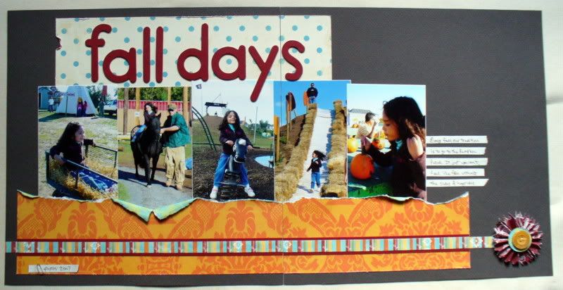
I usually pack my 2 page layouts with pictures, but I wanted these 5" x 7" portraits to be the focal points. The large blue and white element on the right page actually overlaps the page on the left. I have decided to frame these pages for my mom, so I don't need to cut the overlap section.
.
There is lots of texture in this project - Bazzill polka dot paper, chipboard die cuts, velveteen paper, MME die cuts, Prima flowers and buttons. Mom will add journaling when it comes down off of the wall at the store.

Saturday, August 8, 2009

Best Friends by Loretta Cooper


I fell in love with these Lily Bee French Couture papers the fist time I saw them in the kit (nice job, Erin!).

The paper is perfect layered with this Bazzill scalloped green swiss dot. I used it to frame these beach photos of my best girlfriend (Lynnelle) and me.

The MME die cuts are AWESOME, they layer under or over everything (see the lower left hand corner) and of course, there's ribbon... lots and lots of ribbon!

One tip on making papers and accents work together: rough them up with a file, sandpaper, and ink.

Great kit Erin! Awesome job!


Friday, August 7, 2009

Capturing the Beauty of Summer


I just love summer time - especially the gorgeous flowers that bloom throughout the summer months. I love to capture that beauty on film but often don't know how to scrap those photos without it being - well - a little boring in my scrapbook.

The Lily Bee paper was just the fix to my dilemma. By selecting the neutral toned sheets of patterned paper with just hints of yellow, orange and burgundy, allowed for the bright oranges and reds of my photos to really pop off the page. For accents, I used clear acrylic butterfly stamps (Martha Stewart), stamped in brown Staz-On ink onto the orange Lily Bee patterned paper. When stamping, I tried to place the image in a way to get the pattern of the paper to mimic the symmetry of a butterfly's markings. Then I cut them out and added them to the layout with a glue dot in the center of the butterfly body so the wings would "fly".

After I had much of the layout together, it needed SOMETHING. I thought about a flourish, or doodling which led me to my sewing machine. I randomly stitched around the page to sort of emulate the butterfly's flight. I must admit that this was really a "random" layout. I just added things as I went - the lace was too white, so I inked it. The edges were too smooth, so I bent them over. The brown Chantilly Lace card stock was too, well, brown, so I dry brushed it with gesso. And randomly, the page came together.

So take some pictures of the summer's flowers (the black-eyed Susans are just GORGEOUS right now), pick up some Lily Bee paper and let your creativity go off in a random sort of way. We would LOVE to see what you come up with (so enter it into this month's challenge!!)

Thursday, August 6, 2009

Got Goldfish?

I loved the letters in this kit. Someone used them last year, I wasn't on the team then but I remember someone saying how nice they were to work with and I just never got it... So this year when we had a chance to work with them I was so excited! They sand so nicely. They are self adhesive so that made it so easy to sand and go.

This is a simple layout about my nephew and my sons first meeting. We threw some Goldfish on a table and let them go to town. I believe they ate more off the floor then the table. Thank goodness for hardwood is all I have to say. I love this series of pictures and have actually scrapped them several times because of that.

The scalloped edge I did with a fiskars punch and if you haven't had a chance to use one yet, stop by the store and try them out we have several in the class room including the one that I used on this layout.

I would love to tell you that I posted my picture upside down on purpose but I didn't it isn't upside down on my computer and I tried to reload it a couple of times but yet it post it on here upside down. Sorry.

Wednesday, August 5, 2009

Cards!

The double-sided Lily Bee paper made it easy to mix and match to come up with a variety of cards. And you can easily stretch your supplies to get multiple projects. Take the die cut bracket, for example. I cut it in half and used it to make two cards:


For this one I cut the top off the bracket and backed it with the striped paper. A white ribbon and a cluster of embellishments is all it needed.

This one took a bit more time to make. I wanted to make a tri-fold card, so I took the other half of the bracket and laid it onto the textured cardstock. I traced around the paper then scooted the bracket over and traced again. I made sure to leave enough room so that the brackets would overlap when the card was closed.

After I cut out the cardstock I adhered the bracket to one flap, another bit of Lily Bee paper o the inside and a chipboard flower/sentiment. I used a bit of ric rac to keep the card closed.

I liked making the bracket card so much I thought I'd try it again! This time I used a square die cut, again cut in half. However, I didn't want to trace and cut out all around this one so I just adhered it on the outside. I cut a journaling block in half and added a clear flower. On the inside flap is my sentiment using the Heidi Swapp large foam alphas.

Tuesday, August 4, 2009

Puppy Love

This month's kit was so much fun to use. Erin did a great job picking out a kit that was very versatile. I really liked the blue letters that came with the kit this month, but didn't think that they worked really well with my LO, so I decided to paint them with an off white acrylic paint and distressed them with some brown ink on the edges. I loved the green Dotted Swiss paper but it was too big for the paper that I had cut, so I measured a piece that would mat the back of the picture I used and cut it to size. To hide the seam where I joined the paper I covered it with the velvet ribbon that came in the kit.
Don't forget about the Design Team Challenge- let us see your work! You could win a Scrapbooks Plus gift certificate!
Enjoy!
Lisa

Monday, August 3, 2009

Nature's Neutrals

I love the reds and oranges in Lily Bee's French Couture line. Really, I almost always love reds and oranges! :) But when I pulled out this butterfly picture and started laying out the patterned paper, I was surprised to be drawn to work with the blues and greens. It shouldn't have been a surprise. After all, blue and green are great, almost-neutral colors found in most nature pictures. The green grass and blue sky in the background are sometimes our focal points... but they are often the background to some other feature that we are capturing.


Here the green and cream are my neutrals and the bright turquoise blue serves as my accent color. To keep it balanced just use the gallon, quart, pint method.... a gallon of your main color - cream, with a quart of another color - green, accented with a pint of your third color - turquoise.


I wanted to mention a couple of items that I added to this layout. First, I added some of my leftover Bo Bunny cream chipboard pieces from a couple of months ago. I used every last piece of them! They are really versatile and I've enjoyed having them. I may go and get more! :) The two uppermost curls are actually two arrows with the points hidden under the flower. Second, I added some hand stitching with the Bazzil embroidery floss across the bottom of the layout. This floss isn't the same as what you use for cross-stitch or crewel. That floss is made of six strands that you can pull apart. The Bazzil floss is woven together so that it doesn't ravel giving it more durability... which is a must when stitching through paper! Regular embroidery floss will get "fuzzy" as you stitch with it, forcing you to use multiple sections of shorter threads to keep it looking neat. If you haven't tried these items out, you won't be disappointed!


thanks for stopping by!

erin