Friday, April 30, 2010

Springtime Layout

The soft colors of the Clothesline paper line are just perfect for spring. I loved many of the little tags and shapes embedded in the patterns. To highlight them, and to move them where I wanted them to be, I cut out several and used them in my Springtime layout.


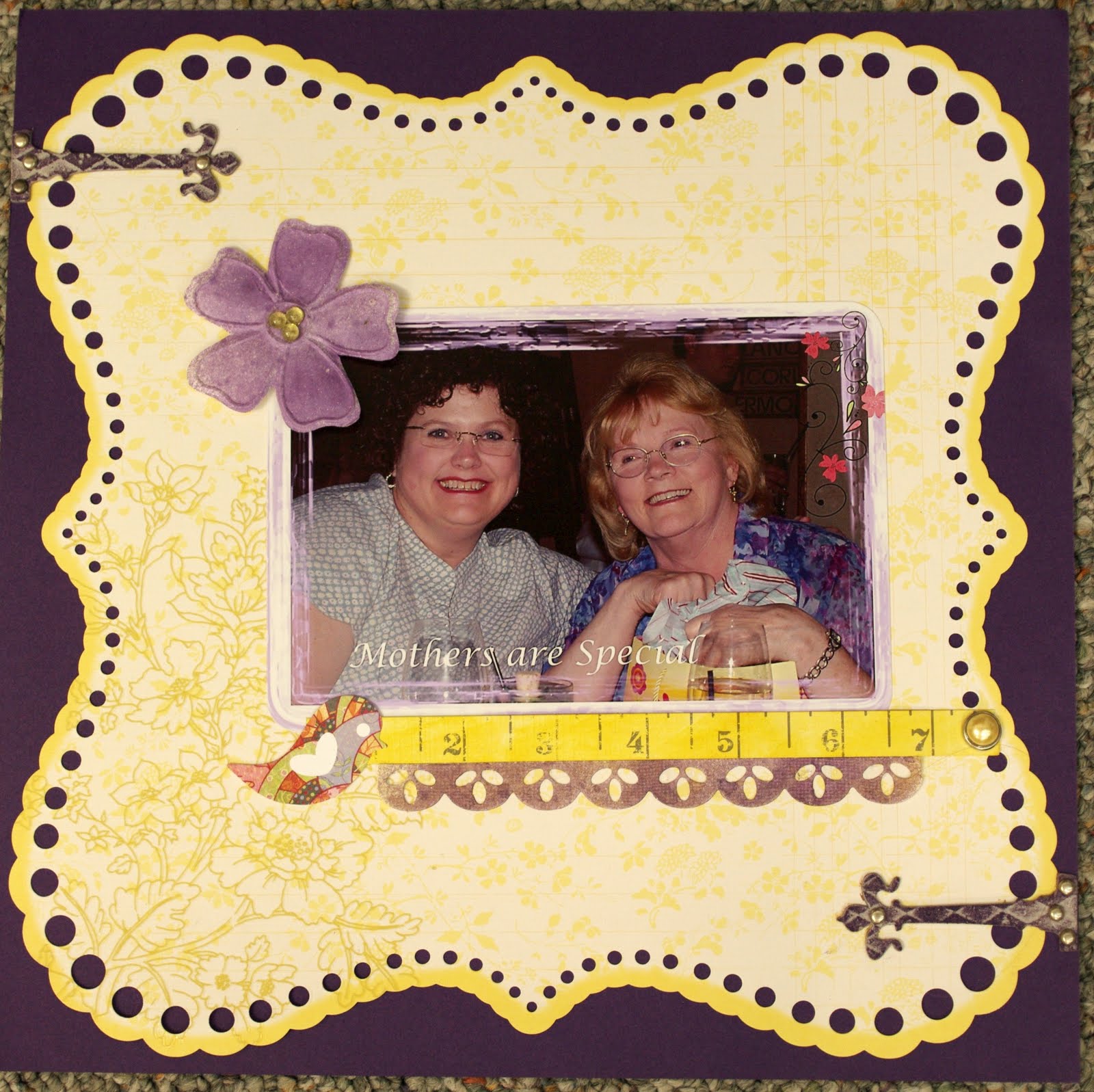
The bracket shape came from the reverse of the Backyard patterned paper and my title tag was part of the Spring Mix paper. To balance the layout I added another tag from the Spring Mix sheet at the top right corner and clustered some leftover strips of paper and a punched piece together. The layout needed something else.... so I pulled out the bling-studded rubons from Basic Grey. They repeat the white found on the distressed paper edges and the journaling around my photo. Each flower is a little different, but since they are similar, they work together just fine. I added a piece of ribbon with Tim Holtz' new tiny attacher... that tool is wonderful and the little staples are a great size. I hid a few extra staples under the title to hold the ribbon in place. It was much easier than any adhesive. :)

thanks for stopping by!
erin

Thursday, April 29, 2010

Envelope Album

Little Yellow Bicycle has this cool envelope mini album kit. The envelopes are all reversible and it comes with double-sided cards that fit into the envelopes. I also used a lot of the matching embellishments and papers to put mine together.


Here's my album:
The kit comes with double-sided paper for each cover. I dressed mine up by trimming one of the card inserts and adding a flower.


And one of the envelopes:


The inserts are perfect for holding all your journaling - with room on the back for photos or more embellishments.


I used the extra piece of the insert from the front cover to hold a photo, with journaling on the back. I just punched holes into the end with my crop-a-dile and added it to my album.


You can see the entire album on the wall at ScrapbooksPlus!

Wednesday, April 28, 2010

Paper Piecing


Card making is one of my favorite new hobbies. There are so many occasions where we need a card in an instant! One of my resolutions for 2010 is to make two cards each month. I am happy to say that I have stayed true to this declaration.


Paper piecing is one of the most beautiful art forms in crafting. The dimension achieved with a few pieces of paper and glue is amazing.

How to:
1. Create a 6x6 gate fold card. To do this, cut a 12x6 piece of cardstock. Punch each corner with a decorative punch. (I used a Martha Stewart Crafts punch)

2. Score at 3” and 9”. Fold inward.

3. Cut a strip of patterned paper and adhere it to left side of card.

4. Using a Sizzix strip die (Birds and Branches), cut your pieced bird image and assemble. The die has two bird images. Assemble both as you will be using one for the inside of the card and one for the card front.

5. Adhere the bird and branch to the right side of the card.

6. Cut a 5 ½ x 5 ½ piece of patterned paper for the inside of your card. Adhere

7. Adhere the second bird and branch die cut.

Thanks for joining me.

Robin

Tuesday, April 27, 2010

Little Fish

I love the colors in this layout. I am generally not a circle person in my scrapbooking, so this month I decided to interpret the sketch literally. I used the Cornflower Ledger and Backyard Ledger paper in this layout. I used some old Fancy Pants orange paper for the fish and coated them with Glossy Accents. "Little Fish" is Maya Roads chipboard painted with Smooch ink in green apple and a little kiwi, which are available at ScrapbooksPlus.

Monday, April 26, 2010

Springtime Card by Esther


The Little Yellow Bicycle spring line in the Freshprint Clothlesline group is all about spring. This card was inspired by the sentiment on The Little Yellow Bicycle Spring Mix. A rectangle was cut just to highlight the sentiment, “Springtime”. A Corner Chomper Rounder was used to soften the corners. Layers of patterns were adhered to the Cora Stitched cardstock used for the card base. This pattern has a nice green border for variety.

The colors in the floral print cardstock gave way to a torn edge paper flower. I used a strip of paper to tear with the torn edge in white. After adhering in the center the edges were then cut toward the center to shape & curl. The center bling is Peridot green crystals applied with the Hotfix method. There are many colors of crystals at ScrapbooksPlus.

Strips of cardstock scraps from the line were used for adornments. A button with a blue bird anchors the pink ribbon in right corner of the card. Inside, the Cora Chrysanthemum gave a cheerful presentation for a message on a centered solid white paper adhered only at the top. This card is ready for a message of spring.

Sunday, April 25, 2010

So Sweet!

Love love love the Little Yellow Bicycle paper in this month's kit to use with a sweet baby on "Sa...weet" paper. I tried to pull out all the colors from the printed paper using flowers and butterflies. I wanted to make it a little more cheery with those embellishments.
I also used one of Martha Stewart's flower border punches. I use Martha Stewart's large border punches everywhere. As well as her butterfly punch. I think it adds a lot of dimension to the layout.
At the bottom of the page I added one of Jenni Bowlin's mini baby girl bingo cards, hat pins, flowers and a folded paper doilee to add depth. Think out of the box when scrapping. Look around your house, you can find a lot of little embellishments to use on your layouts. The punches, flowers, bingo cards and pins are all available at ScrapbookPlus.
Come back soon to get some great ideas from the Design Team.

Saturday, April 24, 2010

Summer List


I love lists. This page is inspired by the cute pocket embellishment from the Little Yellow Bicycle line. It said 10 Things I Love About Everyday Life. I made a new pocket that says "10 Things We Did This Summer". Choosing the photos was the hardest part- only 10 things??? I drew out my layout first so I could fit all the photos & then printed them out in the various sizes. I made the flower using Cricut & cut it twice in 2 different papers. I cut out the flowers, from the 2nd paper & pop dotted them on the base paper to add height & then added some bling. Putting one of the beautiful flowers from the Prima line on, that I got at ScrapbooksPlus made this whole embellishment so much...more.
I few border punched mats, a stamp, & some distressing completed the page.
I hope you like it!

Friday, April 23, 2010

Inspired by Esther

I love a nice, clean layout, but I still tend toward messy, handwritten journaling. Computers are a great option for neatening everything up, but generally I am way too lazy to head over to the family room to use my computer to do the journaling. This month was different. I really wanted a layered title and none of my stamps, or stickers, or rubuns were quite right. Esther uses her computer all the time, and I decided that it was time to take a stab at it myself.


After a few false starts, I finally got the placement and color right. I printed the title and journaling on my background sheet of 8.5 by 11 cardstock. I used Photoshop Elements to create the boxes of text and line it up properly. After printing, I matted my photos on some of the coral patterned paper and bordered it with strips of the bright green reverse of another pattern. The tiny strip on top is actually the discard strip left after running the bottom piece through the edge punch. A tiny button finishes it off.


Thanks for the inspiration, Esther! It really was quite easy.

erin

Thursday, April 22, 2010

A Note About Motherhood

When I became a mother I knew one thing was for certain, I wanted to remember as much as I could about motherhood. I started journaling on note cards that I kept in a recipe box. When I saw a recipe box in the unfinished wood section of a local craft store I decided to use it to make a personalized journaling box for myself.
I love this system of journaling. It is a great way to store memories whether it is just for a period of time or permanently. Some of the things I write down are simply stored in the box until I scrapbook them. Since I can't scrapbook everything I am happy knowing that the memory is kept safe and sound here. If I know there is a pretty good chance that what I am journaling won't end up in the scrapbook I like to add a small photo or an embellishment. Here is an example. My son saved the day when a spider scared my daughter and she wrote about her brave brother. I simply used an extra photo I had of Cullen and cropped it down to 1.5 x1.5 and added it to the corner.


I developed a class to make this journaling box and embellish it using different techniques with distress inks. The box itself is distressed and the tag on top is altered using distress inks as well as other Ranger Ink products. Each of the 5 divider cards inside the box also has a different technique used to embellish it. The class is on Saturday May 8th from 10:15-12:15. If you are interested or have any question contact the store.

Wednesday, April 21, 2010

Hug a Mom

This photo of my in laws, was taken a few years ago at our Mothers Day lunch. I love the bright & cheery yellow of this Little Yellow Bicycle paper, especially the cut-out punched look that is already in place. I backed the layout with purple card stock & Glimmer misted the Bazzill cut-out & the white flower. The cool grunge hinges from Tim Holtz were distressed with Rangers Dusty Concord Ink & attached with brads-yes grunge can go pretty! I had to add the cute Basic Grey bird sticker- well just because!

With Mothers Day right around the corner make sure you give a Mom some special attention!

Tuesday, April 20, 2010

Mixing it Up

As I mentioned last month, I like to scan the new wall at ScrapbooksPlus for things that mix well with our monthly kits. This month I found quite a few things that really work well with the Little Yellow Bicycle paper. I added a sheet of paper from American Crafts' Dear Lizzy collection, a few of Jenni Bowlin's super cute buttons, and Bazzill bling.

I picked up one of Bazzill's bling templates - and I simply love it! It's extremely easy to use, but it really helps to use the tweezers to pick up and set the bling. Just be careful - it is quite addictive.

And on this 6x12 layout I used a few edge punches, yellow alphas stickers from Basic Grey and a Hero Arts journaling stamp. This kind of layout is a great way to use up all those little scraps left over from projects.

Monday, April 19, 2010

For You Card

The colors in this month's kit were very inspiring. I used "Cora Damask" on this card. The centerline of the card is "Spring Mix". I also used the beautiful Prima "Tea Roses" and "Say it in Pearls". "For You" is a rub on. I love how quickly this card came together.

Sunday, April 18, 2010

April Sketch - "Little Angel"


I loved working with the sketch created by DT member Deborah Mahnken. To see the sketch and participate in the monthly customer challenge, please visit us at Scrapbooks Plus. You could win a gift certificate to the store. How fun is that?!!!

I absolutely love using flowers on my layouts.  Petaloo flowers are relatively flat which makes them a beautiful addition for scrapbooks and cards.

 
The title was created using epoxy stickers from the Making Memories Pitter Patter Collection. The stickers I chose to use had these cute safety pins attached. Just perfect! I also used butterflies from the Jenni Bowlin collection.  The size of the butterflies work well with cards and layouts. 

Thanks for joining me today.

Robin

Saturday, April 17, 2010

April Flowers........

Spring has sprung, the grass has rise, I wonder where the flowers is.........well anyway it goes something like that. I love to make lots of easy cards to have on hand. I don't necessary use a salutation until I'm ready to send it out. One of the printed sheets in the April kit was this pretty pink color. Great to make flowers out of for this time of year. I used two different size scallop punches to make the flowers. I added a flower for the center. Used the green paper I had left over from my biker dude layout and just hand cut the stem and leaves.
Jenni Bowlin put out some adorable butterflies recently. I thought this was a good time to use one. It matched the paper perfect. I used some embroidery floss for the streamer. Since there are a lot of circles going on I punched out 6 - 3/4" circles for the bottom border. Hand sewn a back stitch right down the center for a different look. It's cute but easy to do.

Friday, April 16, 2010

April & May Calendar by Esther


When we think of spring, we think April showers bringing May flowers. This calendar is meant to convey those thoughts with the wording printed on photo paper and mounted on green and soft yellow cardstock. I taped two cardstocks: “Spring Mix" and green by overlapping and applying to chipboard for stability. Scraps were used for accents.

Umbrellas were used to represent the April showers in the cardstock at the bottom and the blue highlights of the diecut umbrella. Handles and tops of umbrellas were handcut to change some of the colors and show layers. Copic marker gave the green lines.

A flower was added with a button center that has narrow ribbon threaded in center. The calendar months of April and May were printed on photo paper and staggered on the layout. I used blue flowered ribbon strung through holes on either side at top to make a hanger.

Thursday, April 15, 2010

Things I Love


... about this kit? Well, all the coordinating things that Little Yellow Bicycle has to go with their paper. The pins, the epoxy buttons, the stickers and this fabulous pocket and tags - "10 Things I Love About Ordinary Life."

I often find that most of my scrapbooking revolves around my kids. And I need to remember that documenting my life is just as important and interesting. This makes it simple. You get ten tags that fit in the pocket - just journal right on the tags, add your photo and paper and you're done.

Wednesday, April 14, 2010

Biker Dude on the Little Yellow Bicycle!!!

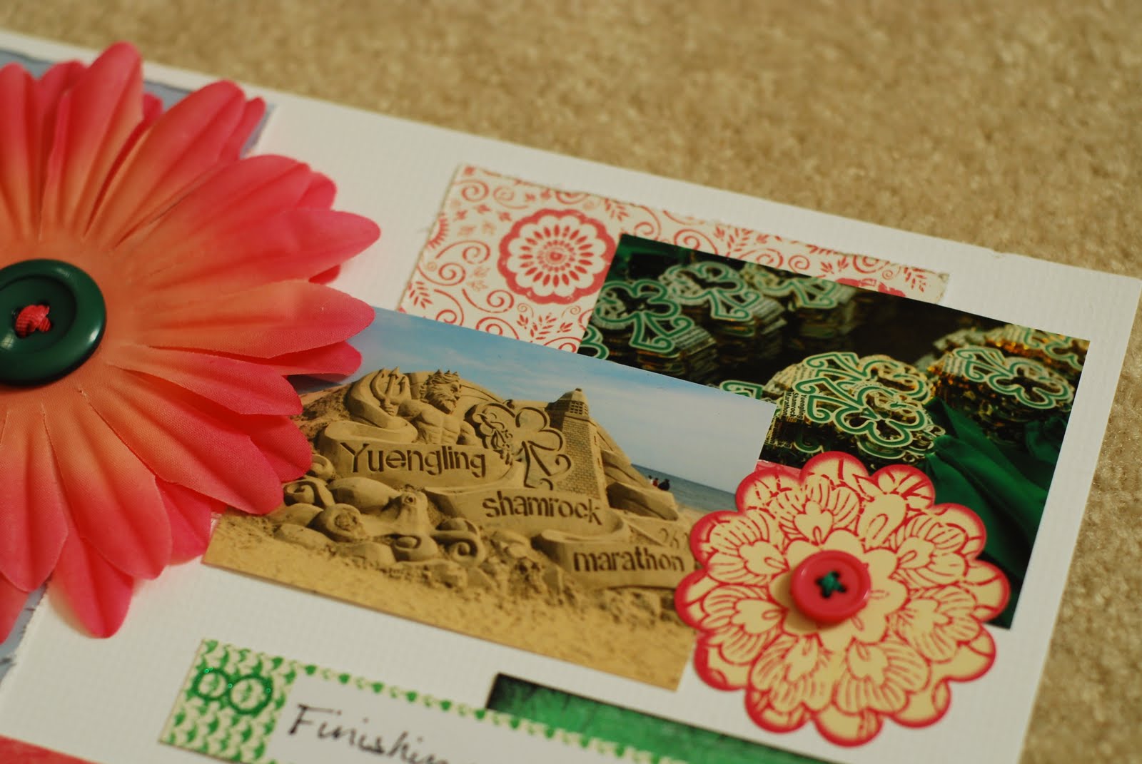
This month's kit by Little Yellow Bicycle is colorful and bright. Great to use for this time of year. My immediate thought when I looked at it was the pretty green paper which lead me to use the 3 photos of my husband with lots of green trees. It just shows that you can use any kind of photos on this paper. I used a large yellow flower in the corner to represent the sun. I thought it would make it even more cheery.


To add some dimension to the layout, I used the new (white) Bazzill (Half the Edge Cardstock Strips) sold at ScrapbooksPlus. There are several colors to choose from and it has 20 pieces in each pack. I then used an EK Success Binding Edge border punch on the green paper. You can distress this as well with sand paper. I think it adds a nice border look. Stop by tomorrow for some more great ideas from the ScrapbooksPlus Design Team.

Tuesday, April 13, 2010

Free Panty... Nope! Free Template!

You know how sometimes you hold onto things that really should be tossed? Well, that's what happened with this freebie from you know where. I kept hanging onto this coupon because it had a fabulous shape and this month I decided to finally put it to good use.


I carefully traced my makeshift "template" onto cardstock and painted the edge with glimmer mist. I loved the Clothesline papers.... especially this lovely neutral Rainy Day Dots paper. I cut out a couple of measuring tapes from the reverse to accent my hair cut theme. What you can't see online is that one side of the Clothesline papers has a wonderful cross-hatched texture. You must go and pick up some sheets for yourself and check it out.
I accented this layout with a few bright turquoise flowers and sparkly bling centers. Glass dots adhered with Glossy Accents finish it off.
thanks for stopping by!
erin

Monday, April 12, 2010

Card Me

Here is my DT card this month using the happy Yellow Bicycle papers. I cut the card with the Cricut Sentiments cartridge, very cool with the key cut-out. Next the bottom of the card was Glimmer Misted, & heat dried, & blinged. Yes, blinged-my new word of the week, to add bling. The lock heart was cut with the same cartridge. I distressed using Rangers Worn Lipstick & Sherbert Glimmer Mist. After drying, the clock was stamped on & heat embossed. This is a Tim Holtz stamp which can be ordered through ScrapbooksPlus. A few more distressed, stamped & cut-out embellishments were added. For the ribbon I sort of swirled a piece & stuck the very pretty pins through, adding some beads & a spot of glue at the bottom to hold the beads. The last thing added was the folded ribbon just haphazardly stapled.
I had fun making this card & I hope you enjoy it!

Sunday, April 11, 2010

Precious Moments

For this month's two page spread I used "Rainy Day Dots" as my background paper. I used used the "Decorative Edge" cardstock on top. I painted my chipboard pieces using Smooch "Olive Twist". I sprayed the flowers with Gold Glimmer Mist. The metal edges on my pictures is by 7 Gypsies. The rub-ons were old Daisy D's that I have had forever. The title was done in cardstock painted with "Olive Twist" Smooch.

Friday, April 9, 2010

Compromise


Here is the layout I made following Deborah's page map. I love the flow of this page especially the three circles in graduating sizes that happily create a visual triangle. I often use a visual triangle in my design to draw the viewer's eye into the focal point.
When designing this page I decided to let the theme carry over into the design, the theme being the compromise between what is girly and what is rough and tumble like a boy. I added a flower {girly} on top of bent metal mesh {all boy} and attached it with a brad that I altered to look like a screw. I also added a pretty yellow bow to accent the distressed looking ruler. Then I choose 2 different fonts for the single word title, one more feminine and the other more masculine. I distressed the edge of the title and attached it with a hat pin.

So how did Iron Man come to sit on a pink chase lounge wearing a tank top and mini skirt?
Here's the journaling:
"Aubrey wanted to play DOLLHOUSE
Cullen wanted to play IRON MAN
In the end they COMPROMISED"


7 Gypsies Photo Tray

As soon as I saw the new 7 Gypsies Photo Trays in the store I knew they were perfect for this month's paper collection from My Little Yellow Bicycle's Fresh Print Clothesline.  I love the versatility that the tray gives you in designing mini layouts.  The tray is perfect for mixing photos, sentiments, keepsakes and embellishments.
In designing the tray, I started with a 12x12 piece of patterned paper. I then adhered a 12x12 piece die cut paper as if I were creating a traditional layout. I cut the papers into six 4x6 rectangles. You may have to trim each just a little so that they fit in each section of the tray.  Using a strong adhesive, I adhered each rectangle to a section.  I made sure to keep the original design when placing each rectangle onto the tray.  I then decorated each section as if I were creating six mini layouts.

Thanks for joining me today. 


Thursday, April 8, 2010

Happy Baby by Esther


A piece of the Decorative Edge cardstock by Little Yellow Bicycle was placed to the left of the page. The larger photo was mounted on Raindrops cardstock with Deco corners made with the Chomper. Beneath the photo is a decorative strip with a lacy feel. Blue grosgrain ribbon was overlaid with a yellow ribbon while a blue pin holds them together on the right. The other side has a loop folded and taped with a satin bow accent.

The two smaller photos were shrunk so that they become accessories, rather than competing with the main photo. The blue dress had faded in the larger photo while the other photo colors were move vibrant.

My title & journaling box were made on the computer in the Harrington font. Printed in blue on photo paper, it contrasts with the yellow and blue. Soft yellow Cotton Pearl was used in the holes of the buttons. A String of Pearls brad by Bazzill was used in the diecut yellow flower. A yellow accent was used beneath the title.

Wednesday, April 7, 2010

Gone by Not Forgotten!


I love the pagemap that Deborah created for this month's kit. It is different and fun. I know I will use it time and time again. I thought it was a great time to use my photos of our family dog "Lax" who passed away in January. It's always tough to do layouts about someone you lost, but luckily with the papers chosen for this month from Little Yellow Bicycle, I could design it a little more colorful and cheery. Lax was a great dog and we were lucky enough to have for 14 years. Thanks for letting me share Lax with all of you.

Tuesday, April 6, 2010

Fiberglass Sheep by Esther


This layout was the pagemap for April. When I saw the circles, I envisioned the sheep on the page with curves in the elements. The soft colors were consistent with this particular one that had a blue blanket for the advertiser's message. The fiberglass sheep are placed throughout the city to promote tourism and businesses. This realtor takes this one to various locations. Most of the other 30 sheep are stationary. The Clothesline group was great for the coloring.


I used one corner of the Decorative Edge Cardstock by Little Yellow Bicycle to get the shape on the left. The frame shapes were cut on the Cricut and the titles were welded with the Gypsy. The journaling was composed on the computer & printed on photo paper with blue lettering. In order to have the blue title be visible, white was used for mounting it. Flowers were diecut from yellow Bazzill cardstock. ScrapbooksPlus has the Cricut Expression and several cartridges that you can use for a small fee to make your titles stand out. If you have your own machine, there are Cricut Swarms and sessions to learn to use it. Look at the Scrapbooks schedule of classes and calendar for dates and times.

Monday, April 5, 2010

Another Sketch Layout

Since we're on a roll with the April pagemap, here's my layout. I, too, changed a thing or two from the original sketch. On the left-hand side of the layout I decided to use two overlapping blocks of paper. I just couldn't cut the bracket paper down -- it's just too pretty!

I did use the large circle to highlight a close-up of my daughter's bling-encrusted shoes. Prima flowers make up the other accented areas. I used both Little Yellow Bicycle epoxy buttons and Basic Grey fabric covered brads for my flower centers. And I found these fabulous yellow Basic Grey alpha stickers at the store. They really match the Little Yellow Bicycle papers and since they're small you get many, many letters on each sheet.

Sunday, April 4, 2010

April Challenge

Happy Easter! I hope the bunny was good to you.

So this was my page map design for the month of April & is also my challenge page ya!! In this Donna Downey inspired layout, I started by printing a book page & covering it in white gesso to fade, then highlighted some kite type words like cloud, splendor & heaven. The chipboard stems were crackle painted & distressed, the flowers were
painted using water color crayons. Some bling & gel marker accents added dimension. I added the "soar" ticket, also distressed - yes I am addicted & can't stop.

The large scallop circle was cut using cricut & distressed with Rangers Peeled Paint. I sprayed glimmer mist using the Bazill Edge strips to make one line & The actual sprayed strip to make the other.

So the challenge for this month is to use metal wire on a layout. I used green wire to make a circle surrounding my journal words. I also added beads as I wrapped the wire around, finishing with the little swirls.

Now get to scrappin & have fun!

Saturday, April 3, 2010

Make Sketches Work For You!

Each month we get a sketch to use for one of our layouts. Here is this month's sketch:


As I was working on other projects and checking out digital scrapbooking supplies I came across these filmstrip borders from Shimelle. The idea to replace the long strips in the sketch with a filmstrip row popped into my brain and I ran with it. The filmstrip wasn't "stretchable"... so I decided take the 12 by 12 sketch and make and 8 1/2 by 11 page from it. Since the page was smaller, I had to simplify just a bit and eliminate some of the background blocking and one of the circular accents. I was stuck on the large circle... I kept trying to find a photo that I could crop without losing any of the details I wanted to show. I couldn't find anything that I was happy with - but then I realized that I didn't have to use a circular photo - it's not like the sketch police were going to come and get me or anything.... so I cut a large circle from patterned paper and used it as my photo mat. Problem solved!


I accented the photo with a lovely Prima blossom and some Kaisercraft bling. I used the new Bazzil bling template to get the swirl just right. It was so easy and fast! You just lay down the template, hold it in place, and stick a jewel in each hole. Lift up and template and you're done! (the largest size of jewels in the Kaisercraft package won't fit through the holes, but the medium size was perfect!)


thanks for stopping by!
erin

Friday, April 2, 2010

10 Things I LOVE


When I saw this line from Little Yellow Bicycle I was so inspired. I love the embellishments that coordinate with these papers. Deborah Mahnken is the DOM this month and did a great job on this kit. This "10 things" pocket was one of my favorite elements of this line. It originally said "10 things I love about everyday life." I altered it using one of the card stock "Favorite Pieces" stickers to say "10 things I love about being a Marathoner." I cut the center of the green sticker out and replaced it with the pink paper on which I had printed "being a Marathoner."

In my design I kept some of the journaling tabs in the pocket and then scattered the rest around the layout to accent different photos. I also used some of the cardstock stickers that
coordinate with this line to embellish this layout. These stickers are very yummy, so much more than just an everyday sticker. For example this flower sticker {far right} came with the pink button attached complete with green thread ready to stick on a layout. Other stickers are made using thermography {thermography is a process that fuses powder and ink to create a raised surface design}. On these stickers the raised surface design is a bit glossy. I love the way they accent the paper from this line. Stop by the store to check them out!

Be Inspired!~Megan