Sunday, March 29, 2009

Circles EVERYWHERE...


I typically really struggle with double layouts. I just don’t do them so I am always looking for inspiration. I found this sketch some place or another ( I believe it was Creating Keepsakes) and it caught my eye. I would be able to display lots of different papers as well as display lots of pictures. I used different sized plates as the templates for my circles.
This layout was simple but fun. I think I may add another circle to do some journaling.

That brings up a question – do you ever go back and add things to your layouts or do you just let it be and move onto something else?
Posted by Picasa

How To: Ribbon Flower Centers

I love collecting paper and fabric flowers, but sometimes I fall prey to just collecting them and not actually using them. In fact, I have a drawer full of little jars full of flowers and a little metal bucket of overflow with those that don't fit. I've been collecting for years, but only using occasionally. I'm sure I'm not the only one!

When a pair a large blossoms ended up in our kits this month, I vowed that I would put them to good use. An easy way to make an extra special card is to feature a beautiful flower on it. For this card I used the peacock cardstock sticker from Basic Grey's Marrakech line underneath the flower to add an extra layer. You can't even tell that it's a peacock since peacock's tail looks like a flower peaking out from behind the real thing! I used a piece of knotted ribbon as the flower's center and took some step by step photos to show you an easy technique.

First, you'll need some ribbon - anything opaque will work for this. Find a brad in your stash that is a little bit smaller in diameter than the width of your ribbon. I usually try to find a brad that is a similar color to my ribbon just in case it shows a little bit.


Now take your paper piercer and make a hole in the center of your length of ribbon.

Gently push the brad through the hole...


... and place the brad and ribbon together on your project, attaching it securely.


Now you just tie a half square knot and trim the ends of the ribbon and you have a beatifully embellished card with a nice, full knot in the center that won't come loose after a little handing by USPS! :)
thanks for stopping by!
erin

Friday, March 27, 2009

That Was New York by Esther


When our family last visited New York in May 1995, there was a magnificent skyline, including the dominate Twin Towers. The Empire State Building gave us a vantage to take photos of the city. Our trip was planned to attend the Broadway play, "Having Our Say" at the National Theatre. Yellow taxis offered daring rides in Manhattan. We saw MOMA, the Statue of Liberty, and the Empire State Building. I posed next to a bronze statue outside our hotel.
The journaling was printed on photo paper on the computer in Microsoft Publisher fonts Ariel and Broadway. The boxes of text were given a dark background fill. Each text box was trimmed to fit the spaces.


I used the striped paper from the Marrakech line to offer color and emphasis of direction. The blue cardstock is Basic Grey Marrakech blue. Dark rectangles lend themselves to support the vertical skyscrapers in the photos. When you want to accent the photos, leave the background solid.

Birds of Paradise

I have been in a tropical state of mind this past month, so it's not surprising that I created this minibook for my altered project. When I travel, I love to photograph nature (and birds are my particular favorite subject!). While in Hawaii last year, I had wonderful opportunity to get some great (and some not so great!) photos of the birdlife on the islands. So I made a small (6x6) reference guide of sorts to document not only the picture of the bird, but information about where and how we saw it as well as some interesting educational facts about the bird for my kids (and me) to remember.
To create the book, I first cut into equal quarters some of the small-print patterned paper and coordinating Bazzill cardstock. I used these 6x6 sheets as the pages of the book. I glued the patterned paper back to back, but used the cardstock as single sheets. I then cut remaining cardstock and patterned paper scraps (as well as a few full sheets) by 5 1/2" x 5". At the top of each pocket I used a circle punch to cut a half circle that would make it easier to pull the tag. To adhere, I used my Zipdry glue on three edges leaving the top open for the journaling tag. I did every page the same way. I printed all my photos 3 1/2"x 5" so they would be the highlight of the page (since I print at home, I trimmed a bit of the edge away so they were just a little under 5" wide. This allowed the bottom of the pocket to act as a mat for the photo).After getting the photos on, it was time to create my tags. I used cream 8 1/2"x 11" card stock and my computer for the journalling. I set my MS Word software up in a double column format set at 3" each for the text. I typed up all my information--the bird name in English and in Hawaiian if it had one, when and in what situation we encountered the bird and any facts that I had learned through my research that I wanted to remember. I formatted the text so that, when printed, it would fit nicely in the pockets with a lot of space on the top for the "pull". I inked the edges of each tag with my Quick Quotes Powder Puffs inks and used buttons, ribbon, or hand cut embellishments from the paper, to create the pull tab. And of course I decorated each page just a little bit. I put it all together with a clear acrylic cover, made three holes with my Cropodile, added rings and ribbon (these are the new beautiful Glimmer Ribbons from Creative Impressions that Scrapbooks-Plus has new in the store.)
Since I've just returned from another trip with tons of snorkeling and scuba pictures, I may have to create another album just like it for all my pictures of FISH!


Wednesday, March 25, 2009

Coaster Mini-Album


For my altered project, I went to my stash of Outback coasters and the Zutter Bind-it-All. I got the idea off of a website awhile ago and since then, always take a few coasters with me when we go out to eat. I decided to make a quote book. I took 5 coasters, inked and papered them, then punched and bound them together. Once the book was assembled, I stamped various friend quotes onto cardstock and then adhered and embellished each page. The cardstock stickers that coordinate with the Marrakesh line are great for this. I used Prima flowers on the front and some of the cardstock stickers underneath it.

I love making little quote books as gifts, they are fun to make. There are some great stamp sets out there with quotes for friends, mothers, etc. There are also great websites that have quotes you can type up and print out. These are also a great way to use scraps, use larger pieces to cover the coasters and your scraps will make great embellishments.

Tuesday, March 24, 2009

Cards!!


Cards!!!  I love to make cards, espiceally when I can use awesome matching stickers!!  I loved this set that came with the kit this month.  The key to making a sticker work is ALWAYS to ink the sticker! Now maybe you can find more uses for those stickers that we all have laying around!

Monday, March 23, 2009

Elephant Walk

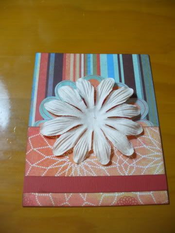
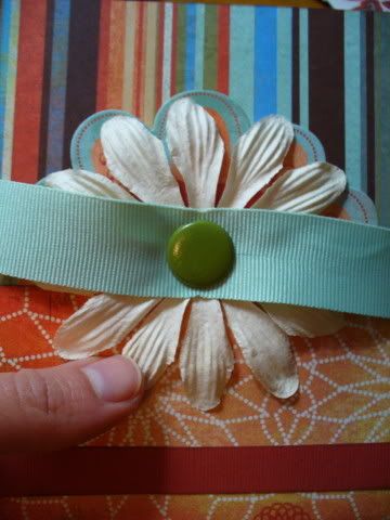
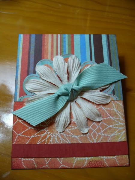
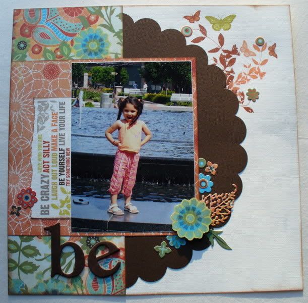
I knew I wanted to scrap these pics of my son & his cousin as soon as I saw the Basic Grey papers this month. Even the exotic names were inspirational: African Nectar, Orchid Oolong, & Madagascar Mint! It just made me think of these pictures from a visit to the zoo years ago.
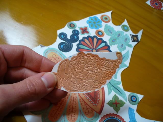
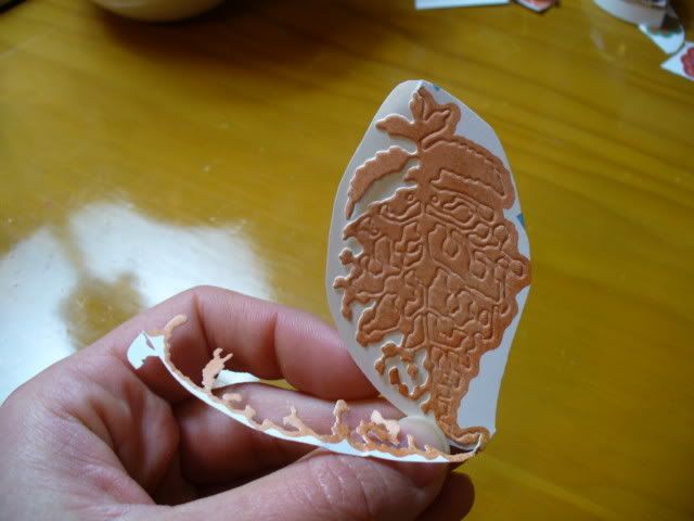
I am afraid I got carried away decorating the elephant, but the die-cut stickers from the Marrakech line made it really easy. The peacock was such a fabulous element to add to the LO - and since it was a sticker I didn't have to do any fussy cutting!
.
I must say that I love having all the resources at 
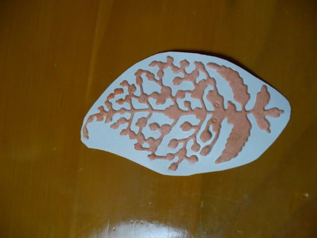
Scrapbooks Plus at my fingertips when I scrap. The ferns on the bottom right are from an Accu-cut die in the classroom. I decided to add a little dimension by cutting them from chipboard, which is always available at the front counter. I used the Cricut Expression to super-size the elephant and I cut the palm trees using the store's Stretch Your Imagination cartridge. It was beyond easy to find the right shades of cardstock since I was right there, and running a tab on my supplies as I worked meant it was quick, too. It goes without saying that there were all kinds of creative and friendly people around when I needed input. It was just fun!

The fancy-shmancy picture frame on the 2nd page was actually from the die-cut sticker sheet. It started out life as a journaling block. I cut out the center with an exacto knife, added some bling, mounted it on the Palace Blue paper, and popped it up over a matte of African Nectar - I just love saying the name of that paper! I do plan to add journaling when I get the LO home. It will go above and below the small picture on the far right...maybe handwritten with some metallic gold ink, which I think will really "pop" off of the Green Tea paper - the shading on this stuff is awesome!

Here's a bit of trivia - you can tell what country an elephant originated from by looking at his ears. The ears on an African elephant are shaped like the continent of Africa. The ears on an Indian elephant are smaller and similar in shape to India. Interesting...

Sunday, March 22, 2009

Mini-Book


I used the Basic Grey papers to make a minibook of our recent trip out to California. The chipboard book is Maya Road. It's an accordian book and it comes with the o-rings already holding the pages together. These kind of minibooks are easy to display, but if you want to keep it folded you can easily tie a ribbon on one of the loops and wrap it around.

Minibooks are fun -- and easy to make if you use a consistent sketch for each page. My first decision was to leave part of the chipboard page showing around the edges. This saved time because I didn't have to take all the pages apart. However, if you don't like the raw chipboard you could always paint it first or use a spray such as Glimmer Mist to coat the background.

Next, I decided on a scheme. I divided my page into thirds - the top 1/3 and the bottom 2/3 (well, except for one page). I alternated blocks of patterned paper and photos, rounding the corners. To divide the two sections I used a strip of ribbon or border stickers from the Basic Grey sticker sheet.

After I had the pages assembled I pulled a few buttons and sticker flowers to embellish a few of the pages. I used a journaling stamp on some of the paper for my journaling.

The back side of the accordian book:

Saturday, March 21, 2009

Lovin' that Bracket Paper

I love the die cut paper from Making Memories in our March kit. The bracket shapes are great to use as photo frames or with a photo collage. I rarely use an entire piece on one layout, instead cutting it into sections. For these two layouts, I cut my paper into two pieces and used both of them underneath my photos. The bracket points can be used like arrows to draw attention - here I used it to "point" towards my title.

I also used the black crystal swirls from Fancy Pants I picked up at Scrapbooks Plus and layered some of the stickers from the Basic Grey sheet around the corner of my photo.


For this layout I used the smaller strip underneath my photo. It provides a nice contrast with the floral pattern of the Basic Grey paper. The large flower was made from layers of the stickers, a fabric flower, and a button. And the bottom of the flower isn't even a flower - it's a bird sticker!

Friday, March 20, 2009

Die-Cut Sticker Tips

One of the items in our kits this month was a sheet of die-cut cardstock stickers from the Marrakech line. The designs were lovely and different from anything else I've seen. I knew that I wanted to use as many as I could. The cardstock sticker designs are printed over the edges... which for me sometimes makes it hard for me to get a feel for exactly what it will look like when I peel it off of the sheet. Also some of the intricate die cuts in this set were a bit challenging to remove from the backing since they were so delicate. Here's what I did to make it easier:

First I cut out the portion of the sheet that I wanted to use.


Then I carefully peeled off the cardstock surrounding the sticker so I can see what I'm working with. With this piece I tore parts of the waste area off little by little to be sure not to tear the die-cut.


Once this was done, I could easily tell what it would look like on the finished project.


For my layout, I layered a number of the die-cuts together with a flower cut from the patterned paper. A sprig of rubons from My Mind's Eye - Laundry Line was the perfect color match. I added a few die-cut stickers over top of the rubon to help tie it all together.


thanks for stopping by!
erin

Thursday, March 19, 2009

A Hard Day's WORK


Right now I am on a boat somewhere in the British Virgin Islands with my husband, his sister and her husband, and my children on our annual Spring Break getaway....And I can still publish my blog posting on time!

This two page design of my boys building a driftwood fort on the beach last summer was inspired by a page map sketch from Becky Fleck. I really love to use page maps and sketches to help get my creativity moving when I'm in a funk (which I've been). Ever get to a point where you just can't even start a page? Trust me, those page maps and sketches can really help!

All the papers (except for the Bazzil Cardstockused to create the circles) is Basic Grey's Marrakech line. I used four different patterned papers and two sheets of solid/distressed paper from the kit. The orange in my boys' swimshirts matched perfectly with the orange in this line. I used my Fiskars shape cutter and circles templates to create the circles, which are deliberately thinner on one side than the other - so perfection is not required!
Basic Grey paper and Becky Fleck page maps just go hand in glove together. You can buy Becky's book at Scrapbooks-Plus. It will be a great tool for you when your creativity just runs dry!

Wednesday, March 18, 2009

Play Ball!

I love, love, love this paper! If I had had more time, there would have been trouble paring down what I made. I have already bought more to make sure I don't run out, because with a roomful of paper, that's a huge risk right? Ok so I confess, I am a paper hoarder on top of an inkaholic. Anyway, I had lots of fun and was very lucky that pictures of my Papaw happened to work well with these colors. My Papaw played Senior Softball till he was 81, he loved it! They were so cute when they played, when I lived in Oklahoma I would go to the games with my Grandma and cheer them on. Unfortunately I wasn't a scrapper back when I went to his games so I don't have any home run pics. But he did hit a few! With this layout, I of course, inked everything. I also got to play with some Basic Grey Clear Stamps that coordinate with the Marrakech line. Buttons are also a great embellishment, I find myself reaching for them everytime I scrap. Basic Grey also makes buttons to match their paper lines, and once again, they are some of my faves!

Journaling is always a challenge for me, I actually journaled on both layouts this month and that is a rare occasion for me. Usually my idea of journaling is writing the person's name under the picture. But I have found one way to make journaling more enjoyable..... the computer! I have learned that I can type it, fix all the mistakes, play with fonts, and then print out pretty, neat journaling that looks great! You can print right onto colored cardstock. I usually use MSWord and put my journaling into text boxes. When you use a text box, you can format the size to make it fit where you need it to. For this layout, I made a box the size I wanted and then made several boxes with each piece of it, like "play" was in it's own box and "ball" was in another. That way you can move them around, then when you have it all the way you want it, just right-click on format text box and remove the lines. Voila!


Tuesday, March 17, 2009

Kettler


I had so much fun at "Hockey 'n Heels" at the Kettler center, so I wanted to create a fun layout to express it!  I liked the idea of using a large picture as my center point, so I balanced it out by creating scalloped circles with the rest of the pictures that I wanted to use.  I also wanted to spice up the rest of the page so I cut freehanded the splash shapes, cut them out in paper and chipboard, inked them, and then layered them in!  Next time you want a little more demention, try adding chipboard to accents and pictures to create depth!

Monday, March 16, 2009

March Madness

I am not sure why I chose that title outside the fact that it is March and I have been watching lots of Basketball :) and also I find titles very hard to chose.


This month I am teaching my first class at Scrapbooks-Plus on Wednesday, March 25, 2009. I am super excited and a little nervous. You will complete 3 cards using the Marrakech line by Basic Grey. The cards can be used for any occasion, they are cute and have a few techniques that you can incorporate into your other projects as well.

If you haven’t signed up yet, please do so. I would love to meet some fresh faces and catch up with some familiar faces.


What Am I Supposed to Say? -- Loretta Cooper

Okay, be honest. You really do want your grand kids and great grand kids to think you (were) cool. Otherwise, you probably wouldn't bother creating meaningful scrapbooks. Right?


Perhaps you subscribe to the ol' "a picture paints a thousand words" theory, and therefore, don't bother with journaling. Or maybe the idea of trying to match words to your feelings and experiences is just overwhelming. I hear a lot of scrappers say that the most difficult part of the craft, is journaling. It doesn't have to be.


I have inherited scrapbooks and photo albums from both of my grandmothers. 'Know what I treasure even more than the photos? The bits and pieces of their lives I find stashed between the pages; shopping lists, receipts, birth announcements. I even found handwritten budgets my grandmother made for herself while my gradfather was dying in a Texas hospital in the 1930s.


These are mudane and amazing bits of their real lives. They touch me deeply, surprise me, and help me to understand what their lives were really like. I love these women even more as I learn about the trivialites they delt with, and the challenges they boldly faced.


Keep that in mind the next time you try to decide what to journal. It doesn't have to be profound or life changing... just real!


Happy Journaling!

Loretta

Saturday, March 14, 2009

Coredinations

I fell in love with a new product this month- well actually I do that almost daily, but this was the "I want to use it on every project type" of love. It is with Coredinations paper. They have a whole selection of it at ScrapbooksPlus. So much fun! If you have never heard of Coredinations paper it is cardstock that is different colors on either side. When you distress it the lighter side of the paper shows through. So cool.
I love the blue/black paper combination of the Sencha paper from the Marrakech. I found that Coredinations black paper with the blue core went really well with it. I ran a piece of the cardstock through an embossing folder and sanded it really well until the blue core showed. It gave great texture and dimension to the page.
Enjoy! Lisa

Friday, March 13, 2009

A simple and functional Frame


I love to have a current picture of my little boy on my desk in my office. This picture frame is the perfect way to do so. It was easy to put together and only took a short while to do so.

I popped out the glass painted the edge...a raw edge is so ugly. I added adhesive to the paper remember when you make your own to add adhesive around where your window is. :)

Then I cut his name (rather what we call him), again I used the Storybook Cricut cartridge that I borrowed from Laura. (Thanks Laura, I love it and I am gonna have to get my own.) Then I added the Diamond glaze and sprinkled with the Martha Steward glitter. I LOVE THAT STUFF! Pick up a bottle from Scrapbooks Plus if you haven't done so already. I layered the flowers added a button and called it done.

Now when all is said and done, I have a simple frame to take to my desk and bring the one that is there home and redo all over again. Simple is really the way to go for my desk at work, all the ladies at the office want to touch it and want to look at how things are glued on. You can make these as elaborate or as simple as you like. Check out Leah's. She really did a beautiful job on her's and it is the same frame. We didn't plan that...Though fun to see what we both did with it.

Happy Scrappin...

Thursday, March 12, 2009

Enjoying San Diego by Esther

The colors in the Basic Grey Marrakech line were good for my photos taken in California. Scrapbooks has all of the stickers I used along with the papers.

The Journaling - Seaport Village: In the fall of 2006 we vacationed in California. San Diego was delightful with the sunny weather & so much to do & see. Seaport Village provided many joyful & quiet hours of watching boats & ships in the San Diego Bay. We walked from the hotel. At left, the Coronado Bridge spans the bay behind the colorful sailboats.

Old Town: The two bottom photos show the stark white building contrasting with the colorful flowers and umbrellas at the Rancho el Nopal Restaurant with palm trees in the background.

Trying to fit the photos on this page was a challenge. I overlapped them to gain space for the stickers to show. The journaling was printed on photo paper.

Wednesday, March 11, 2009

I Love Marrakech!

I was so excited to find out we got to play with new Basic Grey this month. What a way to start this new adventure! I went really basic with this first layout. This is my Papaw in his early days, he passed away a few weeks ago and it was so fun to go through all the old pictures and find these of his days in the military. I decided ink and paper was great therapy! I wanted to stick with the basics on this because I really wanted the photos to be the focal point. I was amazed at how they copied, loved how handsome he was, and wanted them to speak for themselves. I couldn't resist adding a little grungeboard and my other favorite, INK!! :-) I love using ink! My favorite is the Chestnut Roan Colorbox Chalk Ink. I find that it matches everything and just adds something to any layout. I held back on the grungeboard and just inked it with Shabby Shutters Distress Ink. It was tempting to pull them back up and add brown but decided to hold back just this once. :-) But as I was adding ink to other things, like the sticker strip, I was thinking I should sign up for inkers anonymous!


One of the fun things you can do with ink is to ink the edges of photos. I inked the photos to keep the vintage feel. You will want to dab it on instead of swipe. Swiping it often will make it smear. Another thing to watch is that it will take the ink longer to dry, don't ask how I learned that. :-)


Tuesday, March 10, 2009


I got this great idea from my love, Tim Holtz.  I used paper, distress inks, paint, and crakle paint to create this frame for my mom and I.  I love taking all of the little pieces and putting them together to get a finished product.  Each piece was prepaired on chipboard and distressed to get the nice weathered/muted effect!  You can find "family" on the cricut home accents cartridge and then I just added a little stickles to "bling" it up!

Enjoy!  Leah

Sunday, March 8, 2009

Basic Grey Marrakech Working with BIG Prints -- Loretta Cooper


If you are anything like me, you adore printed paper. I have enough printed paper in my stash to complete albums for the next 10 generations. (And I'm always in the market for more....)

But sometimes, working with printed paper can present a challenge. especially if the prints are big and bold like Basic Grey's new Marrakech.

It's easy to let those gorgeous prints steal the stage from the real focal point; your photos. So here are a few tips that I've learned about working with printed paper, without upstaging those family faces.

1. More is Less. It's true in life, it's true when in comes to printed paper. If you want to indulge is big prints and bright colors, use them sparingly. You can actually play up the print more if you use less.

2. Balance it out with Card Stock. Next time you are at Scrapbooks Plus, and are turning cartwheels over the latest Basic Grey, Cosmo Cricket, or Wild Asparagus prints (a few of my faves!) head immediately to the back and collect coordinating solid card stock. And don't just go for the deep hues. Sometimes a neutral shade will make that print pop!


3. Create Your Own Matching Embellishments. Because I love prints so much, I am always looking for new ways to add it to my layouts, without overpowering my photos. One of my favorite tricks is to pick the prettiest part of the print, (or the part that best matches my theme) and turn it into a one of a kind chipboard embellishment.
Just glue it onto a piece of cardboard (I highly recommend using ZipDry, Debbie always keeps it in stock!) and cut around it by hand. It doesn't have to be perfect. Then use a file to knock down weird angles or the uneven parts. Finish it off by inking around the edges in a coordinating, darker shade.

Happy Scrapping!
Loretta

Saturday, March 7, 2009

Room with a View


Basic Grey's MARRAKECH paper really took me back to Hawaii this month (or maybe is just the fact that Spring break is just a week away and I need to catch up on last year's Spring break scrappin' before I get even further behind!)

For this layout, I hand cut elements from Masala Bella paper to create a half frame for the focal photo of the gorgeous view of the Hanalei Bay and Bali Hai peak - the first one in the Napali chain. The design itself was inspired (sort of) from a layout by Nic Howard (love her work!). What I thought was so cool about her design was the handcut "file folder" mat under the smaller photo with the tab providing just enough space for a caption. So I just had to recreate that element in my design. (I could have added more journaling in the file folder under the photo if I wanted to). For the journaling, I printed it on cream cardstock, cuts the lines out and inked them with "Blue Moon" Powder Puff Chalk ink from Quick Quotes. The navy "brads" that highlight the second line of journalling are not brads at all - they are Candy Dots by Pebbles Inc., and are available in a host of colors - black, white, green, red, etc. - you can find them in the NEW section at Scrapbooks-Plus. They are my new best friend - I've been using them like crazy in my layouts these past two weeks - They look like brads - without having to poke any holes - and really stick. Love 'em!
The scalloped edge paper behind the photos was cut using a Fiskars template and their shape cutter. I bought both at Scrapbooks-Plus.

Friday, March 6, 2009

Bumbo


For me a 1-page layout is the perfect way for me to keep some of my favorite pictures in one piece. I don’t really like to cut my pictures. So when I have a favorite picture I will usually do a one page layout. I find that another time for me to do single page layouts is when I have a professional photo. Frequently, I purchase every picture in a package, knowing that I have no need for that many pictures, however, how can I not get all of them, after all they are all so cute. :o) Aren’t we all guilty of that?

Here my letters are cut with the Storybook cartridge from my Cricut. (Thanks Laura) After I cut the letters out I used glossy accent (which you can get at Scrapbooks-Plus) and covered the letters, once the letters had the glossy accent I sprinkled heavy with the Marta Stewart glitter, let dry for a few moments, and tap excess off. Simple! And pretty even for a BOY!

By the way for those of you who don't know...Bumbo is the name of the seat that baby Boy is sitting in. It is not what we call him. He loved that chair and would sit in it on the kitchen counter while I cooked, or fixed his bottle. HE LOVED that chair!

***Just as a side note, if you have not tried the Marta Stewart glitter you are missing out. Run down to Scrapbooks-Plus, and pick yourself up a bottle. You will not be disappointed. This is the best glitter I have ever played with. It is so smooth, and pretty, and sticks really well to the paper!

Thursday, March 5, 2009

For the Love of Stripes


I, like Susie, really like the Cardamon paper in Basic Grey's Marrakech collection. And sometimes a little is all you need. In my layout the stripes complement the other colors in my photos beside the blues. And I had a little fun with the strip, adding Thickers, a few buttons, and a bit from the Basic Grey sticker strips to turn it into a lightsaber.

Spice Up Your Layouts!

Cardamom is the "secret" ingredient in my favorite homemade Christmas cookies. I picked up the tip from a friend's mother who has travelled the world. According to Wikipedia, cardamom has a "strong, unique taste, with an intensely aromatic fragrance". Used in a very small amount, it just changes everything.

Cardamom is also the fabulous stripe found in the Marrakech line of Basic Grey papers, and it is also strong, unique and intense! Just adding a small strip down the left side of this page changed the whole feel of the layout.

When I opened this month's kit and found the Masala Bella paper, I fell in love with the rich colors and bold, exotic floral pattern. This (adorable) picture of my daughter had such a rich blue in the background, I knew it was a perfect match. When I laid it down, though, I had a problem. Even with such a large scale picture, I felt like the paper was taking center stage. So I decided to add a little Cardamom! This paper echoes all the beautiful colors in the floral pattern, but it also adds bold stripes of brown and a nice soft gray. The pattern and the colors have a "muting" effect on the layout. From the stripes, I picked up the color brown and added the scalloped cardstock to create a frame for the picture. (I did a little fancy cutting on the inside to scallop the inner edge.)
When I picked up my kit at the store, I also selected some coordinating Bazzil and I used that to back the page, letting it peek through in between all the elements...kind of a color blocking technique. I left a tiny strip of blue on each side of the ribbon and around the page edges.
For the title I chose the "Daddy's Little Girl" stamp, which was in my stash. I used Stazon pumpkin ink and clear embossing powder and centered it on the flower and topped it with a button - I just love adding dimension! When Deborah Mahnken came back from CHA she brought a product from ScraPerfect and she shared it with me...the Perfect Printing Pouch. I used it on the petals of the flower and then stamped some descriptive words using a soft orange ink...and the ink didn't bleed! It was perfect!
Since I was in the stamping mode, I decided to add some butterflies from a really cute set I bought at Scrapbooks Plus (Making Memories/Flower Patch - on the *NEW* wall in the front of the store - if there are any left!). Using Stazon, I stamped onto some of the distressed "solids" from Marrakech - Palace Blue and Mandarin Slice - and used clear embossing powder again. They are little jewels of color sprinkled around the frame.
The glittered swirls were cut using the Accu-Cut die in the classroom at Scrapbooks Plus. I glittered directly onto the chipboard - no painting a base color - with Ladybug Glitter/Doodlebug Design. I actually had made these for one of my January pages, but they just didn't work. I am very glad I saved them because I think they really are the perfect touch!
.
Sooo - I used a handful of easy techniques to create this layout - color blocking, fancy cutting, mixing papers, stamping, embossing, glittering - but what really makes it work is the amazing Marrakech papers from Basic Grey! Spice up your layouts with some Cardamom!

Wednesday, March 4, 2009

2 of a Kind


Using the Marrakech line from Basic Grey this month was pure heaven! With three boys to scrap for, I fell in love with the vibrant blues, oranges and browns of the line. I loved the pieces of the Sencha paper that came with the kit. It worked so well with the older pictures of the twins from 2003. I used my Mocha Mama ink to tone down the brightness of the paper just a bit and to grunge up the edges. In this LO I also used my sewing machine and tore the edges of the paper to add some texture and dimension to the page. For my journaling spot, I used a bracket frame from Clear Scraps and stamped on the edges of the acrylic with a stamp that is from the Marrakech line and some StazOn Jet Black ink.

Stop by Scrapbooks Plus and check out the Design Team wall. The Design Team projects are beautiful this month!

Enjoy!

Lisa