Monday, February 28, 2011

Quick Two-Page Layouts


My scan went a bit wonky this month, but here's a quick and easy formula for two page layouts. Does having lots of photos stump you? Or having just a bit too many to fit in a one-page layout? Here's a solution that you can use over and over again.

I had these pictures of my daughter's ballet class. I placed them across the page, tying to line them up close to the middle. Then, I added a block of patterned paper behind the photos, leaving an edge on the right. On the left, a block of a complementary pattern. To balance out the dark floors in my photo, I added a scrap of transparency over the paper.

A tip: when you have photos that span both pages, try to align them so that you don't make a cut through your main subject. Here, I shifted my blocks so that I divided my middle photo just to the left of my daughter.

Once your blocks are set, it's time to embellish. I added a title in dark grey Thickers, and a ribbon crossing the entire block. The ribbon acts like a line, and helps draw the eye across the layout to my title. A bit of embellishing, and I'm happy.

Sunday, February 27, 2011

Snow Flurries Class

I am teaching a fun technique class that will result in a beautiful keepsake for all those extra snow pics you have lying around.

Canvas is all the rage but what do you do with it? Join me in this technique filled class where you will learn different ways to jazz up that blank canvas. Using various glimmer mist techniques, acrylic paint, & glitter I will help you create this unique album to put all those "snowmageddon" photos in. We will be "Holtzing it up" with metal, grunge, acrylic & handmade flowers. This album is packed with goodies Due to the technical nature of this class no kits are available. Class is limited to 5. Please pick up class list when you sign up. Instructor Karen Bearse. Cost $75. March 6th 11am-4pm. 0219

Saturday, February 26, 2011

Mother's Heart by Esther

This is a tribute to my mother-in-law. She was affectionately called Mother. She had a big heart. Most of her pictures showed her in pink. The English Rose colors went with these. Pictures with photo corners are mounted onto contrasting patterns and colors and corners are rounded. Trim and flowers with pearls were appropriate accents. The journaling was typed on photo paper with a pink background.

ScapbooksPlus has quite an assortment of paper flowers that can be colored. These had pink pigment ink added. Lace trim was curled beneath them to compliment the white pearl centers. A handkerchief from her collection was photographed and cut to fit the corner. Pink ribbon is tied in a bow and pearls are used to accent.

Thursday, February 24, 2011

A fun card to make

Like I said back on my first post of 2011 for the DT I am not a great card maker. I don't know why, but I really struggle with making cards!! So one of my new years resolutions is to learn how to make cards. I found some instructions on the web for making this Tri-Shutter card. It looks really complicated but in fact it is really easy to make!
You basically just need cardstock, patterned paper, a craft knife and a scoring board. The card came together so quickly and it looks like I spent a loooong time on it!

Here is a view of the card from the top:

and the full front:It was so much fun to make this card and a great way to use up the scraps of paper!

Enjoy!
Lisa

Wednesday, February 23, 2011

Springtime Make & Take -- February 23rd

Tired of winter? Me, too. That’s why I wanted today’s Make and Take at Scrapbook Plus to bring Spring to mind. Using Basic Grey’s Marjolaine line, I created a “Springtime” page. I love the flowers and the blues and greens of this line. with some added bling, the page pops.

As with all Wednesday Make and Takes when you purchase the supplies to make the layout, you’ll receive a free element that you need to complete the layout. This week’s free element is the “Treasure” box that you need for the message “Treasure Springtime.”

This is a quick layout to make with two 4 x 6 pictures and two 6 x 4. In a short time you can have a gorgeous layout with your favorite Spring memories. I plan on including pictures of the things I love about Spring – baseball, flowers, BBQs and golf. Whether you want to scrap spring break, spring fever or just some favorite spring memories, this page will work.

While you’re at the store you can pick up some extra paper from this line. For those that are curious, marjolaine means marjoram in French. Each paper design in this line (and there are lots of them) is named after foods. For example, there is black forest strata, éclair, fudge truffle and buttercream just to name a few. Despite the food names, the primary blue, green and brown papers include flowers, mod designs and classic designs (like plaids, argyle) so there’s something for everyone.

Tuesday, February 22, 2011

Family Treasure by Esther

This is my layout for the page map presented with the Kaiser Craft English Rose line. The rose pattern was perfect for this photo of our aunt. Vellum was used for the journaling with preprinted sentiments giving the color contrast. The photo was mounted onto green for emphasis.

The cardstock corners were rounded with the Chomper. The Quick Quotes title was something I liked and had in my stash for a couple of years. The colors of the paper were a great compliment for the photo and the English Rose paper. A solid rose was used behind it to make it stand out. Gold accents gave the antique look with a feminine touch. They are also securing the vellum. Satin ribbon was used to accent the vellum at the bottom and hold it to the cardstock.

Monday, February 21, 2011

That's right-me-pink. You can't believe it right? So this little card was glimmer misted with a stencil & than stamped on top of the stenciled image with peeled paint. If you use glimmer mist & distress inks, be sure to stamp last with the mist dry. Glimmer mist will make your ink bleed, as they are both water based products. I stamped & embossed the cute birdie & added the bling eye. The edges of the prima flowers were distressed just a bit. Voila a cute little card that took no time at all! Enjoy!

Sunday, February 20, 2011

Technique Using Wet Embossing


Did you happen to notice the little heart in my layout? I have been using this technique for some time now and love it! It is super easy! You will need distress ink (Tim Holtz is used here), clear embossing powder and a heat tool. All you do is ink the material (I used chipboard) and ink it entirely (I used Fired Brick). Immediately add distressing powder. Tim Holtz' distress inks also serve as embossing ink. Shake off the excess powder and heat. You will see the melting of the powder right away. I use it often! Have fun with it!!

Saturday, February 19, 2011

Stamping and Cards

The muted patterns of the Kaisercraft paper really lent themselves to stamping - and I did quite a bit of it on this card. You can use stamps to alter the look of your paper to get more use out of it.

First, I used a large background stamp of definitions with vintage photo distress ink. I chose a paper with several colors to use as my background paper.

I then took a separate piece of paper and embossed the doily stamp with white detail powder. I chose one with more greens so it would stand out from the background. I layered a flower on top of the stamp.

Finally, the sentiment was also stamped on a scrap of the Kaisercraft paper - green again.

Friday, February 18, 2011

Have you used the Pagemap this month yet?

You have seen some of the posts from the other DT members using the kit this month from Kaiser Craft.  For my designs this month, I added glitter, rhinestones and stamps.  Our kit included adhesive backed canvas.  I have never used this before but fell in love with it!  It takes stamped images really well and holds the color and shape without getting fuzzy like some fabrics I've stamped on before. 
Here's a close up of the "Queen for a day" piece I used in my layout of a few of my daughter's princess pictures from Disney World.  I 'second generation' stamped the crown.  This is a stamping technique where you ink the stamp then stamp on scrap paper, then immediately stamp on your finished piece which gives you a much lighter shade.  I then used the same green ink and 'first generation' stamped the words.  I swiped the edges on the ink pad to define the canvas piece.  In the upper right you can see a portion of the flowers from the kit that I stamped a swirly stamp on to give it some excitement.  You can also see a close up of the glittered and rhinestoned chipboard crown in the bottom left of this close up.  This was a fun Pagemap (that I will definitely use again!) and I would encourage you to check out the Pagemap wall for inspiration!

Thursday, February 17, 2011

A & K


I always find designing 8x8 pages simple and challenging at the same time.

They are simple because they come together so quickly.

The challenge is the limited space. You really have to pick and choose what you will include since space is so limited.

I knew I wanted to include the design on the lower left corner of the paper. I had to include some sort of journaling so it really didn't leave much space for embellishments.

The only real space I had left was around the photo.


I used a paper towel that had been misted with Olive Vine Glimmer Mist and Cotton Candy Chalkboard. I folded the paper towel to create layers and then used a border punch to create this fun border.

I added the A & K brads in the corner of the photo for my title to finish the layout.


Wednesday, February 16, 2011

Wednesday Make and Take

This week's Make and Take feature papers from My Mind's Eye. It is perfect for any Valentines layout or just to say I love you to that special person in your life. Have fun with this layout! The heart and tag were inked with Fired Brick (red) distress ink from Tim Holtz and heat embossed with clear embossing ink - all of which you can pick up at Scrapbooks-Plus. You can also find alternatives to the embossing by playing with the new Tattered Angels Glam and Glazes! Hope you enjoy it!

to have & to hold

On this page I used several pieces of the Kaisercraft paper as my background. I also chalked the edges of my paper and picture mats and did a bit of machine stitching. Yes, I used a sewing machine to stitch on this layout! I realize that most of you probably have a sewing machine at home and have probably never used it on a scrapbook page before. Test your machine out on a scrap piece of paper; once you are satisfied with the stitch and feel comfortable using it on paper, give it a try on one of your scrapbook pages. If you’re like me, you probably purchased a sewing machine for another hobby you were interested in. You've probably since given up on that hobby and started scrapbook. So, dust off that old sewing machine and put it to good use! My only caution to adding machine stitching is to be conscious of where you place your adhesive. If you plan to sew around the edges, place your adhesive away from the edge so that the needle doesn’t get sticky. The important thing is to have fun with it!

Products: Swirly: Prima Say It In Pearls; Flowers: Petaloo; Destiny Charm: Tim Holtz; Letters/Symbols: Thickers and Webster Pages; Brads and Lace (generic brands) – for similar items at Scrapbooks Plus check out the brand new Graphic 45 ribbon pack for the lace and WeR for the brads; Buttons.

Tuesday, February 15, 2011

Page Map


For this month's pagemap, I used two different pieces of the Kaisercraft paper as my background, distressing the edges. The colors of this month's paper were timely, as my daughter's dance class had a parent's day where we could watch and take pictures. Now if I could have only gotten her to untuck her skirt!

I added a My Mind's Eye tag for my journaling, some Prima bling and a Tattered Angels Irrisistable Chipboard bird that I inked. I loved making Tim Holtz's tissue tape flowers, and added one underneath the bird with a Prima flower in the center.

Monday, February 14, 2011

Happy Valentine’s Day! This blog is about a 2-page layout that showcases some pictures from a trip to Copenhagen. This is a good example of the benefits of really looking at papers rather than just rejecting them because they don’t immediately spark an interest. I’m not big on roses or pink and might have ignored the English Rose Collection if I didn’t have to use it for the Design Team Challenge. When finished I like the English Rose Collection so much that I want to get more paper.

As I thought about it, the maroon and green mosaic pattern seemed perfect for pictures from a trip to Copenhagen. I had gone some time ago and had not had a chance to scrap the pictures so decided to try and capture the essence of Copenhagen on two pages in case this was the only page I ever completed. For me this meant spirals, water, interesting architecture and food.


To provide some focus on the five pictures, I made a large photo-mat for the four smaller pictures. This drew attention but since I had four pictures with different colors, I made a Sizzix frame for each of the four pictures. This highlighted each picture and provided some consistency to the diverse pictures.

But the paper seemed a little flat with the colors of the pictures. I addressed this by spraying a little Walnut Gold Glimmer Mist on papers. This gave the maroon paper a shimmer and made the color go a little better with my pictures.

Many of our blogs have mentioned using Glimmer Mist and I must say, if you’re not using it you are missing out on a really easy way to jazz up your pages. It is one of those things that can seem intimidating but once you start using it you’ll want to use it more and more. An easy way to start is just spraying some on a scrap of the paper you are using. If you like the look, spray it on. I first tried a green on the maroon paper but it made it to dark but the Walnut Gold gave the page a little sparkle. I liked the effect so I used it on the picture frames and the hearts.

For the larger picture on the left page, I didn’t want to reduce its size to fit in the frame used for the other pictures. Instead, I made a photo-mat the same height as the photo-mat used for the other pictures. Adding a strip of scallops at the bottom of the left page added some consistency with the right page. I also rounded the upper left corner of the picture.

The page clearly needed a few embellishments. I used a chipboard heart (made with chipboard pressed onto the Peeled Paint Distress Ink pad to make it green and applied Walnut Gold Glimmer Mist) to substitute for the word “love” in my title. A second heart was used as an exclamation point. Using a clear button, I made a period for the “heart” exclamation point. I simply put Glossy Accents on the bottom of the clear button and affixed it to the mosaic paper. Once it is dry, you simply cut around the button. Using a Danish coin was a fun way to add a little gold and accent the spiral picture. For balance, I used two more buttons on each side of the coin.

Since my pages were so different, I used a strip of ribbon completely across bottom to bring two pages together.

Finally, I filled in with some tags of various papers used in the page.

Even though when I first looked at the papers, I wasn’t thrilled. I really like this page and believe the papers reflect the “old country” well.

The moral of this blog is:
• really think before you reject papers
• use Glimmer Mist
• make embellishments using glossy accents and clear buttons to accent your pages
Kathy Bryant

Sunday, February 13, 2011

I-rock your next project!

Hi Laura Petruso here for a little bling-y fun!  This neat little tool is called an I-rock.  It isn't a new type of MP3 player, but a hot fix jewel setter.  Just add 3 AA batteries and set specially made rhinestones, crystals and pearls to paper, fabric or even furniture with just a touch.  You can find it at Scrapbooks-Plus on the wall near the punches.

It is super simple to use.  Place the rhinestone or crystal where you want it.  Press the button and the tool heats in seconds.  Press the metal tip of the I-rock on the top of the crystal for just a few seconds and the heat radiates through the crystal to melt the special glue underneath.  The reason I love this tool is that I can set my crystals out and move them around before committing to where I'm placing them.  With the traditional crystals, I have to decide before hand where they will go and once they are placed, they are stuck because of the sticky adhesive backing. 

With the I-rock, you can easily make designs and move your crystals around before making a final commitment to the placement.  Here I used the rhinestones (at the top by Love You & Me) and by I love you on the heart doily there are metal disks that are pink (sorry, hard to see the color in the photo!).  I haven't had an opportunity to do anything intricate yet with this tool but am really looking forward to it!  The designs with crystals that are pre-done are not only expensive but I don't like that the adhesive shows on the final project-- there is never a problem with that with an I-rock. The adhesive is invisible so all you see is the beauty of the crystal and your project!

Here's the completed project- my Valentine 'brown paper packages tied up with string!'.  Check out the I-rock today!

Happy Valentine's Day!!

Saturday, February 12, 2011


For those of you who know me you probably didn't recognize this layout as one of mine! This was my page map layout for this month & I actually followed it to the t! It goes to show you even if you have a certain style you can create in whatever way the mood takes you. I started by cutting the border & the quote from the Kaiser Craft paper from the kit. After matting my photos & quote, I simply added a bunch of layered embellishments & some bling. Voila done. The bling is Prima, the journal card Websters, the ticket is made at ScrapbooksPlus by the talented Susie Bentz. The words & tabs are 7 Gypsie, & other bits n'pieces. Enjoy!

Thursday, February 10, 2011

Tiny Dancer


I designed this layout using the page map as a template.

I chose to embellish it with lots of flowers.

To make the large flowers in the upper left corner I used the white Color Me Crazy flowers by Petaloo.

I colored the white flowers using Olive Vine Glimmer Mist and Cotton Candy Chalkboard.

Here are the results!


Wednesday, February 9, 2011

Precious Moments


I am Nicky Price and Im excited to join the Design Team. I've wanted to join for some time and am excited to have this opportunity now. I have been scrapbooking about 10 years now. I have kids at home and they grow so fast so my goal is simply to preserve these precious memories. I try to keep my scrapbooking simple so that I can get it done but I also enjoy making artsy projects, minibooks and specialized projects.

I confess Im also a paper addict. I love the different styles of papers and accompanying embellishments. My goal this year is to use many of those items so hopefully, you will see the fruits of my purchases on my layouts this year.

My double page layout uses lots of bling. I love adding bling and dimension to a layout. I also added glimmer mist to the flowers to change them from white to the colors they are now. Please stop by the store and enjoy all of the Design Team layouts. My pictures are coming soon!

Greetings & A Ballerina Heart by Esther


Hi, My name is Esther McCullough and this is my third year to have the fortune of creating with the talented members of the ScrapbooksPlus Design Team. While I have been crafting and sewing most of my life, I started to really challenge myself to learn new things about the world of scrapping through this Design Team. My actual scrapbooking started about 18 years ago.

My style is really eclectic with use of glitter, shine and glitz. Starting with a solid color base, I like to let the pictures tell me how to select the other elements. I like two page layouts because you can get more pictures on the space. That can also be accomplished by shrinking pictures for one page.

Most of my cropping is done at home for convenience of having my supplies. It is hard to carry
all of them to a crop. When I attend a crop at ScrapbooksPlus, the atmosphere is very inspirational. Everyone shares ideas, tools and suggestions in a fun setting.


This layout is the use of one photograph on a cardstock from English Rose by KaiserCraft Scrapbooks Plus Design Team kit. A solid biege was used as the base for the layout with the single picture mounted on a more decorative design. Then embellishments were selected to compliment the feminine theme. A Basic Grey laser-cut paper doliy was used behind the picture and title by cutting parts to emphasis them. The title was computer printed in a darker rose on vellum with the corners rounded with the Chomper. Journaling was printed on vellum to complete this simple layout.The vellum was anchored with glue dots under flower accents. The chipboard heart was inked and embossed several times to get a high gloss and the center cutout was done in a contrasting color. The heart also anchors the vellum rectangles.

Tuesday, February 8, 2011

Wed 2/9 make and take

Here is the Wednesday Make and Take for February 9th. It is using papers from the We R Memory Keepers Funfetti line. These papers are perfect for any birthday layout!

See you at Scrapbooks Plus!

Lisa

Cherish Precious Moments

Hi! My name is Erica Houghton. This is my first year on the Scrapbooks Plus DT and I’m excited about the opportunity to learn new techniques, improve my design skills and inspire you! I’ve been scrapbooking seriously for about six years. I enjoy scrapbooking pictures of family events, trips with my husband and anything else that strikes my fancy! I’d say my style is more shabby-chic with a contemporary, or trendy spin. I love making pretty pages. To me, scrapbooking is about using beautiful paper and embellishments to enhance my photos.

This month’s kit was challenging and fun. I loved the KaiserCraft paper – I’m definitely a girly girl. I used quite a few embellishments in addition to the ones provided in the DT kit; however, all of my items can be found at Scrapbooks Plus! This wedding layout of Tim and Steph was special for me. Tim was my husband’s college roommate and also the person who introduced me to my wonderful husband. I loved using such beautiful paper and embellishments to help document such a special event.
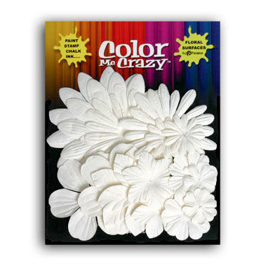
Products: Swirly: Prima Say It In Pearls; Flowers: Petaloo; Lace Corners: Anna Griffin; Cherish Charm: Tim Holtz; Letters/Symbols: Thickers and Webster Pages; Ribbon: Scrapbooks Plus; Brads and Lace (generic brands) – for similar items at Scrapbooks Plus check out the brand new Graphic 45 ribbon pack for the lace and WeR for the brads.

I hope you enjoyed this layout! I’m looking forward to sharing many more with you over the course of the year. I’ll be posting my pages on the 8th, 16th and 25th of every month. Thanks 4 looking (T4L) and Happy Tuesday!

Monday, February 7, 2011

Valentine's Day Cards

Hi! It’s Kathy Bryant one of the new members of Scrapbook Plus’s Design Team. I have been scrapping for more than a decade. Most of my scrapping focuses on family, travel or both. I like designs that include lots of photos. I look forward to sharing my ideas and designs with you. I hope you’ll comment on my blogs. Your feedback will help me to meet your needs. [Simply click on comment underneath the blog to provide feedback.]


With just a few items you can make unique cards, like the one I made for this month’s design challenge. Although mine is an anniversary card, it would be a great Valentine’s Day card – for your spouse, your Mom or an aunt. Who doesn’t love to get a handmade card? The English Rose Collection is great for romantic cards.


I used two special items in this card – canvas and embossed plastic. I stamped the card’s message on canvas strip. Using canvas in cards or scrapbooking pages can add texture. The adhesive-backed canvas is available in either the 8 1/2 x 11 or 12 x 12 size. It can be cut into whatever shape you need and you can stamp or paint on it. If you want another color you can spray it with Glimmer Mist.
I used plastic to create a little more texture and interest to the card. (This is a subtle thing and hard to see in picture.) Cut a piece of plastic (like those you get product in) to the desired shape and run it through an embossing machine. In addition to looking good, it is green! For Valentine's Day you could emboss plastics with hearts.

Interesting ribbons can also be used to make great Valentine cards. This pink heart ribbon with the ruffled ribbon makes great trim for a Valentine. I used it for this baby card. It also comes in red. Of course, if the color you need is not available you can spray the ribbon with Glimmer Mist to change the color. I created some to match the English Rose Collection.


I used another fun set of ribbons to make a valentine for my sister, the seamstress. I picked ribbon that looks like rick rack. It comes in many colors. This would also be great for kids cards.
For my niece, the purse aficionado I made a purse using the Snap On Envelope stamp and a piece of ribbon for the handle. I stamped the purse and the hearts from the Basic Grey Love Stamps with Dusty Concord Distress Ink. I then embossed them with a clear embossing powder. I trimed the card with the same ribbon used for the handle.

I feel so good to have my valentines made a week in advance. I’ll talk to you again on the 14th. Kathy

Sunday, February 6, 2011

Mistified


I'm back! Hi I'm Megan and this is my second year on the Design Team. For me scrapbooking is more than a hobby, its a way of life. I dress my kids in clothes that go with papers that I love and want to use. I'll even buy them new cloths if I have to. I plan activities for my family to do so I can take photos to use in my scrapbooks. I'd feel bad about that but my kids have so much fun that I look at it as a win win;) I actually had to join the yearbook committee at the elementary school so that everyone would stop looking at me funny for taking so many photos.

I believe that great products are important for good scrapbook pages and would like to thank Debbie for bringing these products to all of us. We are so lucky to have our store.

I also believe that great photography can tell a story better. And when it comes to telling the story you need to include journaling. This hobby has lead me to develop myself as a photographer and as a story teller. This year I am committed to learning some new computer skills. I'm not trying to become a Digi scrapper, I love the feel of paper too much. I just want to know how to use certain computer tricks to enhance my scrapbooking.

I joined the ScrapbooksPlus Design Team last year and have grown so much as a designer in the process. These girls have so much talent I can't help but be inspired. I am so excited about the new talent this year.


This layout was so much fun to create. I went no holds barred with my Glimmer Mist and Chalkboard Mist and the results are just beautiful!

I was misting and chalking away on the Birthday Girl background that I cut using my Silhouette and paper flowers I cut using the Tim Holtz Tattered Florals die.

Once the flowers were dry I started layering them but I wasn't quite getting the look I wanted.

Then I remembered the class I took from Lisa Hausman several months back. In that class Lisa had us use a misted paper towel to cut out the shape for an element we used on the cover.

I looked down at the paper towel I had been using while misting
(If you have never misted before then this might not make sense to you.) I added a bit more Chalkboard in places and dried it using my heat gun. I cut some flowers out of the paper towel using the same Tattered Florals die.

I began layering the paper flowers with the paper towel flowers and loved the results. The Olive Vine Glimmer Mist and the Cotton Candy Chalkboard Mist worked so well together and with this paper line.

I had actually never used the chalk and mist together before. I have to say that I love the combination. If you have never misted don't be overwhelmed. There are several great tutorial on all of the Tattered Angels paint products on line. To check out a good one I found this morning click here. She goes into a lot of different techniques and I learned a few new things too. Be sure to check out part two by clicking here.

I did notice that she did not mention using a craft mat, only refers to it later in the demonstration. It is very important to use a craft mat. If you don't own one, GET ONE! They are wonderful. Nothing sticks. Everything come right off. Paint, ink, glue, everything. Even if you don't mist you need one of these mats. They are always in stock at the store but you might not notice them so just ask!

And as far as misting goes I have to tell you if you haven't done it you really, really, really should try it. There are a lot of new products coming out that you will want to mist. I heard Prima is coming out with a White line specifically for Glimmer Mist. Other companies are moving in that direction too. You know when you are looking for an embellishment in just the right color but can't find what you're looking for, well now you can make it yourself. I predict that misting is going to get really big, so big you can't ignore it anymore! Sort of like computers which is the whole reason I own one. I tried to ignore them but I couldn't and look, now I'm a blogger;)

Saturday, February 5, 2011

Hello with a border punch and doily jar project

I am Laura Petruso and I am thrilled to be a member of the Scrapbooks Plus design team this year!  Have you taken a look at the Design Team Wall in the Crop Room at the store?  The designers are all such talented artists.  I am honored to be a part of the team.

Let me take a moment and introduce myself... some of you may know me as the Copic Marker instructor at Scrapbooks Plus.  I have been crafting of some sort for as long as I can remember.  My Mom always had craft supplies around the house when I was young so I naturally had to get into them and start creating!  I have been 'officially' scrapbooking for about 5 years but have albums of photos and mementos from as far back as grade school.  I actually resisted scrapbooking for a long time because I didn't need another crafting hobby.  I have been a stamper for 15 years and over the years I had accumulated a lot of 'stuff'.  Then a friend invited me to a crop and I realized I could use stamping (and all my supplies) to create my scrapbook pages of my children's mounting photos that were sitting in boxes (or still on the computer) and the rest is history.  I have two children and a very tolerant husband and we live in Western Loudoun.

I don't know that I really have an official style to my work but I would describe it as clean and classic in appearance.  I love to create projects and gifts with my scrapbooking and stamping supplies.  As I said, I've accumulated a lot of 'stuff' over the years... mostly smaller things, not major purchases.  However, I did break down and get a Cricut Expression a few years ago.  I kept reading that people were getting rid of their punches and just had this one machine, cutting any size you wanted.  People I knew raved about their Cricuts.  Don't get me wrong, I like my Cricut and use it a lot, however, get rid of punches?!?  Not me!  They are far too handy for a quick project.

If you've checked out the what's new wall at Scrapbooks Plus lately there are several  new large border punches.  I love these punches!  The ones I have in my stash are Fiskars, Martha Stewart or EK Success.  I am attending my first all weekend away crop this weekend and needed a quick gift for my roommates as I've been crazy busy getting ready. 

I pulled out a few Mason jars- the kind that once held spaghetti sauce (I like to repurpose/recycle).  I covered the top with a scallop punch of patterned paper I had on hand.  I wrapped the sides of the lids with the trendy rayon seam binding type ribbon.  I then wrapped wide grosgrain ribbon around the middle and used my newest large border punch from EK Success to cut out a really cool 'ribbon' to go on top.  I have been using a ton of doilies lately and used a lacy stamp to fancy up a small round doily for the front of the jar.  I used a letter sticker that I had on hand for the center (for my friend's first name).  I then filled with some yummy candy and off I went.  Pretty and quick thanks to my punches!!  Here are the finished projects...
I hope you have a great weekend.  I know I will!

Friday, February 4, 2011

Hoo am I?


My name is Karen Bearse & this is my 2nd year on the design team. I am also teaching at ScrapbooksPlus. My style is grunge, inky, eclectic & changes with my mood & whoever I am learning from at the time. I have been scrappin for 10 years although I have always cut up photos & put ephemera in albums. I like Supernatural, True Blood, & American Idol- (Adam Lambert should have won), I am still mourning 24 & Friends always makes me laugh-thanks to the reruns. I am re-reading the "Interview with the Vampire" series by Anne Rice, when I get a chance. Most of my photos are of my 3 crazy, fun kids. I love to travel & am not getting enough of that!

Ok so this month's kit was a challenge for me. I am not the big rose type & I am not a huge fan of pink. I had to pull out some weirdness to get this kit done! The good news is it forced me to stretch! The inspiration for this layout is Tim Holtz's 12 Tags of Christmas. All dies are from his Alterations line. I cut out the fence using the "On the Edge" die & painted it with picket fence crackle paint by Ranger. Pine trees were stamped with colors that blend into the back ground to make the trees look further away. The pine tree embellishment was cut out from paper in the kit & adhered to chipboard than a flourish was stamped with peeled paint distress ink.
Mr.Owl was stamped & painted using Glimmer Mist & adhered with a pop dot. The sign post was painted with glimmer glam & attached with brads. The title is made with Mrs. Grossman's Abigail caps stickers. I look forward to another year on the DTeam & I hope I can inspire you!

Products:
Owl stamp, glimmer mists, glam by Tattered Angels.
All Dies by Tim Holtz for Sizzix.
Distress ink by Ranger- forest moss, peeled paint, vintage photo.

Thursday, February 3, 2011


Hi, I'm Deborah Mahnken, and I'm thrilled to be back on the ScrapbooksPlus design team.

I've been scrapbooking since 2004 - mostly of my two children - and this is my fourth year on the design team.

My style tends to be more on the simple/graphic side, or at least I start off that way before I layers and dimensional embellishments. This layout is a good example of my style - more graphic, handwritten journaling, a bunch of embellishment in a cluster, yet balanced. I used photos taken with my iPhone and the Hipstamatic app. The greens in my photos really matched well with the paper.

Tags are one of my favorite things to make these days, along with one-page layouts and mini-books. Recently I've done a couple of books where you make one page each day of the month - of whatever you have on hand. It's a great way to experiment and use of lots of odds and ends. I find cards the most challenging thing to make. I've also been wanting to try an art journal.

My favorite products? I am a huge Tim Holtz fan. I love his inks, his stamps, his die cuts and the new Vagabond (my new best friend!). I always love new paper and have a hard time passing up Halloween collections. I have a long wish list right now - I just got back from CHA where I got to preview all the new products coming out this spring. But right on top are Tim Holtz's new Distress Stains and glacine paper.

I'm more of a scrap-at-home gal, but I really have a good time at crops. I'm just bad at pre-printing photos and putting together kits so that I have what I need. I try not to snack while I scrap, but I always have a glass of water in reach. When I scrap I'll often just set iTunes to shuffle everything around, including Paramore, P!nk, and any song from Glee. I like to browse most of the scrap magazines, but Scrapbook Trends is my favorite. As far as blogs, I regularly check out Scrapscene, Tim Holtz, Write Click Scrapbook, and Little Birdie Secrets.

Wednesday, February 2, 2011

Hi this is Lisa Hausman and I am so excited to be back on the ScrapbooksPlus Design Team for 2011! I can't believe it but I have been scrapbooking for almost 12 years~time does fly by! I usually scrap about my 3 boys, but you will occasionally see me scrap about my animals (I have 4 dogs - 3 labs and a great dane, 3 cats and 12 guinea fowl. I know I'm crazy!) I am really looking forward to this year being on the Design Team.
This month's paper from KaiserCraft was really wonderful to work with. Since I have 3 boys, I'm not usually a pink person but I fell in love with the pinks/greens/creams in this paper line. I used some Glimmer Mist (including the stamps and screens!) on the right side of the paper under my photo. I also used some bling from Prima, Tim Holtz tissue tape (which is a FAVORITE of mine) and one of my new favorite tools the Sew Easy from We R Memory Keepers.
The flower is actually one that I made out of ribbon. I love, love, love to make handmade flowers and I think that almost every layout that I did this month contains a flower that I made out of ribbon. I will be teaching a class called Crazy for Flowers at ScrapbooksPlus on Feb 8th 6-8pm~ I'll be teaching you how to make this flower out of ribbon. Have a great day!
lisa