Friday, January 29, 2010

Cork Paper? Really?

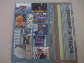
Okay... so I HAD heard of cork paper, but I had never actually used it before. I went into Scrapbooks Plus in search of some new Thickers, and happened to see 8 1/2 x 11 sheets of cork paper near the Coordinations. I decided to pick up a piece to try out with some of my vintage photo copies and the Man About Town papers from Upsy Daisy Designs.


The cork paper is ultra thin... not a bulletin board thickness here. And it can really be used just like regular paper. It was super easy to cut on my guillotine trimmer... and when you tear it, it makes a very cool looking edge! I did tear it extra slowly to make sure not to end up with a tear going further than I needed. I adhered it to the paper with Zip Dry liquid glue to make sure that it would stay in place. My ATG would probably work too if the layout was in a page protector in an album, but I wanted to be sure it wouldn't come down while on display.

thanks for stopping by!
erin

PS. The gameboard pieces I used in the title came from an old collage project that I planned, but never actually completed. You can get a similar look by using rubons or stamped letters on punched squares of cardstock. Mount them on chipboard scraps or with dimensional foam squares.

Thursday, January 28, 2010

Think Out of the Box by Esther

Well the year is moving right along. I thought today was the 27th, when it was actually the 28th. We will soon be into the second month of 2010. What happened to January?

My post is meant to encourage you to think out of the box when planning projects. Everyone has some creativity. Most people will state that they are not creative, when they are and have not tried to create. Each of us has different ideas about doing things. Scrapbooking and the artistic process are also different for each of us.

When planning a layout or project, get ideas from others, but let your own sense of how you want it to look guide you. Some of us, me included, start a layout with the photos dictating the look of colors, papers and embellishments. Others start with patterned papers and find the photos. If you have a favorite line of cardstock, this could be the order used.

There is no right nor wrong in scrapbooking. Be free to create your own look. There are some principals in art that could be used as guidelines - balance, using odd numbers, color combinations, etc. But generally we are at a crop when we ask each other, what would you do to this layout. That is ok. But use your own judgement. I try not to offer too many suggestions to new scrappers. It could be discouraging to be told your ideas are not working. If asked, I will offer some suggestions.

When we see a layout or project, we should be daring enough to put our own spin on it. Afterall, your scrapping is personal. Making something to give to someone might be different, but you are in charge of your scrapping. The Design Team displays it projects to give a jumpstart like we get inspiration from amgazines. Take your own photos and choices of papers and embellishments to make what pleases you using other layouts as inspiration.

Scraplifting can be good or if relied on too much, can stifle creativity. Use your own eye for what pleases you and your pages will be personal memories. This is not to discourage you from visiting the blog or any other blog. Just use it as a guide to think how you can do the layout to suit your own personal taste and be creative.

Look at the Design Team Wall to see what I mean about different tastes and thinking out of the box. When given the same supplies, each member has a distinctive presentation. No two are alike. This is an amazing team and it has been great to learn from each person on DT the past year.

Visit the Scrapbooks Plus 2010 DT starting on the first of February. See you then.

Wednesday, January 27, 2010

Bittersweet Good-Bye


This will be my last post on the Scrapbooks-Plus Design Team as I did not try-out for the 2010 DT.  I have mixed feelings about taking this year off, and I will surely miss the challenge and excitement of the monthly DT kits.  I have many fond memories of my time on the DT and wanted to share with you some of my all-time favorite layouts created by some of my fellow DT members this past year.

Top of my list of favs is this layout by Susie using the Basic Grey Marrakech line of papers...I will always remember that big elephant -and only Susie could pull it off!

And I loved her "Little Guy" layout of that oh-so cute Box Turtle.


And who could forget that Scenic Route layout from June 2008. I love how she cut out all of those waves and wove the rays of sunshine through.


Susie is such the clever girl!!

Erin has created some awesome one-page layouts this year and I had a hard time picking just one. I loved her "Up Close and Personal" title and the clean lines of her color-block design. (and not too much GLITTER could ever be found on Erin's layouts!)


I also love the romatic flair of this layout featuring the papers of her own kit selection. Her folded flowers are exquisite and work beautifully on the design.


And speaking of clean lines, Deborah is another scrapbooker that is very linear in her approach to her layouts. I love this single page layout of her daughter.


And I admire her braveness is chopping off her daughter's head in her Easter layout.  (I'm not sure I could have managed to do that!) The result was stunning!


Loretta is another scrapbooker whose approach is clean and balanced with artful photography that just jumps off the page.  I loved her COWBOY layout especially.


Lisa, like Susie, had so many artful designs, I had a tough time picking my favorite.  But her latest Christmas layout knocked it out of the park for me.  Beautiful simplicity!


Lisa did this very cool Halloween layout in 2008 that I really inspired me...I'm not sure I had ever used flowers on a "boy" layout until I saw how perfect this one turned out.


Esther has such warmth and charm in her approach to designing artful layouts.  I especially liked her pinwheel featured in the June submissions.


Kim was our only eclectic scrapper, and I'm hopeful to see more of her crazy, off-the-wall style next year.  I loved her OUTERBANKS layout. Unfortunately, my favorite layout she displayed in 2008 was never photographed or blogged, but it gave new meaning to eclectic interpretation!  I SO wish I could emulate that her style!


Misty's use of color on a monotone palette worked well in this simple layout using the My Mind's Eye papers.


I have been fortunate to work with such a group of talented ladies.  It is indeed a bittersweet farewell. I will miss the inspiration I have gained from each of you as individuals, and as artists. You can still find me at my blog sharonvm.blogspot.com where I will still showcase layouts and projects.

To all the 2010 DT members, I congratulate you in being selected for this year's Design Team and wish you all the best in your creative endeavors.  I cannot wait to see what new ideas and inspiration you will bring to our readers!

Tuesday, January 26, 2010

Gone Fishing...


I love these pictures of my little guy...the pictures are from when he was just turning 18 months...and I love love love them...he is so cute, and the pictures show his facial expressions so good. Especially his "boo boo" lip...and hiding behind the fishing pool...
I have some plans to add do some extensive journaling starting at the top of the 5x7 going down to the little wallets...
The layout is rather simple and understated, but for me it was all about my pictures, and letting them tell the story, as your pictures should do. I used ink on this one too, to make it look boyish and dirty...
This is my final blog as a Scrapbooks Plus Design Team member...so with that said Congrats to the great girls that were chosen for 2010 year...can't wait to see with what you all come up with. Thank you Scrapbooks Plus for a great year, and thank you to all the Design Team member for a memorable experience, it was like no other.

Monday, January 25, 2010

Design Team 2010

It always amazes me how fast time really does fly by. It seems like just yesterday that the 2009 Design Team started their projects and blogging. They have done so much amazing work! Thank you to all you wonderful ladies!

Our new Design Team 2010 will begin their posts on February 1st. Congratulations to Karen, Deborah, Erin, Robin, Kathy, Kim, and Esther. We look forward to seeing your projects starting in February!

Enjoy!
Lisa

Sunday, January 24, 2010

Scetch Love...

I really had never used a sketch before I was on the Design Team. I would always get frustrated if they didn't turn out exactly like the sketch. I have learned that it doesn't have to be EXACTLY like the sketch. The sketch/page map can be used as more of a guideline.
I have enjoyed seeing how everybody interprets these sketches. Some people turn them around, some people do one big picture, some cut up the pictures, some use pattern paper, etc. The options are truly endless. This month's sketch by Loretta was no different. Every design team member had their own interpretation and each was brilliant.

This is my interpretation of this month's sketch.


Saturday, January 23, 2010

Valentine Blue?

I made this simple valentine for my husband:I hand cut the hearts from scraps from several of the papers in the Upsy Daisy line and inked all the edges with brown. Then I hand cut brown mats for each of the hearts, added a little ribbon and some pop dots, and ended up being very happy with the results. For the sentiment, I think I ran the cardstock through the printer, but I know there are a variety of sentiments available from Mrs. Grossman on the "sticker" wall at Scrapbooks Plus. Who said valentines need to be pink or red?

Friday, January 22, 2010

Using Patterns


I like patterns a lot - and I just love patterned paper. You can still use lots of patterned paper on your layout and not have it look busy.

Haven't tried this before? Why not? The trick to combining patterns is to mix then up and use only one (or two) really bold patterns.

For example, I started with the Tyler paper and used it as my background instead of cardstock. I chose this one because it doesn't compete with my accent paper or my photos. If you squint your eyes a bit and look at it it you mainly see the blue - it disappears into the background but still provides more interest than just a solid colored cardstock. So when you look at the layout you don't focus so much on the background, but on the stripes, the photos & the title. Perfect!

Thursday, January 21, 2010

Snow Layout??

Browns for a snow layout?? Sure, why not!

Last year Santa brought my kids sleds for Christmas. And they were so eager to use them ... but we didn't get the snow. Can't say that about this year! These sleds have gotten plenty of use to make up for it.

For this layout, I changed my photograph to black and white - Rachel's pink jacket and purple sled would surely have clashed with this paper. But this way she stands out -- her expression -- and not the bold colors of the original photo.

I first used a die cut to make the bracket shape. After choosing a paper to mat my photo, I cut out one of the flowers from another part of the paper to use. Then I layered a few stamped & embossed snowflakes adhered with pop dots. All on top of one of the fabulous Maya Road journaling tags that I picked up at ScrapbooksPlus. The chipboard alphas are also Maya Road. After debating and debating on what to do to them, I decided I just liked them raw.

Wednesday, January 20, 2010

Vintage Paper - Modern Layout

When I picked up the kit this month, my first instinct was to use vintage photos. The soft blues and brown are perfect for them! As I was pulling out my copies of old photos, I pulled out an enlargement of me and my daughter one summer at Nathan's Dairy Bar in Manassas and set it to one side. As I was putting everything away, I noticed that the large stripe of Nolan II looked really nice with the photo... so I changed directions and started on a clean, modern layout.


This layout is very simple, but uses four patterns of the papers. The plain, white background cardstock keeps it simple and allows the papers and photos to shine. The main patterned papers used are the Nolan II stripe and the Tyler blue dot. I made paper buttons using the argyle side of Tyler and floral side of Nolan. I used some Jenni Bowlin chipboard buttons as a pattern to get the size and button holes placed perfectly. (I tried eyeballing it once, but ended up with crooked button holes!) I put eyelets in the button holes and mounted them with dimensional foam squares to give them some pop... literally! I added some ribbon and Thickers to finish it off.

A personal note on Thickers... if you see some that you like, buy them! Thickers are perfect for titles. They add texture without adding too much bulk to your layout. In a word, they are perfect! My favorite embellishment of all time! I buy them even when I have no planned layout for them. Why? Because each season, American Crafts comes out with new fonts, new colors, and new Thickers I have to have... and when they are gone, they are gone. So if you like them, it's a safe bet to grab them. You will use them eventually AND you may not be able to find them again. These Thickers I got quite some time ago... so long ago that the packaging has changed since then. Yikes! The brown are almost used up from other projects and the dark blue I thought would come in handy... but they didn't come out of the package until I saw with blue dot side of Tyler. You never know when you'll need them, but it's good to be prepared!

thanks for stopping by!
erin

Tuesday, January 19, 2010

Juxtaposition


I love that word...juxtapostion...and love how it subtly worked on this layout.  Inspired by Loretta's page map, I first went to create this all-boy page of my son Zach in the snow after returning not too many weeks before from the World Series game in New York.  But once I got the winter/boy themed page together, it wasn't quite right.  I decided to let my title lead me.  I pulled out my stash of Prima and started to work.  I thought the white-pink pearl flourish would be great to symbolize the wind of winter, so I cut a piece away and added it to the photo with a snowflake attached with a pearl brad.  I just couldn't resist that pinky-pearly butterfly, so I thought what other better way to capture the dreams of spring.  Butterflies and snowflakes; pearls and boys; winter and spring.  Now there's juxtaposition in its finest.
Enjoy!

Monday, January 18, 2010

Walking Through the Sketch Process

I love sketches, pagemaps, whatever you call them! In fact, I collect sketches all the time and there are several websites that I visit on a regular basis to find more. The best part about sketches is that they give you a jumping off point without giving you everything. So you can use the same sketch as someone else, but both layouts will probably not look the same. This month, Loretta gave us a great sketch (and check out all the different ways it turned out on the left wall of the Scrapbooks Plus crop room!).... so here is my step-by-step process from sketch to layout.

First, the sketch. It shows one large photo and three smaller photos with a large piece of patterned paper or cardstock.


So, first things first, I looked through my photos for four that went together and one that could be a focal photo. I found some pictures of my sister on a not-so-famous walk (we thought we'd take a quick walk and got turned around in the neighborhood streets around my grandmother's house and didn't make it home for 2 1/2 hours!). I had already printed one 4 x 6 and 6 supporting shots when I was trying out my new printer. The smaller shots that I was trying to print as wallets came out a little smaller than expected... 1 1/2 x 2, but fit perfectly going three across... so I picked out the best three.

The second step is usually to pick out the patterned paper... but in this case we already have that. I found some teal cardstock to use as an accent and went with a dark brown base. Once the paper is picked out, then it's just making everything fit! I turned the layout 90 degree clockwise and shifted the layout a little bit. The focal photo went on the left with the three smaller photos on the top right. The remaining lower small "photo" space became the place for the title instead.


I had seen another layout in my blog travels that reminded my of this sketch. It also had all of the photos and embellishments at the top of the layout and had a large piece of patterned paper with an angled tear at the bottom, so I went ahead and appropriated the idea for this layout. I added a box for my journaling to the lower half. I kept it the same width as my focal photo to keep the balance. The white paper ties in with the middle strip and "Walk" in the title. I had considered doing journaling strips... but thought that it would be too busy and compete with the narrow strips of cardstock running through the center of the layout, plus it would overpower my smaller supporting photos. My embellishments were simple... just a couple of staples on each side.

A note on my Thickers.... the Thickers I picked up were lovely (they are Delight fabric Thickers in leaf and have tons of letters in the package!), but just a little bit too bright olive green. I sprayed them liberally with Garden Fairy Glimmer Mist.... which IS green, but more of a minty green color. The change is subtle, but noticable in real life. In the photo, the treated Thicker is on the left and the original is on the right. It really helped the color match the tone in the William plaid paper and not stick out like a sore thumb.


thanks for stopping by!
erin


Sunday, January 17, 2010

Page maps

Page maps are such a great way to get inspiration to create a LO. They are a great starting point for a LO. It is so cool how 11 designers can get the same page map and each LO looks a little different. Hereis a link to see everyone's page map LOs from this month Page maps can be a great way to help with scrappper's block- I like to use them for a jump start when I can't get moving on a LO.

This month's page map designed by Loretta was easy to use. I knew what photo I wanted to use- I had just come across this one when I was doing my decade LO. It worked well with the papers from Upsy Daisy Designs.

Now I probably should have scanned the picture and changed it to black and white or sepia, but I decided that I liked the photo too much in color. I inked up the edges of the papers with Mocha Mama ink. I also took a 1/2 inch piece of the Carter paper and crumpled it up and inked it lightly to accentuate the creases. I also used one of the mini envelopes from Maya Road- which I also inked to put my journaling card in. Scrapbooks Plus carries all the products that were used to make this LO.

Enjoy!
Lisa

Saturday, January 16, 2010

Resolve to Go Green... AND save money!


You've got tons of left over goodies from your scrapping. Here's a way to put them to good use AND make great greetings for your friends and family!


If you haven't been into the store this month, you MUST see this month's kit (okay, I picked it out, so I am biased) but this is beautiful paper by Upsey Daisey Designs. This particular line is called Man About Town.

Don't let the name fool you though, this paper is not just for "boys". It's incredibly versatile and can be used for all kinds of projects.


Friday, January 15, 2010

Simple, and fine tuning...

I think sometimes I get so caught up in trying to create these beautiful pieces of art that I get overwhelmed. Do you get like that? This layout was anything but overwhelming. It came together super duper fast and yet I like it.


I think I may go back and add some more smaller photos from the evening to the left of my 1 photo. I was thinking maybe some sepia tone photos of us girls through the course of the evening when this photo was taken. Which brings up another whole issue - do you ever go back and "fine tune" your layouts? I try not to, but sometimes I do. Mostly it is because I have this internal battle with myself about putting too much stuff on a page and not enough.


The papers by Upsy Daisy Design were elegant, classic and fun all rolled into one. I enjoyed the color combos as well as the designs on all most all of the papers.


Also, I just wanted to take a minute to congratulate the 2010 Design Team members! I can't wait to see all of your hard work!

Thursday, January 14, 2010

Tags and more

The Upsy Daisy Design papers were just so cool to work with. I had a LO in mind that I wanted to do for this month that included using pieces of "memorabilia" on it. I ended up just using the tags from clothes that my son got for Christmas- this was the first year that he wanted mostly clothes instead of toys/video games and I wanted to make sure that I remembered it.

This LO went together really fast. I think at most it took me only about 30 minutes to do- obviously I haven't done the journaling on it yet (that usually takes the most time for me- I'm horrible at writing things down!). I really like when a LO comes together quickly.

I really loved the browns, blues and cream colors of the Carter paper. I used one piece to create both the main paper and the border. I also used the Swiss Cheese punch from EK Success- I really love their border punches.

Stop by Scrapbooks Plus and take a look at the great work the DT did this month with the papers from Upsy Daisy Design- there is so much inspiration on the DT wall!

Enjoy!
Lisa

Wednesday, January 13, 2010

Page Maps...


......la la la la..la la la la...I love you....OH yeah that is right I am singing...plug your ears...and just shake your head...


I have said it before and I will say it again...I LOVE PAGE MAPS...Even though I am not really a blocker of picture, this really worked for my pictures...I had a handful of pictures of my little one and his quad...I stayed pretty true to Loretta's layout with in the exception that I added more pictures...but hey there in nothing that says you have to do it exact...
The other thing I love about Page Maps is, it sometimes, makes you think outside of your confort zone, and try new things...and that is what I did with this...
I plan on when I get it back on Journaling about our walks to the park, or rather my walk/run while he rides his "motorcycle"...
I love the browns and the blues in this paper, when I first saw it...I didn't know what I was going to do with it, but once I got it out and started playing with it...I couldn't believe how great it was...


It isn't too late for you to turn in your project to try and win that gift certificate...come on you can do it...turn it in...

Monday, January 11, 2010

Vintage Family Photographs


This was a layout using vintage photos of relatives and the upsy daisy designs "Man About Town" group. The photos were taken by different photographers in the 1940s. They were different sizes, with different finishing on the edges. In order to get some sense of unity, I used a rectangle shape with rounded corners because they were all vertical. The rectangles were cut the same size and corners rounded for each of the three photos and the journaling block. Brown ink was used to brush the edges. They were mounted onto the cardstock "Martin". The photos were duplicated and sized to fit the rectangles. Placing them with the fourth journaling block left me with an even number to things. I used the journaling block on a shaped accent and at a lower level to give interest.


The upsy daisy cardstock "William" was the base for the layout. The two cardstocks were turned to give the design swirl patterns an opposite effect on the layout. The blocks were placed to let some of the swirls be shown.


Journaling was printed on the computer on biege paper to give the vintage feel. It was adhered to the blue "Martin" patterned cardstock with a vintage button at the top. Inking the edges was essential since cutting the cardstock left a white edge. The accent in lower left was formed on a shaped circle of the blue with flowers, buttons, ribbon flowers and lace using pop dots.


It was ok to leave some solid color in the layout, but the designs needed to be tied together. Strips of the blue and a brown were used at the bottom to give balance, while the blue strip on right side and the lace across the top tie the pages together. The title, big button on right and flower accent form a triangle for the two pages. This helps to unify the two-page layout. Mixing the different sized photographs of the same relatives worked for me. Try it with your families' vintage photographs.

The Best of 2009


Here's a great idea to summarize your year and fill those first few pages of an album. This layout features 17 photos (three are hidden behind the small squares).  Make sure your photos are black and white or sepia-toned - otherwise there's just too much competing color. I sized them at 2.2" square and left a white edge which serves as a mat.


On the title, I used white Thickers chipboard letters.  They were just a little boring for my taste, so I added a small rub-on to them.  I wasn't quite sure if it would stay on both the paper and the raised dimension of the chipboard, but it adhered perfectly.


Sunday, January 10, 2010

Playing with the Map


When I saw the page map I knew that I wanted to use this long vertical shot on the right-hand side of the layout. I switched the left side around a bit to better accommodate my other photos, journaling, title and even a ticket stub. Like Loretta, I added an embellishment group at the bottom on the layout.

I really liked all the earthy green colors from this month's kit and I'm making it one of my New Year's resolutions to scrap with these color more often!

Saturday, January 9, 2010

Playing with Shapes

One of the papers in this month's kit had this great argyle pattern in shades of blue and I decided to play with the diamond shape, starting with trimming around the edges. I cut some more diamonds out of a coordinating paper, creating a large frame on the left and placing the piece I cut out of the middle on the lower right as a frame for the journaling block - using a craft knife gave me a nice clean shape. I added a small diamond in the upper right for balance. I had planned the layout of the pictures and printed them with a white border, but they needed something more so out came an edge punch with the same kind of shape. I was happy but did not know where to go next - so I went to bed!

When I woke up the next morning, I knew what the title of the layout had to be - and no, it was not because of my choice of breakfast cereal! Anyway, I pulled out my much loved and waaaay underused Cricut Printing Press cartridge and cut the title, making it large enough to span both pages. I inked the edges and chalked the surfaces, but something was still missing...

...a little shine! So out came the Pearl Ex and the water pen loaded with Future floor wax, and I frosted the edges of each block in the title. A little glitter on the die cut snowflake and...voila!

Friday, January 8, 2010

You'll Never Get Lost... Following a Map!


Make a New Year's Resolution to join the monthly Design Team Customer Challenge.
It works like this: Each month we post a "layout map". Here's the January page map.


Then, stop by the store and stock up your supplies; You'll need your favorite photos, this month's kit, adhesives, embellishments. Here's what I created using this map:

Then it's your turn! Get those creative juices churning and create something wonderful. When you've reached perfection (or as close to it as you think you can get) take a photo of your creation or scan it into your computer. Then email your submission to debbie@scrapbooks-plus.com by January 20. The winner will be announced on January 31 and will receive a gift certificate to the store.

Thursday, January 7, 2010

That Face!


And all that Glitter!  When I started this layout, I knew that I wanted to use this cute photo of my pup with her head resting on our older dog and I knew I wanted to use this beautiful Upsy Daisy  "William" flourish/floral print.  The problem I had was that the print was a little drab for my liking.  I decided to add a little bling, so I reached for my Martha Stewart Brownstone glitter. At first I just glittered the larger flower.  It looked a bit lonely without a glittered stem.  So I glittered the stem... and after about thirty minutes.... I ended up glittering everything!
After finishing the entire design in Brownstone, the ensemble was entirely too monotone.  I looked through my "Martha" stash and found the Antique Silver glitter to be just what my flowers needed.  I waited for the piece to dry and added a second appliction of glue (FYI, I use Martha's glitter glue for detail glittering projects like this - it holds its "shape" when putting it on and dries really fast) and sprinkled the silver right on top of the brownstone.  It worked beautifully!
Suddenly I realized that my 5x7 photo of the dogs was too big, so I reprinted it in a 3x3 format.  Clearly the layout had become more about the glitter than about the dogs!

After adding the matted photo, I felt it needed something more in that top right quadrant.  I used a second sheet of the "William" paper, hand cut a flourish and a flower and went to glitter some more  (can a girl have too much bling, really?!?).  I popped it on the left side of the photo to give it a little dimension.  Add a title, journaling and a ribbon and you're done! A simple, yet fantastic, design.  Replace the photo with any black and white or sepia-toned 3"x3" and you can achieve the same results.

Wednesday, January 6, 2010

Double Page Layout for a Snow Day...

I based this layout on my Wednesday make and take layout...I loved the papers because they were so "boy-ish" or "manly" if you will....

I couldn't resist scrapping these picture...they are actually from last year. This is the first time in 2 years that "my boys" acutally went out and shoveled the driveway. Even my little angel baby was out shoveling with his little mini shovel.

I took my Tim Holts tool and roughted the edges of and ripped the paper...it helped make it look more boy like...more rugged...and pleant of ink...yes, I used ink...I know there are a few of you that are falling over wiht shock...but it is true.

Tuesday, January 5, 2010

January Cards

OK, after the two feet of snow we got several weeks ago I'm not sure I agree with my sentiment anymore ....


... but you might! I used two different pieces of patterned paper from Upsey Daisy Designs for this, and layered a vellum piece with flocked snowflakes. I liked how the branches looked like they were falling from the sky.


For this card I started with a piece of kraft paper. I cut a smaller rectangle of the same paper and distressed the edges. Then I made a flower for the center from a scrap piece of chipboard (painted & inked), a Maya Road journaling tag and a circle of the Upsey Daisy Designs paper.

You should check out the Maya Road tags -- ScrapbooksPlus has them in several different shapes and they are wonderful - thicker than regular kraft paper and thinner than chipboard. I love them - look for them on several of my projects this month.

Monday, January 4, 2010

A decade worth of pictures

I loved the papers that Loretta picked out this month. To a Mom of all boys, I find my "go to" colors are mostly blues and browns. So when I picked up the DT kit, I was thrilled to see the papers.
With the changing of the decade this year it brought me to thinking about how much my life had changed since 2000. I went from having babies in diapers to have a teenager and two 10 year olds! How did the time go by so fast?! I decided to do a layout of all the past 10 Christmas card photos to show how much the boys had changed. I have to say the part that took me the longest for this layout was actually finding all 10 photos- and as you can see I don't have 2004- my computer crashed that year and I guess I didn't back them up before it did. Luckily, I had put them on a photo processing site and I can order them from there. Guess I have learned a lesson to back up my photos!
One of my favorite parts to this LO is that each year is a flap that can be lifted for hidden journaling.I am going to put things that were important to us under each flap when I get my LO back.
Don't forget about the ScrapbooksPlus DT challenge each month. You could win a gift certificate to ScrapbooksPlus- just pickup the pagemap and papers that the DT used this month, submit it to Debbie at the store!

Enjoy!
Lisa

Sunday, January 3, 2010

It's Not Just for Little Boys

The Man About Town line, with its soft blues and browns, is so versatile! Boys, girls, modern, vintage... it goes with everything! My first layout was a vintage one.


For this layout, I featured one small print of my mom and her sisters from around 1957. When I scanned the photo, I made sure to get the original white border too. Although it makes the photo a little smaller, it helps retain the feel of the original nicely. I matted it on a piece of the Martin plaid cut on the bias (at an angle). I think the bias cut gives it a little more of a girly, playful feel. I punched two strips of the William brown lacey print with a Martha Stewart border punch, and then crumpled and pleated it to give it some texture. Tim Holtz crackle paint covered up the maroon chipboard thickers (although I sanded a lot of the color off to make sure it covered) and the grungeboard accents. I used three Kaisercraft pearls for flower centers since I didn't have many large pearls left. I really like the look of the three little pearls better than a large one. It's a lot more visually interesting and I'll be doing it again on purpose, I'm sure!

thanks for stopping by!
erin

Saturday, January 2, 2010

Brown is my New Favorite Color...

...because it is such a lovely neutral! This layout came together so easily because of all of the browns. In addition to the brown tones in all of the patterned paper, I inked almost all of the edges with brown. Did I mention how much I love brown?!?!

When I first saw the papers that Loretta chose, they just screamed vintage to me. I was inspired to create this layout of a classic Madden family portrait from December 1965. It is going to be the opening page for an album I am creating from the family slides.