
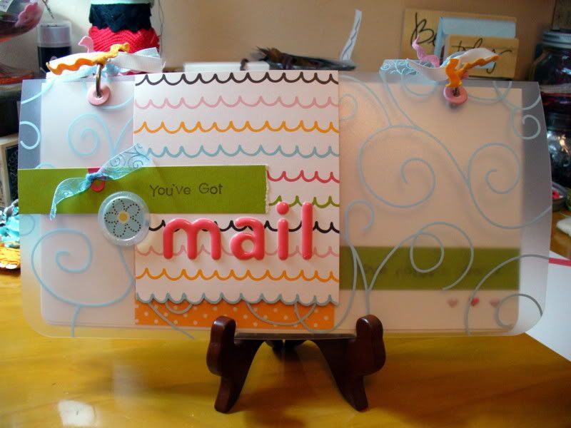
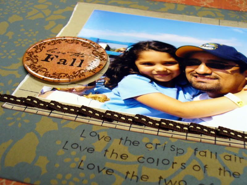
This was the month of the X-acto. Not to mention glitter.
For my project, I wanted to create a hanging Halloween goody, and when I saw the crow template in Creating Keepsakes magazine, I was hooked. I went to the web site, downloaded the template and sized it up in Photoshop. Once it was printed out, I cut it out and traced it onto a piece of cardstock and used my X-acto to cut that out. I wasn't too concerned about rough edges because I knew I'd be smoothing them out with my Basic Grey Precision tool kit.

Once I had all three crows, I decided to cover one side with paper. I selected a grid paper for one and a pumpkin pattern paper for the other and used PVA to cover one side of chipboard. I flipped that over onto the backside of the paper and brayered, making sure to get out all the bubbles. I set it aside for a few minutes and then trimmed off the excess. (The final crow would be covered in glitter.)

From here, it was a matter of decorating. I used the American Crafts Thicker shapes to create my frames for my letters. But first I covered them in Doodlebug orange glitter. I started with the sticky side up, added glitter, let that dry. Then I added a coat of Tombo followed by a second coat of glitter. After that was dry, I added my striped pattern paper to the back along with my black glitter letter from American Crafts.

For the middle crow, I created a pinwheel by folding three strips of patterned paper into an accordion fold. Each section was attached using Terrifically Tacky tape while the middle was held together with a nice dollop of PVA. (The pinwheel was placed between two heavy objects so it wouldn't come apart during the drying process. PVA sets up fairly quickly, but I was a bit nervous so I let sit for a good hour or so. If you want to be completely nervous, let it dry over night.) The framed "O" was also attached using PVA. This time I set one of my small candle holders on top. (It's all so scientific around here.) This crow was also covered in Doodlebug black glitter.

I thought I was done but realized that if this guy turned, I'd be in a heap of trouble when it came to the backside, which was just plain chipboard. So I quickly covered everything with black cardstock and used black glitter all along the edges. I highly recommend covering BOTH sides of your hanging project at the same time.
A leaf, crown and some orange bling finished off the process. Everything was attached to a black ribbon. I wound a piece of waxed linen thread through one of the holes in the ribbon and tied it off so I could hang it where I wanted.


 I actually started with my son's iTunes gift card...it was really cool, but also really pink! How to make a boy layout with such a vibrant pink and not have it overwhelm the layout? Easy answer! The "gidday" paper from the


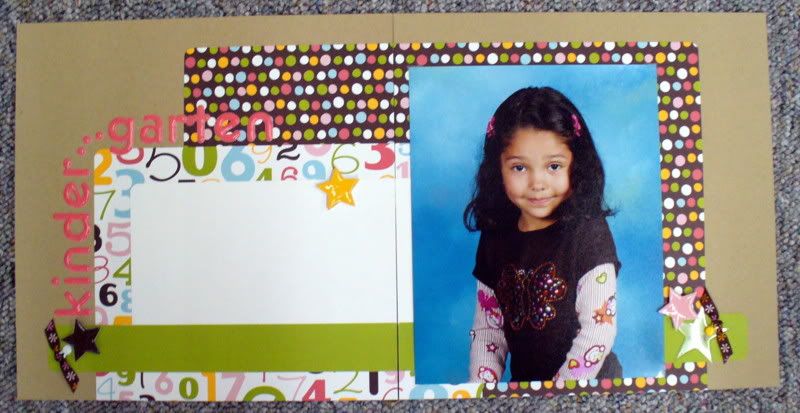
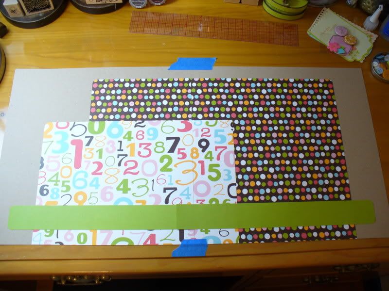
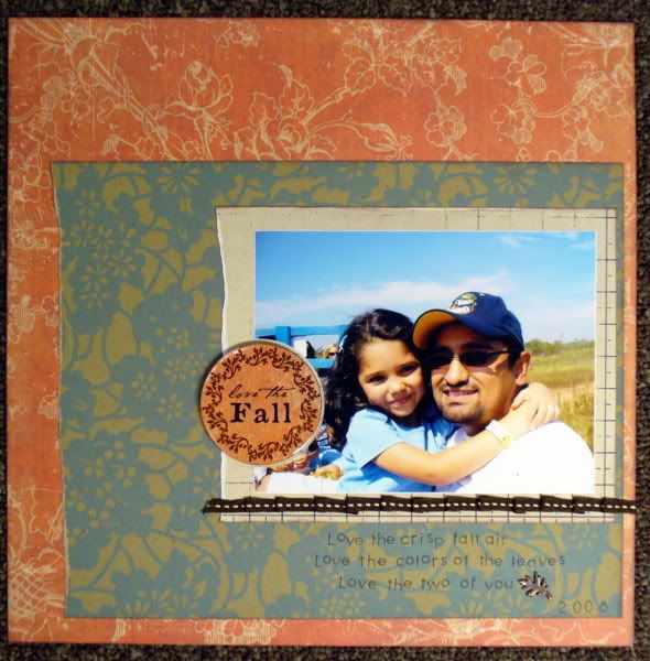
 I cut the pieces of paper to "puzzle fit" around the center rectangle. This method uses the least amount of paper. An easier way to accomplish the same look would have been to mat the center color block with the background solid (in this case, brown) and laid it on top of the surrounding color blocks - much less measuring involved and you also have the option of adding dimension by placing it on pop dots!


