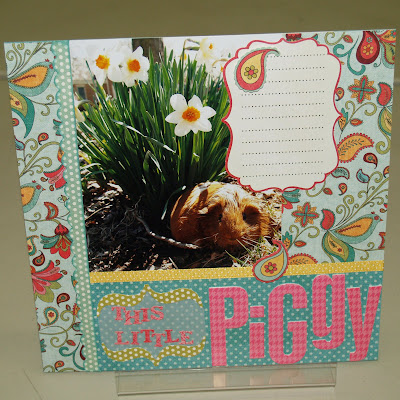
 Not many tips to share from this layout. It went together so quickly because I used several elements from the My Mind's Eye Die Cut sheet - a scalloped border, the journaling block, the parentheses, and two cute little floral paisley embellishments!
.
Because I chose to put the scalloped border on top of paper with similar colors, inking the edges definitely helped the die cut stand out - and the vellum did the same thing for the smaller letters in the title. This is actually one of my favorite uses for vellum because it lets the background show through, but provides just enough contrast to separate the title. The die cut parentheses provided the perfect little frame.
.
And don't you just LOVE the Heidi Swapp Foam Letters?!?! They are so thick and the adhesive on them is great. I always try to add a little dimension to my projects - there are pop dots under the paisley embellishments - but the Heidi Swapp letters just JUMP off the page - perfect for a title!
.
I actually took waaaay too many pictures of my cute little piglet! I was going to make an exploding box for the rest (what a surprise, right?) but I think I will turn this 1 page layout into a 2 page layout when it comes home. I hope Debbie has ordered more of those die cut sheets...

5 comments:
Cute pig! Love the LO- can't wait to see it in person!
I love how the pink title pops. What a cute idea! ... and your flowers are lovely too! :)
The daffodils and the pig do the layout good. Very appropriate for spring.
Susie!
I love how you balanced this layout... The placement of the Journaling box is especially cool. So glad you shared this one.
I love those Heidi Swapp letters too - I love how easy they come off the sheet (backing and all) so you can place them around easily to see where you want them (and change your mind ten times) and then, they actually STICK when you go to put them down. Now if they are just weren't so PINK....
Cute layout!
Post a Comment