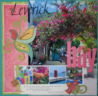
Because of the beauty of the flowered arch in this photo, I decided the photo should be the center of all the attention, but I still wanted to use lots of the My Mind's Eye product in this month's DT kit. I managed to use a total of five photos (one that measured 8.5 "x 11.75"!), three patterned papers, three different cardstock colors, as well as die cuts, HUGE foam letters, and candy dots - all in a one-page layout. And most of all of this "product"could be considered "left-overs".
You can get similar results by just using your left over scraps - you know those long pieces that are never wide enough to mat a photo. You can make good use of those scraps to highlight a super huge photo that you love. Even though I cut most of the pieces for this layout from full sheets (since this was my first project this month, I had no choice, but I could have just as easily put this layout together last from left overs in my "scrap box". ) The green polka dot paper measures 3.5" x 11.5", the pink patterned paper measures 3"x 11". I used some left over white card stock to mat the pink paper to really make it pop. The only full sheet of paper used was a single piece of teal cardstock to mount everything on.
That big photo can take center stage and still be incorporated into a fun (and embellishment filled) design. It's a great excuse to let your photography shine and still incorporate lots of paper and "stuff".
That big photo can take center stage and still be incorporated into a fun (and embellishment filled) design. It's a great excuse to let your photography shine and still incorporate lots of paper and "stuff".

7 comments:
I love the way you enlarged the picture in this LO. Love it!
Love the picture... love the pink... love the white matting. Wow! I thought you didn't like pink? You can't tell! :)
I don't like pink in scrapbooking.(I do like to wear it tho!)
Debbie reminds me that I must "challenge" myself - step out of my comfort box - so I picked a kit that would be hard for me this month (the brown kit would have been much safer). I do believe that when we challenge ourselves, we learn and sometimes we like what we see! Thanks for the feedback!!
I absolutely love this layout! The picture is gorgeous, I love it enlarged. Another great design that I will need to file away for scraplifting! :-)
Really nice use of colors - even the pinks. Beautiful photos.
This layout is absolutely stunning! I am inspired by you every month - this time I am going to tuck away the idea of the block of the smaller photos with the HUGE focal photo. I always take sooo many pics and it is often a struggle to use them all. In the digital world, though, I don't have to print them as 4x6 - I can resize them. Thanks for the reminder!
Love the enlarged photo combined with the smaller photo strip!
Post a Comment