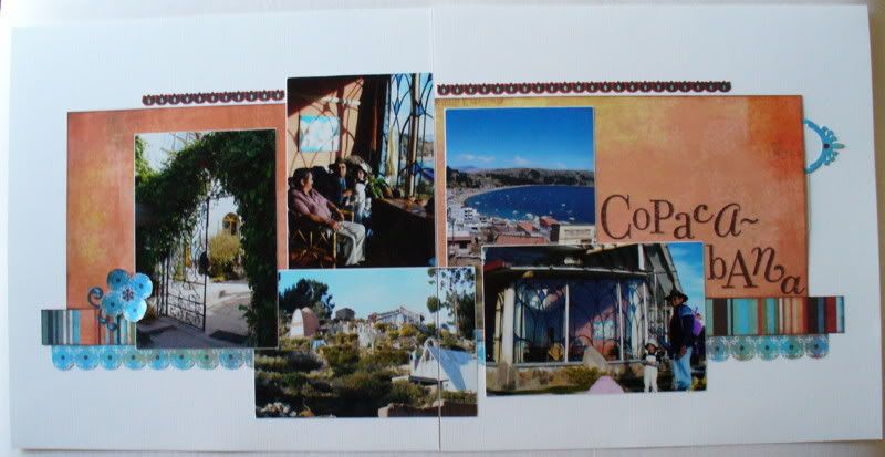
The colors in the Marrakech line were so vibrant and rich, I immediately thought of the photos I took in Copacabana a couple of years ago. My two-page layout has five 4x6 photos and could get a little busy. Using just a little bit of patterned paper, some of the coordinating Basic Grey solid that has that fabulous subtle print, and a lot of white cardstock sets off the photos. The strips of patterned paper and the cardstock border sticker help to draw your eye across the page. Another cardstock sticker serves as the pull for the hidden journaling. You know I love scallops and the blue patterned paper's design worked perfectly to create a scalloped border as well as the four-petal flower.
thanks for stopping by!
erin
PS. These photos are primarily of La Cupola, the hotel we stayed in in Copacabana. It was located on a hillside over the lake with a main building and a number of outbuildings with guest rooms. Each one was completely different. No phone (except in the office), no TV, no heat, but quite peaceful. My room didn't photograph well but it had a ladder that went up to the door in the floor/ceiling in order to climb up into the room. Too cool! The view of Lake Titicaca was fabulous!

5 comments:
I love the white background - the colors just pop.
You just added another destination on my places to visit!
Sounds like a great place to vacation. Your use of pattern sparingly was good. The pictures are colorful & needed to be highlighted. Good job!
I love the little 4 petal flower you made from the patterned paper - I am definitely lifting that idea!
The scallop border works so well with the patterns of the paper - as well as that little flower. Cute!
I wanna go... :)
I love all the colors...this is a beautiful layout.
Post a Comment