
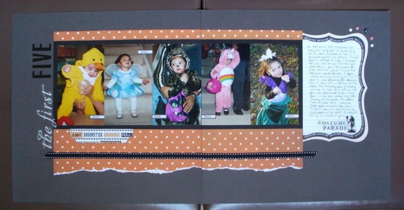
The last option is the one that I chose to use for this page. I had five pictures. Some were from my digital camera, some were from my old APS camera, and some were given to me by friends. When I got around to this layout it was late and night and I didn’t really want to scan them and order prints, or take them to one of the printing kiosks to see how they’d look in b&w or sepia. Instead I decided to keep the color scheme really simple: dark gray, black, white and orange. The die-cut mini-pages from Teresa Collins were the inspiration. I searched through my stash and found this old paper from Scenic Route to coordinate. The orange dot works with the die-cuts really well as they both have the same color and the simple, clean feel. The orange is almost a little burnt and brown looking, making it seem to be even more of a neutral.
Thanks for stopping by!
erin
1 comment:
Very cool! I love how you weren't afraid to use your color photos!
Post a Comment