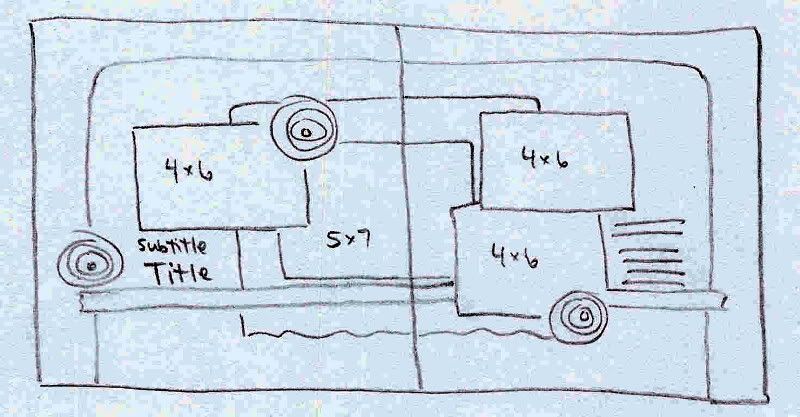
This month when I was working on my design team projects, I sketched out this two-page layout. I tend to sketch most of my layouts first so that I can get an idea of what it will look like... and so that I can make sure to fit everything in! This time I wanted to create a layout that didn't have any cropping and used standard sized photos. This one uses three 4x6 and one 5x7. Some of my favorite sketches are the ones made for regular 4x6 prints. It's a lot easier to see if your pics will work with the sketch if you don't have to figure out how to crop them down! ;-)

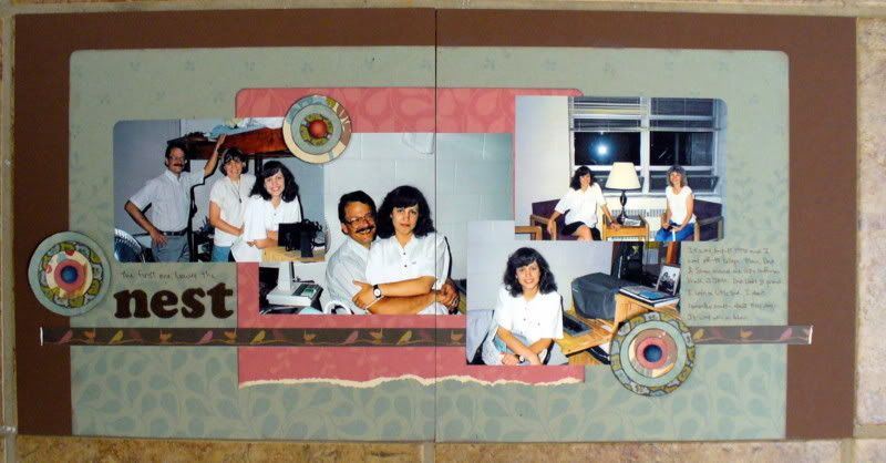
And here is the layout. The red patterned paper is a 12x12 sheet that is torn off on one side. I love the birdie tape that spans both pages. I couldn't get the liner to peel off, but some regular adhesive worked just find to hold it on!

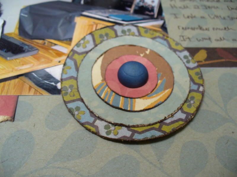
I made layered, flower accents using my Colluzzle and leftover scraps of paper. Some of the layers were actually from the paper that was behind the dimensional Anna Griffin stickers.

Enjoy the sketch... I hope you add it to your collection!
erin

2 comments:
So am I! I love Becky Fleck and her page maps to help get me going when I'm in a rut!
I use sketches, too. Becky Fleck's PageMaps are a huge go to for me when I am stuck in a rut. I need to start jotting down my own sketch ideas as they come to me so I always have a pile to choose from.
Post a Comment