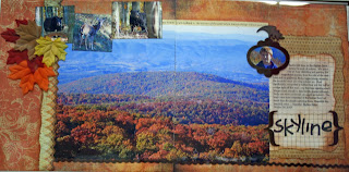
Every now and then, I get lucky enough to capture a spectacular landscape scene on film. You know, those photos where the light is just right, the colors are brilliant and the detail is perfect. And it feels like such a shame to display all that beauty in the confines of 4"x6" or 5"x7" formats. So I say, blow it up and make it BIG!
Autumn is a great time of year to take those kinds of photographs. And making it big doesn't have to be difficult. The photo here of the tree line at Skyline is 10" x 14.5", but you don't have to have a large format printer to print it. Using Adobe Photoshop (and I have an OLD version) set your crop parameter for height to 10" and width to 8" and crop the first "half" of the photo, making a mental note where the "half" stops by picking out a landmark in the picture to overlap your second "half" with. If you have a printer, you can print the first half using the "portrait" setting on 8.5 x 11 photopaper or save it to a file for the printing vendor of your choice. Then undo your crop (or return to the original) and crop the second "half" with a height of 10" and width of 6.5". Start your crop of the second half at your landmark, leaving just a bit of overlap from the first half. Use the same steps as before to print or save to a file. When you save, make sure your file name reflects the dimensions you want the prints to have so the vendor you use won't be confused.
For a layout like mine, simply arrange both "halves" on the center line of your two background sheets - I used Basic Grey's "rust" from Archaic for the background in my layout. You will need to trim the overlap to eliminate any repetition in the photo. My layout was quite simple actually - a couple of strips of patterned paper on the left and a matted journaling block on the right. What I truly like about this layout is the supporting photos in the upper left field of the layout. Here I highlighted a few wildlife shots we took that day - including a Mamma Bear! This space can be used for any of the smaller detailed photos you might take - a close up of a few brightly colored leaves, milkweed pods opening, thistle heads, birds... whatever you see in your view finder.
I've used this design a few times - most recently to capture the breathtaking Napali Coast in Kauai. You can view that example at my blog (link on the right) on the September 1 post. All the product used in that layout also are all available at Scrapbooks Plus.
Layouts like these are great ways to scrapbook those landscapes that truly are larger than life!!
So get out there and capture autumn in all of its glory!

3 comments:
What a great idea. I had never thought of stretching a large photo across a double layout. I will certainly be doing it from now on.
What a gorgeous layout! I love how you just let the photo take center stage like this - beautiful!
I just started putting photos over the center of the page. Your photo it beautiful!
Post a Comment