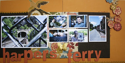
Earlier in the summer, my husband and I spent the day in Harpers Ferry. We had a great time, crossing over the Potomac, walking along the canal, staying far away from the poison ivy, checking out the shops and enjoying lunch at one of the town's restaurants. I loved these outdoor shots and really wanted to use them with this beautiful paper. Technically, we were there during the summer, but you know what? You can't really tell that from the pictures. These pictures could've been taken today, given the beautiful weather we're having. Long story short, don't feel that you have to be locked into matching certain papers with certain activities. Experiment a little and see where it takes you.
For this layout, I had a ton of pictures. Pictures of the bridge, pictures of poison ivy, pictures of me in three cute aprons, pictures of John sitting, standing, reading. Pictures, pictures, pictures. (58 total) It's great to have so many photos but sometimes it can be a bit overwhelming. When you begin to feel that way, ask yourself this question: What story do I want to tell visually for this project? For me, it started with the title: Harpers Ferry. With that in mind, I knew I had to have a couple quintessential photos -- the tunnel and the main street. I also knew I wanted shots of my husband and I.
Once my photos were selected, then it was on to the design. I selected my papers and decided to continue with the sewing theme. As for my photos, I wanted a strong focal point. That was easy. The train tracks with the tunnel. To get a strong focal point, use an image that's twice as larger as the other images on the page. This dominant photo will draw the viewer's eye, giving him/her a place to look. Following that, I stuck with a grid layout, placing my photos equal distance from one another along an invisible line. (The distance between the photos isn't, you know, super perfect, but you get the idea.)

After everything was down, I inked the Maya Road letters with a dauber and heat-set them. Then I punched up the flowers with some bronze Stickles and placed them on the page with pop dots. Ribbon, the beautiful Anna Griffin butterfly and some bling completed the look.
TIP: When doing 24x12 pages with photos that stretch across both 12x12 pages, adhere the photos first and then trim. Line up your pages and adhere the other part of the photo.

1 comment:
Very cute! I love that you cute out those flowers to use in the corner. I also think it's great that you are creative in mixing your photos and paper!
Post a Comment