Here is a little head's up to get your creative juices flowing for the October DT Challenge. Next month's challenge is a little different. We are asking you to use this page map (designed by our own Erin Saravia) to create your submission:
Wednesday, September 30, 2009
The Winner of the September DT Challenge...
Here is a little head's up to get your creative juices flowing for the October DT Challenge. Next month's challenge is a little different. We are asking you to use this page map (designed by our own Erin Saravia) to create your submission:
I am anything but square...
This layout I happen to love the simplicity of it. It was very clean, straight lines but yet just came together so nicely. I simple used four same sized squares in the center as a "mat" of sorts, with four different patterned papers that nicely complimented each other. I was originally going to use a black and white photo, since the doggy seems to be such a beautiful doggy that complimented the paper nicely I chose to just leave this photo in full color.
Not all layouts need to be complex. Not all layouts have to have tons of photos. Sometimes less is more and you definitely have to find your design and your comfort zone.
Tuesday, September 29, 2009
Sometimes you just need to make your own title!
thanks for stopping by!
erin
Sunday, September 27, 2009
Pineapple Mini-book by Esther
After the pages were ready for photos, I concentrated on decorating the cover. The cross-hatched diagonal lines were sketched with a brown marker on gold paper.
Of course, I had to add bling to the intersections of the pineapple diamonds. The rhinestones already had glue on back.
Last Hurrah! of Summer
The pages themselves were pieces of chipboard from my cat's wet food boxes (yes, I'm still saving those inserts!). I cut them out in the shape of the shell, painted them with acrylic paint, then covered them with My Mind's Eye Ohh La La paper. I made a template to cut the photos all identical to add consistency.
Saturday, September 26, 2009
Wednesdays at Scrapbooks Plus
You should get over there, the Design Team and the Staff at Scrapbooks-Plus have been working really hard to bring you a new page each Wednesday!
If you go every every Wednesday Scrapbooks-Plus gives you a page Element, and we design a page for you to copy. You even get directions. Bring your basic class kit and sit down and put your page together right there...Plus that is like 4 layouts a month done with no fuss or muss...we have done the work for you :)
Here is a sneak peak of an up and coming layout.....
...you are going to get the apron, and you even get to assemble it...This is a so cute if I do say so myself...the apron is so fun and is from the "from my kitchen" cartridge...Perfect for the upcoming holidays...or perhaps from holidays past!
Friday, September 25, 2009
Wednesday, September 23, 2009
Are you ready for some Football?!?
Don't be afraid to mix papers from different lines...and different companies. You will end up with a page that is completely unique!
Tuesday, September 22, 2009
Cards with Die Cuts!
Here I used a journaling block as the main design. A few flowers layered with a gorgeous Creative Imginations brad and it's done.
I layered two die cuts for this card, then added a little black bling to make a center for my flower.
The tag is from the die cut sheet - you don't need much more than that. I added a scrap piece of Bazzill scalloped paper left over from my wedding layout, a bit of ribbon and a couple of staples.
And I just made this one the other day! I had the birthday brad and ribbon scrap left over from our June kit and layered them to make a flower. Where's the die cut in this? The edging strip!
Monday, September 21, 2009
Working with Wedding Photos
The patterns in the My Mind's Eye paper really work well with wedding photos. They seem so elegant - and of course, flowery! Honestly I haven't scrapped hardly any of my wedding photos. However, this paper really got my mojo going and I got to fully express my girly side!
So here's how I put it together:
I knew I wanted to make a flower accent with the die cuts. I cut a smaller flower out of a piece of the patterned paper to layer on top of the die cut. Then, I added a paper flower and topped it off with a gorgeous Creative Imaginations brad I picked up at Scrapbooks Plus. You can't tell in this photo, but the top of my wedding dress was covered in fabric flowers similar to this brad.
In design there's the "rule of three." It's good to have three of an element in your layout to repeat a color, pattern, or shape. I used the "rule of three" in a couple ways with this layout. First, I chose several papers with patterns that resembled the metal work in the back of the altar of the church - not exact, but close enough to emphasize as a "theme." And, I repeated scallop shapes. The Bazzill swiss dot scalloped paper was an impulse grab when I picked up my kit - but I love it as a mat. When I was putting together the layout I noticed that my photo also has scallops - in the window at the top most noticeably, so I decided to use a border punch along the left-hand side of another piece of paper to repeat that element again. Finally, I repeated the gold color in the background paper, the flower, and in the paper surrounding my photo.
Sunday, September 20, 2009
Making the Most of your Die-Cuts
We got sets of My Mind's Eye papers this month and I was working with the Ooh La La line for my projects this month. In true page-kit style, it comes with a page of die cuts. My goal was to try to use all of them... because, really, if you save them to use later they will just sit there collecting dust... and then I will feel guilty. My totals for this kit were pretty impressive. I got one 1-page layout and five 2-page layouts plus 2 cards out of the kit... and I still have a few good-sized scraps left for another layout or several cards. What a great deal!
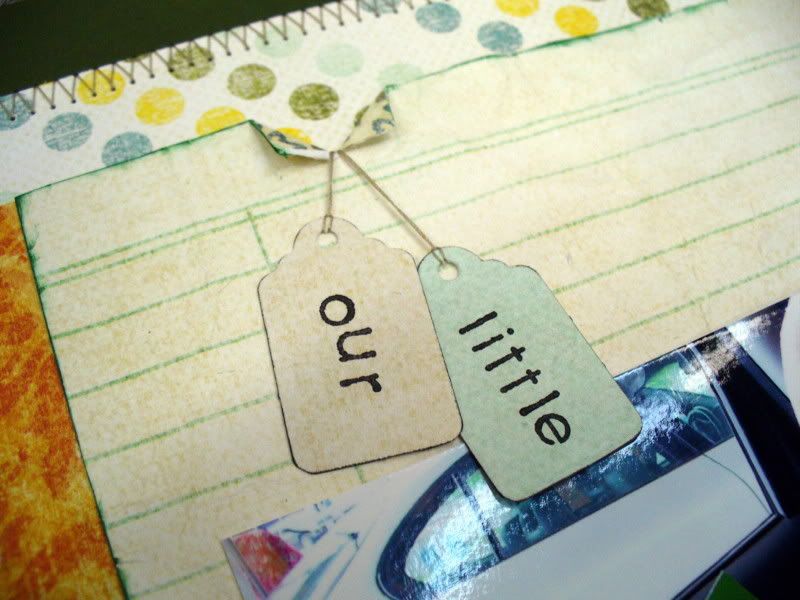
This layout is my favorite this month! The dotted paper made me think of the paper on the inside covers of children's book... which made me look for photos of Adrianna reading... and I found Lyle. She didn't like the book that much... only a single read for this one... but the green croc on the cover inspired the little framed title. I often get these little frames in kits and I confess that I generally leave them unused. Perhaps that's because I was limiting myself to their obvious use: framing a picture. I dedided to frame my stamped title here instead and I like it a lot better! I rumpled the notebook print paper and inked the edges green to help it stand out from the cream backed dot paper. I accidentally ripped the top edge... so I had to rip a little more to make it look right. :) Then it needed something else, so the hanging tags were born. I stamped the first two words of my title on them and looped a piece of thread on each. Then I threaded them through my needle and ran the threads through to the back. I used a little adhesive to hold them just so, keeping the stamping visable. I used part of a decorative edge die-cut along the edge of the photo mat to add some additional contrast between the cream-backed patterned papers.
I used the leftover piece of the decorative edge die-cut for this cute, all-occasion card. A die-cut flower and a pair of labels decorate the front... with a little bling to finish it off!
Last but not least, here was my two-page layout. I love this green honeycomb paper. It is fresh, fun, and modern looking. I paired it with some of the Whitewash Co'ordinations paper. I used a few of the die cuts... the photo corner is really a half-frame with the edges sanded to make the cut edge match the other sides, and a cluster of die-cuts highlight the quote. The title is a stamped die-cut in a label holder paired with some really, really old Lil Davis chipboard letters. Really, it would be totally easy to recreate these... all you need is some scraps of chipboard, ink or paint, alphabet stamps, and glossy accents to seal it and give it that professional, store-bought look. The journaling is a quote from Laura Ingalls Wilder from a Mary Englebreit card I've been holding onto for 9 years. I knew it would come in handy! :)
thanks for stopping by!
erin
Saturday, September 19, 2009
Using Chipboard Frames
I glittered the frames using Martha Stewart's Fire Opal. This color is perfect for fall and it just came in the store. I used hairspray to set the glitter so it wouldn't be all over my scrapbook (and my face) every time I handled it!
I've become a big fan of placing the frames over photos without trimming the photo to fit the frame - note the large sunburst frame on the left. This technique lets you highlight the feature you want to place emphasis on. I used the same technique in my Summer Soiree' class that I taught at Scrapbooks-Plus in June. You will find new purpose with chipboard frames using this technique and it keeps you from having to cut photos down. Just leave the photo in their printed size and use the frame as an overlay for punch. I think I might use the technique this weekend on a football layout (got a game today!), to point out which kid is mine in all those uniformed, helmeted boys out on the field!
Have a great weekend and get some scrappin' done!!
Friday, September 18, 2009
You know how I'm into making embellishments match my layouts, it's a great money saver. I also did that on this layout with the flower, I inked it really well and let it dry for ahile before adhering to the page. It also cleverly covers up a goof I made with the border punch! :-) Happy Scrappin'!
Thursday, September 17, 2009
Wednesday, September 16, 2009
Ohh La La- My Mind's Eye by Loretta Cooper
Tuesday, September 15, 2009
Bling it Out...
Monday, September 14, 2009
Glossy Accents and Flower Soft
After reading Michelle's post on Friday, I got thinking about how I love to embellish my accents. I love the die cut sheets by My Mind's Eye that came with the kit this month ( I used the Andrea Victoria paper line). There are so many uses for the different die cuts and so many different ways to make them go perfectly with you LO.
In this LO I used the flower die cut as an accent. I embellished the flower with some Polar White Flower Soft. It gave some dimension to the flower- just enough for me. Scrapbooks Plus has a great selection of Flower Soft- go by and check it out!
I also love to use Glossy Accents by Ranger to accent my embellishments. I used my Cricut and cut out part of my title LOVE. When I put it on the LO, it just didn't have the pop I wanted. So, I put a coat of Glossy Accents on it and I really like the way it looks.
Enjoy!
Lisa
Sunday, September 13, 2009
When I first got this paper I had no idea what I was going to do with it...I looked at it and looked at it...and looked at it some more...
Then I put it away...
Pulled it out and looked at it again...and put it away again...
Finally, someone asked me what was wrong with me...it never takes me this long to do something...and it was the "gold" color that was throwing me off...
I am just starting to appreciate a black and white palate. So once I got rid of the gold color i knew exactly what to do with this paper. I had this one lone picture left over to scrap from my son's Aunt's Prom.
The butterflies were cut with a punch that is hanging out in the scrapbooks plus crop room...and the paper is some left over Basic Grey lemonade paper I had...yummy so pretty...The flower are flowers that I have been collecting saying "one day I will use these" ... finally that day came :) And all I can say is ladies bust out those flowers that you have been saving for the rainy day. And use them! They are doing no good hiding in the box in the back of your scrapbook room. I see them and I buy them but I never use them. What about you...I see lots of people buying flowers at the store but I am not seeing them on all the pages.
The journal card I used actually had Yellow around it, and it has a damask design on it...but I cut the yellow off, and hid the damask under the picture. I took the purple pen I was writing with and outlined the card, so that it had something around the edge. Just not yellow.
I loved this paper, and hope that you get a chance to run by scrapbooks plus, and play with it too...and don't forget to bust out those flower that you have been saving for a rainy day. Using the bright colors on the black and white really make them pop and look so pretty :) Don't you agree.
Saturday, September 12, 2009
Memphis Quick Stop by Esther
The My Mind's Eye Ooh La La papers seemed right for this layout with colors of decades from the past—gold and green. I started with a solid green color cardstock and built layers that accommodated the four photos that I had on the subject. In order to lend some pizzazz to the layout, I cut a circle using the outline drawn with a skillet lid. A third of the biege circle was used on the left side in order to balance the lightness of the map on the right side. Journaling with transparent materials is best done by planning the page first, then printing a whole sheet of journaling to fit the spaces. I print a black & white copy on paper to test the size first. After cutting the size to fit, I do the final printing in color on the transparency.
Friday, September 11, 2009
Making your own ribbon
Ever have the right ribbon in your head but not in your stash? That happens to me often and for some reason this time I figured, why not, just make my own! So I took a leap and absolutely loved the results!
Once it's finished, apply it to your project, and done! I'm not one to brag, but I absolutely love how this layout turned out!
Wednesday, September 9, 2009
A Glass of Wine and a Good Book...
I also picked up a reader's journal. We are avid readers in my family, but the names of books and authors often slip my mind. The journal has a series of prompts for you to note favorite quotes or characters from the story as well as a place to record your personal review. (It would also be a great place to write down the reading recommendation of a friend, since I am always looking for something good to read.)
In any event, these journals inpired me to do something I rarely do...create a scrapbook page about me! A page about wine and a book I enjoyed...part of that daily minutiae that seems so unimportant...but I would be fascinated to know about my mother and her preferences, for example. The paper is acid-free, the pages are the perfect size, and the "ripped out page look" is just cool!
I think this may be the beginning of a series...I just got back from a weekend in New York where I happened to shared a fabulous bottle of German wine with my mother-in-law and sisters-in-law...and I kept the label...
Tuesday, September 8, 2009
Monday, September 7, 2009
Are you Ready for School?
Sunday, September 6, 2009
Have you been...
When I walked into Scrapbooks Plus this week...I seen these 4 papers right off the bat...sometimes that happens you walk in looking for one thing and something completely different jumps off the shelves right into yoru bag...that is what happened to me.
CHA stuff is starting to come in...and oh my goodness...the New Bo Bunny has come in and I couldn't hardly control myself...
I just HAD to get the new Flutter Butter stuff....So cute...I was so inspired by it...I ran home and had to make a layout. There was no controlling myself...and then I liked that layout so much I had to make another one...
Do you ever feel like that when you see paper? Well, I say run by Scrapbooks Plus, and check out the new Bo Bunny Papers along with all the other new stuff that has come in...I think you will be happy with all the stuff that Debbie has coming in...
The flurish on this layout is from the new sweethearts cricut cartridge....don't have it and want to try it be sure to sign up for the upcoming Cricut Swarm...I will be there and I will have my cartridge with me...