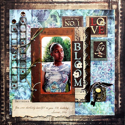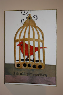
Anyone who knows me, knows I love all things Tim Holtz. It is not an obsession, just a healthy respect for creative genius. I have been lucky to take a few of his classes, which were of course awesome. The invention behind his product, especially his tools is extremely well thought out. We are the ones who wish this tool did this or that, he's the one who thinks the same thing & than goes out & makes a new better one. For my first layout, I used this photo of me & Tim. I went up & took some classes near my home town, in Laval, Quebec. All the products on this page are pretty much from Tim's various lines, Alterations by Sizzix, idea-ology by Advantus, Distress Inks by Ranger, & his spectacular (you can only use the word amazing so many times ) stamps by Stampers Anonymous.
The paper is from the Lost & Found (L&F) paper pack, the flip side of his papers have these beautiful distressed rich colors. I started by using masks & distressing with broken china & spiced marmalade (2 of my favorite colors). The photo was digitally spiced up with a border, title & Tim's name from his packaging. I added tissue tape in the corner. The cool thing about his tissue tape is, it is translucent, you can see the background coming through-love it!
On this layout I tried a new technique-on the tag-painting on paper towel. I painted a paper towel with metallic acrylic paint. The interesting effect is, the debossed image on the towel is not picked up by the paint & creates a textured look. I tore pieces of the towel & adhered to the tag with gel medium. Adding a metal corner, & ball chain with a trinket pin, jump ring & philosophy tag, added the idea-ology bling factor-Tim Holtz style. The key is grunge paper cut from the alterations line, embossed with a texture fade & inked. To finish the tag off, a photo was added & the stamp.
As this layout is following this months page map, I needed some squares in the corner which gave me the perfect opportunity to add some fragments. These acrylic wonders add great dimension & shine to your page. It was also a good way to get extra photos on the layout. Using glossy accents, I adhered pictures of the class projects & L&F pieces to the fragments. The unique thing about this paper pack is the varying sizes, 12x12, 6x6, 2x2, ATC's give you endless ways to use pieces of the paper. The calendar piece which shows the month fit perfectly under the small fragment. As did the bingo # which shows the day. Just a fun way to get the date of the event on the page.
I added to the layout by alcohol inking a memory frame 1st. Stamping a piece of Tim's calendar paper, using various distress inks, & distressed stickles & once dry, put under the frame (very easy to use), with a dangle fleur-des-lys charm. I added a philosophy tag with a brad above, loosely following the page map. To finish up: L&F calendar paper was cut using a Sizzix die from the alterations line. This worked great as a journal ta

g. Some distress ink & matching st

ickles, a bit of bling & voila-done.
So the Design Team wall is up & looks fabulous! The gals did a fantastic job with the Tim Holtz kit, using his products in very creative ways. Stop by
ScrapbooksPlus which carries the largest Tim Holtz line in the area! Check out the wall, get some new ideas. Pick up some of Tim's fantastic products & get scrappin!


