
Tuesday, September 30, 2008
Simple Two-page Layouts

Monday, September 29, 2008
Mix - and Match!

I needed to create some journaling boxes for a layout this month. The background paper looked like the old worn wood of a barn, so I pulled some paper from my stash that was a different wood pattern.
I didn't want to use plain black ink because I felt that would be too crisp and clean for this particular layout so I decided to mix my inks.
I started with a Tim Holtz Distress Ink (Tea Dye). It gave me a nice soft edged impression, but it wasn't really strong enough on its own. I then applied a layer of black Stazon ink right on top. It was easy to line it up because my journaling boxes were clear stamps from Autumn Leaves.
 The results were better than I expected. I think the combination of these 2 inks make it look like the stamps were burned into, or "branded" onto the wood paper. It really does! Look!
I then added the 3D flowers and fern from Anna Griffin and voila!
NOTE: I have been told to immediately clean my clear stamps if I use Stazon ink so that they don't get "gummy". I do this every time and I have had no problem.
Sunday, September 28, 2008
Just a Box
I measured out the area that I wanted to cover, which in this case was the box top. I then just pieced my scraps together. Overlapped, tore, cut, moved and moved some more until I got it just the way I wanted it. Because I am a little "odd" would be a nice word to use and I wanted to make sure I had it looking exactly the way I had it laid out, I took a picture of it and then recreated it with adhesive on the box top. You could use any type of adhesive you wanted but I chose to use my altered ATG gun. I didn't do it but I suppose that placing some photos on top and putting Mod Podge over it all would seal in your seams and would be easy to dust off and such.

Kim :)
More "Gilt" and Frames for Heritage Photos

October Kit


Saturday, September 27, 2008
US

One of things I love about this paper is how well it works for the fall months. Granted, fall is just starting, but that didn't stop me from grabbing some fun photos I took last year. Once I settled on my two photos, I went to town arranging everything. Here's how it all went down:

A. I started by using Fiskars Tear Edgar (deckle edge) to tear the burgundy/dotted paper and then inked the edges with Tim Holtz Distress Ink (vintage photo). The finished size is 4x12.
B. Cut out the flowers from one of the patterned pieces of paper. Set aside.
C. Cut your wood paper to 6 3/4x12. Adhere your photos, making sure to leave room for your title.
D. Adhere everything in this order: Burgundy paper, journaling spot followed by wood paper with photos. (Leave a three-inch opening near the bottom for your tag.) Tip: Don't run the tape runner along the edge of the burgundy and wood papers where you'll be sewing. This will keep your needle from getting gummed up.
E. Run through your sewing machine using a zigzag stitch.
Now that everything's in place, you can start arranging your flowers. I had some unused chipboard lying around, so I backed my flowers with that to give them extra dimension. I also added some brads to a few of the flowers for an extra kick.

Then it was on to the title. I ran Tim Holtz Distress Ink (vintage photo) over Basic Grey chipboard letters and heat-set. Paint with Making Memories Shopping Bag and heat-set again. Distress with Basic Grey precision file set, using the slender file. Keep going until you've revealed enough of the vintage photo ink to your liking. Adhere with Terrifically Tacky tape.
 Finish up by creating the tag. Cut down kraft paper to 5 x 2 1/2. Stamp on left-hand corner, letting part of the stamp run off the edge. (I used Technique Tuesday's Pocket Full of Posies stamp.) Using coordinating paper, punch a tab and adhere to right side of craft paper. Add an eyelet with your Crop-a-Dile and run hemp through. Slide tag into the three-inch spot you left open along the bark paper.
Friday, September 26, 2008
Unusual things...

.
Thursday, September 25, 2008
My September Minibook

I had a lot of fun making this book. I picked up a set of Zutter's chipboard covers at Scrapbooks Plus and covered them with the Anna Griffin paper from the kit. The wooden letters from Kaisercraft were painted with Adirondack paint daubbers. I then used my Bind-it-all to punch the holes. But instead of using the coils, I took the strip of leather from the kit and threaded it through the book. To keep the binding secure I knotted a button to each end of the leather. With the leather and the paper the book has a rustic feel - perfect for a vacation out to California and Yosemite National forest.
Here's another picture of the spine of the book:

And if you'd like to see the rest of the book, I'm uploading them to my blog here.
Wednesday, September 24, 2008
Tutorial: How to make a mitred frame
In scrapbooking, we often frame our photos or background to help them stand out, give added impact, or balance our layout. The most common way to frame items is by matting them. Sometimes you may want to add a mat to the edge of an entire layout. That will generally mean that you cut down one portion of your layout and place onto another entire sheet of patterned paper or cardstock, allowing the base paper to peek out on the edges. This takes up a lot of precious paper! Making a frame of paper strips gives a very similar look and takes a lot less paper.
To make a mitred frame, you will need a base paper or cardstock, a craft knife, adhesive, a straight edge/ruler, self-healing mat, and paper to make the frame.
First you will need to cut strips of paper. Here I was making a three-sided frame to reach out on one side of my layout. So I cut three skinny strips. You can make the strips any width you like... it just depends on how wide you want you frame to be. All the strips must be the same width!
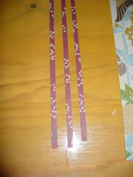
Next I laid the strips out on my layout to make sure I was placing them properly. All of the corners need to overlap fully in order for the frame to be complete.
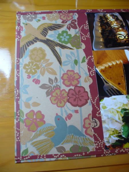
Glue down each strip, leaving the criss-crossed corner portion unglued. A clear ruler helps to keep each strip straight.
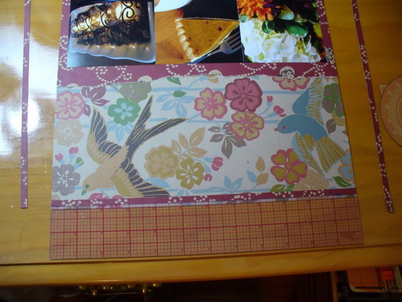
Once all the sides of the frame are adhered, place the layout on your self-healing mat, take a straight edge and a craft knife and carefully cut a straight line from the inner corner to the outer corner. It make take a few passes of the knife to get all the way through the paper frame pieces. Be sure to only cut on the paper frame... that way if you cut through a little bit of the background paper it will be covered by the frame.
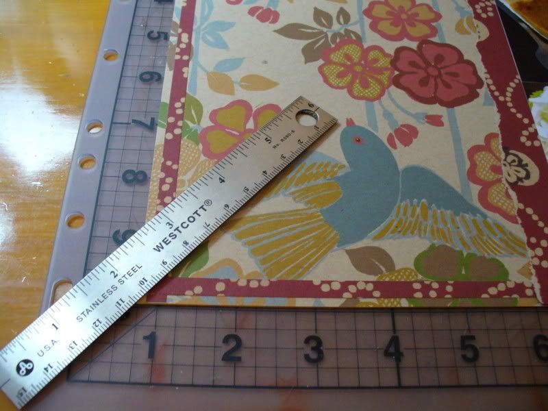
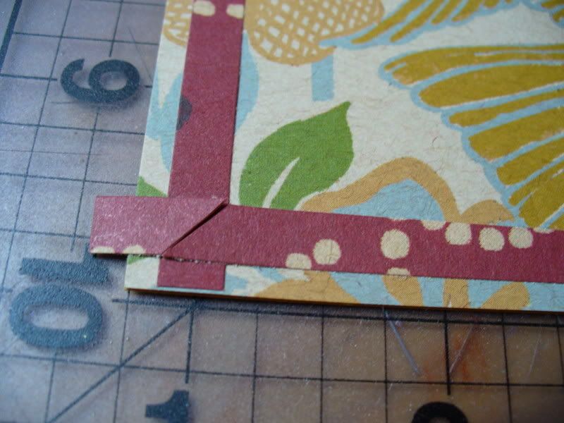
Remove the loose extra corner pieces and your frame pieces should come together in a perfect seam. Put a little bit of adhesive underneath to hold them in place. Repeat for your other corners.
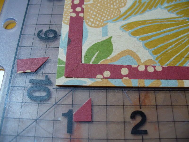
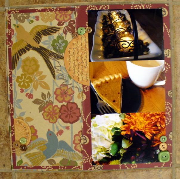
Here is the finished frame! This frame was place inside the edge of the background paper to help balance the dark color from the right side of the page.
Here is another frame example using scraps I had left of the Scenic Route DT kit from a few months ago. For this layout I only had scraps left of the red dot paper, so I made a mitred frame to get the look of layering I was going for.
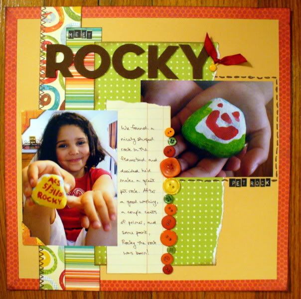
I hope this helps inspire you to grab that craft knife and make yourself a mitred frame. If you do, we'd love to see it!
erin
:)
Tuesday, September 23, 2008
Hey all! This months papers were perfect for my pictures. Parker, my "nephew", just loves Watermellon so I had to use the wonderful Anna Griffin papers to hilight it! By using the Kaiser wood letter and textured papers (the brown) I create some more demention. The wood letters were painted with Making memories paint, but since I couldn't find the right color, I played Chem lab until I got something I liked. Don't be afraid to mix paints! Just don't do it in the bottle, so that you can add or subtract....LOL
Monday, September 22, 2008
A Little "Gilt" Never Hurt Anyone!

When I opened my kit this month, after drooling over all of the gorgeous Anna Griffin papers, I found that Sharon had thrown in a bit of whimsey for us to play with - mine happened to be a little golden butterfly...and it really affected my choices for my one page layout.

Next, I selected a blue-grey paper with a subtle plant pattern for the background . I trimmed it to an 11-1/2" square and adhered it to another sheet of the teal cardstock. I dragged the stamp pad around the outer edge of the entire page, and then mounted the photo on the left hand side. I added some clear overlays from Wild Asparagus (the spinner display is in the front of Scrapbooks Plus) above and below the picture. I hand cut a flower from the patterned paper and placed it in the lower right corner.
Sunday, September 21, 2008
September Design Team RAK

I love bookbinding, so when Sharon came out with her lovely September kit, I instantly thought of fall weather, starry nights and comfortable evenings at home. And that led to this star book. The book's simply titled "Home," allowing you to dress it up as much as you want. Add some letter stickers to spell out "Fall at Home," "Our Home," "Thoughts of Home," or whatever catches your fancy. Then fill the inside with your favorite pictures and journaling. Best of all, it's free! Well, there is a caveat. You must reply to this post telling me your favorite fall activities. Do you hike? Do you stargaze? Do you catch every episode of "Bones"? Whatever it is, do tell! I'll pick a winner Oct. 20.
I covered Davey bookboard with paper using PVA, a bookbinder's glue. I then attached those to the front and back of the star structure, again with PVA. The wood letters were painted with Making Memories paint and adhered with Terrifically Tacky tape. The book is bound with waxed linen thread in the long-stitch method.
Good luck!
Saturday, September 20, 2008
Fall is in the air!

This month's DT kit designed by Sharon is beautiful! The Anna Griffin papers are so inspiring- the browns, reds, greens and blues set the tone for fall. When I got the kit, I was so inspired to distress. The Kraft brown of the papers remind me of all things old. So I broke out my inks and scissors and began to give the edges are nice distressed feel. Now, when I do distressing with ink and scissors I will start with putting a nice layer of ink on the edges of the paper, grab the scissors and rough up the edges then follow it again with more ink. I think it gives it more of an authentic "aged" look. I even distressed the photo corners that I used on the edges of the paper. I even inked up my journaling spot.
Sharon did a beautiful 2 page LO that is for sale at ScrapbooksPlus. Stop by and check it out as well as the DT wall. The wall is pure inspiration!
Friday, September 19, 2008
"Beautiful" Layout - DT project kit for September

Thursday, September 18, 2008
New September DT display and new Sept DT RAK
School is back in session, cooler weather is in the air, and the leaves are turning color and starting to hint at piles to rake. Come visit Scrapbooks Plus for lots of new fall lines, and check out the Design Team display board in the class room for lots of ideas.
Wednesday, September 17, 2008
Congratulations!
Saturday, September 13, 2008
Altered - Thickers & Chipboard
 My DT kit this month came with a chipboard dragonfly and a chipboard flower...but I needed a butterfly...so a snip here and a snip there and voila - Butterfly! I decided the wings needed a little extra swirl, so I snipped away at one of the Thickers Shape stickers and layered it on top.
The flourish underneath also came from the Thickers Chipboard Shapes pack...a little green acrylic paint and some white polka dots...and then I added a touch of Pearl Ex for a little shine (water pen & Future floor polish technique). Sharon is right - don't be stopped because they are plain white in the pack - they are sooooo easy to alter!!
Friday, September 12, 2008
Scraps and Thickers
 To make a card like this, cut two strips of coordinating paper and adhere then to your card. Lucky for me the piece already had scallops, but you can get the same effect by removing the guide on your corner rounder punch and punching in a row or using a border punch. Next, take a complimentary ribbon and tie it over the seams. I used a circular Thickers piece and threaded it through my ribbon for a cool effect. Now, take a small strip of paper, around 1.5", and fold it in half. Adhere it underneath your scalloped paper to make a quick tab. Finally, I used some of the poolside Thickers for a quick sentiment.
 And this card's even easier. Just grab a square punch and punch out four different pieces of paper. Add one embellishment in the center of each square. That's it! I had some clear buttons lying around so I backed them with some of the paper then tied a knot in the center before adhering to my card.
Wednesday, September 10, 2008
More Thickers Versatility


Tuesday, September 9, 2008
"Poolside" Thickers - Love these Letters!
 I am sure that everyone, at some point, has had the same problem I ran into with my 2 page layout for this month...not enough of one particular letter. My title "baby brian's bouncy butt-erfly chair" meant that I needed 5 of the letter "B" but the pack only came with 3. Not a problem! Take a close look at the title below and you will see that the "B" in "brian's" and "butt-erfly" are actually the letter "G" turned upside down...
Still not impressed? Want another example? Take a look at one of my cards from this month...

And just look at the possibilities with the "M" amd the "W" ...oh, and the "F"... and does anybody else think the "L" looks a lot like a bracket?
I will be honest and tell you one little thing I generally do not like about Thickers. I have problems with the adhesive. The letters just don't stick very well. Of course, that is not usually an issue, because most scrapbook pages go directly into a protective sleeve and lay flat most of the time. Mine have to go up on the Design Team Wall, and gravity takes its ugly toll (grin). I am not ready to give up such a great product (I just love the texture Thickers add to my projects!) so I have already figured out a fix for the next time. I will just run them through my Xyron to add a litte more adhesive and I think that will take care of it!
Friday, September 5, 2008
Are you ready for a CHALLENGE?
For the month of September the DT team is playing with Anna Griffin's Sierra line of papers. So while we play with Sierra, let's see what our customers can do with Dorothy, or Caroline, or Blythe or any other Anna Griffin paper!
My challenge to you is this: Create anything with Anna Griffin papers - it can be a layout, a card, and altered project, whatever your heart desires. Photograph or scan it in a jpeg file and email it to me. I'll post it on the blog, the DT will give you some great feedback on your work, and at the end of the month (September 30), we'll decide who has the most creative entry. The winner will receive the Sierra 12x12 card stock collection pack - beautiful double sided kraft card stock that retails for $24.99 at Scrapbooks-Plus. Yours for free if it is your art that rocks our world!
What a better way to show your stuff and have a chance for a great prize!
The only rules are that you cannot submit something that was created in an Anna Griffin Educational Class (that would be cheating). Also, the majority of the entry should utilize Anna Griffin product. You can submit as many entries as you would like. DT members can post any of their other Anna creations (as motivation of course) but are ineligible to win the prize.
My email address is sharonvirts@aol.com. Please send your JPEG file as an attachment (and don't send more than one file at a time - AOL gets funky about the number and sizes of documents)
I'll post your work on this blog and we'll give you feedback and kudos (plus a little publicity!)
I can't wait to see your art!!


