Tuesday, May 31, 2011

Junk It Up!!

So I wanted to experience the freedom of really "junking" a project. So I channeled the talented Karen Bearse and consulted with her to see if I had "junked" it up enough. Fortunately, I received her seal of approval with this project.

I wanted to create a really pink project and most of my layouts this month are REALLY pink - done because not long after this, my daughter swore off all things pink.

I used foil on the floral diecut and the word dream and surrounded all of this with flowers cut out from the Vicky B collection. I also cut out some images using the Cricut Expression and adhered all of this with zip dry and the Helmar glue (available at ScrapbooksPlus). Hope you enjoy it and have a chance to try this great technique!

Monday, May 30, 2011

Glimmer Mist & Etched Glass Add Variety to Your Page


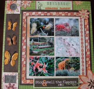
This page used lots of fun scrapbooking techniques and displays 6 pictures of the City Botanical Garden in Brisbane, Australia. The pictures include green, pink and orange, so the Vicki B papers were perfect.

I picked my 6 best pictures from a day at the City Botanical Garden in Brisbane, Australia and printed small ones (2 ½” x 3 1/4”) pictures. This was really easy in Windows Photo Gallery. I just selected the pictures I wanted to print from the more than 100 I took and chose wallet size pictures. I printed on 8 ½” x 11” photo paper. (Up to 9 wallet sized pictures can be printed on same page.)

I matted the pictures on a piece of Loverly (tan side) leaving a ¼” margin on 3 sides and a ¾” margin on the right side. To make the paper a little more interesting and to complement the pictures and other papers better, I spritzed it with Peach Delight Glimmer Mist. I added a slightly larger (9 ½” x 8 7/8”) mat of Florilicious. This was also Glimmer Misted with the Peach Delight. A border from the sticker set was added to the right side of the mat after spraying. I added a third mat of Bazzillion (brown side) 10” x 9 3/8”.

The flowers on the Florilicious paper are gorgeous so I cut some of them out to use as embellishments. After cutting out the flowers, I sprayed them lightly with Peach Delight Glimmer Mist. I affixed them to the page and then cut along the edge of the paper so that only part of each flower is used.

On the left side of the paper, I added a strip of Bazzillion (brown side) to provide a base for some more decorations.

To go with my garden theme, I embossed the glass squares with butterflies. This technique is easy and fun. Simply stamp your image with VersaMark or Perfect Medium on the frosted side of the glass square. Emboss with clear Embossing powder as usual and you have the appearance of etched glass. To provide a frame, I covered each piece of glass with a piece of Florilicious with a window cut out. (I used Sizzix Frame, Slide Mounts & Coin Holder Die, but you could just as easily just cut out a square the size of the glass and then punch out a square or circle.) These were also glimmer misted so that they match the flowers on the page. I placed one at the top and one at the bottom of the brown strip. Flora Doodles Earthtone butterflies in between the glass squares complete the border.

A box from the Vicki B. Cut Outs provides the space for the page title. The title is created using letters from the sticker set. The Stop and Smell the Flowers message from the Vicki B. Cut outs reminded me of the lovely afternoon that I simply walked around Brisbane’s City Botanical Gardens.

Sunday, May 29, 2011

quick and east


Making cards is a really quick and easy way to use your scraps of paper. My favorite card to make (right now) is called the Joy Fold card. The Vicki B paper line worked really well when I decided to make this card. I really loved the Combo sticker collection that came with the line. It has 3 great alphabets and really great borders and phrase/word stickers on it! I used the Thank you sticker and a frame sticker on my card. It made it so quick and easy.
Stop by Scrapbooks Plus today and check out the great Design Team wall. You will love the projects that the designers made this month!

Enjoy!
Lisa

Saturday, May 28, 2011

Mixing Papers


I was looking through the new wall at the store last month and came across another Bo Bunny line - Ad Lib. I grabbed a piece of Verbiage paper, loving the fun feel of it. And lucky for me, the colors were a good match with several of the papers from this month's kit.

So, using the back sides of the Stripe paper, I started building my layout. I used a large chunk of the Ad Lib paper across the middle, followed by a scrap of KI Memories calendar die-cut paper (great for journaling!) and a another find from the store, a piece of Basic Grey that matched all the colors in the Ad Lib.

To help anchor the layout, I used a scrap strip of the Bazzillion paper. I made it a bit more interesting by stamping over it and applying Perfect Pearls powder in pure patina. Finally, I added a bit of Bo Bunny rub-ons on the side. I grabbed some older Thickers for my title, changing their color by painting them with Adirondack Paint Dabbers.

And here's a design note: repetition is good. I repeated dark vertical lines on my layout three times - the two strips of paper and the rub-ons. The brown edge of the die cut paper also counts, although it's curved and not straight. And, if you notice in my photos, there are many vertical(ish) lines -- the chains holding the tire swing.

Friday, May 27, 2011

This page was a very simple fun page to do. I started with the Vicki B. background paper & added a Crafters Workshop stencil with these cool bird cages. I glimmer misted in black magic & olive vine to have the image stand out. On my 2nd page I flipped the stencil so the branches met in the middle. Next I used T.Holtz on the edge dies to cut the cool sprockets on one side of my photo mats. I distressed around the edges with black soot. A little assemble, some letters & bam-done. What I like about this layout is the photos are allowed to shine. Plus I got to use my new stencil that I bought at ScrapbooksPlus!

Thursday, May 26, 2011

Notes by Esther

An orange shape from the Bo-Bunny Vicki B. line was cut to be the cover for a notepad. The swirl grungeboard was colored with an amber pigment ink pad. Folk Art Glass Finish is adding a bit of dimensional shine and adhering pink stones for the flowers.

A back cover was cut to same shape with chipboard between two layers. White paper is stapled to back cover for notes. The front is stapled to back. Ribbon is tied at top.

Wednesday, May 25, 2011

In the Garden...

Ever feel like your page just needs something else? You may not even know what the ‘something else’ is, but your page just doesn’t look finished. Well don’t worry, you are not alone. Often times I am faced with this dilemma! I sit at my table, looking at my page, and I just feel like it needs one more ‘thing’ to complete the look I’m going for. My solution to this problem is always keeping flowers, rhinestones and lace/ribbon handy. You’ve probably noticed, but I generally use these three items on every page. For me, these items add that final touch I felt I was missing. So, when you feel your page just isn’t complete, think about adding something simple – a flower or a piece of ribbon – to finish your page.


Materials: Patterned Paper: Vicki B; Solid Paper: Bazzill; Flourishes: KaiserCraft; Embellishments: Vicki B; Flowers: Petaloo and KaiserCraft

I also chalked the edges of my paper and picture mats and added a bit of machine stitching.

TFL, Erica

Tuesday, May 24, 2011

Using masks


I have to admit, I have a new obsession. I love to use masks on my designs. I love how they can add dimension to any design. Prima and Crafter's Workshop both have some really great masks that you can use~ and Scrapbooks Plus carries them both!

For this layout I used masks from both Crafter's Workshop and Prima. The harlequin mask on the backgroud pages is from Crafter's Workshop and the circular floral mask from Prima. I loved the way the Coffee Shop Glimmer Mist worked with it. You can use a variety of different mediums with masks- some of my favorites are using Glimmer Mist (which is probably my favorite!), paint, using an ink pad directly on it and using modeling paste with it.

Enjoy!
Lisa

Monday, May 23, 2011

Using Big Letters – Beautiful Bermuda

The extra large chipboard letters at Scrapbooks Plus attracted my interest every time I went in the store. (They are available in cream, burgundy and black for only 69 cents.) So as Designer of the Month, I included a letter in the kit to see some ways to use the letters.

I originally planned to use my “B” for a family page but as I worked on my projects a new idea arose. The pink side of the Perky paper reminded me of the pink Bermuda sand and the pictures I had not scrapped from a trip to Bermuda. As I looked at my pictures, “Beautiful Bermuda” popped into my head and I had a title and a use for my “B.” To go with the theme and the colors of the page, I sprayed the “B” with Cadillac Pink Glimmer Mist making it a solid, shinny pink. To make it more interesting, I used the green vines from the Vicki B. rubon set to add accents. This also brings together the pink with the green background. The “Beautiful” above the “B” and “Bermuda” below came from the Vicki B. Sticker set.

I placed the pictures in a grid on a photomat made from Perky paper (pink side) and added a frame from Bazzillion paper (brown side). Some pictures are on each side of the 2-page layout. This didn’t provide enough attention to the pictures so I added a corner accent in each corner created from the rubon set. The flowers in the center are also from the Vicki B. rubon set. They are placed so that each is partially on both pages and draw your eye to the center of the picture display. Tape the pages together on reverse side with painter’s tape to assure that they don’t move while you work and apply the rubons as usual. Once affixed you can simply pull the pages apart and the rubons separate with the design fitting together perfectly when you place the pages together. I love this trick!

To add a little more design, I covered a chipboard flourish with Bazzillion paper (brown side) and also cut two smaller flourishes ones from the same paper. (The dies for these are available in the crop room.) To add interest, I sprayed the flourishes with Decadence Chalkboard. The effect of this is hard to see in the picture but when you look at the page directly it adds a benefit.

Without the “B” this page would not be nearly as attractive. Check out the letters. You can use all kinds of scrapbooking techniques on them to make them fit your page. How else can you add this kind of focus on a page for only 69 cents?

Sunday, May 22, 2011

Island Wraps by Esther


This one picture never seemed to be a fit with others because it demanded a layout of its own. Using the Bo-Bunny Vicki B. for the base, the single picture was mounted on the biege of Vicki B. Stripes are accenting at the top. A large green journaling shape used to line up small letters of the combo stickers for the title.

Rick rack was slightly colored to tone down the white. Two Bo-Bunny Chunky Charms were colored with caramel alcohol inks that are attached with brads. A circle of the pink Perky and flowers from Florilicious with pink cwnters are enhanced with a paper flower sprayed with Iridescant Glimmer Mist.

Saturday, May 21, 2011

Meow

I have been obsessed with masks & stencils for awhile now but apparently the industry has caught up with me-yes I am taking credit. There are so many cool fun stencils now by Prima, & Crafter's workshop I want them all!! The great news is we are carrying them at ScrapbooksPlus so you can get them too. We just put in an order for some more Crafter's Workshop because they sold out pretty quick. What I love about using some glimmer mist with these products is you can add such dimension to your background paper, plus the shimmer is amazing.

I took this photo of my cat a couple of years ago. It was mother's day & I was getting the royal treatment of breakfast in bed. I had received a new cameras lens as my gift & these were my 1st photos with it. My cat was completely intrigued with the rose & allowed me (as cats sometimes do) to take her picture.

The Bo Bunny Vicki B line was perfect for this photo! I started by using some paper dies as stencils & GMisted with one of my favorites-coffee shop. I roughly outlined the birds in black pen & added a pearl for the eyes. A Martha Stewart vine punch was placed at the bottom of the photo mat. A couple of strips of T.Holtz tissue tape was added to the top & bottom as well as 2 cut outs from the paper-a scallop & the title which was perfect! I assembled everything & added some white embellishments from my stash. Finally a Bo Bunny rub-on from the kit was added along the left hand side. So go get your glimmer on!

Friday, May 20, 2011

Love this PageMap!

Its amazing how layouts evolve when you have a pagemap to use. I always intend to follow the pagemap as given (ok.. not always). This layout was no different but the final product was different and Im happy with it! I cant say enough about those Martha Stewart punches. They are SO versatile. We were given wooden keys and the clock die cut (both of which you can find at ScrapbooksPlus). With a little ink, they are instantly tailored to your layout. I added the cutout from the Bo Bunny collection and then you're done! Easy Peasy!


Thursday, May 19, 2011

Spring Card


Bo Bunny's collections make it easy for cardmakers. Each paper collection contains a cut out sheet that has preprinted sentiment blocks, journaling blocks and printed embellishments. I chose one of the sentiments for my card, used a bit a scrap paper, ribbon and a Bazzill flower.

Quick and easy!

Wednesday, May 18, 2011

Wednesday Make and Take with Jillibean Soup


Get in to the store today to pick up this fun birthday layout!
How many birthdays are a month-long event between the actual day, the party with family, the party with friends and other fun things to celebrate the occasion? Or do you have a month with several people's special days? Whatever the month this is a super fun layout to use to mark the days!
The included element is the title and handmade cake embellishment. You'll also receive a bonus matching 12 inch piece of green grosgrain ribbon to use on your layout so hurry in before they are all gone!

Instant Matching Embellishments for Any Layout

You can create matching embellishments for any layout quickly and easily using Copic Markers.  Copic Markers are ethanol-based markers that can color on practically any surface and dry acid-free making them ideal for scrapbooking!  Below I've used an orange shade Copic to color a Kaisercraft wood key.
I colored more keys with my Copic Markers in different shades but these were brown chipboard!  Copic Markers dry very quickly making them ideal for me as I'm rather impatient and wouldn't want to wait for them to dry as I would using many other mediums!
Here's my completed layout.  If you want to learn more about Copic Markers, join me on Sunday, May 22nd at 12:30 for our Copic Basics class.  Call the store to register today!

Tuesday, May 17, 2011

Changing Gears

Anyone who knows me knows that I think that I love pink! I was having so much fun with this kit making pretty pink layouts with lovely greens and browns too. Those are the colors of my old studio and I find the combination ever so inspiring. But my son gets upset if my DT projects are all about his sister and don't feature him so I had to change gears from girly to grungy and I love the results.


I love the story behind this layout and it was definitely the inspiration for the layout. I added gears and metal brads to go along with theme of the workbench.

I painted the gears I had cut out of a thin cardstock with Pewter Glimmer glaze. If I had it to do over I would have cut the gears out of chipboard to give them more dimension.
When I had finished painting the gears with the Glaze I spattered some of the glaze onto the cardboard just behind where the gears would go. I immediately began to dry the glaze with my heat gun and it made this really cool bubbled effect which is great for a grungy layout.

I used a piece of a card board box and some corrugated lettering in the title to give a nod to the box in the story. I inked, misted, and spattered glaze onto the title tag.

I also ran a brown StazOn ink over the corrugated letters to give them more definition.

So glad I changed gears with this last layout. It was so much fun to make. I hope I've inspired you!


Monday, May 16, 2011

Creating Shapes

Often times I see paper cut into shapes I love; however, since I wasn’t the designer, I don’t know how to reproduce the same shape on my layout. A perfect of example of this can be seen on my 12 x 24 layout (see below). Several people have asked how or what product I used to cut the shape of the striped piece of paper. So, I’ll tell you my secret…the design actually came from a piece of Webster’s Pages paper (this shape is generally replicated in each of their collections). Prior to using the shaped piece of Webster’s Pages paper, I traced the shape onto a piece of cardboard, creating a durable template that can be utilized long after the original shaped piece of paper is gone. When designing my pages this month I pulled out this cardboard template; traced it onto the striped paper and cut it out…yes, it’s really that simple!

When you find a shape you love, create a template and save it for future use. This not only allows you to replicate shapes you love on future layouts, but it also saves you money. Did you know that most paper companies charge extra for a shaped piece of paper? So save yourself a few bucks and create a template that can be used on any layout.


This month I chose to use this collection to highlight several Alaska pictures. This past May, my husband and I took an Alaskan cruise. It was an awesome vacation; we loved the Alaskan landscape, as well as the cruise itself. I’ve been looking forward to scrapbooking this trip, but just haven’t had the time to start. The Vicki B line was just perfect for my pictures; and now that I’ve started, I can’t wait to finish scrapbooking my trip!

Materials: Patterned Paper: Vicki B; Solid Paper: Bazzill; Flourishes: KaiserCraft; Embellishments: Vicki B; Flowers: Petaloo and KaiserCraft

I also chalked the edges of my paper and picture mats and added a bit of machine stitching.

TFL, Erica

Sunday, May 15, 2011

Easter Layout


Have you scrapped your Easter photos yet?

I always take pictures of the egg dying process. It's something my kids really look forwards to each year. This time we had two kits - one regular and one "glittered eggs."

For the layout I took out a piece of kraft cardstock, grabbed a square punch and my Bo Bunny scraps. I also used a bit of pink dotted cardstock by Lily Bee Designs.

For a fun twist I added a Ranger glass slide with a Bo Bunny rub-on in the center. Glass can be used with many different things - paint, alcohol ink, or rub-ons. You can stamp on it with staz-on ink.

Saturday, May 14, 2011

A Set of Cards


I made this set of coordinated cards using the Vicki B. paper. Each card is similar in terms of basic design and theme but different papers, stamps and a variety of ribbons colors are used to make each unique. In my May 7th blog, I shared how to make the coordinating box for storing the cards.

For each card, you’ll need:
•A 8 ½” x 6” base (Any cardstock will work as the entire front of the card is covered. I used Bazzill white as it is easy to write on and provides a strong base for all the added items.)
•A 4 ¼” square from Perky
•A 4 ¼” x 6” rectangle from a coordinating pattern. (For my three cards, I used Stripes, Perky (floral side) and Vicki B. paper.)
Fold the base in half so that you have a 4 ½” x 6” card.

Affix 4 ¼” x 6” piece to the front of the base.

On the pink side of the Perky square, stamp a design with VersaMark or Perfect Medium. On each card, I used some variety of a stamps so that each card would be unique but still coordinate with the others and my box, which has a large butterfly design and a Flora Doodle butterfly. Since my butterflies were small I used several stamps on each card. Emboss the design with white embossing powder. Ink edges with Spun Sugar Distress Ink. Affix a ribbon horizontally across the square near the top. For my cards, I used a variety of colors – pink, green and orange. Affix rick rack down each side of the square.

Tie small bow with same ribbon as used on the square. Emboss a chipboard key with white embossing powder on both sides. Put two Tim Holtz Idea-ology jump rings together. Put one end of the jump ring chain through the top holes in the chipboard key and put the other end through a back loop of the bow. Affix bow to the card.

Select messages from Vicki B. Sticker sheet and attach. Alternatively, you could simply stamp messages on the card.

By using matching colors and papers, you can create a set of coordinated cards. Put them in a coordinated box and they make a great gift. (The instructions for the box were provided in my May 7, 2011 blog.) Using a variety of papers, stamps and embellishments you could make a unique set of cards specially designed for the recipient.For example, you could use the KaiserCraft buggy to decorate the box and decorate each card with the KaiserCraft diaper pins to make thank you cards for baby gifts or cards to enclose pictures to send to Grandma.

Friday, May 13, 2011

Letter Placement Made Easy

 This month's Design Team kit has an available sheet of matching stickers.  They are really great and make your scrapbooking a snap!  The letters can be tricky if you want to line them up side by side evenly.  Here's a handy trick...
 
I took a strip from the rub-on backing (that is also available to match the DT papers) and chose my letters and stuck just the bottom edge of the letter stickers on it.  You can line them up as you want and by using a strip of 'non-stick' type of material you can move them around without committing until you are happy with them. Then just stick the top of the letters down on the final project and carefully slide the 'carrier sheet' out.  Super simple!


Thursday, May 12, 2011

Umbrella Man Canvas

This is a class I am teaching in June at ScrapbooksPlus. You can learn the techniques & than apply it to any style you prefer!


Multi-Media Art Canvas -

In this class you will learn how to create a multi-layered canvas. We will play with paper, stamps, paint, metal & other materials to create your own unique work of art. Learn how to create multiple textures that can be used on scrapbook pages, cards or in multi-media projects. You will learn embossing, paint texture, & how to turn metal into a piece of fabulousness. The best part is you will take home a unique canvas that is ready to hang on your wall or be given as a gift. Perfect for Fathers Day! Love Tim Holtz then this is the class for you. If you don't love the grungy style this is still the class for you as I will show you how I have applied these techniques in other colorful & fun ways. Supplies: bring regular class kit plus: modge podge or gel medium mat or glossy which ever you prefer (I used mat). If you have them bring your distress inks, StazOn & alcohol inks, especially if you want to change the color palette. Also feel free to bring your favorite stamps & your heat gun. I used glossy accents & helmar 450 for the embellishments. Please register for the date that works best for you: Thursday, June 2nd 10:30-1:30pm, Saturday, June4th 2-5pm. Instructor Karen Bearse, cost $35. 0508