Saturday, April 30, 2011

Creating a Sea Layout


I had fun with this month’s page map, which is available at the store. I liked the proposed placement of a trio of pictures so I began there. I had three pictures that went well with the papers. I went with a theme-based layout to tell the story of an attempted fishing trip that was miserable due to “Rough Seas.”

A few elements worth noting. As you know, I am a big fun a canvas and that seemed to fit with a nautical theme so I cut “SEAS” for my title out of a piece of canvas and raveled the edges. I put a bit of brown paper behind the letters so that the letters would pop a bit more. For the “rough,” I used another favorite. I cut the letters out of grungepaper and embossed them with vintage photo embossing powder. The anchors were made using the same technique.

The page map had a line near the bottom. I decided to use the “sea” for the bottom section of the page. To create the sea, I cut several strips of paper with the top being wavy out of the turquoise side of “Little Lady” Fine Flowers paper. To create the white caps on top, I distressed the edges of the waves. I glued this to the background at varying levels, overlapping the strips.

Journaling was done on cream cardstock. To make it fit the colors and theme better, I distressed it with three colors of Distress Ink (Vintage Photo, Scattered Straw & Wild Honey).

Just a few Stella and Rose Brads completed the page.

Friday, April 29, 2011

Metal love


I have a new addiction. I am becoming addicted to working with metal on my pages. I love the dimension that it adds and how you can do so much with it. I can't wait to get my hands on some of the new metal foil tape from Ranger!!

On this layout using Deborah's pagemap I cover some chipboard with metal (since they haven't released the metal foil tape yet I used some metal tape that I had in my garage) and ran it through my Vagabond using the Tim Holtz Gadget Gears die. I also did a piece with Weather Clock die (also from Tim Holtz!) I then ran them through again using a texture fade from Tim H. I inked them with some Alcohol Inks (I used Espresso and Black Soot). It worked really well and I love how it came out!

Again I apologize for the picture being upside down- I'm working on trying to figure out why my photos don't want to cooperate!

Enjoy!
Lisa

Thursday, April 28, 2011

Quick Two-Page Layouts

Sometimes you just need a quick go-to sketch for your layouts, one that you can use again and again. I've used variations of this one before, and I like it the symmetry of the four photos together. This time I used three different blocks of paper across my cardstock background and my photos are divided by the page break.

After the basic layout is set, I can then embellish. I added a strip of ledger paper on the right for journaling. Next was some trim across the bottom topped by a ruffle made of Tim Holtz tissue tape. The brown trim across the top helps hold the tissue tape down. Finally, a dress form die cut (Tim Holtz die) alongside a cluster of flowers and butterflies.

I have to say, I've never been a really huge fan of flowers, but the new paper flowers from Kaisercraft have turned me. They look more like real blossoms and come in such soft pretty colors.

Wednesday, April 27, 2011

Wednesday!!

And here's a sneak at this week's layout. We're using items from the Kitch collection by The Girls' Paperie. It has blues, greens and pinks - fine for both boys or girls.

I put together an Easter layout that has space for up to five 3.5" x 5" photos - or you can easily substitute three 4" x 6" ones. No Easter pics? Simply leave off the clip art for a lovely spring layout and substitute a few more flowers, or another photo.

I Can Fly


This was my 2 page layout using the beautiful Stella Rose collection from My Minds Eye. I started by printing out a photo (with title) on watercolor paper in black & white. Next I used glimmer mist & water color to a paint the picture. Than I randomly stamped all over. I punched the left side of the paper with a border punch. The word fly was quite muted so covering it with glossy accents helped it to pop a bit with that epoxy look. I printed out a 2nd photo & cut out just my daughters face & cut a hole in the watercolor paper to put the photo face in. The only problem was her head looked funny as she had this photo jutting out of it. Adding jute in cut strips to represent her hair was the perfect fix. The title & flowers, & swirl are all from the same Pink Paislee alphabet sheet. It is wonderfully covered in glitter which added some more texture. After matting & putting my photos on the 2nd page I created a tag, distressing it with spiced marmalade, than stamped all over vintage photo & added a cute key brad. The edges of the tag were distressed with the tonic distress tool & inked. Ribbons & a charm were added along with a THoltz reinforcer sticker. A strip of paper & tissue tape both THoltz was added at the bottom of the photo along with one of the My Minds Eye brads. They come in a package with all sorts of fun paper embellishment. i hope you enjoy!!!

Tuesday, April 26, 2011

Fan From A Rosette by Esther

The Stella Rose Papers are cheerful enough to say "Thank You". Using the Mabel "Little Lady" Fine Flowers Paper to make a gate fold card was easy. One side is slightly larger than the other with ribbon wrapped behind a fan. The fan is a rosette made with the Sizzix and Tim Holtz die that is glued half around and at bottom. Clear stones and a lace decorate the center and bottom of the fan.

The closure is velcro on a strip of the green side of "Little Lady" Fine Flowers Paper. The green goes around the whole card. A small piece of brown rick rack is on left side with small pieces of the paper labeling glued for accents. Sentiment is die cut using the lined side of the cardstock "Joy" & adhered on copper cardstock. Some brown pigment ink was used to tone down the green edges.

Monday, April 25, 2011

my valentine & i love u


My husband surprised me with a trip to Boston, Massachusetts for Valentines Day this year. I’d never been to Boston before so we took advantage of a beautiful winter weekend to see the sights, as well as enjoy great food and a wonderful weekend together. What a fabulous way to spend Valentines Day!

Materials: Patterned/Solid Paper: Basic Grey Curio Collection; Flourishes: Prima; Ribbon: May Arts and Offray; Embellishments: Making Memories and Blue Moon; Flowers: Recollections and Making Memories; Letters: Thickers

I also chalked the edges of my paper and picture mats and added a bit of machine stitching.


TFL, Erica


Sunday, April 24, 2011

Scrapper's block

This month personally was completely hectic for me. I couldn't get into my craft room until 2 days before the Design Team kit was due. When I finally was able to get in, I was suffering complete scrapper's block. So, to kick start my creativity I decided to go through my albums and find some layouts that I really liked and recreate them with this month's paper from My Mind's Eye.

I loved the die cut paper from the Mabel line. Like I said it reminded me of a layout from 2009 that I did with an SEI line of paper. It was perfect for a scraplift of the same design. Here are the two layouts so you can see how I scraplifted my own design!

Here is the original layout using SEI paper from December 2009:


Here is the layout I did using the papers from My Mind's Eye:

I apologize for the bad photo. I will get to the store tomorrow and repost the photo~ for some reason it keeps wanting to post upside down!

But as you can see, the layouts are practically the same. I used the white flower ribbon from American Crafts and "painted" it with Wild Honey Distress Stain to mimic the snowflakes from the original layout. I used the journaling block from My Mind's Eye to mimic the "peace" title. Love the way it came out! I also used some to the Glassine paper from Tim Holtz as my photo mat and attached it with the Tiny Attacher also from Tim Holtz.

Enjoy!
Lisa

Saturday, April 23, 2011

Designing A Page to Tell Your Story

My two-page layout this month is a good example of what I like to do when scrapbooking -- tell the story of a family event. To begin, I think about the event and consider how I can use the pictures to tell the story. Once I have an idea of this, I design a page around the pictures and the story.

This page was to tell the story of a trip my niece and I took to San Francisco. What I recalled was that we did all the typical touristy things. I decided that pictures would be better to convey this activity than journaling, but I was challenged by how to fit so many pictures in two pages. Also, since this was before the days of digital pictures, I was stuck with 3” x 5” pictures. By cropping some pictures, I managed to include pictures depicting the skyline, the Golden Gate Bridge, our hotel, the sea lions at Fisherman’s Wharf, Hard Rock Café, Buena Vista Café, Candlestick Park, Ghirardelli square, a total of 12 pictures.

To avoid a cluttered appearance with so many pictures, there had to be an order. I achieved this by dividing the two pages into three horizontal sections that went across both pages, using thin strips of the “Joy” Woodgrain paper to divide the sections. The top section contains only the title. The middle section consists of a row of pictures between the two strips of woodgrain paper that divide the middle section from the top and bottom. These strips also create a frame for these pictures. Some of the pictures are cropped so that six pictures can fit in the 3” x 24” space. The center picture on each side was put in a fun polka dot frame (cut with a Sizzix die). I used the bottom and largest section to have larger pictures and in most cases those with people, which of course are more important.

I used small tags cut with Sizzix dies to label the pictures and the beautiful Stella & Rose brads to hold them to the page. Because there was so much in these two pages, I printed the jounaling directly on the background cardstock and did not in any way frame it. Even with journaling you can’t fit everything. One thing I remembered about the trip was every time we went by a sign directing you to San Jose, I would start singing “do you know the way to San Jose?” and since I can’t sing I would be asked to stop. To scrap this little memory with hardly any space, I just cut the San Jose sign out of picture. I wrote on the tag near it “Do you know the way . . .” and drew some musical notes. The pages were decorated with selectively placed Mabel “Joy” labeled Stickers, Mabel “Love” Decorative Brads and a Mabel “Play” button. I love the way you can mix and match this stuff to create the look that you like.
Friday, April 22, 2011

Glow of Hawaii by Esther


Stella and Rose's Mabel is the base of this two page layout. The pictures are mounted on orange side of stripped cardstock with another mount of Mabel Joy. Ribbons are used to accent across the pages. Brads hold the journaling on to torn pieces of the lined side of the crocheted paper pattern.

The lettering for the title was an interesting puzzle. Each piece had to be carefully thought out before coloring. That way the contrasts of backgrounds let the letter stand out. I used bronze and a Copper Kettle Tattered Angels Glam on the butterflies. The pictures were panoramic; they can be replaced by a grouping of 4"x6" pictures also.

Thursday, April 21, 2011

My Boys Bring Joy


Clearly this layout is about my sons. Sometimes I am so busy chronicling the obvious events that I forget I really want to remember the people my kids were at certain ages. I started with the paper Mabel "play" as my background & GMisted using various masks. The mat was torn & distressed. I used the quote tag-one of the great things about this line is all the bits & pieces that come with it-as a pocket to hold my journal tag in. The buttons as well as the date of the photos was put on the "pocket". For the tag I used GMist to match the colors of the layout also with a mask & journal stamp. The butterfly comes embossed so I ran a candle stump over it so the embossed portion picked up the wax creating a resist. Again Gmist allows me to match embellishment to the layout colors. The wax resists the GMist letting the design show through. The word/brad is also from the Stella Rose line that sits in the middle of the butterfly.

The title "my boys" is the cool new alphaparts from THoltz's line. They are plastic stickers that can be altered but for this purpose they fit perfectly just as they are. Finally I added some random stamping to "Holtz it up" a bit. The stamps are both from his new line & Tattered Angels & can be ordered through Scrapbooksplus.
Supplies Used
Papers, buttons tags, brads: My Minds Eye-"Mabel"
Stamps:Tim Holtz (stampers anon), Tattered Angels & Bo Bunny
Glimmer Mist-patina, dragonfly, dreamsicle, tiger lily, & coffeeshop
Masks-THoltz, Tattered Angels, & Prima
Butterfly glimmer chip by Tattered Angels.

Wednesday, April 20, 2011

Make & Take April 20, 2011


The Best Creation line of Travel Forever is a great inspiration to travel and "Get Away". I used three patterned cardstocks that have the glitter and decorative images already printed. The companion pieces can be seen in the crop room at ScrapbooksPlus. A small loop of twine was the only addition to the glitter cardstocks. The decorative sections on the right and left of the layout are in the cardstock designs. The colors are marvelous contrasts - browns, yellows and blues. Grab this collection for your travel pictures.

Tuesday, April 19, 2011

Stella Rose MiniAlbum


Who doesn't love a handy mini-album? This mini-album featuring the Stella Rose collection is perfect that any themed photos. Dont let the orange fool you! The colors in this collection are not seasonal but useful for any theme!

I love the colors in this collection and could see it used as an inspirational album. The cover is stamped with flourish stamps that were purchased at ScrapbooksPlus. I also used my Tim Holtz die with chipboard and inked the cut-out before wet embossing with clear embossing powder. I love this technique!


Buh Bye

One of the things I really like about this collection from My Mind's Eye is how versatile the paper is. I decided to scrap a picture taken with my phone from a snowy day in January.

And bring on the Distress Stain! I had some white fabric Thickers laying around that were easily and quickly changed with a few swipes of Wild Honey Distress Stain. The Tattered Angels chipboard, too, was colored using distress stains.

I opted to fill the middle of the butterfly with flowers and brads.

Monday, April 18, 2011

Every day with you is a treat!

Happy Easter! (a little early!)  I used an acrylic box filled with jellybeans, our fun Design Team paper this month, and the upcoming Easter holiday as my inspiration for my project.  I wanted to make a little Easter basket to go with my box.  It is tall and narrow, about 1 1/4" square on the bottom of the box.  I designed my basket as follows:
I decided how far up the side of my acrylic box I wanted the sides to come (about 4" in this case), I added in my 1 1/4" box base and cut my paper in a square.  I traced the box base in the center of my square.  I then cut myself a corner template out of cardboard and traced it on to my paper on all 4 corners.

I cut on the lines but left a little tab on each of the side pieces so I could easily glue the basket together.  I then erased all my pencil marks just in case they would show on the finished project.  I then used extra strong tape to hold the sides together, applying to my tabs I left on the sides.  I used a scallop border punch on the edges while it was still flat so the edges of my basket would be scalloped.
I added a handle covered with ribbon, a few bows on the side, orange Easter grass and a Happy Easter scalloped circle to the front to complete my basket.  Hope you have some fun projects lined up for the upcoming holiday!

Sunday, April 17, 2011

Happiness is...


I was able to incorporate several of my favorite papers from this My Mind's Eye collection by simply using different size strips to fill in the blank space around the photo and journaling. The photo, paper strips and journaling card are arranged like pieces of a puzzle to create a square. I completed the layout with a bold title that leads into the journaling.
I love the simplicity of this layout.

There are some really sweet journal cards that coordinate with the papers. This one is the one I used on this layout. When ever I see a journal card I like I pick it up. I keep a small stash of them and whenever I am stuck for journal ideas I go to my drawer to see what kind of inspiration I can get. You'd be surprised how often an old journal card is the perfect addition for a layout created with a new collection.


Saturday, April 16, 2011

True Beauty & Oh So Lovely


Sunshine and warm weather are right around the corner and for most of us this means scrapbooking takes a back seat. We trade our cricuts and distress inks in for a beach towel and sunscreen. As a result, our pictures begin piling up and we fall behind. However, I have great news; there is a solution to this problem. Head to Scrapbooks Plus right away and stock up on this month’s Design Team featured collection – the Mabel line by My Mind’s Eye Stella Rose. These AWESOME papers and embellishments make stunning summer layouts! So keep on scrapbooking while April showers bring May flowers, and by the time July rolls around you’ll have dozens of pre-made layouts just waiting for your fabulous summer pictures. Don’t fret about having the “right” pictures now because these papers are sure to match all of your summer photos perfectly.

I chose to use this collection to highlight several Alaska pictures. This past May, my husband and I took an Alaskan cruise. It was an awesome vacation; we loved the Alaskan landscape, as well as the cruise itself. I’ve been looking forward to scrapbooking this trip, but just haven’t had the time to start. The Mabel line was just perfect for my pictures; and now that I’ve started, I can’t wait to finish scrapbooking my trip!

Materials: Patterned Paper: Mabel – Play Silly Stripe, Joy Crocheted, So Sweet Plait, So Sweet Herringbone and Joy Woodgrain; Solid Paper: Bazzill; Flourishes: KaiserCraft; Ribbon: May Arts and Offray; Lace: Prima; Embellishments: My Mind’s Eye – Mabel Love Label Stickers and Gertie Friends Forever Layered Chipboard; Tim Holtz – Trinket Pins; Gate House – Decorative Clasp (purchased from Lowe’s hardware section; could use Graphic 48 hinges for same effect); Flowers: Petaloo and Prima Letters: came from personal supply, suggest using Scrapbooks Plus Thickers in Chocolate for same effect.

I also chalked the edges of my paper and picture mats and added a bit of machine stitching.

TFL, Erica

Friday, April 15, 2011

Switching Around Sketches


Sketches are a great starting point. But don't be afraid to change it - after all, it's your layout! Turn it around, flip it, merge parts of the sketch, add to it, or leave things out.

Here's this month's sketch:

For my layout, not only did I turn it 45 degrees to the right, I also flipped it horizontally - well, some of the elements got flipped. I also changed the circular embellishment on the bottom to a much larger bracket, added a piece of patterned paper underneath my center photos, and eliminated the horizontal line across the middle (which would have been vertical) - although I did include a piece of ribbon under my photos.

For my patterned paper piece, I stamped all over it with a "friends" definition stamp. The chipboard was colored with Tim Holtz's Distress Stains - so quick and easy!

Thursday, April 14, 2011

Easter Card

Great Easter cards can be made from the Stella Rose papers that the Design Team used for April. I made an Easter card using three of these papers and resist embossing. When you are resist embossing, you emboss as usual and then use ink to color the paper. Because the embossing resists ink, the stamped design remains the color of the embossing powder but the paper is colored by the ink. For my card, I stamped a flower on a 1 ¼” square of white paper with VersaMark and embossed the flower with white embossing powder.
Once you have embossed your design you can apply ink in any way you like. Regardless of how you apply the ink, it will color the paper but not the embossed design. The easiest way to apply ink is to wipe an ink pad across the paper. You also can spray with Glimmer Mist. I, however, used a fun technique with ink and two colors of Glimmer Mist. Here’s how I did it. I used a 1” acrylic block like a stamp. I chose a 1” block, which was ¼” smaller than the paper I was using so that I would have a white frame on the outside of the inked image. I covered the block with Wild Honey Distress Ink as if it were a stamp. Next, I sprayed the ink-covered block with Sun Sisters and Peach Delight Glimmer Mist. This added more variety yellow and a different shade of orange. It also added glimmer. After adding a couple of spritzes of water, I stamped the block on the paper with the embossed design just like it was a stamp. You may want to practice with colors a bit to get exactly the effect that you want. For another card, I used Dragonfly Glimmer Mist just a touch of Inchworm Chalkboard. I liked the result. If you have a spots without paint, you can use a paint brush to push paint in those spots. Once dry, I assembled the card. For this card, I started with plain white ribbon and used Dragonfly Glimmer Mist to make it turquoise to match the paper. Once it was dry, I gathered the ribbon to give it a special look. To gather ribbon, you simply use tweezers to grab a thread or two in the center of the cut edge of the ribbon and gently pull until it is gathered the appropriate amount. Of course, you have to pull carefully so you don’t break the thread. I also find it helps to adjust the gathers as you pull. With these two techniques you can have fun and create unique cards. I’m sure they will be appreciated by the recipient.

Wednesday, April 13, 2011

More Ribbon Fun

Hi!  Laura here with a few more ribbon techniques for you to try that I used on this month's Design Team projects!  I'm using 1" Satin ribbon for on my project but you could use these techniques with any width or type of ribbon.
The first technique is quick and easy...ribbon pleating with my secret weapon... a stapler!
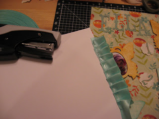
Here's a photo so you can see my ribbon pleating in progress.  I added pleated ribbon to the bottom of my layout by using a sturdy piece of cardstock because I wanted to hide my staples-- although you could easily staple right on your project for a different look.  I folded the ribbon over on itself to create the first pleat, adding a staple with my Tim Holtz Mini Attacher (love, love, love the tiny staples!).  If you don't have this tool, you must add it to your stash!  They are located in the store in the tool area near the other Tim Holtz tools.  Then I created another pleat, stapled and kept repeating until my pleats were well, com-pleat (sorry, I couldn't resist the pun!).  I then glued my cardstock to the back of my project so the pleats peeked out from the bottom.  Super easy!  See bottom of post for a photo of the completed (I resisted the pun here) look!

On this same project, I used the same 1" Satin ribbon and made a gathered ribbon flower.  This is easy also but to create you'll have to dig out a needle and thread. 

I chose a matching color thread, tied a knot at one end of my thread and stitched a running stitch along one side of my ribbon.  I know, I can't sew straight or even stitches-- I'm a little embarrassed to show you my terrible stitching but this just demonstrates that anyone that can thread a needle can do this! 

Once you've stitched all the way through your ribbon piece (mine was about 14 inches), hold the end of the thread opposite your knot and start pushing your ribbon down to gather it by the knot. 


Then I held it in place and stitched a few stitches through the center of the flower to hold it together and then knotted my ribbon to tie it off.  You can then move it around to shape it how you want it.  You might also try taking a short cut and use wired ribbon.  This saves you from stitching-- just secure the wire on one end of your ribbon so you don't pull it out of the ribbon and start scrunching your ribbon down the ribbon on one side.  Once fully scrunched you can twist the two ends of the wire together to secure. 

And here's my completed layout with both ribbon techniques...
Get out your ribbon and have some fun!


Tuesday, April 12, 2011

Wednesday Make & Take 04-13-11


Supplies Needed:


  • 2 Webster’s Pages Celebration Bay, 12W x 12L

  • 2 Webster’s Pages Captain’s Notes, cut two rectangles 5¼W x 12 L, cut two squares 6¾W x 6L

  • 1 Webster’s Pages Boardwalk, cut one rectangle 3W x 11½L, cut one rectangle 2¼W x 11½L

  • 1 gray cardstock, cut two photo mats 4¼W x 6¼L and one photo mat 5¼W x 7¼L

  • 1 yard of the yellow flower ribbon

  • 2 KaiserCraft Flourishes – one classic champagne and one classis pearl

  • 1 set of Webster’s Pages fabric tickets

  • 1 package of velvet hydrangeas – cream

Additional Guidance: Stitching: use sewing machine to add stitching. If you do not have a sewing machine, use a white pen or stamp to add stitching detail. Flourishes: cut each package in half and layout according to picture. Chalk: add chalking or distress ink to edges of paper for additional coloring. Free Element: the dragonfly charm and ribbon bow.


Drivin in My Car

This was a fun "tag" to do. I used the fantastic new THoltz alterations, Jalopy die cut to cut both chipboard & DT kit paper. I used his masks for the word car & than colored using distress stains. If you haven't tried these - they are very fun & versatile. After drying add some stamping with multiple images in ink & acrylic paint. I stamped the vintage gentleman & cut them out placing them in the windows-note the driver is the skeleton (this cracks me up every time). Next I stamped the "ticket to ride"- get it? It was distressed & attached with the memo pin. The metal sprockets were stamped with stazon & attached with brads. The floral metal is painted with acrylic dabbers & bent to look more dimensional. Finally I outlined the word car as it was a tad washed out. I plan to use this on a scrapbook page. Enjoy!
Supplies:
Tim Holtz Alterations die by Sizzix
THoltz Stamps by Stampers Anon.
Distress Stains & dabbers by Ranger
Metal & mask by Advantus
Acrylic paint by DecoArt


Monday, April 11, 2011

Play Hard


The page map this month was the inspiration behind this layout.


I wanted to use the orange paper for the title and photo mat in my layout but the color was clashing a bit with the DS in the picture. To solve the problem I used a bit of Fired Brick Distress ink to add a red tint to the orange paper. I love the results. The ink made the already bold title stand out and it also picked up the texture in this paper.


I had two large photos and wanted to use both of them so I matted the top photo leaving an extra inch or so on the top edge of the mat. I then folded this end of the mat under and attached it to the page to make a hinge. The top photo is lifted to reveal the journaling as well as another photo.

Sunday, April 10, 2011

Ahhh Serenity

This layout using My Mind's Eye paper is perfect for tropical sunset/sunrise pictures. This was a sunrise shot that is one of my favorites from VA beach (not as tropical but it was nice in July!). I added lots of flowers to pull color from the papers. This is an easy technique to use whenever you need to bring out colors. I also used a flower making technique offered by our own Lisa from the Design Team. I bet if we twist her arm, she will offer the class again! We made the flower on the left and added lots of glitter. I held on to this flower sure that I would find the perfect home for it and I did! Enjoy!

Saturday, April 9, 2011

Downtown Dallas by Esther


The colors in this line were good for combining with the pictures of skylines in Dallas' eclectic skyline. The red horse of the Mobil/Magnolia Building is historical while the newer sky towers are modern. The dark brown dotted Bo-Bunny was used for the base of this page map which let the pictures pop. Torn pieces of Little Lady cardstock were used to bring interest across the bottom.

Circles of Joy's crocheted pattern are used as accents in three areas. Chantilly Lace rust colored cardstock gives a background for title and . The journaling printed on white cardstock. The title was cut from the pattern Joy. Lace ribbon by Prima and Basic Grey buttons bring more color. Glitz is provided with the orange stones. ScrapbooksPlus has a great selection of stones you can see when you go through the front door. They make the finished layout more finished.

Friday, April 8, 2011

Carefree Day & Remember


Looking for vibrant, cheerful and fun summer paper and embellishments? If so, head to Scrapbooks Plus and check out this month’s Design Team featured collection. The Mabel line of papers and embellishments from My Mind's Eye's Stella Rose are BEAUTIFUL! The line has a colorful variety of double-sided papers and dozens of matching embellishments to choose from. I enjoyed mixing and matching these items to create just the right page to highlight my pictures.

I chose to use this collection to highlight several Alaska pictures. This past May, my husband and I took an Alaskan cruise. It was an awesome vacation; we loved the Alaskan landscape, as well as the cruise itself. I’ve been looking forward to scrapbooking this trip, but just haven’t had the time to start. The Mabel line was just perfect for my pictures; and now that I’ve started, I can’t wait to finish scrapbooking my trip!

Materials: Patterned Paper: Mabel – Play Damask, Love Letters, Little Lady Fine Flowers, Joy Woodgrain and BoBunny – Coffee Dot; Solid Paper: Bazzill; Flourishes: KaiserCraft; Ribbon: May Arts; Lace: Prima; Embellishments: My Mind’s Eye – Decorative Brads and Hattie Buddies Layered Chipboard; Tim Holtz – Muse Tokens; Flowers: Petaloo, Prima and KaiserCraft

I also chalked the edges of my paper and picture mats and added a bit of machine stitching.

TFL, Erica