Friday, August 31, 2012

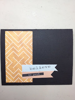
Clippings Easy Card

I love adding black to my layouts! It adds a simple elegance that is hard to find.

This easy card uses a strip of paper - scraps really from the Clippings collection. I inked the orange a bit but its hard to tell from here.

I then cut out one of the journal prompts/sayings from the collection pack - Believe in you and there you have an instant inspirational card.

I cant wait to send this one out to one of my friends!

Thursday, August 30, 2012

Sewing Themed Card

Since my sister is a seamstress, I tend to buy scrapbooking supplies that have a sewing theme but then don't use them.  The Handmade Quilt paper of the Clippings Line seemed the perfect paper to make use of these.   I combined the paper and its matching buttons, which look like spools, with some stamps I had and presto a sewing themed card. 
 
I used some white cardstock for the card.  For accents, I used Handmade Quilt and Cotton Dress papers.  I cut a message box using a Tim Holtz  Sizzix Mover & Shaper Styled Label die.   Inside I used Technique Tuesday border stamps to add buttons and stitches to border the message.   The message and border were stamped with Black Stazon ink and the some of the pieces were inked with Forest Moss Distress ink. 

Wednesday, August 29, 2012

Wednesday Make & Take – August 29, 2012


Patterned Paper
  • 2 SPL-105 – cut a 12”Lx12”W square; 12”Lx1”W rectangle; 9”Lx4”W rectangle  
  • 1 SPL-106 – cut a 11”Lx11”W square; 10”Lx1/2”W rectangle
  • 1 SPL-104 – cut a 12x”Lx1/2”W rectangle; 10”Lx1½”W rectangle; 2 6”Lx4W” rectangles (photo mats)
  • 2 SPL-103 – cut a 7”Lx9”W square; 9”Lx3”W rectangle; 2 12”Lx2”W rectangles; 12”Lx8W” rectangle
  • 2 SPL-108 – cut a 11”Lx3W” rectangle; 10”Lx2”W rectangle; 10”Lx2½”W rectangle; 2 12”Lx1”W rectangles; 2 12”Lx2”W rectangles   
  • 1 PB-30019 – cut a 7”Lx5”W rectangle (photo mat); 10”Lx5”W rectangle

Embellishments
  • 1 beach chipboard title
  • 1 anchor wooden flourish
  • 1 pack of SPL-195 dimensional stickers
  • Free Element: scalloped circle

Thankful


Instead of ‘seeing stars’ I started seeing circles and decided to highlight this shape as it seemed to be prevalent throughout the Clippings Collection. Since I only used a small section of the Drafting Table patterned paper I cut out several circles from the remnant and arranged them along the left side of my layout. In addition, I used a portion of the Typewriter patterned paper, the circle shaped garland, and wooden buttons to ensure I continued the circle theme.

I also added a V shape to a number of the patterned papers, as well as to the Cotton Dress patterned paper (background). I simply cut a V shape out of chipboard and traced this shape onto each piece of paper. I then cut the V shape out and distressed the edges using a distressing tool. Often times the distressing tool adds a grunge look to your layout. Since I was scrapping a girly picture I decided to add lace and rhinestones to balance out the distressed, grunge look and give it a softer, feminine look.


I hope you’ve enjoyed all of the DT inspiration this month there were so many fabulous layouts, cards and altered items.

Thanks for looking, enjoy!
Erica 

Tuesday, August 28, 2012

Putting a Layout Together


This was a fun layout to put together. I had a bunch of photos taken with my phone of my daughter and her latest obsession - American Girl dolls. I started out with five photos, and narrowed them down to these three.

When I start working on a layout, I'll place my background papers on my workspace  with my photos, then lay patterned paper down under the photo as I decide which papers I'm going to use. Once I have a good idea of a sketch I cut my paper.

I chose these papers because I originally wanted to use the letters on the left to help me spell out a title (American by the "A" and Girl by the "G"), although that changed by the time I was finished with the layout.

Once I've cut the accent papers I lay everything out with my photos to decide final placement before adhering everything. Then it's time to move on to accents, small embellishments, and title. The last thing I do is journaling.

I added a bit of washi tape and some old doily rub ons that were laying around to complete the layout.

If you look closely, there's also a few smaller white rub ons - "happy birthday" on the cluster over a doily, on the small bottom photo, and next to the "worth every penny" chipboard. I originally didn't intend to put a rub-on on the photo - that stemmed from an "embellishment opportunity" when my rub-on sheet accidentally touch the photo and a bit stuck. The white "thank you" luckily covered up my mistake.
Sunday, August 26, 2012

Star Wars Weekends!

My daughter's family is all about Disney!  They traveled to Disney World this past June for Star Wars Weekends and my Grandson Trey loved every minute of it!  Of course I had to make a layout for my family album!  The Basic Grey Clippings collection was perfect for documenting this!  The colors and patterns were perfect!  Be sure to stop by ScrapbooksPlus and grab this easy-to-work-with collection for your crafting needs!

Saturday, August 25, 2012

Clippings two page layout


If you're wondering, I chose this layout for Megan - our Design Team leader. She pointed out that I use tons of softball/baseball photos on my layouts. This time, I used football camp!

This layout was super easy once you figure out the pattern. I am an easy person and want my layouts to be easy.

I cut out the strips and separated the fillers inside. Added contrasting browns and greens and joila! A layout is born! Hope you have a chance to stop by the store and see the amazing layouts by the DT members!

Friday, August 24, 2012

Happy

I think every month I rave about how much I LOVE the collection the Scrapbooks Plus Design Team selected to work with. And, this month is no different. I absolutely love Basic Grey's Clipping Collection! ;) Talk about versatile; using this collection I scrapped pictures from a high school graduation party and thanksgiving. Some of you are probably thinking the Clipping Collection doesn't even have a graduation or thanksgiving feel or look. And, you're right; however, non-themed collections give you the opportunity to be creative, to think outside the box, and to use pictures you love but haven't had the chance to scrapbook.

Besides being extremely versatile this collection features a number of fun elements including garland, wooden buttons, and snippets. I enjoyed mixing and matching all of these embellishments, not to mention cutting out a number of elements from the patterned paper to add detail to my layout. 


However, while I LOVE all of the embellishments, my favorite thing about this collection is the typography. The character and appearance of the type adds an interesting art to a layout. As you can see below my layout showcases a number of different typefaces and sizes, be it lettering or print on the garland, paper, brads or stickers. Bottom line: I just ADORE everything about this collection! ;)


Paper
Basic Grey – clippings

Embellishments
Basic Grey – mixed brads, snippets, garland, wooden buttons
Prima, Petaloo, and Recollections – flowers
Offray – ribbon

Thanks for looking! Enjoy.
Erica 

Thursday, August 23, 2012

French Desserts

Scrapping the pictures from a French cooking class in my French apartment was lots of fun.  And the Basic Grey Clippings line has such variety that this picture doesn't look anything like the other items I made.  This is an easy layout that you could use for a wide variety of pictures.  The flowers of Cotton Dress and the orange dots of Flannel Suit reminded me of a French country kitchen, but they also reminded me of my grandmothers or a little girl.  Moreover, you could simply use four different pieces of paper and have an entire different look.

The background is Trench Coat and the photo mat is from Cotton Dress.   On the right side it is  7 ½” x 11 and on the left 7 ½” x 5 ½”.  I added a strip of Flannel Suit on the bottom and top of the photo mat, indenting it about 1” from each side.  (Prior to applying I inked it with Mango Mai Tai Powder Puff Ink.)  I scalloped a 2” x 12” of Cotton Dress and glued the bottom to a Bazzill White Perfectly Pleated Strip.  I glued this on top of the Flannel Suit Strip.   You can either cut for right and left before you glue down or afterwards.  Then figure out what pictures fit in the space that you had.  As you can see I cut some of them to new sizes.  I had one to fit inside the Chipboard frame that came in the Printed Chipboard and Alpha set.   I used the unique Clippings Sticker Titles shaped like tags and tied with white/tan twine to fill in some of the space between my pictures.

For title, I used letters cut with the Tim Holtz alpha set.  I stamped them with a stamp of tiny French words and the Mai Tai ink.  For my journaling, I used a piece of Typewriter and brown ink.  Since we made, four desserts, I used this as an opportunity to use numbers made the same as the title.  I framed the journaling piece with Cotton Dress.  I added strips of Cotton Dress and Flannel Suit on the left side.  (They look angled but I used straight strips and glued at an angle.)  I added a brad from the Mixed Brad set and a sticker from the Sticker Title set for emphasis.

Tuesday, August 21, 2012

Yard Work

Wow...what a fun line! The new Basic Grey Clippings line is a MUST HAVE!! There is so much that can be done with this line and the colors are awesome!  Last spring, my grandson Jon began  helping out his parents with the yard.  The bright papers brought out the bright colors in this photo, which really made the page.  As always, Basic Grey offers some great embellishments to add lots of interest to any layout!

Sunday, August 19, 2012

Banner Love

I really loved all the papers and embellishments in this month's Basic Grey kit. I had a hard time choosing what to use, as I wanted to use about everything. My favorite was the Confetti Garland paper. I had to use all the banners (and buy another sheet while I was at it).

The garlands & banners are double-sided which is a huge plus!


In the above layout I used the largest banner from the page, choosing the more colorful side.

And below, a smaller banner on another layout. Don't feel shy about cutting it up! I used just five small flags at the top of this layout.


TIP:  Here's a great tip for using these. Carefully punch out around the edges of each flag. Once that's done you'll notice that the stitching goes through the banners AND the paper in between. You can either very carefully tear the paper from each side of the stitch (put your fingers right next to the stitch to tear) or cut just alongside the stitch with a pair of small scissors. You don't want to cut through the thread if you want to keep the banners attached to each other.

Friday, August 17, 2012

Copic Christmas Card Class

Join us for a quick and easy Copic Christmas class on August 30th at 11am.  The class is only 1 hour and you'll leave with several colored images and enough paper to create 2 each of these cards!  This class if for those that are Copic 'pros' and those that have never picked up a marker before.  If you are looking to try these fun, vibrant markers this is a great chance to do just that!

Space is limited so call the store today to register!

Thursday, August 16, 2012

Wonders of Water- Port Discovery

We had a wonderful time visiting Port Discovery Children's Museum in MD last summer.   My kids especially loved the Wonders of Waters exhibit.  It was kind of tricky taking photos because the place was so crowded and the lighting was... well, yuck.  I did get photos of all of the fun they had there and wanted to use several of the photos on my LO, afterall scrapbooking for me isn't just about art and design but also about capturing the moments of my children's lives that they will want to remember.  So sometimes I have to scrap odd topics with less than perfect pictures.

 So how do you embellish a LO about a trip to a children's museum?  I decided to use circles layered all over the layout to bring in the different patterned papers and splashes of color, no pun intended. The gears work great here too.  I do have to say that the Tim Holts gear dies I have are much more versatile than I ever thought they would be.


 In this photo I was able to get a picture of my kids (and some other random kid) playing with the pipes.  And in the background you can see my friend's daughter using the water hose to play the instruments.  I wanted the viewer to see both of my subjects so I used circles to draw the eye to both my kids in the foreground and their friend in the upper right corner.


I used one of the flag banners from the Basic Gray Clippings collection.  I love these banners! I think it was the perfect addition to this layout.  It looks really good paired with the gears in the corner. 

The journaling card in the lower left corner made it easy to add color to the layout while telling the story.  I loved these journaling cards, called Snippet and even have a few that I saved for my stash for future journaling use.  I have gotten pretty good at journaling but sometimes I still get stumped so I like to collect things like this to help me when I get stuck. 

Wednesday, August 15, 2012

Wednesday Make & Take – August 15, 2012


Patterned Paper
  • 2 My Mind’s Eye, Miss Caroline, Howdy Doody, ‘Lovely’ Mums Paper, cut a 12”Lx12”W square; 7”Lx5”W rectangle (to be adhered 3” from L and B); 9”Lx5”W rectangle (to be adhered 1½” from L and B)  
  • 1 My Mind’s Eye, Miss Caroline, Howdy Doody, ‘Happy’ Beach Stripe Paper, cut a 12”Lx12”W square
  • 2 My Mind’s Eye, Miss Caroline, Howdy Doody, ‘Happy’ Decorate Paper, cut a 10”Lx10”W square (to be adhered 1” from T, B, L and R); ¾” perimeter of 12”Lx12”W paper (to be adhered ¼” from R, L, T, and B); 12”Lx3½”W rectangle (to be adhered 5” from R and flush with B and T)
  • 2 My Mind’s Eye, Miss Caroline, Howdy Doody, ‘Lovely’ Wallpaper Paper, cut a 12”Lx12”w square; 10”Lx5”W rectangle (to be adhered 2” from L and R and 1” from T and B)
  • 2 My Mind’s Eye, Miss Caroline, Howdy Doody, ‘Like’ Wild Flower Paper, cut a 8¾”Lx3”W rectangle (to be adhered 1” from R and 2” from B); 10”Lx1½”W rectangle (to be adhered ½” from R and 2½” from B); 6” diameter circle; 10”Lx1¾”W rectangle (to be adhered 2¼” from L and 1¼” from B)
  • 1 My Mind’s Eye, Miss Caroline, Howdy Doody, ‘Baby’ Lacey Paper, cut 2 7”Lx1”W strips (use border punch to add decorative trim along photo mat); 10½”Lx 2¼”W rectangle (to be adhered 2” from L and 1”B); 12”Lx¾”W rectangle (to be adhere 2¾” from B and flush with R and L); 12”Lx½”W rectangle (to be adhered 3” from L and flush with T and B)

Embellishments
  • 1 ‘Baby’ Journal Card (adhere as shown)
  • 1 Pack of ‘Happy’ Rub-on Transfers (adhere as shown)
  • 1 ‘Beautiful’ Title
  • 1 Pack of ‘Beautiful’ Layered Stickers
  • 1 ‘Like’ Title
  • Free Element: gold ribbon

Tuesday, August 14, 2012

Fast, Mini Album

Page of Mini-Album: Note "Family" Tag on Side
On the 12th, I blogged about the ScrapFile I made for the family reunion and promised to write about how to make the little mini-photo album I included on the inside. 

 To make this album, you need only one piece of Chronicle paper.  (Do not cut label trim off.)   Cut the  Chronicle paper in half vertically.  (So you have two pieces 6” x 12” plus about ½” of trim.)  Put the trim at the bottom and score 4” from the top.  (Choose which side you want to be the cover of your album before you score and score accordingly.)  Score the opposite direction 4” further.  (You should now have a three-part accordion with the label at the bottom.) Score the opposite direction where the label joins the paper.  With the 2nd page, put the label at the top, and affix to 1st piece of paper so that the decorated portion of each label shows at the bottom or top of one page.    (This sounds complicated, but when you do it you’ll see it is quite easy.)  Then continue scoring and folding every 4.”

Cover of Mini-Album

When you finish, you will have 12 surfaces to decorate, including front and back.  Since I wanted something that went with my folder layout , I stamped the “cover” with the Tim Holtz “Generations” stamp using Fired Brick Distress Ink. 
Page of Mini-Album: Decorated with Stickers & Garland

I added a picture on the bottom of the cover and at least one on each of the remaining 11 pages.  I expressed appropriate sentiments with stamped messages.  I decorated the pages with tabs, labels  and spools from the Elements Sticker set and a bit of Garland that I had left over. 

That’s all there is to it.  I put the photo album in the pocket of the ScrapFile.  These would also be great to do as a little photo album to share some photos and say thank you.  And they are a great way to use left over embellishments. 

Monday, August 13, 2012

More Basic Grey!

This was a super simple card to make with Basic Grey's Clippings.  I cut half of the above paper- paper bag colored with red outline flowers paper lengthwise.  I eyeballed where to score based on a very slight overlap of my upper flap.  I used a 1 inch circle punch and red eyelets to create my closure- finished off with red and white twine.    I cut out another flower from elsewhere on the same paper and popped it up on the front of my card to add some interest.

The inside is made up of various cuts of left over Clippings papers.  Some are cut with my Cricut and some are punched.  The Thanks label is from the Clippings coordinating stickers.  What can you create with this fun paper line?

Sunday, August 12, 2012

Scrap Folders for Special Events

Not enough time to scrapbook all the pictures you want.  Scrap Folders may be jsut what you need.  I was excited to try this  new technique that I'd been reading about.  They are a lot like Scrapbooks except instead of many pages for a single event, you make a folder per event and include lots of places to store extra pictures and memorabilia.  I chose to make my first attempt with the Basic Grey Clippings line and pictures from last year’s family reunion.  I think it turned out pretty well.  And in addition, to what you see in the pictures, I have a photo album in a pocket, two files for extra stuff and a CD with all the pictures in a pocket. 

You start with a basic file folder -- like the ones you use for normal filing.  You can use one and decorate both sides.  I used two to make it a little sturdier and to allow me to use brads. (Although I didn’t end up using any.) When you use two, you make one the inside and one the outside and then glue together. 

I figured out how I wanted the inside of the folder to look and that I wanted two pockets – one for a photo CD and one to hold a small photo album and extra memorabilia.  When I had this figured out, I cut out the pieces of paper to fit the folders.  It is not necessary to do this exactly as you can trim afer gluing down.   On the bottom left side, I used two pieces of Novella, so that the pocket totally blends into the page.  For the right pocket (for a photo CD)  I cut out a design out of the Flannel Suit paper and turned it upside down. I stitched the two pockets to the paper..  (If you’re not into sewing, it would work just as well to attach the paper forming the pocket with RedScor Tape or other strong tape.)  Before covering the sides, I put a strip down the center with crease where needed for folder to fold.  Then I put the paper (with pockets on each side) and affixed a strip along the right edge.  I affixed all of these with a glue stick and a brayer.   I needed to trim some of the edges a little.  Also, I inked various pieces and edges of file folders with Fired Brick, Vintage Photo and Peeled Paint Distress Ink.

The  “Generations” you see in the photo is a small hoto album.  (I’ll blog on how to make it on the 14th.)  I used a large letter “K” to represent the family name.   I love these letters and you  get them in a few different colors at ScrapbooksPlus.  They add a lot and are very inexpensive.    

I used a variety of Clippings items to decorate the inside, the outside and the photo album, including Sticker Titles, Stickers Elements, Printed Chipboard and Alphas, and Garland.  Just get a pack of each and you’ll have plenty of embellishments for a few files.  (I cut the “2011” from the Typewriter paper with a small circle punch.)  I added a picture and mat to the plain black box on the CD pocket and using those great Clippings Alpha letters I added title.  The banner at the top is held on with Tim Holtz Muse Tokens.  

Then I covered the outside of the other folder using Gazette and Typewriter.   I knew from the beginning that I wanted to spell something with the letters from the 5th Avenue paper.  So I spelled “Family.” To make the letters a little more interesting.  After distressing the edges of each letter, I embossed the edges with Stampendous Aged Taupe Embossing Powder.   I “inked” the edges with VersaMark.  Like with inking I didn’t make it even, I simply rubbed the edges with the VersaMarc so it is thicker in some places than others.  I then sprinkled the edges with the embossing powder and heat embossed.  This embossing powder includes a variety of granules so it can create interesting textures.   (I just learned that with this embossing powder it is better if you heat from the bottom.   I just heated from the top as usual.  Try it both ways and see which you like best. ) I also used it to emboss the word “Photographs” on the cover.  I added a picture and some strips along the bottom.  To make it sturdier, I covered the outside with a couple of coats of Modge Podge. Then I added two large Tim Holtz Word Keys.  (Note: Because of the shape of folders, I used you see a good portion of the inside right across the top of the top when closed.)   

Once the outside and inside were done,  I fastened the two folders together along the outer edges.  As a result I have two large areas to store memorabilia, etc. I made two smaller file folders made from Drafting Table paper and the tabs from the Tim Holtz Sizzix On the Edge Folders to keep some additional photos or memorabilia.  You can see tabs in the photo. 

This is one of the most fun projects, I’ve done in a while.  I encourage you to try to make a Scrap Folder for some of your precious memories. 

Saturday, August 11, 2012

Scrap'n Easel

Every once in a while a product will come along and as I use it I know that it is going to change the way I design.


This product has done just that!  Here is how it works.  It is a magnetic easel that can be used on a low angle for designing or a high angle for display.  All of the components of your project can be stuck to the board using magnet (included.)  This helps to speed along the design process because you can stick a paper or embellishment to the LO and it stays put until you move it.  I never realized how much time it took for me to place and replace all of the elements of my layout that accidentally shifted around while I was working.  This past Thursday I finished 6-2page Layouts (12x24 layouts) in one day thanks to the Scrap'n Easel!  6 in one day!!  I have been able to pull off 4 in a day before but 6?  I know it was the Scrap'n Easel that helped me to work quickly and efficiently to get the layouts completed. 


It is such a time saver, and a neck saver.  I can keep cropping for hours without neck pain thanks to the ContainYa Crafts Scrap'n Easel.  It is angled for several reasons.  First, to avoid overhead light glare on your layout which can be very distracting.  Besides, moving left and right trying to get a look at your layout without the glare takes up time.  The angle also helps to minimize neck/ shoulder pain caused by keeping that odd angle of looking directly down while working on layouts and other projects.  The third reason is the glare again but this time it is how the glare effects your photographs.  If you have ever tried to photograph a layout you know it is pretty tricky to get all four sides squared in the picture and avoid glare on your photos.  I mostly just wanted to get the Scrap'n Easel to photograph my layouts.  I had no idea that once I used this product that I would never scrap without it again!  Seriously it is as important to me now as my 12 inch cutter and my ATG gun, can't scrap without it!
  

It is totally portable, you can see in the photo it folds up so it is completely portable.  It is great for crops!  I found another blog post with a really great video demonstrating the easel.  Check it out here.  

Stop by the store and get yours today.  Don't wait, Debbie can't keep them on the shelves.  I couldn't get my hands on one until the 3rd order came in, they go that fast!  If she is out of them Debbie will order one for you so don't worry, you'll get one.  But you might have to wait.


Friday, August 10, 2012

Clippings Single Layout

When in doubt, always go for the patterned paper with patterns already there. It makes scrapbooking that much easier. This sheet from the Clippings Collection is but one of many of those.

The great thing about this collection is that it can be used on any photo/memory. It is not specific to any one theme.

I realized that last weekend when one of our DT members, Meghan, reminded me that I use sports photos in just about any layout/collection. I had no clue I was doing that! I was just using my photos. Regardless, be sure to stop by ScrapbooksPlus for your own Clippings Collection. Debbie has the store stocked with this awesome collection.

Thursday, August 9, 2012

Junk Travel Journal           


I decided to make this journal 7” x 5” in size, large enough for lots of pictures, ephemera, & papers etc.; Basic Greys “Clippings” line is great for a travel journal.  I cut coordinating papers about 8” x 6”; I put adhesive on the chip board and then laid the paper over it.  I used a bone folder to score along the edges of the book board and sanded the excess paper off.  I like this smooth look and it is easy to do and you get nice edges.  I did about nine pages.  I cut out a picture of my niece and added chip board under it for a popped affect and put this on the front of the journal; I added coordinating ephemera from the Basic Grey “Clippings” line.  It gave the journal a cute, casual, let’s see where I am going look, loved it.


Inside the album I covered the pages with additional layers of papers, pictures, and “Clippings” ephemera.  I added pockets for those special event ticket stubs and travel items can be tucked safely into for future viewing.  I loved the coordinating “Handmade” sticker and the folio “this book belongs” die cut; I placed both of these on the back of the book, they were perfect.  Used the scrapbook tiles from the line to spell out “Travel” on the front of the book.  I also punched holes along two of the pages and threaded ribbons through leaving it hang off the top and bottom edge.  If you never did this give it a try, it is easy and looks great.  The chip board I used for this book already had tabs on it, but you can always add tabs by making by hand out of the coordinating papers and sticker sheets that come with the line, you can also die cut some as well.  Use a Japanese screw punch or any other type whole punch that goes through chip board.  I used the Cinch to bind the book and tied lots of ribbons to the coil spine to finish off the “Junk Travel Journal).

Tuesday, August 7, 2012

Rat Pack Themed Layout

I love it when I can design layouts the reflect the essence of my pictures.  Although it wasn't mmediately obvious when I saw the Basic Grey Clippings line, upon review I discovered that the grey herringbone and red houndstooth paper worked well to create a perfect layout for pictures from a Rat Pack-themed party at a famous nightclub in San Fran.

Here’s how to make this page.  Start with a background of Novella.  Add a 5” x 12” piece of Handmade Quilt on the top.  Affix a strip of shiny black ribbon (available at ScrapbooksPlus) where the papers meet.

Cut 6 ¼ ” X 10 ¼ ” piece of white cardstock; print or write message in right bottom corner.  Add two  4” x 6” pictures (one horizontal and one vertical).

To make the sign and the flourish, you use one of my favorite techniques.  Using the Tim Holtz Sizzix Hanging Sign Die cut sign hangar from chipboard.  Cover hangar with VersaMark by pressing into VersaMark pad, emboss with Zing black embossing powder.  The texture created is wonderful.  Put eyelets in holes.  The flourish was cut with the Tim Holtz Mover & Shapers Mini Flourish die.  To make the sign, glue a 5” x 3” piece of Novella to a piece of chipboard. (For this purpose I use a glue stick and even out with brayer.  Because of how you are cutting you need every bit of the paper glued to the chipboard and this is a great way to do it.)  Cut out sign using same die as you used for hangar. Put eyelets in holes.  Affix sign to hangar using Tim Holtz Jump Rings or Clasp Clips.

Put title on sign using alphabet from Printed Chipboard & Alpha Set.  I love this set of alpha for several reasons.  A couple are that they give you lots of letters and even have a apostrophe’s. 

In bottom right and left corners, embellish with  Clippings Brads and Wooden Buttons.  I put Memory Thread in the holes of the buttons.   This set of brads gives you lots of options and the buttons are really fun.

Sunday, August 5, 2012

Clippings from Basic Grey

I love Clippings from Basic Grey.  The line has the look that's so trendy now featuring vintage look library cards, ledger paper, etc.  I can't seem to get enough of this type of look.  I've even picked up a few 'real vintage' ledger papers in thrift stores lately to use in my projects.  But you don't have to scour thrift stores for these finds when you can just head to Scrapbooks Plus and pick up Clippings from Basic Grey!  It was tough to decide what to use for my projects this month because I loved all the paper and all the embellishments!  Usually a few things in the kit 'speak to me' but this month-- they were all yelling at me so I had to choose!! 


I created a one page layout using a page map which I pinned on Pinterest for inspiration.  I used paper garlands and lots of chipboard shapes that coordinate with the Clippings line.  The C and S I used for the title were cut out on my Cricut.  The other letters are from the Clippings chipboard pack.


Friday, August 3, 2012

Making It Your Own


Here's the first layout I made with the Basic Grey kit. I started with the Flannel Suit paper:


If you want, you can use the paper as is, just adding your photo, title and journaling. Or, you can mix it up a bit.

First, I turned the page upside down. I then used a craft knife and carefully cut around part of the edge of the photograph. That allowed me to slide a tag under the edge.

I used Distress Markers and a Tim Holtz water brush to add ink to the edges of some of the printed papers.  To do this I scribbled on my craft mat with the marker, then picked up the ink with the waterbrush. Then I applied the ink to the paper, getting a watery, inked effect.

After my photo, I then added embellishments from the Basic Grey collection, along with some Thickers for a title and a leftover Dear Lizzy cloud.

Wednesday, August 1, 2012

It's August!

August is here!  Is anyone else feeling like summer is going by way too fast?  Well, a new month means a new featured product line at ScrapbooksPlus and this Month the Design Team is featuring Clippings, by Basic Grey.


The inspiration behind this collection is the mystery novel.  The patterns and colors in this collection include type writer keys, herringbone, deep red lipstick, and drafting paper. 


The embellishments are even more inspiring with stickers, sewn banners and 
mini envelops to name a few.  


And to top it all off Clippings is complete with lettering perfect for making a random note!  


 What you will do with these papers is an even bigger mystery because the possibilities are endless.  From school days layouts to travel pages these papers will inspire you to get those memories scrapped.  Basic Grey has done a great job designing this collection.  Now what will you create with it?

Wednesday Make and Take

Patterned Paper
  • 1 Webster’s Pages, Girl Land Apron Strings Paper, 12Lx12W
  • 1 Webster’s Pages, Girl Land Dress Up Paper, 12Lx12W (cut around dress, flowers, etc. – as shown)
  • 1 Webster’s Pages, Girl Land Retail Therapy Paper, cut 2 12Lx1W rectangles, adhere 1” from bottom (do not place adhesive all along the bottom as you will need to place the brown scalloped circle along the bottom); cut tags from remaining paper and layer as shown
  • 1 Webster’s Pages, Girl Land Bubbly Paper, cut 2 12Lx1W rectangles, adhere 2½” from bottom (do not place adhesive all along the bottom as you will need to place the green scalloped circle along the bottom)
  • 1 Webster’s Pages, Girl Land Shopping Spree Paper, cut 2 12Lx6W rectangles, adhere 3” from bottom
  • 1 Webster’s Pages, Girl Land Carefree Paper, cut brown, green, blue and pink scalloped circles and adhere as shown
  • 1 Webster’s Pages, Girl Land Jump Rope Paper, cut 4 4Lx3W rectangle photo mats, adhere the 1st photo mat 3½” from left and 4½” from bottom; photo mats 2, 3 and 4 should be ½” apart with the 4th photo mat ending 7” from the right

Embellishments
  • 1 Girl Land Sentiments (adhere as shown)
  • 1 Girl Land Tags & Prompts (adhere as shown)
Free Element: silver key

Enjoy!
Erica