Friday, September 30, 2011

Creating More Journaling Space

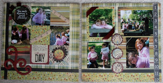
Sometimes things fall into place when you just go with the flow.  I was struggling with the school theme of this month’s papers.  I really liked the papers but I didn’t have any school pictures to scrapbook.  After much thought, I decided that I would use the paper with books and just use a title about learning, such as “Learning Outside the Classroom” and started to work on a page with pictures from a August trip to Springfield, Illinois.  As I was working on the page it dawned on me that the paper fit perfectly – our favorite place was the Lincoln Presidential Library and Museum.  No need for special title.  Simply the Lincoln Presidential Library and Museum. 

For the most part the two-page layout is fairly straight-forward so I’ll just highlight a few things. I used the Life Documented Flash Cards for journaling.  One titled “Life Documented” for the place, city  and date.   I used Cosmo Cricket Tiny Type for the actual words.  I love using these as they are small enough they don’t take up too much space and I don’t have to worry about handwriting.  To list the things we saw in Springfield, I used a flash card with numbers.  These Life Documented Flash Cards have many uses.  I urge you to get a page or two before they are gone.

However, I still did not have enough space to tell the story of the day and display all the pictures that I wanted so I created a journaling flap. To make the flap, I used a plain piece of cardstock for the page base.  On the right side, I affixed strips of Study Hall & Letterman’s Jacket.  I then attached a 12” x 9 3/4” piece of the Fencing paper on the left side of the cardstock, affixing the top, bottom and left edge.  On the right edge, I affixed the piece of the Fencing paper only 2” from top and bottom, thus creating a flap in which to insert the journaling.  

For the journaling, I typed it on a piece of Oxford Dean’s List.  I folded it in half so it would be a little more durable and trimmed to size needed.  You could of course add more pictures on this.  I made two tabs for the journaling page using two pieces of ribbon (also folded in half).  I affixed these with Tim Holtz snaps.  You might prefer to use your stapler as the stamps are a little thick when inside the flap.  The ribbon shows when the flaps inserted.  This ribbon came from ScrapbooksPlus and is so elegant.  With other papers, twine would work well also.  That’s how simple it is to make extra space for that precious journaling of special moments.

I embellished the page with pencil stickers and Tim Holtz Idea-ology philosophy tags.   I used ones to express meaning.  I threaded a double string of brown floss through holes and tied.  (I used threaded needle to get the thread in the holes.) I affixed with Glossy Accents.  As usual,  I inked things liberally.  For this page, I used Black Soot Distress Ink.

Thursday, September 29, 2011

It's all about splattering!

For this month's layouts I actually designed my pages without pictures.  I don't usually do that but I was at a crop and didn't have photos, so I just decided to give it a try.  I really love the colors of the Oxford line by Basic Grey~ have to say it is some of my favorite color combinations!  I wanted to give the paper an "aged/distressed" look so I went to my new favorite technique.
My latest go to technique is paint splattering~ I think I enjoy just flinging the paint/ink around!  I use a bunch of different ways to splatter paint, but one of my favorites is to use an eyedropper- it works well for the bigger splotches. If I want smaller splotches I will dip the handle of a paint brush is the paint/ink and do it that way.  I like the aged/distressed look it gives the paper.

Enjoy!
Lisa

Wednesday, September 28, 2011

Showcasing Photos


I always end up with lots of vacation photos. Two-page layouts are great when you have many pictures you want to scrap.

But sometimes you have a great photo (or two) that you really want to showcase. Solution? Blow it up!

I printed my left photo as an 8x10, centering it on the left side of my layout (at the top...), adding a block of paper, a border strip and title under the photo. The other half of my layout uses another block of paper to anchor the remaining 4x6 photos and journaling card.

Wednesday's Layout for Fall Days


This week's layout is made with Best Creation's Hello Fall cardstocks and chipboard shapes. I added a dotted pattern from Lily Bee Design.

When September is coming to an end we get ready for fall, the leaves falling and pumpkins. Whether you carve the pumpkin or just display it whole, it represents fall. ScrapbooksPlus has the right papers to give you a good layout for fall and the pumpkins. Check out the rich colors and patterns at ScrapbooksPlus.

Tuesday, September 27, 2011

Art Journal Club!


This is the page I designed for last months Art Journal Club. We learnt about gelatos & the zillion ways to use them. The funnest part of class for me was to go around & see what the other gals had come up with for their pages. That was the beauty of the class-you could copy my design or come up with your own & we have some seriously talented girls!

Join us this month as we jump into distress stains and the fabulously talented Dyan Reavely & her funky cool stamps. There is still time to sign up. Class is tomorrow at 6-9pm or Sunday 11-2pm. just tell them Karen sent you!

Monday, September 26, 2011

Apple card by Esther


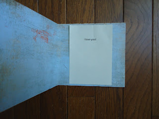
The masculine patterns in this Basic Grey kit were perfect for making cards meant for a man. The plaid pattern of Debate Team was backed with the University blue lining inside. I glued them together after cutting and scoring each one. The outside was scored smaller to show the blue lining. A chipboard apple die was colored with Copic markers and mounted on top of another masculine looking pattern, Dean's List. Lettering was done with a labeler and red tape. Inside the ivory sheet bears the message of love.

Sunday, September 25, 2011

'If only I had another E...'

I'm sure I'm not the only scrapbooker who has heard themselves using this phrase - 'if only I had another (insert missing letter)'. I often find myself missing a critical letter when attempting to spell a card or layout title. However, I recently read an article about reusing, recycling, and renewing scrapbooking products. One suggestion was to combine letters and colors to complete your title. I tried this on my 'thank you' card and was very happy with the result. So, instead of pitching your letters away because your missing an 'E'(or whatever the letter might be) try combining multiple colors to complete your title.

Saturday, September 24, 2011

Just loving the paper

Do you ever have a paper line that you just love the paper?  I really enjoyed this month's paper sooo much!  I really loved this quote on the Simple Stories paper- so I used it as the center of my pagemap layout. At first I tired to find some pictures that would work with the layout, but as I sat looking at it, I just fell in love with the paper. So I decided instead of putting pictures on the layout  I am going to put this layout in a shadow box frame and hang it in my craft room. 

Enjoy!
Lisa

Friday, September 23, 2011

Basic Grey Papers & Flowers for Special Memory

I had a special picture of my cousins from our annual family reunion.  As with all pictures with a lot of people, it is hard to know what to do with them.  I know from trying to sort out old pictures of my Mom’s that it is important to name the people because even though today we may be able to identify them all, 50 years from now people will say who is that?

Rather than simply putting boring labels at the bottom, I decided to put each person’s name on a flower stem. (The stems were cut from Oxford Deans List. The person’s name was written on it with a pen.)  I then used flowers (made in a variety of ways) to identify to which family each person belonged and where in the picture they are.  Let me explain.

My sister and I are flowers made from Tim Holtz Sizzix Tattered Flower die cut from Basic Grey paper.   (Both flowers are the same; the die contains four flowers.)  My Uncle Dick’s kids are also represented by flowers made using the Tim Holtz Sizzix Tattered Flower die, but I used a different paper and flower.   All my Aunt Joann’s kids are all Bazzill Paper Flowers 1.5 Primula French Vanilla.  (These flowers are great and ScrapbooksPlus has them in  lots of fun colors and different sizes.) My Aunt Marilyn’s kids are all blue BoBunny buttons and Uncle Tom’s are tan BoBunny Buttons.   (Smaller buttons the centers of  the flowers.)  I tied a knot in each of the buttons with blue sewing floss.  The flowers are placed vertically and horizontally to correspond to where the person is in the picture.  For example, my cousin Tommy is in the back row and the furthest to the left so his flower is one of the tallest and on the left side of the page.
I also used symbolism to enhance the meaning of the page.   For example, the #19 represents the total number of cousins.  It is from the Pink Paislee Daily Junque Mini Note & Label set, which contains 43 embellishments.  l  also used two cards from this set on the right side to provide balance.  In the upper right, I used a Kaisercraft Wood Flourishes leave to  provide two leaves to represent the two cousins who are no longer with us.  

This page was a lot of fun to make and will provide special memoires for years to come.

Thursday, September 22, 2011

For the Record by Esther


The Getty Museum visits gave us great memories. The blues and textures of Basic Grey's University were perfect for the colors in the pictures. A strip of Dean's List was used in the center for mounting the pictures. Each is mounted on the dark side of Letterman's Jacket to give depth. A tag from Simple Stories was used as the title and as a journaling area. To the left side is a decorative sticker to balance the darker areas. Sometimes, simple is better. Let the pictures speak.

Wednesday, September 21, 2011

Wednesday Layout


This week's layout used the Velvet Ensemble collection from Kaisercraft. It's starting to feel like fall and that's what these papers reminded me of - luscious brown, teal and a hint of green.

While I've got three 4x6 photos on here, you could easily add another photo, or switch around the sizes and use quite a few 3.5x5 photos. 

last chance sign ups!


Thursday the 22nd is the last day to sign up for Sundays A Time to Travel class. There is a lot of kitting that has to be done for this class so that is as late as I can go. If you still want to take this beautiful Graphic 45 envelope album there is one more date -October 4th from 10:30-3:30. The deadline for sign ups for that is the 1st of October. I hope to see you there!

Now for another DTeam layout! This was my page map design & I kept it super simple. I took a lot of fun IPhone Hipstamatic photos while on vacation & this was the perfect layout to use them on as they are square! This was basically cute, stamp paste. I great way to get 5 photos on 1 page. Plus it gave me the excuse to use my cute scaredy cat stamp from Stampotique!

Tuesday, September 20, 2011

Oxford 2 Page Layout

I have had these pictures for quite some time. Do you have photos like that... that lingers around waiting for the perfect paper? I love how the Oxford Collection from Basic Grey brings it all together!

This is my little boy playing with the computer and just being inquisitive with that wonderful smile.

I love how the accu cut dies from Scrapbooks Plus adds just the right touch to any layout.

Stop by the store and find out how you can also use these great dies to add dimension to your layouts.

Monday, September 19, 2011

Pagemap


For this month's pagemap, I decided to use a few iPhone photos taken with the Hipstamatic app. This application gives you square photos - and hey, our pagemap called for squares!

In addition to my three photos, I added six squares of different patterns from this month's kit. I roughed up, inked and bent the edges of each piece. For my background, I used a piece of Tim Holtz's craft resist paper, and liberally spread Claudine Hellmuth's Studio paint around the middle of the page before adding my grouping.

A couple small embellies were added, including some old clock parts from I kit I bought ages ago, then misplaced.... (well, enough of it). I used Distress Stains to color these fabric Thickers to match my layout - super easy to do!

Sunday, September 18, 2011

Page map and the rest of the story!

Using the Design Team page map this month I crated this layout.  I had some really great photos from my daughter's school trip that I also wanted to use, so I created a second layout to go with the given page map! 


One of the fun things I've pulled out of my scrapbooking tool stash recently is my Fiskars crimper.  I haven't used it in years but have been having a fun time making patterned paper look like corrugated cardboard- which is so hot right now!
The crimper adds fun texture and dimension to any project.    It is great to distress the ridges or leave as it.  I used it on my card set as well!

Pull out your old crimper and give it a try!

Saturday, September 17, 2011

School Days and Schoolhouse

School days

This is the layout I created based on this months page map.

The ruler, apple and School Days stamps are all Graphic 45; An ABC Primer.


This little guy is also from the Graphic 45; An ABC Primer. He reminds me of my little guy. I wish he was on a stamp!!!


Schoolhouse

I took photos of my daughter's classroom at school and made this fun layout using a few of the photos.

I used one of the circle stickers from this month's DT kit to highlight her backpack in the photo.

I used another circle around the subtitle: My Classroom.

And the third circle I placed with s few cute embellishments I made using some stamps.


I love this little school house I made using some of the Basic Grey papers. I made the pattern myself out of basic shapes after googling "Schoolhouse images" and getting some inspiration. The red paper I used for the schoolhouse was a little too plain. I felt like it needed a little something so I used fired brick Distress Ink and a simple ABC stamp to add the subtle pattern the paper. I finished the schoolhouse with a red brad for the doorknob on the door.

Friday, September 16, 2011

**NEW** My Mind's Eye Collections

Have you dropped by Scrapbooks Plus recently to check all the cool new items the store has displayed? I stopped by last week as several of the new My Mind's Eye collections were being placed on shelves and racks. Wow, these new collections are beautiful. I've include a few pictures of the new Lost and Found 2 Breeze collection. I'd encourage you to drop by the store today to see all the new items available. I'm looking forward to creating beautiful layouts this weekend using several of the My Mind's Eye papers and embellishments I picked up!!


Thursday, September 15, 2011

Got LOTS of Vacation Photos to Scrap?

There are some good sites and bloggers for sketches and inspiration. I enjoy reading Shimelle's blog, and she has lots of them. This year she's been doing "4x6 Photo Love" -- a sketch at the end of each month adding one 4x6 photo for each month. So in January her sketch had one 4x6 photo, February had two, and so on.

We had just gotten back from vacation when Shimelle posted her August sketch - eight photos. Bingo! I instantly loved this idea. We had tons and tons of photos. Hordes of photos.


But wait - there's only three photos?!

Ah..... but you need to flip open the page protector. This layout actually has three sides. There's two page protectors sewn together along the left-hand side with the front one being shorter. I think I made my front page about 8" tall.

And here's what you see on the inside...


 You can see a video of her process on her blog, as well as other examples using this sketch.

Wednesday, September 14, 2011

Making Holiday Tags with Oxford Paper

I know it is only September but if we are going to hand make things for the holidays now is the time to do it so we have time to enjoy the holidays.   I liked the Oxford paper, but didn’t have any  school related pictures to scrap.  The burgundy and green colors made me think of Christmas so I made extra large tags.  These could be used in several ways --  for those really big boxes that a small tag just doesn’t do the trick, on cards or as decorations.  Another thing I love about making your own tags is that you can mix and match what you have and they all coordinate.

Reindeer
I cut the tag and a cooridinating shadow tag with the Cricut using Oxford paper.   Christmas needs a little shine in my view so I spritzed both the tag and shadow tag with Sun Sisters Glimmer Mist.  I cut a tree and painted it with Dirty Martini Glimmer Glam.   Using plain cardstock I cut out a reindeer and a star for the top of the tree..  I embossed it three times with gold embossing powder.  I added BoBunny Zoology Jewels for eye and collar.  You could also use jewels or buttons to decorate the tree. Tie with a ribbon and you are done.  You could make several of these in no time at all.

Snowman
The approach was similar to the reindeer tag except I used Silver Glimmer Mist on the tag, shadow and the snowman.  I  left the tree plain.  I embossed the snowman’s hat.  The eyes and buttons same from the Bo Bunny Jewel set.  The Bo Bunny Father Christmas buttons would also be great.  There are hearts in the set that would be adorable on a snowman.  Again, add a ribbon and you are done.  Scrapbooks Plus has a great supply of ribbon. 


Since I’m in France now, I may decide to carry the French theme all the way to Christmas and make some holiday tags with the Eiffel Tower!  Another idea is to add a picture of that special person.  That’s the advantage of making your own tags – they can be uniquely yours.

Tuesday, September 13, 2011

Bueller, Bueller...


I was inspired to frame and embellish this quote from the Basic Grey Oxford collection because it is so true and because it is from one of my favorite movies growing up, Ferris Bueller's Day Off!  
"Life moves pretty fast, if you don't stop to look around once in a while you could miss it."
I used fringe brown ribbon, pleated green satin ribbon, pink pom pom trim and Prima flower ribbon to embellish with the Live Laugh Love quote.

I just love it when I see something in my scrapbooking supplies that inspires me to create artwork for my home.  I have the perfect place picked out and ready for this!

Monday, September 12, 2011

Stencil Binder

I am unable to edit this so the photos are not in the right orders-OPPS! The close up of the car has me, with my coffee driving the owl, scardy cat & little birdie. Hee, hee.


I needed a place to put my stencils. I bought 8x8 page protectors (idea from Lisa Hausman) but wanted something to put them in. I started with just a piece of chipboard & went from there. I had great ideas of using the paper as my base because it is beautiful but I got carried away with the ink & stencils which was actually appropriate. The jalopy was chipboard also die cut & embossed, than highlighted with ink. The wheels..are metal & painted with black paint, wiped off & highlighter with copper alcohol ink. I assembled by punching holes & using rings added with ribbon. The journal box is from SimpleStories To do the word stencil-I cut the words with my cricut & used the negative space & gmist.


Sunday, September 11, 2011

9/11/01


Ten years ago today our nation suffered an attack on our own soil that shook us to our core. The sense of peace we all held before that day is gone forever. Although the attacks were intended to pull us a part we came together as a nation in a way I have never seen before in my lifetime.

I remember that day like it was yesterday. I'm sure we all do. While I remember the darkness of the attacks I remember more profoundly the LOVE that poured through our country. The flags that lined the streets on houses, cars and buildings showed our love for this great nation. The kindness among stranger showed that we had come together.


We never know how much time we have or when tragedy will strike. We are doing such a good thing by preserving our memories and our lives through scrapbooking. Almost a year ago now I had a minor surgery that led to major complications. I nearly lost my life. In the sobering days and weeks that followed I realized how much I would be missing if I had not pulled through. I also realized how much I would have left behind for those I love. My scrapbook pages tell my story. There are lessons in there I want to teach my kids when they are older. They can read my journaling and know how precious they really are to me and my husband to know how much I adore him. What a wonderful gift it is to scrapbook.

At church last night the priest talked a lot about the attacks of 9/11/01. In the car on the way home I had lots of questions to answer for my children. I realized they never would have known that their grandfather was supposed to be in the Pentagon that day. Or that I waited all day to find out if he would come home, if he would walk me down the aisle 3 weeks later. They wouldn't have known that his meeting changed at the last minute and it took him all day to get home and when he walked in the door how we all cried. So they would know about this day in my life I got up early this morning and made this layout about 9/11. I know this is a sad blog post and personal too. I just didn't feel right about posting about my daughter's school days layout on such an important day in our history. Life isn't always lighthearted and in my scrapbooks I want to capture life, all of it. Even in tragedy there is goodness and that was never more clear to me than after 9/11/01. God bless all those who were lost and the loved ones they left behind.

Where were you on 9/11/01? Have you scrapped it?


Saturday, September 10, 2011

Mosaic PageMap

When in doubt, mix things up. That must be my motto for the year in scrapbooking. I love to mix things up... it frees you and helps you step outside the box!

This layout is super easy! You just cut regular blocks and if using double sided pattern paper, its all the more easy to do. You just cut regular patterns, either 3x3 or 4x4 and place your tiles on your layout. Super easy!!

Now add your photo in the middle or over one of the tiles, embellish if you wish and you're done!

Take the challenge and scrap lift this idea. You'll be happy you did!

Friday, September 9, 2011

Poogan's Porch by Esther


Life was good as spelled out with the tag when I ate at this nice restaurant in downtown Charleston. The old house gave an atmosphere for a historical dining experience. Poogan was the dog that once occupied the porch of the dwelling.

Basic Grey greens were used as the base cardstock with the dots of Frat House to accent. A strip of Study Hall at the top and bottom and Letterman's Jacket at the bottom. While there are only three photos there is a flash card from Simple Stories to add other thoughts or memories. Journaling and the title were printed on ivory for contrast. Tape at the top adds a decorative touch.

Thursday, September 8, 2011

What to do with leftover embellishments...

Often times I have a number of leftover embellishment I'm not sure what to do with when I've finished a layout. Most of the time I use them on another layout, a card, etc. Sometimes though I just don't have enough leftover to reuse. However, I happened to stumble upon a perfect solution for reusing buttons and/or ribbon - embellishing clothes. While I can't say this was an original idea, I was happy to try it out myself. I'm sure most of us have a few plain tee shirts hanging in the closet or folded in a drawer. I'm the same way; I like having plain shirts that coordinate with everything and require no effort when I need a quick outfit. So I pulled out an $8 v neck tee from target and decided to jazz it up a bit with gray leftover Webster's Pages trim and buttons. For less than $1 I transformed an plain $8 tee shirt into a one-of-a-kind. By embellishing this tee shirt I was able to recycle and reuse embellishments I would have likely pitched because I didn't have enough to reuse. Next time you find yourself with leftover ribbon, lace, buttons, etc. pull out one of those plain tees and create your own one-of-a-kind shirt.

Wednesday, September 7, 2011

Dog Days

The make and take layout this week is really something to bark about!  This really fun paper and stickers will make your layout come together really quickly to showcase photos of your favorite canine!  The free element is the 'Good Dog' journaling tag at the bottom left of the layout.  Come in today to get your instructions, free journaling tag element, papers and stickers to create this fun layout today!  Supplies are limited so hurry in!

Stars of My Life

This month’s page map gives you lots of options for how to make it your own.    You have 9 squares in the center.  It is up to you whether you use them all for pictures, all for decorations or a combination of pictures and decorations.  My squares included some with pictures, some with embellishments and some words.   My page includes a picture of me with each of my aunts and uncles when I was young.  Since I have only four, that left me five squares to use as accents.   

I used the Oxford Frat House paper for the background.  To bring the focus to the center where the pictures are, I made a large photo mat (10” x 10”) to hold all the pictures and other décor. I printed 3” x 3” pictures and placed them equally on the grid.  I cut 3” x 3” squares from coordinating paper.  In the center square, I placed a subtitle made from letters cut from Oxford Fencing paper. Instead of a square in the upper left, I used a journaling block from Life Documented Flash Cards.  I inked it with Peeled Paint Distress Ink.  All squares were inked with Peeled Paint Distress Ink.  

 I inked ribbon (available atScrapbooksPlus) and Tim Holtz idea-ology trimming lavish flower ribbon with Peeled Paint Distress Stain and used the ribbon to decorate the squares.  If you haven’t tried Distress Stain, you really should.  It is so easy to make items the color you want .  I added a heart stamp and some flowers cut with Tim Holtz Tattered Flowers Sizzix die. 

Since I had some chipboard stars, I titled this page “Stars of My Life.”  (I apologize that the picture makes it difficult to read the title. ) Although it goes with the embellishments, it is also true – my aunts and uncles played a significant role in my life.  They continue to today.) I used  a large chipboard star for the title.  I covered it with Versamark and embossed it with Peeled Paint Distress Powder.  The remainder of the title was made with Pink Paislee Daily Junque wood alphabet.  

This month’s page map is one that  is easy to adjust to the pictures that you want to scrap.  Simply gather the 3” x 3” pictures.  Once you have these selected and placed, pick paper and embellishments for the other squares that reflect the theme.  You can make them frilly and pink for a girly girl, bold and modern for a hip look, fill with sports symbols for the big game, or since it is September you could use a school theme with a back to school picture of each of your kids.