Wednesday, October 31, 2012

Yard Sale Winning Ticket Numbers


Here are the ScrapbooksPlus Yard Sale hourly door prize winning numbers. If your ticket number is listed below please bring your ticket into the store and claim your door prize!!

11AM - 112077
12PM - 112078
1PM - 112034
2PM - 112033
3PM - 112070
4PM - 112027
5PM - 112038

Tuesday, October 30, 2012

Halloween: Spiders, Ravens & Costumes

Using the Chillingsworth Manor line, a piece of Authentique Spooked and some black cardstock,  I created a fun one-page layout to include a fun picture Hall`oween picture with one pregnant women and two pretenders.  For the background, I put an 11” square piece of Chillingsworth Manor Spider Web Polka Dots on a piece of Authentique spooked. 

I framed my main photo in a circle of black cardstock and a slightly larger circle of Orange Floral Damask.  I made a photo frame from black cardstock, but cutting a circle out of the center, rounding the corners and adding a little scallop strip on the top.  I added a Orange Floral Damask circle between the photo frame and the bottom strip.

A strip of black cardstock is added on the bottom.  A 3 ½” x 11” strip of Damask Stripe affixing just on three sides with WonderTape to form a pocket for a journaling tag.

For the two spiders on paper, I traced over the legs on the paper with an embossing pen.  I then embossed them with Zing Black Embossing Powder.  After the legs cooled, I made the spiders body with two rhinestone-type embellishments of two different sizes.  I made a 3rd on a scallop circle except I drew the legs rather than tracing and I glued a piece of black memory thread before affixing the body.  After gluing the circle I attached the other end of the memory thread to the top of the photo mat.  I added a “Best Costume” sticker and a little ribbon over the top. 

For the journaling tag and the decorative label, I cut out labels from the Apothecary label section and added ribbon.   

I added a  few little strips of different paper and varying sizes on the side.

The year was added on a little lable cut with a Tim Holtz Movers and Shapers Styled Label die cut and accented with stickers from the Alpha Stickers sheet.  The stickers on here are great and you can use them for a variety of projects.

The title was made with Tim Holtz Alpha Parts Newsprint letters.
I hope this gives you some ideas of the wonderful things you can do with these great papers!

Saturday, October 27, 2012


Family Memories
Sometimes simple is better, the case with this double page layout.  I didn’t have many Halloween pictures, but I thought some of this month’s design papers would work perfect for my nieces’ recent wedding.   I wanted the pictures to be the focal point of this layout so I decided against embellishments and flowers, instead to my simple layout I used several of the KAISERCRAFT Rub on words; Cherish, Family, and Memories (located in the front of the store on the nearest turn style rack).   
 

Thursday, October 25, 2012

Alternative Options


Have you ever had themed scrapbook paper and wanted to use it for something other than that theme?  Well here is an idea!!  I took Halloween papers and used the combination to make a black/white photo pop.  There is nothing Halloween about it but its perfect for my photo!

I used a Martha Stewart punch and Want 2 Scrap bling found at Scrapbooks Plus as embellishments for this layout.  It was super easy and I tied it all together using a wonderful stamp provided by my friend, Susie Bentz!  (Thanks Susie!)

Wednesday, October 24, 2012

October Afternoon - Witch Hazel


I love this line of paper. I really enjoyed putting this layout together. The wahsi tape is so much fun to work with. You can use it like ribbon or make a flip up tab to hide a picture. I chose to do both. You can find all the paper and embelishments you need at Scrapbooks Plus. 

Tuesday, October 23, 2012

Halloween Layout with Lots of Pictures

If you’re at all like me, when the kids are dressed up you take a bunch of pictures, but then what do you do with all the pictures?  As I was trying to select two to three pictures for a layout from the dozens of pictures of my nephew dressed up as a gangster, I enjoyed the pictures which showed him “acting the part.”  It occurred to me that it would be fun to do a timeline.  So I picked out the one that I thought showed him and his costume the best and printed a 6” x 4.”  Then I printed a series of small ones (2 ½” x 2”) that seemed to tell a story.

To add even more focus on the large picture, I framed it with the Chillingsworth Orange/Tan paper and then black cardstock.  Keeping with the gangster theme, I framed the small pictures, which I had printed with a white border, with the black cardstock.  Using the Chillingsworth Paper Pumpkin for the background, I added a strip ompletely across both pages for  the small photos with a piece of  Chillingsworth Dictionary paper  that was the same height as the pictures.   (I inked this and other paper with Black Soot Distress Ink.)   Although, I was mostly sticking with the black and white theme, I added a little color by cutting out the tags from Apothecary Labels paper  After placing them across the bottom of the strip, I added small strip from the Green/Grey paper across the bottom and the grey strip from the Apothecary Paper with a spooky message across top.  I used a loopy black ribbon from ScrapbooksPlus across the green strip that addes some texture and downplayed the green.   I added the large picture and the one small one that looked  like a mug shot.  The final touch was adding the title.  I used Tim Holtz Idea-ology Alpha Parts Newsprints letters and I just put them across the top of the pictures, going up and down as the pictures did.

I was really happy with the results.  It would work great with any of those pictures where you have a lot of pictures that are similar – i.e. all horizontal or vertical, same subject, approximately same size image. Then you just adjust the background and colors you’re use to fit the theme or colors of your pictures.  If you have more than one child, you could do a  page for each, making them the same but using different colors.  If you have a girl dressed in frilly things, you might want to add some glitter, rhinestones or other glam.

Here’s an idea!  I bet you know what your child/grandchild is being for Halloween this year already so head over to Scrapbooks Plus and get the supplies you’ll need.  You can make the page and the day after Halloween you can have the pictures scrapped! 

Sunday, October 21, 2012

Haunted Mansion


The Haunted Mansion is a family tradition for us. The Echo Park Chillingsworth Manor paper and the Authentique Enchanted paper are perfect for highlighting these pictures. The muted orange and black  papers give just the right touch.

Saturday, October 20, 2012

Trick or Treat!!!


Its that time of year again!  The leaves are starting to change, there is a chill in the air and there's lots of candy in the aisles!  This month's design team collection is spot on with the colors of Halloween!  Im loving the orange and black combinations.  This layout was made using the super large Accucut die and Martha Stewart punches that are available at Scrapbooks Plus.  Be sure to stop by the store to see all of the awesome layouts by the design team!

Thursday, October 18, 2012

Creepy Potions!

I had a great time with the Echo Park Chillingsworth Manor papers and embellishments!  I am not a Halloween person by nature.  But these little jar stickers really appealed to me!  I thought they made a super quick and easy embellishment for my kids Halloween photos from last year.  What do you think?
Hurry in to Scrapbooks-Plus today to pick up your own dose of Chillingsworth Manor today!

Laura Petruso

Wednesday, October 17, 2012

Journey

The Wednesday layout this week features the products from Creative Imaginations~ Gallivant collection.  These papers and embellishments are beautiful.  Filled with subtle nods to travel they are the perfect papers for your last trip or even a less literal journey.  There are postcards, hot air balloons, vintage luggage and compasses as well as patterns and prints throughout the papers in this collection.  Stop by the store to get your supplies and instructions on how to make this layout.  When you by the other products to make this layout you will receive your title, "Journey" as a free element to help you complete your layout.

Sunday, October 14, 2012

Halloween Card

Since most people email these days, people really love it when they get something in the mail.  And it is even better when it is a handmade card!  Once I have the idea, making a card is a snap.   So use this one or take a look at the Design Team Wall for lots of other ideas.  The instructions to make this card follow.

Cut a 9“x 6 ¼” piece of Authentique Glowing paper and score it to make a 4 ½” x 6 ¼” card. 
Stamp three images on Chillingsworth Orange/Tan  paper with Stazon black ink.  I used  Stampers Anonymous Tm Holtz Stamps Mini Blueprints CMS 136.  This is a great set that has four images for each Halloween, Thanksgiving and Christmas.  Cut out the stamped images and ink edges with Spiced Marmalade Distress Ink. Affix these to black cardstock that is just slightly larger than the piece with stamped image.  Affix two of the images to the outside of the  card with pop dots and one to the inside top (not with pop dots).

Add  a 1 5/8” x 6 ¼” strip of Authentique Glowing paper (Herringbone side) on bottom of card.  Stamp message on a strip of Orange/Tan paper with VersaMark and  emboss message with Zing Black Embossing Powder. Affix to top of  Herringbone strip.  Affix ribbon to the top edge of strip.

On the inside, add a rectangle of Orange/Tan piece, inked with Spiced Marmalade & Black Soot Distress Ink so  you have a place to write a message.

Affix ribbon across inside along fold line and on outside.   Tie bow on left side

Saturday, October 13, 2012

Spiders- Eek! and Trick or Treat!!

This month's DT kit features Echo Park's Chillingsworth Manor collection.  The kit has great papers and some really fun letter and word stickers and a full page of tags.  I took advantage of the stickers and tags, utilizing both in this one page layout.
I also used my Cricut Artiste cartridge to cut out a spider shape.  I used my Black 100 Copic marker to color twine to suspend my spider from the web printed on the paper to overlap my photo.  It is amazing how Copic markers can change the look of so many embellishments from twine and ribbon to clear sparkles and even metal or wood.  If you haven't tried Copic markers we'd love to have you join us at our next class on Sunday, Oct. 21st at 1pm.  Just call the store to register!

Laura Petruso

Friday, October 12, 2012

BOO!

Hi scrappers. I am the guest designer for the month of October. My second favorite holiday is Halloween & every year I dress up for the big night. This was a photo taken about 6 Halloween's ago- Time flies! I covered a 12x12 paper (great way to get rid of old paper you don't like) with pieces of various papers. I gave it a wash of gesso to help all the papers blend & tone it down a bit. I stamped randomly and with great enthusiasm. Next the photo was double matted & the edges distressed.  A few stickers here & there & voila done!

Mini Coffin Boxes (for Candy, Gift Cards or Other Small Items

Last blog, I described how I made a coffin candy dish.  I was so enthused that  also made a set of mini coffin gift boxes.  I started with a cute set of paper mache coffins.  Although my goal was to cover them with paper, I found you couldn’t close them once you did, so I covered all of the coffins except the part of the lid that goes over the edge of the bottom and the part of the bottom that is covered by the lid.  I painted the inside edges of the lid and the outside edges of the bottom.  It is good to paint the edge of the lip on both so if your paper doesn’t quite make it to the edge then it looks great.  Then you simply cover the remaining surfaces.  I affixed the paper with Ranger’s new Glue n’seal.  (If you need tips on this see blog from 10/7.)  The 6” x 6” pad of paper works great on these small coffins as the designs are smaller.  


Each of my coffins is made with different papers and I used a few of my favorite techniques to add a little extra.  Here’s a few of the extras, I used.
 
  • I added a stripe of black glitter all around the outside of a coffin decorated with black and white paper.  This is really easy.  Put a 1/8” strip of InkEssentials Wondertape around the outside of the box.  Remove the tape on the other side and roll the coffin in Stickles Black Diamond Dry Fine Glitter.  Even if you don’t like using glitter with glue, try this technique.  You get perfectly straight lines.  And to make it even better if you don’t like getting glitter on things, ScapbooksPlus has a cloth that picks up all the pieces of this glitter.
  • On a coffin lid that was covered with  the small version of reverse side of Grey Damask paper (from the 6 x 6 pad), I put little dots in each diamond with Orange Peel Stickles on the top and along the lip of the lid.I glued a strip of small ribbon  around the lip of the lid on one. 
  • I stamped a skull using Stampers Anonymous Tm Holtz Stamps Mini Blueprints CMS 136 inside the lid of one.  (Check out this stamp set.  It include four stamps for each Halloween, Thanksgiving and Christmas.
  • I stamped the spider web from the Mini Blueprints on a piece of solid paper.  I tore the edges, glue it to another piece of paper, tore the edges and glued to the top of a coffin. 
  • One that I thought turned out well, I distressed the lid.  After painting it black, I sanded it and inked it with Forest Moss Distress ink, which made it look old. (The top of the lid and inside bottom were covered with paper, so it was just the edge of the lid that was distressed.  On the bottom of this coffin, I used stickers from the Alpha Sticker sheets.  (This sticker sheet is fabulous – it has all kinds of things, letters, words, and insects.)
The final  step was sealing the surfaces by painting the entire coffin inside and out with Glue n’seal. 

I really had fun with these and didn’t want to stop making them.  Everyone I know may be getting a coffin for Halloween.  Your options are almost endless.  You could make all your coffins with the same paper, but add different accents.  You can make them with different papers, but the same colors.  Or you could make them all with the same accents.  One option I didn’t use was adding rhinestones or buttons.  I encourage you to  make some coffins! Now that’s something I never expected to say.

Wednesday, October 10, 2012

Vintage Halloween Box Class

Halloween is such a fun time of year! And I've really gotten into decorating - nothing scary, as my kids demand. 

And in that light, I've put together a configuration box class that celebrates Halloween - all the fun stuff! It's full of vintage items, Tim Holtz Idea-ology pieces and more.

You'll learn how to cover these boxes with paper and Tim Holtz tissue tape. Then the real fun begins - filling the box! I've got plenty of items to make everyone happy. Vintage game pieces and bottlecaps, a Tim Holtz pocketwatch and more.
 

 and here's a fun little addition.... a glowing surprise....


Here's the details:

The class will be on Thursday, October 25th from 11:30 - 3:30.  

Please bring with you: adhesive, your favorite ink colors, black paint, scissors, and your imagination. Recommended: Ranger Glue n' Seal and Claudine Hellmuth Matte Medium, both of which can be purchased at Scrapbooks Plus.  I'll have several hot glue guns for use during the class.

Wednesday Layout


This week's layout is all about Halloween.

We've combined paper from My Mind's Eye, American Crafts and Reminisce to put together a fun layout just waiting for your photos. Stop by the store and pick up your kit today!

Tuesday, October 9, 2012


Card Fun
The Chillingsworth Manor paper is perfect for Halloween cards.  I used an assortment of the papers: Apothecary Labels, Orange Floral, Spiderweb Polka Dot, and Damask Stripe papers.  I selected one of the tags off of the Chillingsworth Manor “Alpha Label” paper as my focal point on the front of the card, I then put then over chip board and trimmed; layered this over a mat.  I wrapped the twine around  the bottom of the matted tag and tied off in the front.  So the piece would lie flat, I cut chip board to lie above the twine.


Sunday, October 7, 2012

Halloween Coffin Candy Dish

Halloween Candy Dish
When I saw some paper mache coffins, I twanted to make a candy dish.  Like many of my projects, I started out with the basics (covering the coffin with paper) and then kept adding so I ended up with a skull, printer’s block letters, etc. I had a lot of fun and think you will too.  With this candy dish at home or the office, you’ll sure to be a hit.  I’ll describe what I did, but once you get started I’m  sure you’ll see ways to do it better.

To begin, I painted the edges of the top and bottom of the coffin using Ranger Pitch Black Paint Dabber. Everything else will be covered with paper.  I covered all sides of the coffin top and bottom with paper.  To do the bottom outside, I simply glued the paper to the bottom of the coffin and then cut out about ¼” larger than the coffin.  I cut a slice from edge to the coffin in the corners so it would fold up smoothly.  For the inside bottom, I drew a pattern by running a pencil around the edges of the coffin.  I then cut out a piece just slightly larger, maybe an 1/8”.  Neither of these need to be exact as you will be covering edges.  I made some slits like on the outside bottom so it would fold easily.  Then I put some glue on it and stuffed it into the bottom of the coffin.  You need two strips of paper for each surface you need to cover that are about 1/8” to ¼” smaller than the surface.  Glue them together and then glue them on the outiside or inside, cutting off the extra.  Smooth carefully so you don’t have ridges or gaps in your final project.  For accents, I used two strips from the Apothecary Labels paper.  I sprayed it lightly with water, crumpled it up really good and then inked it with Vintage Photo and Black Soot Distress Ink and glued around the outside.  On the top, I used the same technique with a piece of the dictionary paper.  (I love this – dictionary with spooky definitions!)  I also stamped som Halloween designs with black ink.  I also inked the top of the coffin lid.   In the bottom of the candy dish, I used stickers from the Alpha Stickers, which includes some great options – words, letters (in two sizes), creatures and apothecary jars. animals and letters.  I then gave all surfaces a good coat of sealer.  You could probably avoid this, but when I am going to use something  I like to make it a little stronger and the sealer dose that.

I used Modge Podge for all the gluing and sealing on this project, but since then I’ve run out of Modge Podge and replaced it with Ranger’s new Glue n’seal.  It doesn’t smell better and is easy to work with.  If you’re buying something for this project, pick up Glue n’seal at ScrapbooksPlus.  As a hint, get the small bottle as it has a brush built in so you don’t have to keep washing brushes.  When you run out you can buy a 4 oz bottle and refill. 

Using 405 glue, I glued the lid of the coffin to the coffin.  I used quite a bit of glue and let it dry for quite awhile.

Inside View of Candy Dish
Making the skull was easy.  I couldn’t find a paper mache skull the size I wanted, but found the perfect size that was covered with glitter.  I soaked it and rubbed glitter off; then I discovered that it was a Styrofoam skull.  I took metal tape and cut it in small strips and pieces and covered the skull.  I smoothed it out, but as you can see it was very bumpy.  I used pens and assorted other items to make imprints on the skull.  Then I covered it with alcohol inks (black, brown & terra cotta) and wiped off much of it.  I colored some really large staples with orange alcohol ink and put them on the skull.   Using 405 glue, I glued the skull to the candy dish.

For the sign, I covered a small tube with paper. (If you don’t have a tube of the right size, you can make one with a piece of cardstock. I’d use something that is a little heavier and glue two pieces together.)   I covered it and one of the tags from the set with sealer.  I added an eyelet to the tag and put a little shiny ribbon through it.  I put memory thread through the back of the ribbon and stuck one end  through a small hole in the tube and wrapped it together at the bottom and glued the tube to the coffin.  I thought I could make it look like a lamp post by adding a Tim Holtz Curio Knob on top. 

I love the printer’s blocks and they are really easy to make.  I used three chipboard squares/rectangles that my chipboard letters will fit on.  I painted the squares black on all sides and the letters on the top and sides.  After gluing the letters to the blocks, I sanded off the paint on top and edges. (If you have a sander’s block, it is good to use for this project.)  Ink again with another color; I used Vintage Photo.  Glue to the coffin.

Add candy and you’re done!!!

Saturday, October 6, 2012

Pumpkin to JackOLantern

 I stopped in the store the other day to put my layouts and projects on the wall.  I got to see most of the other projects and I have to say I was very inspired.  Angela did this one layout with a portrait of her beautiful daughter on it.  It was just exquisite.  The layout was also a great example of how these papers are versatile and can be used to create many types of layouts, not just Halloween.


That being said, these papers are so yummy that I 
just couldn't help but make several Halloween layouts with them.  I love the fall and love, love, love Halloween.  I also love this layout!!  I take lots of pictures and often want to use several of them on my layouts but have to choose because there are only so many pictures you can fit on a layout.  I was thrilled to come up with this design that includes 9 of my photos.  By trimming down my 4x6 photos a bit but still keeping the main subjects in the picture I was able to include a row of 3 photos down each side of the layout leaving the middle open for my main pics and some embellishments.


 The title tag was fun to make using lettering from the Echo Park line.  I also used several of the stickers and some labels I made with my Dymo label maker.  I used the Tim Holtz Matchbook Set ~Movers and Shapers die to make my matchbook journaling piece.  I just used the die to cut the matchbook out of the diagonal striped paper.  Then I cut 2 pieces of cream cardstock to the right size to make pages in the matchbook.  I stuck them in the bottom edge of the matchbook and using my Tiny Attacher I stapled the edge.  I added a decorative strip along the bottom edge of the top flap.  I love this fresh new way to add hidden journaling to a layout!


Friday, October 5, 2012

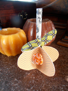
A treat for your special pumpkin!

This pumpkin treat was made very easily with my Cricut Cartridge, Art Philosophy.  It holds one (inverted) Tootsie Pop.  Simply cut the following:
  • 5 of the <Oval 3> key at 2 1/2"
  • 2 of the <Oval 1> key at 1"
  • using your paper trimmer, cut the stem piece 3" x 1 1/2"
In the center of each of the 5 Oval 3 (pumpkin) pieces, use a 1 1/4" circle punch to cut a hole.  Roll and glue the stem piece lengthwise.  Score each of the Oval 1 (leaves) pieces down the center lengthwise with a bone folder.  Fold slightly to create dimension.  Pinch one end of each of the leaves to create a flat section and use a glue dot or two to secure to the stem.  Start gluing (or extra strong tape- I used my ATG gun tape) one side of the backside of a pumpkin piece.  Be sure to put glue above and below the punched hole as well as on the side.  Line up a second pumpkin with the first pumpkin half with glue.  Press the sides together, leaving the section above and below the punched hole exposed and not glued down yet.  On pumpkin #2, add glue to the other half that isn't glued down and attach pumpkin #3 the same way as the prior.  Continue to add until adding the last one. Before pressing the last side together to form the pumpkin, insert the Tootsie pop (stick end up) in the punched hole and add the Stem over the stick.  Make sure the stem is in the area above the punched hole and squeeze together to hold the stem in place.  Then press together the final glued pumpkin piece to form the pumpkin treat!

If you don't have the Cricut Art Philosophy cartridge you can stop in the store and use the template to trace and cut your own.

Laura Petruso

Thursday, October 4, 2012

Seeing Double


The Echo Park Chillingsworth Manor Paper line was perfect for this layout. The papers in this line combine wonderfully to create layered designs. I love this picture of my grandson. He loves hats and had to have the captian hook costume for Halloween. 

Wednesday, October 3, 2012

Boo!


I had fun scrapping last year's Halloween photos with this month's kit. I used mostly papers and accents from Echo Park's Chillingsworth Manor for this page. A bit of washi and tissue tape helps frame the embellishments.

If only my kids' costumes coordinate as well as this kit! ;)

Monday, October 1, 2012

October Goodies


This month the Design Team wall at ScrapbooksPlus will be featuring projects designed using two different product lines; Echo Park’s Chillingsworth Manor and Authentique’s Enchanted. 


This collection by Authentique is so rich with color and texture you won’t be able to resist.  The orange, black and cream colors lend themselves perfectly for the Halloween season but the striped, dotted and houndstooth prints make them generic enough to use for projects with many other themes, not just Halloween.  


Chillingsworth Manor is just as yummy of a collection and just as versatile.  Again in this collection we see some houndstooth as well as damask prints, stripes, diamond prints and dotted papers.  The colors of orange, green, gray, black and cream will inspire some fun Halloween projects but can also be used to scrap many other themes and events.  The best part about this collection is the Apothecary Labels sheet and the Alpha Stickers, which aren’t just alphas but also a bunch of really fun word stickers and some apothecary jars with various labels and banners.  These papers and embellishments are sure to inspire you.