Saturday, October 31, 2009

And October's DT Customer Challenge Winner is...

...Kathy Young with a beautiful layout of Skyline Drive in the Fall! Your prize is a Gift Certificate to Scrapbooks Plus, so check in with Debbie the next time you are in the store. Congratulations!
.
Thanks so much to everyone for participating in this month's challenge. We loved seeing the pages you all submitted - what a creative bunch! The Page Map Challenge has been our most popular and we had a tough time deciding between all the entries. Be sure you check back tomorrow when Designer Michelle Coffee debuts the new kit and challenge for November.

Friday, October 30, 2009

LOVE ME SOME...

CORRUGATED LETTERS!


I loved the corrugated letters this month. I loved the endless possibilities with them. Just off the top of my head I can think of several things you could do with these kraft corrugated letters by Jilly Bean Soup.

  • paint
  • chalk
  • diamond glaze
  • naked
  • ink
  • emboss
  • stamp

Have you thought about what you would do with them?


I decided to use a quote that I love - in typical me fashion I didn't really plan ahead. SO... didn't have enough letters, but Scrapbooks-Plus has a very generous Design Team and they helped me out with the letters I was missing, thanks guys!


I also never know what I am designing until I sit down with my project. I am not a person to spend hours/days on my layouts or even to plan them out before hand. Once I got my letters down I knew that I needed to POP my letters a little more or else they were going to get lost on the layout. Of course, I didn't realize this until my letters were all placed down on the layout! OH CRUD, now what? I have to be honest, I didn't know if it would work or not but I just took my Staz-On black ink and rubbed it over the top of my letters, crossed my fingers and went to town. Guess what? It worked! I was super excited and ended up loving how it turned out! The good thing was I didn't have to hold each individual piece and get ink all over my hands, and I would love to tell you that this was all premediated. I'm not that organized!


Have a great weekend - enjoy your Halloween and be safe!

Thursday, October 29, 2009

Celebrating Relationships

One of the best results of starting to scrapbook has been the opportunity to put down on paper those special relationships in our family. When Susie put in some pages from the Pet Journals, I thought that I would print out some pics of our new pet bunny and talk about her. As I went looking through photos, I found this old picture of my dad with my first dog, Dabney. Dad and Dabney spent a little more than a summer together during a time when my sister had moved out, I took a full-time job at school, and my Mom was living out of state when her job moved a few states away. To say the least, they bonded. Dad taught my beagle how to bark at strangers... much to my dismay not to mention the next door neighbors and the property manager at my complex (I actually almost got kicked out of my apartment - yikes!), ...he took her to the Taco Bell drive-thru window to have bean burritos, he used powdered donuts to teach her to catch, and they kept enough other company. The following semester, when I would come to visit Dad would often greet the dog first... with a bowl of powdered donuts! Dabney passed away a few years ago, and I thought it was really important to write down the story of their relationship before I forgot it completely.


To complete this layout, I used simple blocks of patterned paper, my corner rounder, some machine stitching, and the Pet Journal pages - cut down to let overlap portions of my photo. I loved the bird and tree patterned paper, so I cut that piece the largest. Scraps of some of the other Jillibean Soup neutral papers filled in the rest of the spaces and the cardstock filled in the middle. The torn edge and uneven stitching give it a warm, homespun feel to balance the bright colors and clean lines. The end result is simple and focuses on the photo.

So here is my challenge to you... celebrate a less-than-obvious relationship in your family. Perhaps it's a pet, a neighbor, a teacher, or someone that you just can't believe hasn't been featured yet on a page in your scrapbook.

thanks for stopping by,
erin

Wednesday, October 28, 2009

"The Color Purple" Mini-Album by Esther

When you want to send something special to a friend, try the collage method on a shaped mini-album. I used a round tin to make a momento of a trip to New York. The trip was to go see the Broadway Play, "The Color Purple", so it was a given to use that color throughout the mini-album. The ticket stubs and other things from the trip collected were saved with this in mind. I found a tiny plate with New York at Scrapbooks Plus to add. There are plates for all states at the front of the store.

The personalized journaling was done on the computer and a faux ticket was made in just the size needed to show the sentiment. Vellum shapes were punched to overlap the papers.


The circles were formed using chipboard pieces that were covered with solid color cardstock in shades of lavender and purple. While gluing the chipboard together, a 3" piece of ribbon was used to glue between the pieces to fold for an accordion effect.


The pictures & playbill were printed in a smaller size to fit the circles. The memorabilia is glued on both sides of the circles. Remember to cut the shapes smaller than the tin, so they willo have room to fold with the ribbons.


I had to add bling to at least one page. The glitter paper & papers were adhered with red line tape to make sure there would be a good adhesion after being handled several times.Small dabs of glitter were added to pages using Stickles.


A 7" ribbon is used on each of the end circles for tying the mini-album together. It was placed into a decorated tin to make ready for gifting. What a personal gift to remember a special occasion.


Tuesday, October 27, 2009

Glittered Chipboard and Wooden Shapes

Sometimes I have a hard time coming up with clever designs for cards. This month, I opted for easy. I took plain black card stock and folded in half to make the base of the card. I covered the entire front with a scrap of My Mind's Eye "Boo to You", leaving only 1/4" edge. I created a glittered embellishment as the "eye candy" for the card. These glittered embellishments are super easy to make and can really add pizazz to your cards and your scrapbook pages. This wooden black cat was left over from my "Bewitched" class I taught last year. I decided to make other glittered embellishments for cards and pages planned for this autumn.
To make these bejewelled treasures, all you need are die cut chipboard or wooden shapes, acrylic paint and Martha Stewart glitter. Shown here are two chipboard leaves cut from the Accucut dies available to use for free at Scrapbooks-Plus. There are a number of really cute dies available at the store, including leaves, pumpkins, apples, etc. The wooden shapes (the cat and the bat) were bought last year at a box craft store when they went on sale after the Halloween holiday (25 cents each!).


I mixed a little acrylic paint with a little water on a paper plate and painted the piece. While it was wet, I sprinkled the piece with Martha Stewart fine glitter. I used Brownstone for the bat.


For the chipboard leaf, I used a little red paint mixed with metallic gold paint (and water of course to keep it wet longer). I sprinkled the main body of the leaf with Carnelian. Garnet would have worked equally as well. I sprinkled the edges with Florentine Gold and Copper mixed for a more "natural" look.


You can see the beautiful results. To keep your piece from getting glitter all over your envelope, scrapbook and/or face, spray it with two coats of White Rain hair spray (the cheaper the hair spray, the better!) Remember that hair spray is not acid free, so keep the piece away from your pictures in your scrapbook.


Scrapbooks-Plus has a variety of Martha Stewart Glitter for sale at the store. And remember, your coupon for 40% on Wednesdays works on ALL products at Scrapbooks-Plus, including Martha Stewart products! (Unlike those big box stores!).
Happy glittering!
P.S. And for another reason to come by the store on Wednesdays are the make and take/two-page layout. This week (10/28/09): My two-page Halloween "Spooktacular" Basic Grey layout (using the new Eerie line of papers) with a minibook make-and-take. The minibook's cover features this really cool black velvet witch riding over a glimmering full moon! Supplies are very limited, so come early!!


Monday, October 26, 2009

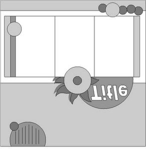
Page Maps


Thank You, Erin for an awsome page map...I loved it and new exactly what I was going to do with it...

I love that we were all handed the same exact paper and the same page map and they all were handed the same map...

Have you ever scrapped with friends and done this...Sometimes when I get a chance to crop with my sister we do this. Amazing how different we all do...I can't wait to see everyones layouts the did the challenge, and if you didn't do it this month, try next month as we got another page map and it is just as fun.

Sunday, October 25, 2009

Pumpkin Time

This layout is an example of what you can end up with if you mix Roasted Pumpkin with some Curry Spice - papers from Jillibean Soup, of course! Just like in my 1st layout this month, I cut an extra large letter with my cricut and crimped it to coordinate with the corrugated alpha by Jillibean Soup:

The green letters were inked, then heat embossed with clear powder - I love the way it shines! The other letters were inked with a dark brown.
I used my 1.5" circle punch to cut out circles from the Chopped Parsley, cut them in half, and spread them across both pages.
.
The felt flowers (Bean Seeds in Jillibean lingo) add a much needed punch of color.


I liked sprinkling multiple Jounaling Sprouts across the pages - different shapes and sizes, but I tied them together by inking the edges with the same ink.
.
.
.
.
.
.
.I hope you are having fun whipping up some recipes of your own!

Saturday, October 24, 2009


I love moments when you're not expecting to happen. They are the sweetest and it's even better when you get get proof with a camera. While I was babysitting my pod he needed some love after he got up. He wouldn't let me let him go...how sweet. I took the blanket color and matched up papers (the dark orange strips are halloween words that I cut so you couldn't read the words) and then added just a little bit of color with the tiny stripe photo mat. The journal block was a dog journaling page that I cut off the words and now it works perfectly fine!

Friday, October 23, 2009

This is the Sad Story of a Happy Tail

Pretty simple layout...created a pocket by matching the designs on the paper, folding over an edge along 3 sides and attaching it with red line tape.
.
For the title I pulled out the corrugated letters and used acrylic paint on some of the letters to emphasize the primary color scheme: black white & kraft. Green , from the grass in the pics, became the accent color.
.


Let me say again how much I love using the pages out of the journaling books - this time it was the pet journal. I used (2) pages so that I could display the journaling on each side. I backed the pages with Olive Sugar and used circles cut out of the Chopped Parsley as pull tabs.
.
.
.
Cute layout - not so cute story: We were getting ready to leave the house one morning when I noticed something was all over the walls...and it was getting worse. Then I realized it was coming from the tip of Sulu's tail - blood was spurting out with every single wag! After a trip to the vet and a quick (and expensive) surgery, we determined that somehow, the dog had severely abraded the tip of his tail and removed the skin! We tried to bandage it and give it time to heal...do you know how hard it is to bandage a dog's tail - and to keep that bandage on?!?!? After a very stressful and unsuccessful couple of weeks, we realized we had no option - surgery to bob the tail! As it turns out, according to the vet, this is not uncommon among dog breeds with strong tails (which is one reason some of them are just bobbed as puppies - it could actually have cost Sulu his life!). They have even given it a name - Happy Tail - because they wag their tails so hard that they actually hurt themselves when it hits something hard.

Thursday, October 22, 2009

Lovin the Bird!


I really really loved the chipboard bird this month. I wanted to do something fun with it, so I decided to make a minibook about music (birds - songs - right?).

I had a hard time picking paper for this - so I decided to use all of it! I grabbed my square punch and went to town, fitting as many patterns on my cover as I could. There are two ways to do this: (1) you can adhere them directly to the bird then once the glue is dry cut off the extra with a sharp craft knife. Or, (2) you can adhere the squares to a scrap piece of paper, trace the bird outline onto your squares, cut out, then adhere.

For the interior pages, I printed out my photos onto glossy paper then traced the outline of the bird shape right onto my photos. I covered the back of each photo with patterned paper.

And you'll notice that I used that square collage on several pages - including one of my photos. If you have iTunes you can copy the album cover artwork with a simple click. I did that about eight times and arranged them in Photoshop Elements before printing it out on the sheet.

Wednesday, October 21, 2009

Using Page Maps

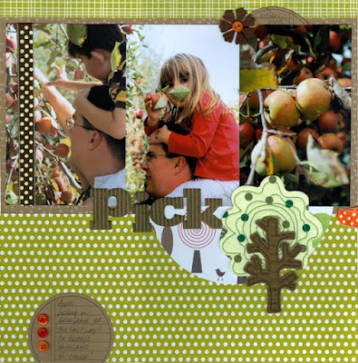
Have you tried this month's page map challenge? Got some great vertical photos? Well, then, just turn that sketch around! Don't feel like you have a use a sketch exactly - make it work for you.

Not only did I rotate the sketch, but I flipped it horizontally so it better fit my embellishments:

And here's my layout. Other than rotating & flipping, I stayed pretty true to it.


In addition to the kit, I picked up this cool fabric tree at Scrapbooks Plus. I loved the polka dots on the tree (well, OK, I seem to have a thing for polka dots, period)!

To make the Jillibean corregated alphas stand out a bit more I lightly inked them by rubbing Distress Ink over the top. It really accentuates the ridges.

Tuesday, October 20, 2009

Stretching Those Supplies


When I talk about Stretching Your Supplies, I actually mean it two ways:

First, the obvious: making those supplies go as far as possible. Here I punched circles out of the various patterned papers and lined them up. This is a good solution to not enough paper left and a good way to use many patterns all at once. All of the white balances it out while the simple black line gives it a ground so that it doesn't float away.

Second, and a little less obvious: drawing your eye across the page visually. This is done with the line of circles starting at the top and continuing across the bottom, with the title split up and gradually guiding you across the page, and finally with the green photo mats. All of the mats touch each other giving you a pathway from left to right. Cutting a custom piece that went under each photo would be challenging... but overlapping and touching each individual photo mat works perfectly.

thanks for stopping by!
erin

PS. I am guessing at the title per my high school German... so I hope it's right! :)

Monday, October 19, 2009

Layering, Inking and Distressing

Kraft paper is one of my favorite scrapbooking papers. It's heavy, it inks well, and you can really bend it, tear it, and rough it up without it falling apart.

On this layout, I tore strips of different kraft papers and some black cardstock. I inked all the torn edges that would show with Mocha Mama Chalk ink from Quick Quotes. On a plain sheet of cardstock (kraft or otherwise - it doesn't matter), I layered the strips and glued the back edges, leaving the front edges unglued. Then I sewed the outer edges about 1/4" from the torn edge. I used long, straight stitches. Once I had the edges sewn, I "curled" them up. I used my finger to bend the edges up over the stitching for a really distressed, "curled" look. It really is quite easy. A very simple layout without too much measuring or cutting. The more inaccurate the measurement, the better! As long as you fill your 12x12 paper edge to edge, you're good to go!

Sunday, October 18, 2009


Tyson at the Pumpkin Patch. I love scrappin' my nephews because they are so photogenic. These are some of my faves from his first trip to the pumpking patch last year. I've been sort of into making my own embellishments lately, in case you haven't noticed. For this layout I wanted a pumpkin, but one that was more dimensional than a cricut cut-out. Soooo, just a quick 3 ovals punched out, inked and layered with a few pop-dots, and there ya go! A pumpkin that looks almost as good as the real thing! (Ok, well maybe not, but it looks great on a layout! :-)

Friday, October 16, 2009

One Idea - Lots of Creativity by Loretta Cooper


If you haven't had a chance to stop by the store this week, here's another good reason. There's a new addition to our Design Team Monthly projects... The Design Team Customer Challenge: Here's how it works...

Design Team's Customer Challenge

Every month the Design Team gets to play with fabulous new papers and products to create a 1 page layout, a 2 page layout, a card and an altered item.
Sometimes this is really easy, sometimes it is more of a challenge - people have different tastes and different styles - but we always come up with a wide variety of ideas to share on "The Wall".

Now, we invite you, the customer to play along in our new ***Monthly Challenge***!!

The rules for this month's challenge are pretty simple:

1. Come by the store and pick up some supplies (the papers and products we used for this month will be available on the 1st at a special display in the Crop Room.)

2. Create a layout (1 or 2 page) in which the majority of the materials used are from this month's kit.

3. Complete and post your project by the 21st. On the 1st of every month, the Designer of the Month has a post where she reveals the new kit.
Leave a comment on that post, providing a link to where your project may be viewed online…OR…email a photo of your project to debbie@scrapbooks-plus.com.

4. The winning layout will be featured on our blog so check back on the last day of the month to see if you won! Won? Yes! A prize will be awarded - a gift certificate to ScrapbooksPlus!


Wednesday, October 14, 2009

School photo album

Every year I have my boy's school picture taken. I love to look back at how much they have change over the years. This month, I decided to do a small 8x8 album with only their school pictures and the year. I just did a simple layout with minimal embellishments and used the same basic page design. It was a simple and easy(quick too!) way to get the album done for the years that I have the small wallet sized pictures for ( which just happens to be every year that they have been in school!)
Make sure you stop by Scrapbooks Plus and check out the DT Wall!
Enjoy!
Lisa

Tuesday, October 13, 2009

"the sweetest face I ever saw"


I picked this picture to scrap because it is one of my favorite pictures of my Mushu. Who we also call our Mini Moo, not that there is a full size one anywhere it is just what my son calls him... :)

I used one of the journal pages and cut it into strips for my notes. The title is on a journal block. When I was editing the photo I used the text option to journal a little on the photo as well. I inked the papers and everything up before putting it all down to make it look a little dirty, and old...not a fan of inking but I think that it worked for me this time :)

Monday, October 12, 2009

My Fall Journal by Esther

When you have scraps left from creating pages, try making a journal. I used a 6”x11” piece of chipboard for the back. It was covered with the patterns from the Jillibean Soup Staples Collection in the DT October kit. The corners of the back piece were shaped with the Chomper after the glue dried. Each of the other cardstock pages was cut 6” in width with the patterns staggered in length. The green plaid pattern was 9”; orange plaid was about 7”; and the others shorter.


The cover is a transparent sheet that was rubber stamped with Stazon in leaf designs. Leaf shapes were punched and glued to the layers. Two holes (made with the Crop-a-dile) in the top are used to thread a 12” length of ribbon to hold the journal together. This gave me the chance to use the memo sheets to record my memories about reading books and sharing with family and friends. The “Autumn Memories” is a Karen Foster sticker. Now, if I can only find the time to journal the season’s activities, I will have a keepsake. This could be an idea for a journal for each season, too.

I could not get the photos into this blog; please view the Scrapbooks Plus Design Team Wall on the website for the pictures of the journal. WWW.Scrapbooks-plus.com

Saturday, October 10, 2009

Simple and Sweet

I love this LO because it has a simple dot theme used in the two main colors. The happiness that Parker has playing with his bus is the excitement that I get from the dots! the simple circles and line create a focal point for my picture.

Try being simple and playing with the same theme next time you're working!

Friday, October 9, 2009

Page Map Challenge

This month the DT Customer Challenge has a little twist. In addition to using the same papers we used in creating our projects for The Wall this month, we are asking you to use this page map: Now we would not ask you to do something we did not do ourselves, so here is my layout:

You can see that I turned the layout 90 degrees clockwise, but other than that, I was very faithful to the original sketch.
.
I am not generally a very fast scrapper, but this page went together very quickly. The little trees were fussy cut from the Cream of Mushroom paper from Jillibean Soup and make the perfect accent pieces. The corrugated alpha (which I raved over in a previous post) has 2 different treatments: inked then heat embossed and acrylic paint.
.
You can check out the display featuring all the DT page map layouts in the crop room. We came up with a wide variety of ideas using the same page map and the same selection of papers - you will even find an example showing how to turn it into a 2 page layout! We hope you decide to enter this month's challenge, because we would love to see what you create - and you might just win a Gift Certificate to Scrapbooks Plus!

Tuesday, October 6, 2009

Boo! SPOOKY! and YUMMY!

When we got our kits, I knew exactly what I was going to do with it...for the first time in nearly a year, I made my card first.

I love for stripes to run up and down on a page...and i love to fussy cut...so it was perfect there was something to fussy cut and there was strips...

I used the core'dinations paper, to make the card itself...and then sanded it a little so that you could see the yellow-orange color as well.

I love this card...Did you make a card for World Card day?

Monday, October 5, 2009

Word Cardmaking Day ....

... was this past Saturday. So in honor of that, here are the cards I made with the Jillibean Soup kit.

The papers are great for "fussy cutting" - cutting out part of a pattern. I used a large flower from the Roasted Pumpkin on my first card. Then, I thought the green circles from the Chopped Parsley would make a great tree, so I added a hand-drawn trunk & branches and a few leftover red dots for apples (what can I say - we've been spending a lot of time at the farmers' market).

Sunday, October 4, 2009

Too cute to spook!

I loved the kit that Susie put together this month! I love to use kraft colored paper and use it quite a bit in my everyday scrapbooks. To me it is so versatile and easy to match (most) any paper with.
I really loved the Jillibean Soup corrugated alphabet, but when I put my title down with just the kraft color, it didn't have enough "pop". I decided to ink the letters in black to tie it into the black capes and costumes that are in my photo. I also put some googly eyes in the "o"s of spook. The black ink worked really well and helped the letters pop right off the page!
Stop my Scrapbooks Plus and pick up some the papers that we used this month and show off your work!
Enjoy!
Lisa

Saturday, October 3, 2009

The Rule of 3's - It's Not Just For Triangles Anymore!


One of the basic design principles we scrapbookers, among others, use is the rule of 3's. Usually we use this to create a visual triangle of embellishments around our focal point. You can also use the rule of 3's when selecting the color of your items for your layout. Many times I have a layout that looks okay, but is missing something. Usually I notice this when I have just one black or white colored item on the page. It looks lonely and somehow the entire piece is unfinished-looking to me. The solution is simple: always be sure that your colors are in 3 places on your layout. If you have a white photo mat, add some white brads and patterned paper with white in it to make the layout feel cohesive.

In this layout I really wanted to use these yellow Thickers to highlight the yellow dress in the photo. I split the title in half, giving me 2 areas of yellow. Then I added the yellow journaling box (a Marvy punch) to get my third yellow item. I liked the burgundy ribbon, but by itself it stood out too much.... so I added the thin burgundy mat and the burdundy felt flower. Now it looks complete! I did the same with the orange... it's in the patterned paper, the cardstock matting, and the brad center of my flower.
The next time your layout feels off, check and see if you're following the rule of three!

thanks for stopping by!
erin

Friday, October 2, 2009

1 Cute Chick

Start with some Cream of Mushroom, add equal parts Ground Corriander, a dash of Orange Sugar, and a pinch of Chopped Parsley and what do you get? A layout using papers from Jillibean Soup! I really am in love with this stuff! The little birdies on the Cream of Mushroom paper were actually the inspiration for this layout because they led me to the title, which led me to this picture of my daughter from this summer!

To emphasize the "chick" theme, I looked around Scrapbooks Plus and found those cute chicken stickers from Mrs. Grossman's. I could not believe how absolutely perfectly the colors worked! Then I pulled out my Modge Podge and decopauged this little wooden birdie element with a brown on brown patterned paper from Anna Griffin.(By the way - the orange grid paper in the background is the flip side of the Orange Sugar polka dot I used in the layout - sweet!) I gave this guy some fancy tail feathers with a wide, striped ribbon and added a small black button for an eye.

Back to the Cream of Mushroom paper - I pulled the dark brown color from the trees and used it to mat the photo and the different layers of paper. It's a color blocking trick I use when I am working with papers with strong graphic design.
.
.
I think every layout needs journaling, but I often hide that journaling. Do you see a pull ribbon just to the right of my daughter's smiling face? It is attached to a "Journaling Sprout" from Jillibean Soup. They come in die cut packs of 24 in a variety of sizes and designs.
.
.
.
.

For the title - One of my favorite products from Jillibean Soup is the corrugated alphabet!! You will see in my other layouts this month that I played around with some different techniques on this embellishment. For this particular layout, I just swiped the letters with an orange ink pad and sat back and enjoyed the results! I like mixing up different fonts and textures, so I added vinyl thickers from American Crafts for "chick". I used my Base Camp Cricut cartridge to cut the rather large numeral "1" from coordinating blue cardstock and ran it through a paper crimper to match the corrugated alpha. Voila!
.
.
.
.
"So where is that "pinch" of Chopped Parsley?" I hear you wondering. Good question! You have to look carefully. At the top of the layout on the Cream of Mushroom paper there was a red swirly tree that really didn't work with the other colors in the rest of the layout. No worries - I just pulled out a circular punch and cut a new tree!

Yesterday I promised you a picture of the "free with purchase" bonus. Take a good look at the wooden birdie element from the layout, because that is the freebie! Yep! If you buy any (3) items from the Design Team kit this month, you can pick up one of those cuties at the register - but only one per customer because we like to spread the love!

Thursday, October 1, 2009

Soup's On!

The Design Team has been busy this month with Chopped Parsley, Roasted Pumpkin and Minestrone. No, we have not moved our creative pursuits into the kitchen! These are the names of a few of the "ingredients" in this month's kit: The manufacturer is Jillibean Soup, a company featuring designs on kraft paper as well as brightly colored prints, some of which are double-sided (like the Olive Sugar). There are also a bunch of coordinating elements available with this line - ribbons, felt flowers, and *yummy* journaling spots. Just wait until you see the corrugated kraft paper alphabet!

I also "mixed in" some papers from Anna Griffin and the "Boo To You" line from My Mind's Eye, because how can you scrap for October and not include Halloween?

We are really looking forward to seeing what your pages look like! For the DT Challenge this month we are providing you with a page map to use for your layout. We are also offering another incentive - a "free with purchase" bonus! I will post a picture of it tomorrow, so make sure you check back. Once you see how the DT used it on their projects you will definitely be inspired.

.So come on into the store, check out The Wall, choose your papers, pick up a page map and get "cooking" - there is another Gift Certificate up for grabs!!!
(and yes, I will probably continue to "pepper" my blogs for the rest of the month with references to cooking - oops! I did it again!)