Showing posts with label glimmer mist. Show all posts

Friday, December 30, 2011

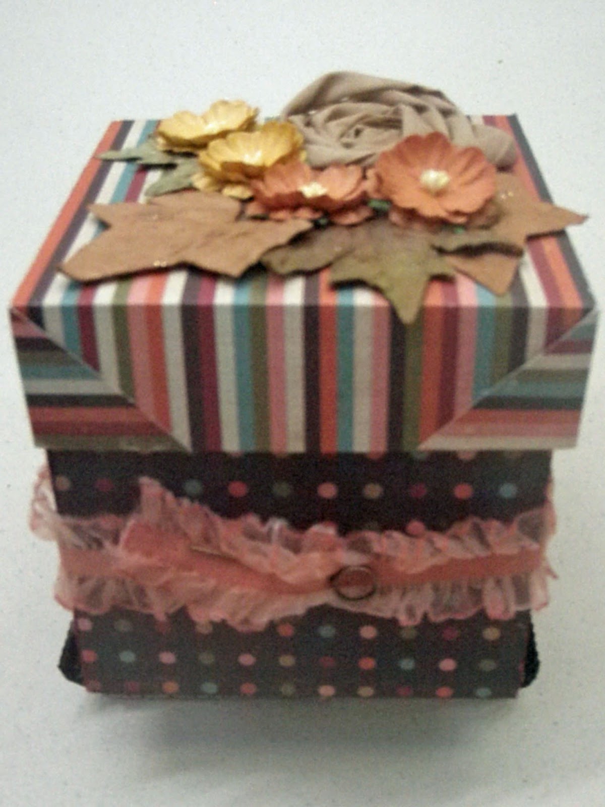
Share Your Sentiments with an Exploding Box

An exploding box is a small box that when opened has pages and pockets for pictures or messages, giving you a special way to share your sentiments.  They are great for special relatives or friends.  My  box is filled with inspirational messages for a friend, who is going through a tough time.  You have a total of 20 sides inside the box on which you can put messages, pictures or embellishments.  In addition, you have pockets for 8 tags or special memorabilia.  This is one of the projects that looks tough but the basic framework is easy if you follow the pattern.  The Simple Stories Life Documented collection works especially well.  The double-sided coordinating papers are of just the right weight – they are easy to work but thick enough for a box.  The embellishments can be as simple or complicated as you want. 

For this project you need four pieces of paper/cardstock – three for the boxes and one for the top.  For the outside of the box, I used Live Life 24/7.  A 12" x 12" piece forms  the outside of the box and one set of inside flaps. For the middle box, you need a 10.5” square.  I used Newsprint.  And for the inner box, which requires a 9” square,  I used Orange/Grid. 

Begin with the 12" x 12" paper.  Imagine your paper is a grid with 4" squares as in the image below.  (My drawing is not to scale; all should be 4" squares.)   Score on dotted lines and cut on solid ones.  To assure that all my lines were straigiht and corners square, I used my trimmer, changing from a cutting blade to scoring blade as needed.   Score a diagonal line from the outside corner of A to the inside corner of A.  Repeat with C, G & I.


A

B

C

D

E

F

G

H

I

Inside of Outer Box
Fold along score marks.  The four corner squares will become triangles once you complete folding.  Use glue to hold the corners in the triangle shape.  The flatter they are the better it will be when you fold the box.  I inked all the edges with Fired Brick Distress Ink.  The four squares that you have on the inside can be decorated.  I would recommend that you decorate these with flat objects as the two other sets of “pages” will be on top of these.  I stamped messages on coordinating paper and affixed to the squares.  If you use, a lighter paper on the inside you could stamp your design directly on the flap.  Cut out objects, border trim, etc. would be really great for this. 
 
Middle Box Pocket & Tag

For the middle (10.5" square) and inner (9" square) boxes, score and cut as shown in diagram above.  Squares should be 3 1/2" and 3" respectively.  (Note: Do not score diagonal lines as you did for the outer box.)  For these two boxes, you fold along the scored lines to make four pockets for each.  Seal the side edge of the square.  I used 1/8” redline tape to hold the pockets in place. You only need to adhere on side since once box is glued in place a bottom will be formed.  Remember in selecting colors and folding to consider what color you want the pockets to be.  The pockets will be the color of the paper that is facing down.  

Inner Box Pocket & Tag


I inked the inner box with Spiced Marmalade Distress Ink and the middle box with Weathered Wood Distress Ink.  I stamped a variety of  positive messages, butterflies and birds using Tim Holtz stamps. (Stampers Anonymous Odds & Ends, Stuff to Say,)   I used some hearts cut from the papers, circles and scalloped circles.   Life Documented provides lots of circles and messages that could be used.  On the inner pockets, you can use items with a little more depth.  For example, I used some Bazzill flowers.   (Since you are going to decorate the bottom, it is best to put the thicker embellishments at the top.)

 
I used the Simple Stories journaling cards to create tags to put in the pockets. I trimmed them to fit the size of the pockets.   I affixed an eyelet and tied a ribbon to the top.  (I used white ribbon and sprayed it with Spiced Marmalade Glimmer Mist.  The tags can include a message, a picture or one on each side.

Inner Box
Once you have all boxes decorated, glue the boxes together.  You can use your favorite adhesive.  I used Glossy Accents because I wanted to make sure it stuck.  Once the boxes are together, you can decorate the bottom of the inside of the box.   I made one flower with a Gluber and a strip of linen ribbon that is available at ScrapbooksPlus.   (If you  haven’t used Glubers, you need to try them.  They are really easy to use to make a variety of flowers.)  You simply roll the ribbon and push down into the massive (and strong) glue dot.  Of course, you could use any kind of flower or other embellishment you like.  The remainder of my flowers are  Bazzill paper flowers. This is where you can make the box fit your theme and use lots of the fun embellishments available at Scrapbooks-Plus.  The only limit is the space you have.


Inside of Box When Closed


Fold the box closed and secure with a ribbon.  I used the elasticized ribbon from the Tim Holtz Ideo-ology Lavish Trimmings set.  After it was sprayed with Spiced Marmalade Glimmer Mist it looked great with the paper.  I fastened the ribbon with a Tim Holtz Idea-ology Memo Pin.  An Idea-ology Trinket Pin would work the same way – perhaps even better because it wouldn’t have a sharp edge.  You can tie it shut with any ribbon, but using this elastic ribbon means you don’t have to re-tie every time you open the box.

Voila!
A Beautiful Box wtih a Special Inside

For the box top, you need a 5 ¾”  piece of paper/cardstock.  Score 1½” around all four outside edges of the box.  In the corner squares, cut a straight line from the out edge to the inside edge of the square.  Fold along the scoring lines, gluing the corner edges. 

All that is left to do is decorate the top of the box.  I made mine match the decorations that I put in the bottom of the inner box so I used another flower made with a Gluber and linen ribbon and the same Bazzill flowers.  I added a few Prima leaves.

These are perfect when you want to give a little more than a card, but not a big gift.  What grandmother wouldn’t love one of these with pictures of the grandkids?  Or it would be a great way to share your  feelings or memories with your Valentine?  I’m thinking it would also be a great thank you gift for a hostess.  And you get the fun of making it.  Try it!


Friday, December 23, 2011

Using Simple Stories Line to Scrapbook Your Life (Easily)

My last two pages for December show how easy it is to match the Simple Stories to the pictures you have.

My first page uses the page map to make a Christmas page.  I was delighted to use these paper as my family wears a lot of orange and rarely does Christmas paper go with orange.  Using a page map makes it easy to make a page.  It shows where to put the picture and the title and you fill it in with the paper you like and the embellishments.  I used the striped side of Everyday Life for my background.  To give it a little shine (I always like shine for the holidays), I sprayed the edges with Spiced Marmalade Glimmer Mist.  I used an 11” x 11” square of Green/Notebook for the inner background.  I distress the edges of this square before gluing down.  Finally, I made photo mat of Orange/Grid from a 10 ½” x 10 ½” square.  (I cut it along grid lines so it may not be exactly a 10 ½” square.  I distressed the edges and inked the edges with Spiced Marmalade Distress Ink.  I scalloped a  strip of Green/Notebook on both sides and placed it below the bottom pictures to complete the frame.  I used the pieces left over after scalloping to separate the pictures. The title was made from two different size and colors of stickers from the set.  I added a Christmas tree sticker and a scalloped circle on which I placed another Christmas tree sticker.  The final embellishment was a scalloped circle cut from the Grid paper. I inked it with Spiced Marmalade Distress ink and added a circle from the set and a “24” sticker to show that picture was from Christmas Eve.

The other one-page layout  truly scraps an everyday event.  A relative and I had driven to Georgetown (45 minutes from my house) just to get a cupcake.  We had such a great time that I wanted to be reminded of the day.  When I saw the pink paper from this line, I thought it was perfect.  Georgetown Cupcake colors are pink but the line lent itself to a less girly pink picture that totally fit the bill. I used pictures of a variety of sizes; most I cut to fit the space/look I wanted, but I did use Photoshop to make a 2” x 6” picture of the three types of cookies we tried.   I used several items from the line to add to the page.  For example, I cut circles in half and then put below the picture to label each type of cupcake. Similarly, I cut out a scalloped circle that said “Celebrate, today” to put beneath a picture of my relative eating a cupcake.  I cut out a heart and a strip of paper that said “Life is Sweet,” clearly appropriate for a page about cupcakes. I again stitched to match stitch design on the paper.  (I just made holes where you needed them with my needled and then went back and stitched.)  I used a sticker to add “May” and “28.”  The small title, “Georgetown Cupcake” also came from the line.  I put a journaling tag on a piece of red paper.  I stitched across the top (as the journaling card showed) and added the year with stickers on the bottom.  

This line really offers stickers, journaling tags, etc that allow you to personalize a page just for your event.  Even if you don't see exactly how they work for your pictures, just buy paper, stickers and journaling cards.  Take them home and look at them.  I guarantee by the next morning you will be thinking, "Oh yeah, that message really fits this day." 

Wednesday, November 30, 2011

Fall Layouts with Hello Fall Papers

I used the fall themed paper to create a showcase for the photos of a day I spent at Giverny.  The background is Red Splendor.

I used half of the left page to creat the title.  Using the Cricut, I cut “Fall” from Burnt Orange Knit and sprayed them with Spiced Marmelade Glimmer Mist.  I cut “at” out of a circle using the Word Party Cricut Cartridge and placed it on a scalloped circle.  Giverny is made with Daily Junque wooden letters.  To make them cooridinate with the colors of the papers of stamped the letters repeatedly until I got the color I wanted.  I used Tea Dye, Frayed Burlap, Scattered Straw, Spiced Marmelade & Fired Brick Distress Inks.

Burnt Orange Knit rectangles sprayed with Spiced Marmelade Glimmer Mist fill the space between pictures. 

Using many of the items available in the Hello Fall collection  I was able to create a showcase for the pictures, quite simply.  A canvas strip ties the title to the pictures.  Crepe lace stickers, a quote from the Cardstock Die Cuts and the journaling cards embellish the page.  Prima leaves and unique buttons from Scrapbooks Plus finish the page.

Another completely different layout was made using the same papers.  This one uses Little Leaf Pile for the background giving it a much more fun them.  All that is added is a few cutouts made using Tim Holtz dies and a strip of Tim Holtz film strip.  A Tim Holtz samp was used to add a quote about my experience was added to the photo mat. 

This demonstrates two different looks with the same basic colors.

Monday, November 14, 2011

A Thank You Card


I used our paper to make a card that is perfect for a thank you to your Thanksgiving hostess.  It is so easy to make.

Cut a piece of Ivory Text paper  5 1/2” x 12” and score at 3” and 9” and fold along score lines.  You will have a card that is 6” on the back and have two 3” flaps.  One flap will be on the top and the other on the bottom. This paper is great for cards  because it has text and colors but is still light enough that you can write your message over it.  I used the Sizzix Tim Holtz Alterations On the Edge Brackets die to give the flaps a decorative edge. 

Stamp “thanks” with Walnut Distress Ink on the bottom flap and emboss with Clear Embossing Powder.  Repeat inside the card where the message would go.

Cut two pieces of Golden Flourish 4 ½ ” 6 1/2.” Cut the edges using the other edge of the die.  (The on the edge dies have two possible designs you can cut.)    Glue these two pieces inside the flaps so that the Golden Flourish shows on the outside.  You will need to cut the straight edge of these pieces to make the card so that the top edge doesn’t cover the outside message.

To embellish top flap, I used a corrugated chipboard circle from the Little Yellow Bicycle Hello Fall set of corrugated shapes.  I filed and inked the circle.   I punched an owl out of a circle of Golden Flourish and put inside the chipboard circle.  Both were sprayed with Glimmer Mist marmalade.  I added jewel eyes and two jewels outside the word “Thanks.” You could easily embellish the card with any of the corrugated shapes you like.  The Little Yellow Bicycle Hello Fall Jewels add a little glamour and offers several color options.

Monday, November 7, 2011

Thanksgiving Place Cards

Thanksgiving is the perfect time to use some scrapbooking techniques to decorate your table.  Using paper and corrugated chipboard shapes from the Little Yellow Bicycle Hello Fall line,  I made Thanksgiving place cards.  I made a set of four using different approaches so you could see different options.   You can easily make these to match your style your color scheme.  Make a matching set or make coordinated ones. 

You need two tags of the same size from brown Bazzill paper for each place card.  I used the large tag on the Sizzix Tag, Traditional die.  Score a line across one of the tags so that the place card will stand up.

The fun part is decorating the place card.  You use one of the corrugated chipboard shapes.  Eighteen different shapes come in the set.  I used two flowers, a bird and a squirrel.   I used a nail file to scrape off a little of the brown finish and then inked with some distress ink. I used colors to coordinate with the embellishments I would be using.  I  then sprayed the shape with Marmalade Glimmer Mist. 

I embellished the place card with paper, a few leaves from Prima’s Splendor Fall Mix and jewels from Little Yellow Bicycle Hello Fall Jewel stickers.  

To put the place card together, glue the top of the back to the top of the front.  I then affixed a metal eyelet to hold in place.

I added a Tim Holtz Memo Pen to hold the name tag in place.  I cut the name tags From cream Bazzill paper using the Cricut Celebrations die.   I inked then  with Spiced Marmelade Distress Ink. 

Write the name on it and you are all set.

Wednesday, September 14, 2011

Making Holiday Tags with Oxford Paper

I know it is only September but if we are going to hand make things for the holidays now is the time to do it so we have time to enjoy the holidays.   I liked the Oxford paper, but didn’t have any  school related pictures to scrap.  The burgundy and green colors made me think of Christmas so I made extra large tags.  These could be used in several ways --  for those really big boxes that a small tag just doesn’t do the trick, on cards or as decorations.  Another thing I love about making your own tags is that you can mix and match what you have and they all coordinate.

Reindeer
I cut the tag and a cooridinating shadow tag with the Cricut using Oxford paper.   Christmas needs a little shine in my view so I spritzed both the tag and shadow tag with Sun Sisters Glimmer Mist.  I cut a tree and painted it with Dirty Martini Glimmer Glam.   Using plain cardstock I cut out a reindeer and a star for the top of the tree..  I embossed it three times with gold embossing powder.  I added BoBunny Zoology Jewels for eye and collar.  You could also use jewels or buttons to decorate the tree. Tie with a ribbon and you are done.  You could make several of these in no time at all.

Snowman
The approach was similar to the reindeer tag except I used Silver Glimmer Mist on the tag, shadow and the snowman.  I  left the tree plain.  I embossed the snowman’s hat.  The eyes and buttons same from the Bo Bunny Jewel set.  The Bo Bunny Father Christmas buttons would also be great.  There are hearts in the set that would be adorable on a snowman.  Again, add a ribbon and you are done.  Scrapbooks Plus has a great supply of ribbon. 


Since I’m in France now, I may decide to carry the French theme all the way to Christmas and make some holiday tags with the Eiffel Tower!  Another idea is to add a picture of that special person.  That’s the advantage of making your own tags – they can be uniquely yours.

Thursday, June 23, 2011

Using Masks & Chalkboard Spray


Although much of this month’s paper screamed family, the Groomed Traveler said travel to me so I had to make my 2-page layout a travel one. I chose to scrapbook an afternoon I spent at the Duomo Museum in Florence. A wonderful museum that is often at the bottom of the list in a city filled with great museums but on my third trip to Florence, I finally made it.

For the right background, I used Groomed Traveler (turquoise side). On the left side, I used a plain piece of cardstock for the base. I cut a piece of Groomed Traveler paper into two pieces. I used the larger piece (12” x 7”) on the left side. The square design made a perfect frame for a picture of a Michelangelo Pieta. (The larger pictures are framed with a tiny frame of the solid side of BoBunny Coffee Dot paper. ) I used the turquoise side of the leftover piece for the other side of the background.

Before applying the turquoise piece to the background, I used Tattered Angels Chalkboard Decadence and the Tattered Angels compass stencil to design and interest to the background. Using the stencil as both a stencil and and a stamp gave different looks. To do this, I placed the stencil on the background and sprayed around it leaving a turquoise compass when I removed the stencil. Instead of wiping the stencil off, I immediately turned it over and used it to stamp the paper at the top and bottom to create brown compasses. I added another compass on the right background but did have to spray the stencil again to have enough ink for the third stamp. I also stamped a globe with Vintage Photo Distress Ink on the right background.

For the title, I used Tim Holtz idea-ology mask of Ransom letters to spell “Duomo” on a piece of Time of My Life paper. I then sprayed it well with Chalkboard Decadence. I love the result. I’ve had these masks forever and just never used them. Stickers from the Ladies & Gent set are used for the remainder of the title.

For a journaling block, I printed the journaling on Time of My Life paper. I cut the box out and used the Tim Holtz Sizzix Bracket Die to make the top and bottom edges more interesting. I inked the block first with Tumbled Glass Distress Ink and then with Vintage Photo Distress Ink. The journaling block and other accents were made from Time of My Life paper, with some using the cream side and some the green side. For picture titles and other accents, I made the same way except the writing or stickers were added after inking.

Monday, May 30, 2011

Glimmer Mist & Etched Glass Add Variety to Your Page


This page used lots of fun scrapbooking techniques and displays 6 pictures of the City Botanical Garden in Brisbane, Australia. The pictures include green, pink and orange, so the Vicki B papers were perfect.

I picked my 6 best pictures from a day at the City Botanical Garden in Brisbane, Australia and printed small ones (2 ½” x 3 1/4”) pictures. This was really easy in Windows Photo Gallery. I just selected the pictures I wanted to print from the more than 100 I took and chose wallet size pictures. I printed on 8 ½” x 11” photo paper. (Up to 9 wallet sized pictures can be printed on same page.)

I matted the pictures on a piece of Loverly (tan side) leaving a ¼” margin on 3 sides and a ¾” margin on the right side. To make the paper a little more interesting and to complement the pictures and other papers better, I spritzed it with Peach Delight Glimmer Mist. I added a slightly larger (9 ½” x 8 7/8”) mat of Florilicious. This was also Glimmer Misted with the Peach Delight. A border from the sticker set was added to the right side of the mat after spraying. I added a third mat of Bazzillion (brown side) 10” x 9 3/8”.

The flowers on the Florilicious paper are gorgeous so I cut some of them out to use as embellishments. After cutting out the flowers, I sprayed them lightly with Peach Delight Glimmer Mist. I affixed them to the page and then cut along the edge of the paper so that only part of each flower is used.

On the left side of the paper, I added a strip of Bazzillion (brown side) to provide a base for some more decorations.

To go with my garden theme, I embossed the glass squares with butterflies. This technique is easy and fun. Simply stamp your image with VersaMark or Perfect Medium on the frosted side of the glass square. Emboss with clear Embossing powder as usual and you have the appearance of etched glass. To provide a frame, I covered each piece of glass with a piece of Florilicious with a window cut out. (I used Sizzix Frame, Slide Mounts & Coin Holder Die, but you could just as easily just cut out a square the size of the glass and then punch out a square or circle.) These were also glimmer misted so that they match the flowers on the page. I placed one at the top and one at the bottom of the brown strip. Flora Doodles Earthtone butterflies in between the glass squares complete the border.

A box from the Vicki B. Cut Outs provides the space for the page title. The title is created using letters from the sticker set. The Stop and Smell the Flowers message from the Vicki B. Cut outs reminded me of the lovely afternoon that I simply walked around Brisbane’s City Botanical Gardens.

Monday, May 23, 2011

Using Big Letters – Beautiful Bermuda

The extra large chipboard letters at Scrapbooks Plus attracted my interest every time I went in the store. (They are available in cream, burgundy and black for only 69 cents.) So as Designer of the Month, I included a letter in the kit to see some ways to use the letters.

I originally planned to use my “B” for a family page but as I worked on my projects a new idea arose. The pink side of the Perky paper reminded me of the pink Bermuda sand and the pictures I had not scrapped from a trip to Bermuda. As I looked at my pictures, “Beautiful Bermuda” popped into my head and I had a title and a use for my “B.” To go with the theme and the colors of the page, I sprayed the “B” with Cadillac Pink Glimmer Mist making it a solid, shinny pink. To make it more interesting, I used the green vines from the Vicki B. rubon set to add accents. This also brings together the pink with the green background. The “Beautiful” above the “B” and “Bermuda” below came from the Vicki B. Sticker set.

I placed the pictures in a grid on a photomat made from Perky paper (pink side) and added a frame from Bazzillion paper (brown side). Some pictures are on each side of the 2-page layout. This didn’t provide enough attention to the pictures so I added a corner accent in each corner created from the rubon set. The flowers in the center are also from the Vicki B. rubon set. They are placed so that each is partially on both pages and draw your eye to the center of the picture display. Tape the pages together on reverse side with painter’s tape to assure that they don’t move while you work and apply the rubons as usual. Once affixed you can simply pull the pages apart and the rubons separate with the design fitting together perfectly when you place the pages together. I love this trick!

To add a little more design, I covered a chipboard flourish with Bazzillion paper (brown side) and also cut two smaller flourishes ones from the same paper. (The dies for these are available in the crop room.) To add interest, I sprayed the flourishes with Decadence Chalkboard. The effect of this is hard to see in the picture but when you look at the page directly it adds a benefit.

Without the “B” this page would not be nearly as attractive. Check out the letters. You can use all kinds of scrapbooking techniques on them to make them fit your page. How else can you add this kind of focus on a page for only 69 cents?

Saturday, May 7, 2011

Cards in a Box


I made a set of three coordinated cards and a box to keep them in using the cheerful floral prints of the Vicki B. line. To make the box, I used Vicki B. and Loverly paper. I decorated the box with rick rack, ribbon and a variety of embellishments. Making the box is easy and it provides an attractive place to store cards or a gift box if you choose to make a gift of the cards. Of course, the technique allows you to make a box for anything you want. Once you learn the technique, you can make boxes for anything that you want. The instructions for making the box follow. In my May 14th blog, I’ll describe how to make the coordinating cards.

To make the bottom of the box, cut a 9 ¼” x 7 ½” piece of Loverly paper. Score 1 ½” from the edge completely around the piece. On the two short ends make a cut from the edge of the paper to the score line (for a total of four cuts). Fold along the score lines, putting the tabs on the inside and glue. To make the top, repeat the process with a 8 ½” x 6 ¾” piece of Vicki B. paper and score 1” from the edge all around. I inked the box top with Spun Sugar Distress Ink.

For the decoration on the side of the box, cut two pieces of plain white rick rack slightly larger than that needed to go completely around the box. Spray one with Key Lime Glimmer Mist to make it green. Once dry, weave the green and white rick rack to create a close knit ribbon. Affix to the side rim of the box top.

Cut a 4 ¼” square piece of Perky. Ink edges with Spun Sugar Distress Ink. Stamp a design that matches the one you intend to put on cards with VersaMark or Perfect Medium. I used a large butterfly (and my cards each have a butterfly image as well). Emboss the design with white embossing powder. Affix square to the top of the box.

Add three Tim Holtz idea-ology Jump Rings to one of the holes in a KaiserCraft wooden key. (You can paint or ink the key if you like. I used mine as it came from package.) Affix the key to the box. Place three Vicki B. green pearl jewels to the body of a Flora Doodle butterfly and place on box. Add a bow made with pink ribbon with swirls, three Vicki B. green pearl jewels and three Bazzill Twisted Flowers. You can also add stickers from the Vicki B. sticker set. I used the one saying “Flowers are love’s truest language.”

Next week, I’ll provide the instructions for the coordinating cards.

Thursday, April 14, 2011

Easter Card

Great Easter cards can be made from the Stella Rose papers that the Design Team used for April. I made an Easter card using three of these papers and resist embossing. When you are resist embossing, you emboss as usual and then use ink to color the paper. Because the embossing resists ink, the stamped design remains the color of the embossing powder but the paper is colored by the ink. For my card, I stamped a flower on a 1 ¼” square of white paper with VersaMark and embossed the flower with white embossing powder.
Once you have embossed your design you can apply ink in any way you like. Regardless of how you apply the ink, it will color the paper but not the embossed design. The easiest way to apply ink is to wipe an ink pad across the paper. You also can spray with Glimmer Mist. I, however, used a fun technique with ink and two colors of Glimmer Mist. Here’s how I did it. I used a 1” acrylic block like a stamp. I chose a 1” block, which was ¼” smaller than the paper I was using so that I would have a white frame on the outside of the inked image. I covered the block with Wild Honey Distress Ink as if it were a stamp. Next, I sprayed the ink-covered block with Sun Sisters and Peach Delight Glimmer Mist. This added more variety yellow and a different shade of orange. It also added glimmer. After adding a couple of spritzes of water, I stamped the block on the paper with the embossed design just like it was a stamp. You may want to practice with colors a bit to get exactly the effect that you want. For another card, I used Dragonfly Glimmer Mist just a touch of Inchworm Chalkboard. I liked the result. If you have a spots without paint, you can use a paint brush to push paint in those spots. Once dry, I assembled the card. For this card, I started with plain white ribbon and used Dragonfly Glimmer Mist to make it turquoise to match the paper. Once it was dry, I gathered the ribbon to give it a special look. To gather ribbon, you simply use tweezers to grab a thread or two in the center of the cut edge of the ribbon and gently pull until it is gathered the appropriate amount. Of course, you have to pull carefully so you don’t break the thread. I also find it helps to adjust the gathers as you pull. With these two techniques you can have fun and create unique cards. I’m sure they will be appreciated by the recipient.

Thursday, April 7, 2011

Spring Basket & Wine Coaster

The Stella & Ross Mabel papers are a great set of papers and embellishments for making fun spring items as you’ve probably noticed from the other blogs. I used them to make this cute trio of Easter items – a wine coaster, a basket and a card. The oranges and turquoises were just the right colors for Easter items and the wide variText Colorety of brads available made perfect accents. I found the sturdy nature of the Stella & Ross papers to be excellent for items needing a little more strength than a card or scrapbook page. To make the coaster and basket, I used the Mabel “Joy” Woodgrain for the base. I sprayed it with two colors of Glimmer Mist to give it more texture and some shine. I wove in a variety of spring colors and added a scalloped edge at the top and bottom. The only challenging part was getting the bottom the right size but you can either use my sizes or just experiment a little to get it the right size. Or if you are a math whiz, you could use a formula to figure out the size of circle you need. The detailed instructions for the basket follow. I have also included notes of the adjustments needed for the wine coaster. This is definitely a project that you can have some fun with.

  1. To make the weaving base cut a 3” x 12” out of Mabel “Joy” Woodgrain paper. The strips to weave are made by making a 11 ¼” cut (in other words your strip will still be attached on the left side of the weaving base) every ¾” or 3 times. You will have four strips. It is important that the cuts end at the same point leaving ¾” piece on the left side that is uncut. Spray the woodgrain side randomly with Sun Sisters & Peach Delight Glimmer Mist.

  2. Cut 15 ¾” x 3 ½” strips of matching materials. This is a great way to use scrap paper. Sample uses Mabel “So Sweet” Herringbone (orange side), Mabel “Little Lady” Posies and Mabel “Play” Damask.

  3. One at a time weave each of the 3 ½” strip into the main weaving piece alternating on top and on bottom. After all are woven, go back to the beginning and make sure all strips are pulled completely to the one next to it. You need to do this with both the vertical and horizontal pieces. It may take a couple of times to have it all lined up. Affix each strip at top & bottom on the side that will be covered or use a small stapler like Tim Holtz Tiny Attacher to hold the strips in place. If use stapler you’ll want it to be close enough to top or bottom that trim will cover.

  4. At this point you can decorate the basket with brads, flowers or stamp images in the squares. The sample basket does not include any decorations, but the wine coaster includes a variety of the Stella & Ross brads to make it more attractive.

  5. Cut ¾” x 12 strip for top edge Mabel “Little Lady” Fine Flowers. Scallop one edge; attach to top of main weaved piece on outside.

  6. Cut another ¾” strip of Mabel “Little Lady” Fine Flowers for bottom edge. Scallop one edge.

  7. Cut circle for bottom. (Sample is 3 ⅜”.) Best if use hard cardstock for this. Sample uses Bazzill cardstock. Cut 2nd circle about 1” bigger than 1st circle.

  8. Affix wrong side of smaller circle inside wrong side of larger one. (I used a glue stick.) Using tool score as close to inner circle as possible so it will fold up easily. Cut a series of “v”s out of the circle about every ½”. The widest part of the “v” should be at the outside edge and the tip of the “V” should be exactly at the scored line. Slowly fold the outer circle inward on score line. Put row of red line tape on inside bottom edge of main weaving and one on edge of main weaving that should be on inside. Place some round object in the circle that is about the same size as the inner circle. I used a wine bottle but they do vary in size so it may take a little effort to find the right size bottle. Assuring that the sides of the larger circle are all pushed up and in. Slowly wrap main weaved piece around the circle pressing to assure it seals. When get to the end, press the edges going up the side of the bottle together. You may need to add some extra glue in places.

  9. Cut a 1” x 12” piece of Mabel “Joy” Woodgrain. Put red line tape on the woodgrain side and affix it inside the top of the basket (so polka dot side is showing. This creates a nicer edge for the basket.

  10. Put a 1 1/2” piece of Mabel “Little Lady” Fine Flowers for the handle. Scallop both sides. Put a hole in the basket and the handle. Affix with brad. Repeat same on the other side of the basket.
Wine Coaster The wine coaster is made the same as the basket except for size and choice of colors. The following variations are made in the sample.

  1. The main weaving base is 4 ½” tall rather than 3”.

  2. The strips are 5 ½” instead of 3 ½”.

  3. The top and bottom strip should be 1 ½” rather than ¾”. •The sample includes brads for decorations from the Mabel “Love” Decorative Brad Set.

  4. The sample also includes a small tag that can be used either as a gift tag or to label the kind of wine that is in the coaster if you are using to serve.

  5. The tag from the Mabel “Love” Decorative Brad Set.

  6. Add a 1” row of trim on the bottom inside affixing with red line tape so that there are not rough edges for wine bottle to catch on. (This is just like the one on the top as in the basket.)

  7. There is no handle.

Monday, February 14, 2011

Happy Valentine’s Day! This blog is about a 2-page layout that showcases some pictures from a trip to Copenhagen. This is a good example of the benefits of really looking at papers rather than just rejecting them because they don’t immediately spark an interest. I’m not big on roses or pink and might have ignored the English Rose Collection if I didn’t have to use it for the Design Team Challenge. When finished I like the English Rose Collection so much that I want to get more paper.

As I thought about it, the maroon and green mosaic pattern seemed perfect for pictures from a trip to Copenhagen. I had gone some time ago and had not had a chance to scrap the pictures so decided to try and capture the essence of Copenhagen on two pages in case this was the only page I ever completed. For me this meant spirals, water, interesting architecture and food.


To provide some focus on the five pictures, I made a large photo-mat for the four smaller pictures. This drew attention but since I had four pictures with different colors, I made a Sizzix frame for each of the four pictures. This highlighted each picture and provided some consistency to the diverse pictures.

But the paper seemed a little flat with the colors of the pictures. I addressed this by spraying a little Walnut Gold Glimmer Mist on papers. This gave the maroon paper a shimmer and made the color go a little better with my pictures.

Many of our blogs have mentioned using Glimmer Mist and I must say, if you’re not using it you are missing out on a really easy way to jazz up your pages. It is one of those things that can seem intimidating but once you start using it you’ll want to use it more and more. An easy way to start is just spraying some on a scrap of the paper you are using. If you like the look, spray it on. I first tried a green on the maroon paper but it made it to dark but the Walnut Gold gave the page a little sparkle. I liked the effect so I used it on the picture frames and the hearts.

For the larger picture on the left page, I didn’t want to reduce its size to fit in the frame used for the other pictures. Instead, I made a photo-mat the same height as the photo-mat used for the other pictures. Adding a strip of scallops at the bottom of the left page added some consistency with the right page. I also rounded the upper left corner of the picture.

The page clearly needed a few embellishments. I used a chipboard heart (made with chipboard pressed onto the Peeled Paint Distress Ink pad to make it green and applied Walnut Gold Glimmer Mist) to substitute for the word “love” in my title. A second heart was used as an exclamation point. Using a clear button, I made a period for the “heart” exclamation point. I simply put Glossy Accents on the bottom of the clear button and affixed it to the mosaic paper. Once it is dry, you simply cut around the button. Using a Danish coin was a fun way to add a little gold and accent the spiral picture. For balance, I used two more buttons on each side of the coin.

Since my pages were so different, I used a strip of ribbon completely across bottom to bring two pages together.

Finally, I filled in with some tags of various papers used in the page.

Even though when I first looked at the papers, I wasn’t thrilled. I really like this page and believe the papers reflect the “old country” well.

The moral of this blog is:
• really think before you reject papers
• use Glimmer Mist
• make embellishments using glossy accents and clear buttons to accent your pages
Kathy Bryant