Showing posts with label my minds eye. Show all posts

Saturday, February 9, 2013

Old Pictures + New Mind's Eye Paper = Family Memories

The newest My Mind’s Eye Lost & Found Ruby line is perfect for old photos so I used it to create a two-page layout of black and white photos from 1955.  They feature me with every member of my family that existed in 1955 except my Dad, who I believe was in the Air Force in Morroco and my two uncles. 

I used the Paper Lace paper to provide my background.  To use the design of the paper that I loved , which was on the paper’s right and left edges, I simply used the edges of the paper and put a different paper for the center of the layout.  And just like that I had the same design as the initial paper, but as a two-page layout rather than a one-page one. 

 I added gray paper from the line, which is a solid color but textured to make a photo mat.  To add glitz and focus to the layout I added some embellishments.  I started with three of the layered stickers, which had glitter and the one that said “Happy Days are Here” seemed appropriate for pictures of people wearing party hats.  The layered doily wasn’t quite large enough so I added a red doily sticker underneath.  To add a little glitz to another layered sticker, I added red rhinestones.    I used the little pennants from the chipboard set across the bottom.  I added a few more up the right side.  Finally, I added a crown and mirror I created with a Spellbinder set that has stamps to match.  And to tie in, I added the red rhinestones I had used on the layered sticker to the crown.

This line has so many items you can use it for almost any type of layouts.   To see how you can personalize your layouts very easily with the many coordinating items offered in this line.   added lots of embellishments. 

Friday, September 14, 2012

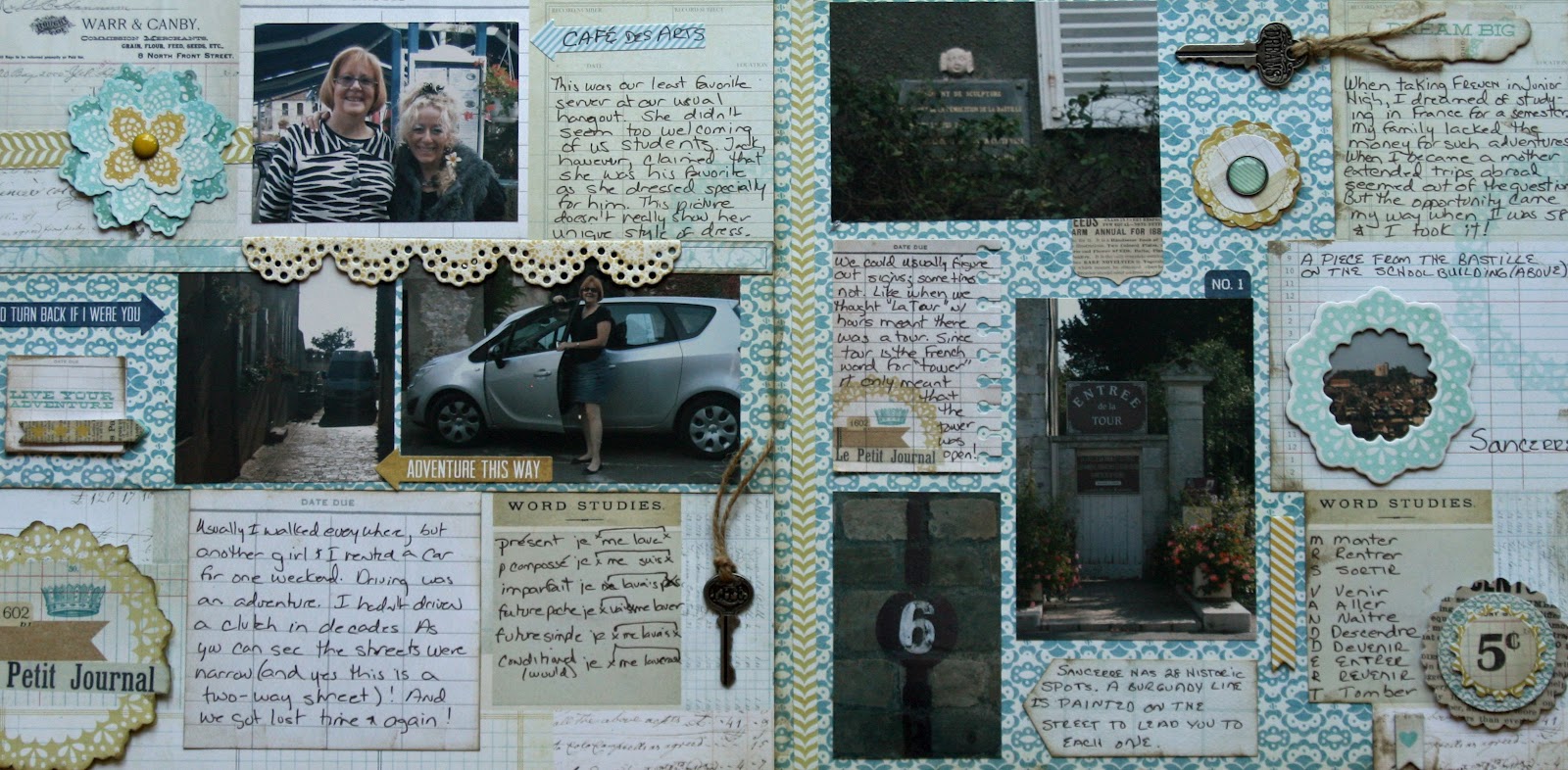
Le Petit Journal


As soon as I saw this paper, I knew I wanted to do something with the Remember Journal paper to document some of my French experiences.  The paper had lots of blocks with decorations and space for journaling.  So I created a layout with pictures and stories that individually would not fill up a whole layout.

  I started  with the Remember Journal paper for my left page background.  Using a 2nd piece of the paper, I cut out the “Le Petit Journal” emblem and a row of the boxes from the right side.  I affixed the emblem with pop dots  directly over the one on the  background (after inking it).  I used the block of boxes for the right edge on top of  a piece of Playful Mischief.  I added a horizontal strip of Playful Mischief on the left and a narrow vertical strip from the Playful Lively page on the left. 

With the background complete, I added a few pictures and lots of journaling and then went crazy adding embellishments.  I used Playful Layered Stickers, Bright Chipboard, Everyday Decorative Brads, Smile Stickers and Playful Label Stickers.  The final touch was a couple of Tim Holtz Word keys with twine tied through them. 

Although this fit well with my French pictures, it would work well for any situation where you want to tell a story.  If you don’t want Le Petit Journal put a block of paper over it and put a picture, journaling or some other embellishment. 


Friday, September 7, 2012

Embellishments Plus

This bright paper made me happy -- just to looking at it.  Once I got started embellishing the embellishments I had a great time.  The end result is a lovely layout with 5 pictures from a wedding I recently attended and lots of room for journaling.  (You can’t see it in this picture because I hid it!). 

On a background of Smile Beam, I used a 11 ½” square piece of Bright Blossom.  I put the five 3 ½’ x 5” pictures on a piece of Smile Bouquet paper ¼” larger on all sides than picture block and added this to a piece of Smile Beam about ¼” larger on all sides than Smile Bouquet.  I inked the edges with Tumbled Glass Distress Ink

I used the new Tim Holtz Brushed Pewter Distress Stain to make the two silver (okay actually peweter) accents, one of which is a pull tag for the hidden journaling.  Here’s how you make them.  Cut  2”  X 4” and 2 x 6” pieces from neutral-colored cardstock.  Using the Sizzix Tim Holtz On the Edge Brackets Die cut one edge of each piece.  Put a piece of scotch or masking tape across the edge of the design (the part above the tape is what will show.)   Color the part above tape on each piece with Brushed Pewter Distress Stain. Quickly after adding 2nd coat, cover with clear embossing powder and heat emboss.  Affix the shorter strip to bottom left of photo block. Apply Range Wonder Tape ¼” around sides and bottom fof the photo block.  Affix to backgroung forming a large pocket for the journaling tag.  To finishe the pull tag, put a small brad from the Everday Decorative Brads in the center of the remaining strip.    Add piece of thread or ribbon around brad to pull in and out of pocket and you’ve got a pull tag.  (I colored white thread with the Brushed Pewter Distress Stain.)   Add journaling now or later.   (I printed mine on Playful Mischief paper and scalloped the top & bottom before affixing to pull tag.  I really like it with the scalloped edge showing just above the photo block.) I added the “Tell Me A Story” label  from the Label Sticker set.

I used embellishments in three corners.  Instructions for making them follow. 

Upper right – Start with Decorative Brad from the Everyday Decorative Brad set.   Attach to a 1”scalloped circle from Smile Beam paper and inked with Tumbled Glass Distress Ink with a pop dot.  Affix to a 1 1/2” scalloped circle from Smile Beam and inked with Tumbled Glass Distress Ink with a pop dot.

Lower right – Start with Bright Chipboard flower that is same flower as is in the background.  Affix to a 1 ½ ” Smile Beam scalloped circle inked with Scattered Straw Distress ink with a pop dot.  Affix to a 2.5 circle cut from Smile Beam and inked with Tumbled Glass Distress ink with a pop dot. 

Lower left –Start with a 3” circle of Smile Beam inked with Tumbled Glass Distress Ink and affix it to the background.  Add a 2.5” of Remember Record.  Ink a strip (approx 9 ½”)  of net ribbon (available at Scrapbooks Plus) with Brushed Pewter Distress Ink.    Fold into a bow and secure with two heart pins Little Yellow Bicycle Stick Pins.  To create the center, you start with a 1” scalloped circle of Playful Mischief (inked with Scattered Straw & Tumbled Glass) and insert a brad from the Everyday Decorative Brad set.  Insert this in the center of the bow you have made.  Add two smaller brads.   Using 450 glue or Glossy Accents affix the bow to the circles on the page.

A variation of this page could be made with a variety of the papers and embellishments.  And if you don’t to journal (and I know many of you don’t), either just use the brackets for embellishments and don’t make into a pull tag or use the pull tag for additional pictures instead of journaling.

Thursday, March 1, 2012

Follow Your Heart: Be Amazing & Be Happy

If you love embellishments, like I do,  then My Mind’s Eye is the perfect scrapbooking line for you.  Using one of their newest lines – Follow Your Heart: Be Amazing, the Design Team has created some fabulous pages, cards and  altered items.  With 12 different double-sided papers in blues, browns, whites and golds and prints including strips, checks and my favorite -- hexagons, there’s sure to be something that appeals to you.    Several of the pages have cute designs and inspiring messages like a bicycle that says “Be the Best You Can Be,”  music with “Listen to Your Soul “ and kites with “You Fly, You Soar.”

And if the beautiful papers are not inspiring enough, there’s chipboard, brads, buttons, twine and rhinestones in matching colors.    I used pages from the matching 6” x 6” paper pad in two of my creations.  The paper is the exact same as the regular paper, except everything is half as big.

With these coordinating papers and embellishments, creating a stunning page is cinch.   Get inspiration from the Design Team projects to make your unique pages or just scraplift one of ours.   All are available at the store with the supplies you’ll need. It’s easy to create great cards and pages so don’t delay, get started today.

Scrapbooks-Plus also carries the Be Happy line of Follow Your Heart, which features pinks, peaches, and greys.  The Be Happy line includes the same wonderful embellishments.  Check these out while you’re at the store.

Thursday, February 23, 2012

Making Pinwheels

I really love the look of pinwheels and they are so easy to make.  They can be multidimensional or flat.  The three pinwheel-layers can be three different papers or all the same paper.   It is all up to you.  Here’s how you make the pinwheels.   

Cut 2 circles of three different sizes.   Cut each circle in half.   If you are making them flat against the paper, simply affix the largest four half circles to the paper in a circular pattern with all the flat edges facing the same way.  You will probably want to overlap them in the center a bit.  Repeat with each successive smaller circle, gluing them so blades of pinwheels do not totally cover the layer below.  On top of the top circle, add something to cover up the area where blades come together.  I like using a small paper circle and then an ornament – a brad, a button, or some fun object.  For this box, I used Elements White Buttons, which I threaded and tied a knot before affixing.  For Easter, some with eggs or bunnies in the center would be cute.  The possibilities are almost endless.

Now it is only slightly more complicated to make the pin wheels multi-dimensional.  Instead of gluing pinwheel blades to the paper, glue them to a circle (sized so that the next layer completely covers it).  Put another circle on top.  Do the same with the other layers.  Add a pop dot to the bottom and between each layer.    

To decorate mine a little more, I embossed the edges.  I “inked” the round edges with VersaMark.  This is the same technique that you use when inking an object so it isn’t even.  Then I embossed with a transparent glittery embossing powder.

To make the box, you simply cut and score a 12” piece of paper into  9 even squares.  The center square is scored and the lines that go from outside to center square are alternated scoring and cutting.   (If you’ve not done this before, the instructions with a diagram are in the 12/30/11 blog.)  Glue the sides of the box together.  I used the Bazzill pre-cut edges to decorate the top. You’ll need two packages, but you’ll have lots left over for other projects.  These come in lots of colors.  A ribbon, which is also available at Scrapbooks Plus, goes around the center.

Saturday, July 30, 2011

4th of July Barbeque Page with Recipes

My 2-page layout this month gave me the opportunity to preserve our traditional 4th of July barbeque. I used pictures from two different years and included the recipe for the barbequed ribs that are the featured item every year. Most of the paper was from My Mind’s Eye American Made line.

To make this page, I started with Petticoat Plaid Red Polka Dot paper for the background. I added a 2 ½” strip of My Mind’s Eye Celebration Banner across the top. To make it a little more interesting, I cut the bottom of the strip in large scallops rather than a straight line. I added a 3” strip of Pieced Pinwheels across both pages.

I used two techniques to make the rather boring title (4th of July Barbeque) more fun – a banner & a chipboard star frame. I painted a chipboard star frame white. After inking it with Weathered Wood Distress Ink, I added some solid blue cardstock to fill in the inner star. For the banner, I cut individual flags using the Celebration Cricut cartridge. After string these on Lime Twist Fly a Kite “ Soar” Twine, I tied a small bow on each end and affixed with Glossy Accents. The “4th of July” was cut from the Petticoat Plaid Red Polka Dot paper using the Cricut. The “4” was made much larger. The “Barbeque” part of the title was cut from solid blue cardstock using the From My Kitchen Cartridge. The smaller “Barbeque” and “Chef” and the background ovals for each were also cut using this cartridge.

I printed my journaling on The Day We Celebrate paper so that I could create a box that overlaps the two pages and would use the papers border on three sides. In addition to journaling this box serves as a photo mat for two pictures. I also inked this. After printing the two recipes on The Day We Celebrate paper, I hand cut the recipes into the shape of recipe cards. To draw more attention to the recipes, I cut an outline for each recipe from polka dot paper (one red and one blue). The remaining photo mats were cut from Pieced Pinwheels paper.

To finish the page, I embellished with flowers, buttons and stars. All buttons were tied with twine. The buttons and the stars came from the BoBunny Liberty Button set. To make the flowers, I stamped plain white flowers with Weathered Wood Distress Ink very lightly. I tied twine in the center of buttons for the center.

I love this page and even more love that our 4th of July barbeques will not be forgotten.

Saturday, July 23, 2011

Making a Barbeque Recipe Book

This month’s papers strongly suggest celebrating the 4th of July and for us this means food, so I decided to use the From My Kitchen Cricut cartridge to make a recipe book. I used Moxie Hometown Celebration line (Star-splangled, Grand Ol’ Flag, and Patriotic Patchwork) so that everything in the book matches everything else. The recipe book has three parts – covers, dividers for different types of food and recipe cards. It was easy to put together. The description that follows seems complicated but it really is not. The only challenging part was figuring out what size to cut the pieces.

For the front and back cover, I cut two 5" X 6 ½" pieces of chipboard. I covered the edges with blue ribbon so the edges would be finished. After I finished the edges, I adhered paper to both sides of each cover using a glue stick and a brayer. Using the Cricut, I cut the title “Barbeque” and “Recipes” from dark blue Bazzill cardstock.

I cut six dividers using the same cardstock as the title using the Tabs Feature (2 each of mixer, blender and toaster; 4 ¼”). Each divider has a title on the divider and on the tab of the divider. For the title that goes on the divider itself, I cut the words using the Cricut from the same cardstock as the dividers. The cartridge offers several options. I used drinks, appetizers, vegetables, meats, breads and sweets. To make the titles stand out, I cut an oval shadow for each using the Cricut. The oval shadows and the tabs (3 3/4”) were cut from matching paper. I used a label maker to make the title to go on the tab. For some dividers, I added some stickers from the Moxie Hometown Celebration sticker set to decorate them a bit more.

I printed the recipes on My Mind’s Eye American Made “Patriotic Picnic” Paper. I printed five recipes on one piece of paper by using Microsoft Publisher so I could turn some sideways to fit more per page. They were cut to be 3 ¾” x 6” . I cut a recipe card overlay for each recipe (Tab Feature Key, Shift & Cookie) from one of the Moxie papers and glued to the recipe card. In printing the recipes you have to work around the shape of the recipe overlay.

There are a few ways that you could make this project a little simpler. Two involve the recipe card overlays. The simplest way would be to not use any recipe card overlays so that your recipe card would just be a rectangular piece Patriotic Picnic paper. Another alternative is to use recipe card overlay that is rectangular. The cartridge offers several options. I used an overlay that has a circular cutout on one side requiring formatting the recipe to avoid this spot. Another option is instead of printing the recipe on paper and then cutting to match overlays, you could simply cut a recipe car and stamp lines on it for handwriting recipes.

After punching three holes in all (cover, dividers, recipe cards), I put We R Memory Keepers blue eyelets (large) so that the holes would withstand use. After putting book in proper order, I strung all items tan twill ribbon from Scrapbooks Plue and tied in a knot and then a bow. You could also use rings but I liked the look of the ribbon.

It will be great in the future to have all the recipes I use for barbequing in one place so that I don’t need to look through a bunch of cookbooks. It would also make a nice gift for a housewarming or bridal shower.

Saige Barnett, who was visiting my house, for the 4th of July holiday helped me with this project. She did lots of assembling and holding.

Saturday, April 30, 2011

Creating a Sea Layout


I had fun with this month’s page map, which is available at the store. I liked the proposed placement of a trio of pictures so I began there. I had three pictures that went well with the papers. I went with a theme-based layout to tell the story of an attempted fishing trip that was miserable due to “Rough Seas.”

A few elements worth noting. As you know, I am a big fun a canvas and that seemed to fit with a nautical theme so I cut “SEAS” for my title out of a piece of canvas and raveled the edges. I put a bit of brown paper behind the letters so that the letters would pop a bit more. For the “rough,” I used another favorite. I cut the letters out of grungepaper and embossed them with vintage photo embossing powder. The anchors were made using the same technique.

The page map had a line near the bottom. I decided to use the “sea” for the bottom section of the page. To create the sea, I cut several strips of paper with the top being wavy out of the turquoise side of “Little Lady” Fine Flowers paper. To create the white caps on top, I distressed the edges of the waves. I glued this to the background at varying levels, overlapping the strips.

Journaling was done on cream cardstock. To make it fit the colors and theme better, I distressed it with three colors of Distress Ink (Vintage Photo, Scattered Straw & Wild Honey).

Just a few Stella and Rose Brads completed the page.

Saturday, April 23, 2011

Designing A Page to Tell Your Story

My two-page layout this month is a good example of what I like to do when scrapbooking -- tell the story of a family event. To begin, I think about the event and consider how I can use the pictures to tell the story. Once I have an idea of this, I design a page around the pictures and the story.

This page was to tell the story of a trip my niece and I took to San Francisco. What I recalled was that we did all the typical touristy things. I decided that pictures would be better to convey this activity than journaling, but I was challenged by how to fit so many pictures in two pages. Also, since this was before the days of digital pictures, I was stuck with 3” x 5” pictures. By cropping some pictures, I managed to include pictures depicting the skyline, the Golden Gate Bridge, our hotel, the sea lions at Fisherman’s Wharf, Hard Rock Café, Buena Vista Café, Candlestick Park, Ghirardelli square, a total of 12 pictures.

To avoid a cluttered appearance with so many pictures, there had to be an order. I achieved this by dividing the two pages into three horizontal sections that went across both pages, using thin strips of the “Joy” Woodgrain paper to divide the sections. The top section contains only the title. The middle section consists of a row of pictures between the two strips of woodgrain paper that divide the middle section from the top and bottom. These strips also create a frame for these pictures. Some of the pictures are cropped so that six pictures can fit in the 3” x 24” space. The center picture on each side was put in a fun polka dot frame (cut with a Sizzix die). I used the bottom and largest section to have larger pictures and in most cases those with people, which of course are more important.

I used small tags cut with Sizzix dies to label the pictures and the beautiful Stella & Rose brads to hold them to the page. Because there was so much in these two pages, I printed the jounaling directly on the background cardstock and did not in any way frame it. Even with journaling you can’t fit everything. One thing I remembered about the trip was every time we went by a sign directing you to San Jose, I would start singing “do you know the way to San Jose?” and since I can’t sing I would be asked to stop. To scrap this little memory with hardly any space, I just cut the San Jose sign out of picture. I wrote on the tag near it “Do you know the way . . .” and drew some musical notes. The pages were decorated with selectively placed Mabel “Joy” labeled Stickers, Mabel “Love” Decorative Brads and a Mabel “Play” button. I love the way you can mix and match this stuff to create the look that you like.

Thursday, April 7, 2011

Spring Basket & Wine Coaster

The Stella & Ross Mabel papers are a great set of papers and embellishments for making fun spring items as you’ve probably noticed from the other blogs. I used them to make this cute trio of Easter items – a wine coaster, a basket and a card. The oranges and turquoises were just the right colors for Easter items and the wide variText Colorety of brads available made perfect accents. I found the sturdy nature of the Stella & Ross papers to be excellent for items needing a little more strength than a card or scrapbook page. To make the coaster and basket, I used the Mabel “Joy” Woodgrain for the base. I sprayed it with two colors of Glimmer Mist to give it more texture and some shine. I wove in a variety of spring colors and added a scalloped edge at the top and bottom. The only challenging part was getting the bottom the right size but you can either use my sizes or just experiment a little to get it the right size. Or if you are a math whiz, you could use a formula to figure out the size of circle you need. The detailed instructions for the basket follow. I have also included notes of the adjustments needed for the wine coaster. This is definitely a project that you can have some fun with.

  1. To make the weaving base cut a 3” x 12” out of Mabel “Joy” Woodgrain paper. The strips to weave are made by making a 11 ¼” cut (in other words your strip will still be attached on the left side of the weaving base) every ¾” or 3 times. You will have four strips. It is important that the cuts end at the same point leaving ¾” piece on the left side that is uncut. Spray the woodgrain side randomly with Sun Sisters & Peach Delight Glimmer Mist.

  2. Cut 15 ¾” x 3 ½” strips of matching materials. This is a great way to use scrap paper. Sample uses Mabel “So Sweet” Herringbone (orange side), Mabel “Little Lady” Posies and Mabel “Play” Damask.

  3. One at a time weave each of the 3 ½” strip into the main weaving piece alternating on top and on bottom. After all are woven, go back to the beginning and make sure all strips are pulled completely to the one next to it. You need to do this with both the vertical and horizontal pieces. It may take a couple of times to have it all lined up. Affix each strip at top & bottom on the side that will be covered or use a small stapler like Tim Holtz Tiny Attacher to hold the strips in place. If use stapler you’ll want it to be close enough to top or bottom that trim will cover.

  4. At this point you can decorate the basket with brads, flowers or stamp images in the squares. The sample basket does not include any decorations, but the wine coaster includes a variety of the Stella & Ross brads to make it more attractive.

  5. Cut ¾” x 12 strip for top edge Mabel “Little Lady” Fine Flowers. Scallop one edge; attach to top of main weaved piece on outside.

  6. Cut another ¾” strip of Mabel “Little Lady” Fine Flowers for bottom edge. Scallop one edge.

  7. Cut circle for bottom. (Sample is 3 ⅜”.) Best if use hard cardstock for this. Sample uses Bazzill cardstock. Cut 2nd circle about 1” bigger than 1st circle.

  8. Affix wrong side of smaller circle inside wrong side of larger one. (I used a glue stick.) Using tool score as close to inner circle as possible so it will fold up easily. Cut a series of “v”s out of the circle about every ½”. The widest part of the “v” should be at the outside edge and the tip of the “V” should be exactly at the scored line. Slowly fold the outer circle inward on score line. Put row of red line tape on inside bottom edge of main weaving and one on edge of main weaving that should be on inside. Place some round object in the circle that is about the same size as the inner circle. I used a wine bottle but they do vary in size so it may take a little effort to find the right size bottle. Assuring that the sides of the larger circle are all pushed up and in. Slowly wrap main weaved piece around the circle pressing to assure it seals. When get to the end, press the edges going up the side of the bottle together. You may need to add some extra glue in places.

  9. Cut a 1” x 12” piece of Mabel “Joy” Woodgrain. Put red line tape on the woodgrain side and affix it inside the top of the basket (so polka dot side is showing. This creates a nicer edge for the basket.

  10. Put a 1 1/2” piece of Mabel “Little Lady” Fine Flowers for the handle. Scallop both sides. Put a hole in the basket and the handle. Affix with brad. Repeat same on the other side of the basket.
Wine Coaster The wine coaster is made the same as the basket except for size and choice of colors. The following variations are made in the sample.

  1. The main weaving base is 4 ½” tall rather than 3”.

  2. The strips are 5 ½” instead of 3 ½”.

  3. The top and bottom strip should be 1 ½” rather than ¾”. •The sample includes brads for decorations from the Mabel “Love” Decorative Brad Set.

  4. The sample also includes a small tag that can be used either as a gift tag or to label the kind of wine that is in the coaster if you are using to serve.

  5. The tag from the Mabel “Love” Decorative Brad Set.

  6. Add a 1” row of trim on the bottom inside affixing with red line tape so that there are not rough edges for wine bottle to catch on. (This is just like the one on the top as in the basket.)

  7. There is no handle.

Sunday, September 27, 2009

Pineapple Mini-book by Esther

Aloha!
When I think of Hawaii, I think pineapples. While vacationing there, we visited the Helemano Pineapple Plantation. My desire to use those photos led to the design of the pineapple book. The Oh LaLa papers were great for the subject. I started with a shape cut from chipboard using the trial & error method. Half of the 12' square looked like a good start in order to accomodate the 4"x6" photos & journaling with embellishments. The shapes were traced on the back side of the Bazzil gold cardstock. Next, I painstakingly cut each of the shapes (so they lined up) & inked the edges of the chipboard with a green marker. I glued the cardstock shapes to the chipboard and punched holes for the rings.


After the pages were ready for photos, I concentrated on decorating the cover. The cross-hatched diagonal lines were sketched with a brown marker on gold paper.
They were shaded with brown stamping ink. Orange Staz-on ink was used to give contrast.
The leaves were cut of green paper & shaded with markers & ink pads.
Overlapping them in layers gave a more realistic effect.

Of course, I had to add bling to the intersections of the pineapple diamonds. The rhinestones already had glue on back.
Because I put inks on the cardstock cover, some stones had to be glued on a second time. An attempt was made to color the silver rings using alcohol inks. The color is faint though.
The photos, embellishments & were added. Hand formed letters were used with markers & a calligraphy marker in green. Ribbons added that festive touch to the rings (see them on the display board).
This was a fun project that kept the creative juices flowing for a couple of weeks. Try shaping a book from the chipboard pieces you can get at Scrapbooks Plus.
Aloha!

Saturday, September 12, 2009

Memphis Quick Stop by Esther


The My Mind's Eye Ooh La La papers seemed right for this layout with colors of decades from the past—gold and green. I started with a solid green color cardstock and built layers that accommodated the four photos that I had on the subject. In order to lend some pizzazz to the layout, I cut a circle using the outline drawn with a skillet lid. A third of the biege circle was used on the left side in order to balance the lightness of the map on the right side. Journaling with transparent materials is best done by planning the page first, then printing a whole sheet of journaling to fit the spaces. I print a black & white copy on paper to test the size first. After cutting the size to fit, I do the final printing in color on the transparency.


I used Microsoft Publisher (or Word) with Britannic Bold in 18 point being shaped to align with the arc. It was printed on a transparency sheet. When placed over the beige cardstock arc, the green print is clearly readable. The title was also printed on the transparency in size 44 in Bodoni MT. Scrapbooks Plus sells a transparent sheet by Graffix. I would have used that if it had not been midnight when this was being printed. Those sheets are smooth on both sides. The transparencies are to be printed on the textured side. Adhering clear papers and transparencies present a challenge. After planning layers, the clear printing is adhered under other elements or holes were punched with the Crop-A-Dile & Big Bite (center of page) to insert green brads. Some edges are beneath the photos , like the title. In order to place the brads on the gold cardstock mats for the photo captions, I measured & marked placement on the back of the gold cardstock. That way the clear journaling piece is attached to the gold cardstock with brads. Double stick tape was used beneath the brads to adhere to the sheet.


The additional museum information was found on their website. The map was printed on photo paper. This was a fun way to present a memory of a place I plan to see in its entirety in the future. We only made a quick stop to see the building before it was opened that day.

Tuesday, September 1, 2009

Memphis Quick Stop by Esther


The My Mind's Eye Ooh La La papers seemed right for this layout with colors of decades from the past—gold and green. I started with a solid green color cardstock and built layers that accommodated the four photos that I had on the subject. In order to lend some pizzazz to the layout, I cut a circle using the outline drawn with a skillet lid. A third of the biege circle was used on the left side in order to balance the lightness of the map on the right side.

Journaling with transparent materials is best done with planning the page befpre printing a whole sheet of journaling to fit the spaces. I print a black & white copy on paper to test the size first. After cutting the size to fit, I do the final printing.


I used Microsoft Publisher (or Word) with Britannic Bold in 18 point being shaped to align with the arc. It was printed on a transparency sheet. When placed over the beige cardstock arc, the green print is clearly readable. The title was also printed on the transparency in size 44 in Bodoni MT. Scrapbooks Plus sells a transparent sheet by Graffix. I would have used that if it had not been midnight when this was being printed. Those sheets are smooth on both sides. The transparencies are to be printed on the textured side.


Adhering clear papers and transparencies present a challenge. After planning layers, the clear printing is adhered under other elements or holes were punched with the Crop-A-Dile to insert green brads. Some edges are beneath the photos, while others are beneath the biege arc (shown in the second and third photos). In order to place the brads on the gold cardstock mats for the photo captions, I measured placement on the back. That way the clear journaling piece is attached to the gold cardstock. Double stick tape was used beneath the brads to adhere to the sheet.


The museum information was found on their website. The map was printed on photo paper. This was a fun way to present a memory of a place I plan to see in its entirety in the future. We only made a quick stop to see the building before it was opened that day.


Wednesday, April 8, 2009

Spring Fling by Loretta Cooper


I loved this paper as soon as I saw it! Great choice Deborah. It's the Bloom and Grow line from My Mind's Eye. The inspiration for the layout was really the great colors in the line. As you can see I layered several prints and created chip board embellishments out of some of the coordiating stickers.

The oranged scallop piece was part of the kit, but I balanced it with a scalloped white stripe placed horizontally across the bottom. You can purchase all kinds of pre-cut scallops, but if you love the look you might consider investing in a cutter that includes various decorative blades. Debbie or any of the girls at Scrapbooks Plus can help you choose one you are sure to love.

Thanks for dropping by the DT Blog,

Loretta

Wednesday, April 1, 2009

It's April 1st!

And it's time for a new kit. This month we're featuring the Bloom&Grow collection from My Mind's Eye. I don't know about you, but I've been simply dying for spring this year -- and these are just perfect for springtime.

There's two different color groups in this collection, which makes it easy to please everyone. The first group (below) has more teal and orangish red in it. We've paired these with brown American Crafts Thickers, Pebbles Candy Dots, Maya Road chipboard, Co'ordinations Cardstock and some fun new products from Bazzill Basics - paper leaves and Just the Edge paper strips.

The second group is more girly with lots more pink. Along with the Co'ordinations cardstock, Bazzill Basics leaves, Just the Edge strips, Pebbles Candy Dots and Maya Road chipboard we've got Heidi Swapp large foam alphas.


We'll be changing out the design team wall tonight -- no tricks! Please stop by and check out what our design team has created with these great products.