I used the Paper Lace paper to provide my background. To use the design of the paper that I loved , which was on the paper’s right and left edges, I simply used the edges of the paper and put a different paper for the center of the layout. And just like that I had the same design as the initial paper, but as a two-page layout rather than a one-page one. Saturday, February 9, 2013
Old Pictures + New Mind's Eye Paper = Family Memories
I used the Paper Lace paper to provide my background. To use the design of the paper that I loved , which was on the paper’s right and left edges, I simply used the edges of the paper and put a different paper for the center of the layout. And just like that I had the same design as the initial paper, but as a two-page layout rather than a one-page one. Friday, September 14, 2012
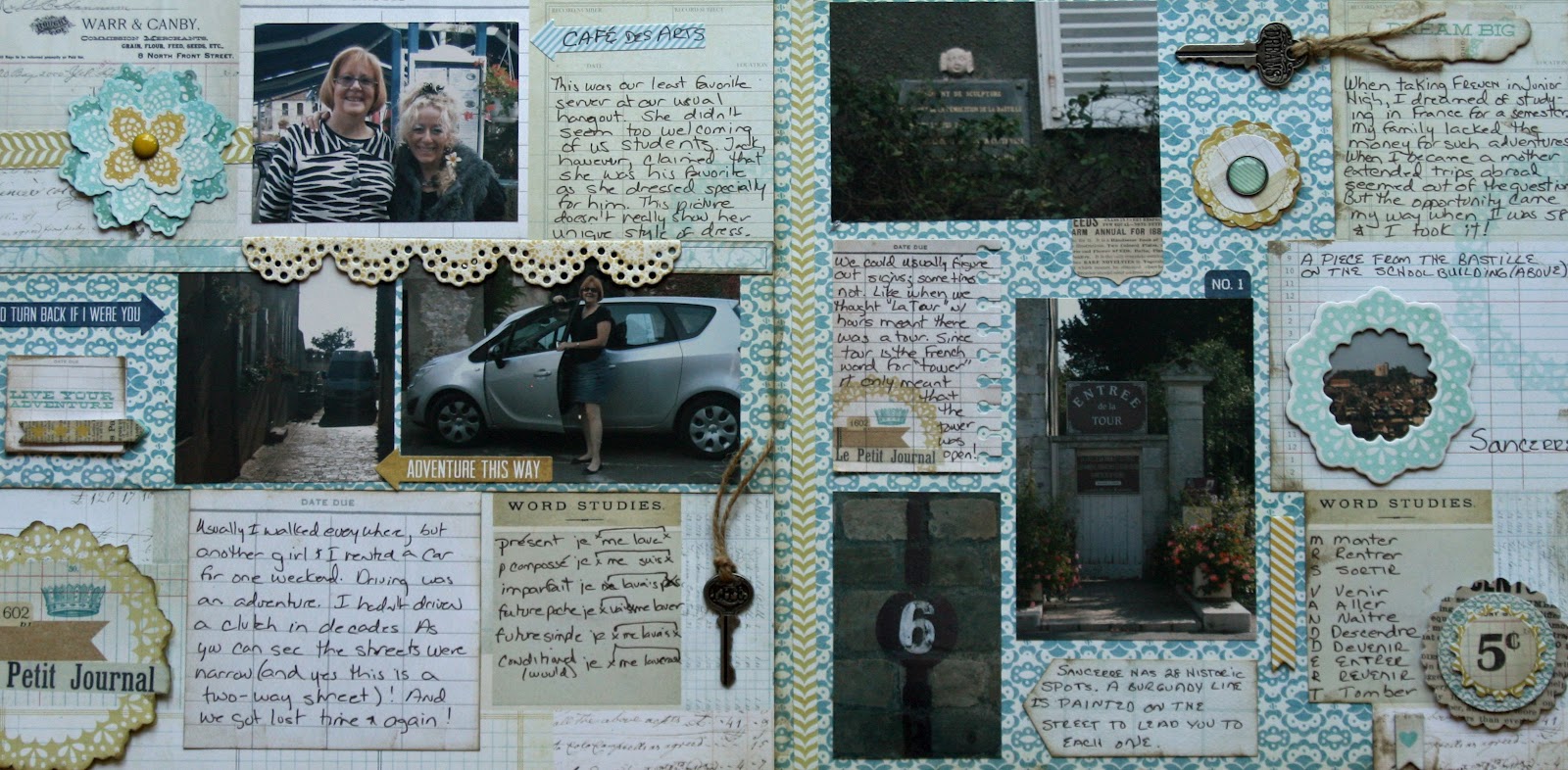
Le Petit Journal
As soon as I saw this paper, I knew I wanted to do something with the Remember Journal paper to document some of my French experiences. The paper had lots of blocks with decorations and space for journaling. So I created a layout with pictures and stories that individually would not fill up a whole layout.Friday, September 7, 2012
Embellishments Plus
the shorter strip to bottom left of photo block. Apply Range Wonder Tape ¼” around sides and bottom fof the photo block. Affix to backgroung forming a large pocket for the journaling tag. To finishe the pull tag, put a small brad from the Everday Decorative Brads in the center of the remaining strip. Add piece of thread or ribbon around brad to pull in and out of pocket and you’ve got a pull tag. (I colored white thread with the Brushed Pewter Distress Stain.) Add journaling now or later. (I printed mine on Playful Mischief paper and scalloped the top & bottom before affixing to pull tag. I really like it with the scalloped edge showing just above the photo block.) I added the “Tell Me A Story” label from the Label Sticker set. Thursday, February 23, 2012
Making Pinwheels
I really love the look of pinwheels and they are so easy to make. They can be multidimensional or flat. The three pinwheel-layers can be three different papers or all the same paper. It is all up to you. Here’s how you make the pinwheels. Wednesday, February 22, 2012
A Few of My Favorite Things
Saturday, July 30, 2011
4th of July Barbeque Page with Recipes
My 2-page layout this month gave me the opportunity to preserve our traditional 4th of July barbeque. I used pictures from two different years and included the recipe for the barbequed ribs that are the featured item every year. Most of the paper was from My Mind’s Eye American Made line.To make this page, I started with Petticoat Plaid Red Polka Dot paper for the background. I added a 2 ½” strip of My Mind’s Eye Celebration Banner across the top. To make it a little more interesting, I cut the bottom of the strip in large scallops rather than a straight line. I added a 3” strip of Pieced Pinwheels across both pages.

I used two techniques to make the rather boring title (4th of July Barbeque) more fun – a banner & a chipboard star frame. I painted a chipboard star frame white. After inking it with Weathered Wood Distress Ink, I added some solid blue cardstock to fill in the inner sta
r. For the banner, I cut individual flags using the Celebration Cricut cartridge. After string these on Lime Twist Fly a Kite “ Soar” Twine, I tied a small bow on each end and affixed with Glossy Accents. The “4th of July” was cut from the Petticoat Plaid Red Polka Dot paper using the Cricut. The “4” was made much larger. The “Barbeque” part of the title was cut from solid blue cardstock using the From My Kitchen Cartridge. The smaller “Barbeque” and “Chef” and the background ovals for each were also cut using this cartridge.I printed my journaling on The Day We Celebrate paper so that I could cr
eate a box that overlaps the two pages and would use the papers border on three sides. In addition to journaling this box serves as a photo mat for two pictures. I also inked this. After printing the two recipes on The Day We Celebrate paper, I hand cut the recipes into the shape of recipe cards. To draw more attention to the recipes, I cut an outline for each recipe from polka dot pap
er (one red and one blue). The remaining photo mats were cut from Pieced Pinwheels paper.To finish the page, I embellished with flowers, buttons and stars. All buttons were tied with twine. The buttons and the stars came from the BoBunny Liberty Button set. To make the flowers, I stamped plain white flowers with Weathered Wood Distress Ink very lightly. I tied twine in the center of buttons for the center.
I love this page and even more love that our 4th of July barbeques will not be forgotten.
Saturday, April 30, 2011
Creating a Sea Layout

The page map had a line near the bottom. I decided to use the “sea” for the bottom section of the page. To create the sea, I cut several strips of paper with the top being wavy out of the turquoise side of “Little Lady” Fine Flowers paper. To create the white caps on top, I distressed the edges of the waves. I glued this to the background at varying levels, overlapping the strips.
Journaling was done on cream cardstock. To make it fit the colors and theme better, I distressed it with three colors of Distress Ink (Vintage Photo, Scattered Straw & Wild Honey).
Just a few Stella and Rose Brads completed the page.
Saturday, April 23, 2011
Designing A Page to Tell Your Story
My two-page layout this month is a good example of what I like to do when scrapbooking -- tell the story of a family event. To begin, I think about the event and consider how I can use the pictures to tell the story. Once I have an idea of this, I design a page around the pictures and the story.This page was to tell the story of a trip my niece and I took to San Francisco. What I recalled was that we did all the typical touristy things. I decided that pictures would be better to convey this activity than journaling, but I was challenged by how to fit so many pictures in two pages. Also, since this was before the days of digital pictures, I was stuck with 3” x 5” pictures. By cropping some pictures, I managed to include pictures depicting the skyline, the Golden Gate Bridge, our hotel, the sea lions at Fisherman’s Wharf, Hard Rock Café, Buena Vista Café, Candlestick Park, Ghirardelli square, a total of 12 pictures.
To avoid a cluttered appearance with so many pictures, there had to be an order. I achieved this by dividing the two pages into three horizontal sections that went across both pages, using thin strips of the “Joy” Woodgrain paper to divide the sections. The top section contains only the title. The middle section consists of a row of pictures between the two strips of woodgrain paper that di
vide the middle section from the top and bottom. These strips also create a frame for these pictures. Some of the pictures are cropped so that six pictures can fit in the 3” x 24” space. The center picture on each side was put in a fun polka dot frame (cut with a Sizzix die). I used the bottom and largest section to have larger pictures and in most cases those with people, which of course are more important.I used small tags cut with Sizzix dies to label the pictures and the beautiful Stella & Rose brads to hold them to the page. Because there was so much in these two pages, I printed the jounaling directly on the background cardstock and did not in any way frame it. Even with journaling you can’t fit everything. One thing I remembered about the trip was every time we went by a sign directing you to San Jose, I would start singing “do you know the way to San Jose?” and since I can’t sing I would be asked to stop. To scrap this little memory with hardly any space, I just cut the San Jose sign out of picture. I wrote on the tag near it “Do you know the way . . .” and drew some musical notes. The pages were decorated with selectively placed Mabel “Joy” labeled Stickers, Mabel “Love” Decorative Brads and a Mabel “Play” button. I love the way you can mix and match this stuff to create the look that you like.
Thursday, October 1, 2009
Soup's On!
I also "mixed in" some papers from Anna Griffin and the "Boo To You" line from My Mind's Eye, because how can you scrap for October and not include Halloween?
We are really looking forward to seeing what your pages look like! For the DT Challenge this month we are providing you with a page map to use for your layout. We are also offering another incentive - a "free with purchase" bonus! I will post a picture of it tomorrow, so make sure you check back. Once you see how the DT used it on their projects you will definitely be inspired.
.So come on into the store, check out The Wall, choose your papers, pick up a page map and get "cooking" - there is another Gift Certificate up for grabs!!!
(and yes, I will probably continue to "pepper" my blogs for the rest of the month with references to cooking - oops! I did it again!)
Wednesday, September 23, 2009
Are you ready for some Football?!?
Don't be afraid to mix papers from different lines...and different companies. You will end up with a page that is completely unique!
Wednesday, September 9, 2009
A Glass of Wine and a Good Book...
I also picked up a reader's journal. We are avid readers in my family, but the names of books and authors often slip my mind. The journal has a series of prompts for you to note favorite quotes or characters from the story as well as a place to record your personal review. (It would also be a great place to write down the reading recommendation of a friend, since I am always looking for something good to read.)
In any event, these journals inpired me to do something I rarely do...create a scrapbook page about me! A page about wine and a book I enjoyed...part of that daily minutiae that seems so unimportant...but I would be fascinated to know about my mother and her preferences, for example. The paper is acid-free, the pages are the perfect size, and the "ripped out page look" is just cool!
I think this may be the beginning of a series...I just got back from a weekend in New York where I happened to shared a fabulous bottle of German wine with my mother-in-law and sisters-in-law...and I kept the label...
Wednesday, September 2, 2009
Do you need some All Occasion Cards?
These are generic, all occasion cards that are even okay to send to a guy!I always struggle trying to make cards that are a little more masculine, but because of the colors, I even think the flowers don't make them too "pretty" or "girly"... although I wouldn't hesitate to send them to my girlfriends either!
The sentiment on (2) of the cards are from a stamp set that Debbie has in the store from Inkadoo "Tell It Like It Is" - they are so cute and so true! The asian word tiles are from a doodlebat font set I purchased online. The "perfect day" icon is also from a purchased doodlebat font.
.
The die cut sheet makes it quick and easy to assemble the cards.
Sunday, August 9, 2009
Young Love
.
There is lots of texture in this project - Bazzill polka dot paper, chipboard die cuts, velveteen paper, MME die cuts, Prima flowers and buttons. Mom will add journaling when it comes down off of the wall at the store.
Thursday, April 23, 2009
Fact: 5 Year Olds Ask the Most Interesting Questions...
I think the contrasts on this layout are what makes me happy - or maybe it is just looking at my daughter's little red boots and thinking about her curious nature that turns up the corners of my smile...
Thursday, April 9, 2009
Bloom & Grow...
Thursday, April 2, 2009
This Little Piggy
Not many tips to share from this layout. It went together so quickly because I used several elements from the My Mind's Eye Die Cut sheet - a scalloped border, the journaling block, the parentheses, and two cute little floral paisley embellishments!.
Because I chose to put the scalloped border on top of paper with similar colors, inking the edges definitely helped the die cut stand out - and the vellum did the same thing for the smaller letters in the title. This is actually one of my favorite uses for vellum because it lets the background show through, but provides just enough contrast to separate the title. The die cut parentheses provided the perfect little frame.
.
And don't you just LOVE the Heidi Swapp Foam Letters?!?! They are so thick and the adhesive on them is great. I always try to add a little dimension to my projects - there are pop dots under the paisley embellishments - but the Heidi Swapp letters just JUMP off the page - perfect for a title!
.
I actually took waaaay too many pictures of my cute little piglet! I was going to make an exploding box for the rest (what a surprise, right?) but I think I will turn this 1 page layout into a 2 page layout when it comes home. I hope Debbie has ordered more of those die cut sheets...
Tuesday, February 3, 2009
Recital 2005
but I really liked the journaling card, so it was actually my starting point for this layout. There is a place to record the event and the date, but it also adds a bit of whimsy with a choice of emotions. EXCITED was how my daughter felt for her first time on stage, so I used some Glitter from Doodlebug Designs to accent a chipboard arrow. A brad in the center holds it pointing in the right direction. Next to the journaling card, the program from the recital actually was just too bright and clean, so I swiped the front with a light brown inkpad to match the tones a bit. The background paper ties in the pinks & browns from the photos. The picture frame on the first page was cut using an Accu-Cut die you can find in the classroom area of Scrapbooks Plus. I used pop dots under this picture because I wanted it to lay on top of the program, giving it a bit more prominence in the layout.
Page 2 went together very quickly. I used the light brown ink pad to distress the cream colored background paper. Using a square punch and a corner rounder I created a border using pieces of coordinating papers. I also used (2) slide frames in the border, covered in coordinating paper, to highlight a couple of detail shots of my daughter.
(I just love the little awkward angle of her tiny dancing feet!)I plan on adding journaling over the long block on the right side of page 2. I will print it on vellum and use some brads to hold it in place...and I may use Erin's glittering technique to give them some shine! (Thanks for the tip, Erin!)
Monday, February 2, 2009
Pocket Page
Pink and Brown was the perfect color choice to use for scrapping my daughter's baby picture...and the glittery paper added a feminine touch.
With a piece of brown bazill as a base, I started by trimming the Flirty "Lil Girl" Pretty Coat Print paper to 11.5" x 7.5" and used a little adhesive in the center to temporarily hold it in place across the top of the page. Then I cut a piece of brown bazill to 12" x 5.5" and placed it across the bottom of the layout, lining up the side and bottom of the page. A zig zag stitch around the edges held it all in place, and added a textural detail. The chipboard borders from MME's Laundry Line are actually adhesive, but just to really hold it in place on top of the pocket edge, I put a copper colored brad at each end through the entire layout. Then it was a simple matter of punching out some squares of coordinating papers ( Winding Vine & Fresh Pressed Lines) and rounding the corners to match the journaling card. The title was printed on vellum and is highlighted by a set of decorative parentheses. These were soooo easy to make because I used the Clear Acrylic Stamps from the Laundry Line Natural Aspire collection (it has 4 different sizes in the set!) and stamped them on the back of the glitter paper. Then I simply trimmed them out, flipped them over, and attached them to the layout around the title. The velvety flowers are also from bazill and added even more texture and depth...and voila! A pocket page to hold cards and momentos from baby's arrival.