Sunday, June 29, 2008

July's Kit!


Are you excited for July's kit??? Well here's a preview of the papers!! I LOVE THEM!!! (That's probally why I picked them!)


Ladies, we will be having a cupcake party on Tuesday, July 15! That's the day we change the board. So I'm baking cupcakes (and anyone else who'd like to may ;) and well have a party (because it's also my birthday)!!!! I got lucky!!!


Let's make a night of it!!!

Thursday, June 26, 2008

How to use index prints...

Okay, I promised I would show you the inside of my mini-book today.


First let me say how much I love the double sided paper this month from Scenic Route. I cut the strip of surfboards out for the cover, and the flip side of the paper is this cool yellow and orange pattern where I used my Autumn Leaves journaling stamp.
I did something kind of fun with the next page, which is actually just (2) photos glued back to back. Those tiny pictures are actually from the index print I got with my picture order. Nothing fancy, just used some glue and popped them straight onto the picture. (If you want to see a larger image, just click on the picture.) I like it because it tells more of the story and I don't have to feel guilty about throwing away the index print! I have been trying to figure out for a while how to use them, so sprinkling them throughout this book made me very happy!
I used the chipboard pieces on this picture of a seagull on a pier piling. I think it looks like a signpost! This little book went together so fast because the pages were double-sided and coordinated so well. Throw in the stickers and chipboard...and it couldn't have been easier!

Wednesday, June 25, 2008

I *heart* this paper!

I just love this Scenic Route paper! I think that part of it is because I *love* polka dots... and their are lots of dots on the backs of these designs. As I was thinking about how much I loved the dots, I came across a sketch posted online from the February/March issue of Scrapbooks Etc. I knew that it would be perfect for the pics I had sitting out on my scrapdesk and these fun, fun dot papers. I moved things around a bit and changed out some of the paper in the heart to feature my dandelion photo underneath the title... but that's the great part about sketches - you can adapt them to fit whatever supplies and pics you have on hand!


Enjoy!
erin

Tools Rule!!

I made my first mini book this month and it was a fun and easy project, thanks to having the right tools - my Scor-Pal and my Crop-o-dile. I started out with a 12" x 2.75" strip of cardstock and scored it with my Scor-Pal...every inch on the inch up to 6", then flipped it over and scored it again, every inch on the half inch up to 5.5"...does that make sense? Here's a visual to clear things up:
Using the Scor-Pal, the lines were even and exactly where I needed them to be.I made the accordian folds and then, using my Crop-o-dile, I punched holes through the first 3 folds which was (6) layers of cardstock...yes, I said S-I-X layers...and it was a piece of cake (which is why I love my Crop-O-Dile)! Using one fold as a guide to make sure all the holes were lined up properly, I punched through the next 3 accordian folds (See photo at right). As I added pages to the book, I just used the holes I had already punched in the accordian folds as guides to punch holes in the pages.

When it was finished I used brads to hold it all together. I put one brad through the front of the book and the first 3 folds. Then I put a brad through the back of the book and the last 3 folds. Finally I glued the spine together where the brads met.
Obviously, the number of pages you have in your book would be limited by the length of the "legs"(?) on the brad. I had 6 pages, plus the thickness of one layer of cardstock at the front and back.

The other limiting factor is the length of the cover. My cover was 6" long, and since I was using a 12" piece of cardstock, the maximum number of 1/2" folds I could create for the spine of the book was 6.

I don't know if the double brad thing is a new technique because I made it up as I went along...but it is new to me!! Oh, I will post the actual pages of the mini-book tomorrow.

Monday, June 23, 2008

June RAK Giveaway


How about a giveaway to celebrate summer? If you've been by Scrapbooks Plus then you've spotted by Sand Pail Mini Album with no pictures on the inside. Why are there no pics?? So you can fill it with yours!! On the day the DT display for June comes down (July 15) I will draw names from the folks that leave us comments on this blog and select the winner. You can pick the Sand Pail up at Scrapbooks Plus or, if you are not in the DC area, you can tell us how to contact you and we'll mail it to you. The only "rule" for this RAK is you must tell us in your comment your favorite scrapbooking product manufacturer (for example mine is BASIC GREY). The other "rule" is that no DT Member or employee or owner (sorry Debbie!) of Scrapbooks Plus will be included in the drawing (but you can leave your comment and it will make me happier!)

Thursday, June 19, 2008

My "Negative" Reaction!

I saw Lisa's 2 page layout this month (see"Summer fun" which she posted on June 11th) and I had to laugh...I loved it, but I realized that the 2 page layout I had created was the negative of hers! Where she put papers (around the edges), I put pictures, and where she put pictures (nice strong block in the center) I put papers!
I actually need to give credit for this layout design to tomiannie from the Cricut message board...I scraplifted this from one she posted several months ago. I have used this idea a few times, because it lets me use lots of pictures but doesn't leave the layout looking too busy or crowded.

The polka dot papers from Scenic Route this month were really helpful in this layout, because it is a very consistent pattern. It was very easy to decide I was going to leave 2 rows of white polka dots on the green paper all around the edge, and then have a row of red circles from the next layer of paper, before I started laying down my pictures - and everything was even! I didn't need to take out a ruler once!

I ordered some of my prints as wallets, because that is the basic building block of this layout, but I also incorporated several larger pictures trimmed to the correct width...like this one on the right that I framed with the outline of the diecut arrow journaling block
which I ALSO used, as you can see in the picture to the left! It does take a bit of fiddling around to get the pictures to fit right, but you can fill in gaps with stickers (like the "gone surfing" one).

I can't emphasize enough how easy it was to use these papers...the colors and the patterns have such energy! The stickers make it easy to add a quick punch when needed.
AND...I loved the die cut journaling blocks...and even used the remnants/edges! In addition to the arrow in this layout, did you catch that the sun in this layout provided the outline edge for the sun in my one page "dream" layout below?
I am curious...how much time do you spend deciding upon the title for your layouts? I tried to be clever with a title for this layout, discarding at least 5 or 6 ideas before I ended up with stating the obvious, "the sign said No Diving!" How important is the title for you to be satisfied with your final layout?

Wednesday, June 18, 2008

Scenic Route - More Than Just Summer!

When I first picked up the beautiful Grafton line of Scenic Route, I thought up some great summer layouts to make with it. I also thought that the James Street paper would be great for a kid's art page... the cute free-formed circles reminded me of finger painting! Don't limit yourself to just the obvious theme of the papers... they can definitely be used in many more ways!

As I was flipping through pics, I came across a couple of my daughter at the pumpkin patch last fall and realized that the colors were a perfect match. Plus they featured her painting a pumpkin... so those circles were going to work with my art theme too! I used the fun circles as the background, the dots on the back of Laxton Avenue as an accent, and the cool, sun-designed side of Maxwell Avenue to point right to the picture. Stratigically cutting the sun paper and lining up the rays with the photo give it a totally different feel. Some foam stamps with brown paint for the title and a few accents really focus the page on the photo. I didn't want to crowd the page so I used some of the brick-colored, flecked Chantilly Lace cardstock folded in half behind the photo for hidden journaling... just lift the little tag to see it!


I've been seeing a lot of pages in the scrapbooking magazines lately that only use patterned paper and no - or almost no - cardstock. It's easy for those types of pages to be a little busy and overwhelming. To make it work easily, use a large scale print, a small scale print, and tone-on-tone prints to even everything out. This page is all patterned paper, but since two of the patterned papers used are practically tone-on-tone it keeps the page from looking too busy.


Enjoy and thanks for looking!

erin

Monday, June 16, 2008

A Real "Dream" Page...

Does anybody else create in their sleep? It happens to me all the time...

This month things were really crazy around my house so I didn't get to start working with my Design Team Kit right away. I took everything out and drooled over the Scenic Route papers, and then put them away. I didn't forget about them, though, because I woke up one morning and knew exactly how I was going to start this layout!

I took out my Cutter Bee exacto knife and sliced most of the sun's rays along the bottom half of that paper. Then I trimmed out the wave paper and "married" the two of them, pulling forward a little ray of sunshine here and there. A couple of times I had to slice into the wave so that the "sunshine" would lay properly on the page.

I had noticed the Accu-cut swirl die back at Scrapbooks Plus, and it reminded me of the waves. After a trip to the store (where I also bought some terrific Luxe clear acrylic stamps that will undoubtedly show up on some of my future pages) I was back in business. I painted the chipboard green and then pulled out my Pearl Ex to try a slightly different technique using Future floor polish! I filled a Waterbrush with Future and used it to apply the Pearl Ex. I also painted in some shimmery details on the fishies I had cut out. Once it had dried, there was no need to seal these items with acrylic spray to keep the Pearl Ex from rubbing off. Love it! A couple of pop dots for dimension...Done!

Now the bottom of the page was finished and the top half needed some more "weight". I had a die cut of a sun, but it really didn't work, so I used my scissors and trimmed out the thin outline of the sun that was left on the diecut paper (I love to squeeze every little bit out of my kit!). I added a little Pearl Ex...and it looked good, but still not quite right. Soooo I dug into my stash and found some sunshine yellow mulberry paper with a gold paisley pattern. Perfect! I adhered the mulberry paper and the sun outline with Memory Mount.

The final touch was the title which I ended up printing from my word processor. I tried to add a tag for journaling several times but I just couldn't find a spot that made me happy. In retrospect, I think I could have made the sun into a flap, and journaled behind it. There really wasn't much I wanted to add - this was one of those rare moments when they were all together and happy and not bickering - so "Sibling Revelry" really says it all for me!

Sunday, June 15, 2008

Anatomy of a Layout

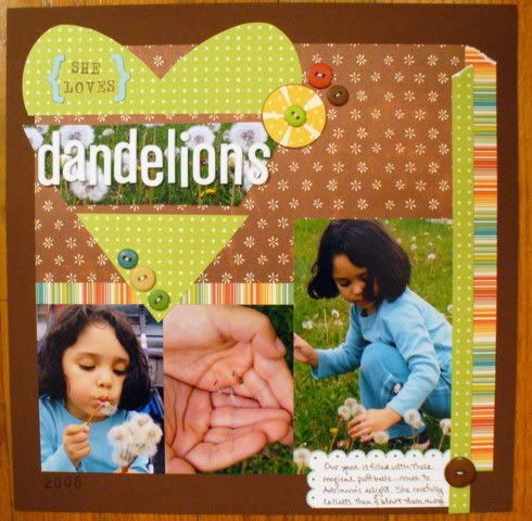
While putting my layouts together for this month, I thought I'd take a couple photos of a 12x12 page in progress and share what I was thinking as I worked. I was sure about a couple things before I started. One, I wanted to use photos of our visit to Monterey Aquarium and two, I wanted to incorporate the fish paper in some manner.


I gathered my photos and Scenic Route Grafton paper and decided on what I'd use. The two white squares represent photos and were punched out with my two-inch square punch. I wanted to see how that size would work in my space before I committed to punching the pictures. As for the title, I wasn't sure where I wanted to put my title and didn't want to accidentally stick my stickers where I didn't want them, so I lined them up on my transparent ruler. You can see here that the two words are too close together, which I easily resolved later. Sticking them on the ruler, though, lets me see how they'll look on the page without actually putting them on the page. And it lets me judge how much room I'll need. The transparent ruler is made of awesome.


I decided that I wanted to turn my 12x12 page into an interactive page by creating a folder with the blue 8.5x11 paper. To do so, I scored the longer side about an inch in and adhered it to the back of my 12x12 paper. This is a great way to keep your 12x12 dimensions while also giving you extra space. And you get the added touch of wondering what's behind the page. (Cool, secret stuff!) I also used my newest toy, Fiskars Threading Water punch, to create the scallops. You can see that I brought out some diecuts and stickers for possible use. Nope, they didn't make the cut. You can also see the fish up top still swimming around on my healing mat, waiting to be used.


I'm using my ruler here to place my foam Thickers by American Crafts. Once I had them where I wanted them, I pressed the tops down and peeled back the ruler. You'll still get some wonky letters (m's going askew, etc), but that's easily fixed by nudging them with your finger. (If you want to fix them, that is. Sometimes that wonky look is exactly what you want.)


The left side of the page was blank and needed a little kick. I wanted to keep a large portion of white space (negative space that allows a layout to breath) but also wanted a small something there. I tried the fish, but they were too overwhelming. So back to the healing mat they went. I went with couple of stripes of patterned paper and chipboard accent, which added the touch I was looking for.


For the inside of the folder, I wanted a good amount of images along with plenty of journaling space. My photos were all 4x6s and that wouldn't work here, so I opened up Photoshop, resized the images, added a title and printed it out on white card stock. That piece went on top of the fish patterened paper. Yay, fishes! They weren't the originals that were cut out, but sometimes you have to compromise on a design. :)

Supplies: Scenic Route Grafton paper and chipboard accent; American Crafts Thickers (foam and Poolside vinyl); font, Helvetica Neue; software, Photoshop CS3

I'd love to see how everyone else approaches their pages. Take pictures or just talk about your process. If you do take pictures, link us to your blog so we can peek!

Wednesday, June 11, 2008

Summer fun


The new kit that Kathryn put together using the Grafton line from Scenic Route has been so great to work with. The papers work so well with summer pictures- the colors are bright and fun! On this LO all the paper except the white came from the kit. I used foam letters from American Crafts for my title and wrote on a blank transparency with a Sharpie marker from my journaling. I inked the edges of the background paper with Color Box Chalk ink and did some drops of Ranger Glossy Accent on the wave paper.

Tuesday, June 10, 2008

Hot Summer Layouts


With all of this heat outside, there's no place to be but indoors, working on hot, summer layouts with Scenic Route Grafton papers, chosen by June's designer of the month, Kathryn Krieger. This two page layout uses earth tones in the background, spiced up with the bold colors of the reverse side of the paper. (Double-sided paper truly does mean twice the fun!)

To keep the photos from competing too much with each other and with the design, I used Adobe Photoshop to remove the colors of five of them and applied a soft sepia filter at 60% to warm the tones. You can make this layout with any favorite six beach pics - you'll need one at 4.5x4", three at 3x 4.5", one at 3x4", and your favorite color one at 4x6". To make this work, I matted only one 3x4.5" sepia photo and popped it on the page to make it stand out even more. The color photo is framed, then popped on a 4.5x6.5"mat cut from the same paper as the other mat. Then just "scatter" your photos across your background with slight overlap to homogenize the look.

All products that create the background are from the Scenic Route Grafton line with the exception of the cardstock (Chantilly Lace) and the brads (Basic Grey Archaic). And, yes, I did rip the background paper on the right page into vertical strips and overlapped them to give the layout a little more dimension. The flowers are made from left over scraps from the title cutting (Cricut "Opposites Attract" ). The flower punch is from Marvy. And don't forget to chalk ink everything. On this layout I used Quick Quotes chalk inks (the absolute best chalk ink on the market - and my favorite), in Amaretto. There's a new supply of nearly every color under the rainbow at Scrapbooks Plus.

Friday, June 6, 2008

And the Winner Is ...

Sher Gonzales!

Congratulations, Sher, my husband picked your comment from the hat!

Thanks to all the ladies who participated -- it was wonderful to hear all your suggestions for content!

Scenic Route love


Here is a quick look at the 1st project that I have finished with the new kit. The papers Kathryn picked from the Scenic Route Grafton line are perfect for any summer LO! The bright cheerful colors are easy to use and the patterned papers coordinate so well. On this LO I added the buttons on the "sun rays" to make them pop and used one of the the summertime stickers as the center of the "sun". I used the Zip Dry Glue that is available at ScrapbooksPlus to adhere the buttons and the photo corners down.


Thursday, June 5, 2008

It's a RAK!

UPDATE!!! The drawing is tonight at 6:00 PM. Just a few more hours to post a comment with either a question for the Design Team or an idea for some content you'd like to see & be entered in a drawing to win the "Notes" minibook below! Please don't forget to include a way to contact you if you are the winner (name, email, link to your blog).

So the other night I was out at ScrapbooksPlus cropping with Kim and another friend of ours. We're out there pretty much every Wednesday night -- just cropping, chatting, and, of course, shopping. We were talking with Pam and we realized that we have not had any giveaways or RAKs on the blog yet.

So, I'm going to change all that!

Do you remember this darling little notebook?


Well, it could be yours! I had a ton of fun making this little notebook, and I'm going to share it with one of our lovely readers. If you'd like to enter to receive the notebook, leave a comment on this post with either a question for the Design Team or an idea for some content you'd like to see, as well as some way to contact you if you are the winner (name, email, link to your blog). We'd love to hear from you!


At 6:00 p.m. next Friday (June 6th), I'll have my husband pick a name randomly from the comments to receive the notebook. I'll contact the winner to make arrangements for you to pick up the book at ScrapbooksPlus if you're local, or to mail the book to you if you're one of our world-traveling readers.


We'd love for you to help us make this your blog -- one you'd love to come to for tips, projects and more. Please drop us a line and let us know how we're doing and what type of content you'd like to see in the future. We'd love to hear from you!

Wednesday, June 4, 2008

June Design Team kit in the works

The members of the Scrapbooks Plus Design Team now have June's kit and are hard at work creating their wonderful and varied layouts, cards, and projects for you. This month's kit using the Scenic Route Grafton line was chosen by our Designer of the Month, Kathryn Krieger, who often comes in to use the crop room on Wednesday evenings after work, if you'd like to meet her. The large Design Team Display in the crop room will change June 15th and each mid-month as the designers meet their deadlines using the new materials. Along with the changing displays, the product used in each month's kits will be highlighted nearby for you to find easily.

In addition, Kathryn's duties as Designer of the Month include making a project for you to do on your own. She has designed a fun summery mini album (mini-albums are her specialty) and has included all the Grafton papers and embellishments necessary, along with photos and instructions, to complete the project. Starting mid-month, you can see this specially-designed take-home Design Team Project behind the front counter and buy it while supplies last!

Our first Designer of the Month, Erin Saravia, already has a nifty Design Team Project for you to try. As May's Designer, she created a clever little photo album, small and sturdy enough for your purse, using a cardstock-folding formula that you can repeat easily for many more cute albums. Included in her project kit are instructions and all the supplies, including Jenni Bowlin papers and Erin's own hand-painted and hand-sewn flowers. This project is currently available at the front counter while supplies last!

The Design Team members are enjoying all your comments and hope to see many more to buoy our creative enthusiasm and to guide us as we share our ideas. Please scroll down and read past posts, too. Don't miss the giveaway, offered on May 30th, of Kathryn's fantabulous handmade "notes" book with My Mind's Eye papers. On June 6th, a winner will be picked from those who leave us comments on that May 30th post!  Join us as we build this creative site together!

.

Tuesday, June 3, 2008

Summer Fun with Scenic Route


UPDATE: Instructions for this layout are on my blog - link on the right....
A number of folks have made comments on the blog wanting to see some summer layouts. With this month's DT kit put together by Katie Krieger, you're about to have plenty of summer filled layouts and projects coming your way! The Grafton line from Scenic Route is full of vibrant colors and and sunny patterns - I've already finished a single page layout and my double page LO is nearly done!

Here is my completed layout of my 8 year old snorkeling and some of the pictures he and I took of the creatures we found in the water. All the products in this layout are from the DT materials. Let me know via this blog if you would like the design and instructions and I'll post them. (and don't forget to post a comment on the RAK post for Katie's drawing this Friday) Can't wait to see what other great designs we'll create with this month's kit!

Sunday, June 1, 2008

Cards galore!

One of the things that I love about the Jenni Bowlin paper this month, is how just little pieces of it look great, especially those cute little butterflies... which makes it great for creating cards! Although I'm a reluctant card maker, I've already made three out of this line!

Card #1:

I got my punches out for this one, which makes it fast and ultra easy! Four square punches later I had the background. I added a scalloped circle punch and a regular circle to the middle with popdots. I hand cut around the stamped message and added it on top to finish it off and Voila!


Card #2:

I used a few larger scraps that I had laying around and hand cut one of the Jenni Bowlin floral sections... it wasn't has hard as it looks! Adding a couple of words from the Jenni Bowlin music patterned paper made it complete.

Card #3:

Back to those punches again! This one has 5 square punches of different patterned papers. I added a chipboard butterfly from Scenic Route that I saw in the store and painted with Tim Holtz crackle paint in Broken China. Some of the Kaiser pearls make a great trail accent.(there are even different shades of pearls at the store.. some more pinky, some more tan... and the best part - lots in the package!)
Thanks for taking a look!

What to do with those extra pics?

I don't know about the rest of you... but when I have a favorite picture I often get several sizes printed since I know that I'll be scrapping it, but am not sure of the size that I'll need. Of course that means that after I scrap it I end up with extras... and since it's one of my favorites, I just can't bear to toss it! :) I've been slowing switching all of my photos into Stacy Julian's system (I picked up her Photo Freedom book at Scrapbooks Plus when it first hit the shelves... LOVE it!). As I was sorting all my photos, per Stacy's instructions, I came across one of the many extra enlargements of my daughter and decided that I need to do a non-event page about one of her personality traits: she's a bit timid and really has to check things out before she'll take part. Once she's in, she's in... but if she isn't comfortable there is no convincing her. This is what I came up with:
I used some HeidiSwapp clear letters for the title and cut a little flower out of the the Jenni Bowlin floral paper as an accent... which also helps to emphasize the topic. The lined paper is great for adding journaling easily! The clear letters went on great with a little bit of Glossy Accents. You can barely see it and the dry time was enough to give some playing time to make sure everything was in place properly.
Now that I've given you one way to use your extra photos, what things do you do with your extras?