Monday, March 31, 2008

Little Yellow Bicycle


Well, it's actually a little red bicycle in my layout - but these papers are perfect for boys! Add a couple of stickers, some Thickers, and a cool accent or two. To make this, I started with red cardstock and cut a piece of the Skate Park Stripe paper in half to surround my photos. I used the rub-ons in each corner of the layout. The flames were made with the Heidi Swapp flame mask - you don't have to just paint those things. I actually scanned and reduced it for this layout, then printed out the smaller size on regular paper, cut it out and traced around it on my patterned paper. Once I had the shape cut out I brushed the edges with some red paint.

Saturday, March 29, 2008

Take a Peek at My First "Squash Book"!


I had pulled out a lot of beach pictures when I was doing my pages and projects with the kit from this month and I really loved the beach themed papers from Reminisce and wanted to play some more!
I was very excited when my Scor-pal came in and I decided to use up some of the last bits of my kit to make a squash book. This is the cover... I used the lighthouse journaling block label and added a title with a mix of the letters...and some Mrs. Grossman seagull stickers. I tried a card stock "belly band" first, but I just didn't like the look as it covered up too much, so it occured to me to try one made out of vellum. I added a seagull sticker on the belly band and loved the effect. Here is the back of the book...

...decorated with some of the paper that looked like sky and some more seagull stickers. The words on the belly band are a sticker from my stash...beach themed of course!
I decided to decorate both sides of the book with pictures and papers. They are cut to 3.75" squares... and then divided into triangles if necessary.
It was fun playing around with the pictures to see which ones worked best when cut diagonally...I succeeded in not cutting anybody's face in half!
And it was easy to title or caption the pictures by cutting some of the words out of the patterned paper...vacation, shell hunting, sand between my toes, water's edge, walking on the beach...there really was something to suit every photo.

This is a perfect project to use up bits and pieces because the dimensions of each panel are only 4" x 4". I set up plenty of panels for journaling using some of the more plain patterend paper. Some of the wilder designs (like the flip flops or the words) added a fun accent.
Thanks for looking and I hope you like it!

I finally started my blog!

I finally started my blog!
www.lisahausman.typepad.com
Stop by and check it out if you want!

Forget March Madness -- it's time for Midnight Madness!

Saturday night is made for cropping, so Kim and I are heading out to ScrapbooksPlus tonight for the Midnight Madness crop! I plan on playing with my new page kits and maybe, just maybe, finishing up my 2007 album (gasp!). I'm sure that album would be done by now if I wasn't so addicted to mini books. On the other hand, the worst thing I could imagine would be being "caught up" (because then what would I scrap?) so I don't care if it takes me until 2017 to finish.

I'll also be enjoying a bag of Lifesaver Gummies and a Cherry Coke this evening -- the ultimate cropping food, in my opinion. They have plenty of caffeine and sugar, plus they're not messy at all. (Chocolate is now banned from my scrap area since the tragic incident of last May involving a bag of Pretzel Flips and some Fancy Pants rub-ons)

What is your favorite thing to snack on while you're scrapping?

Thursday, March 27, 2008

late entry with daisy bucket papers


Better late than never, I'm hoping, with posting my layout from last month's tryout kit. Although the challenge is a little different for me, since I've been using what's left after assembling the Design Team kits, it is just as much fun to pull together. The papers from Daisy Bucket are familiar to you, but with fewer embellishments left, I needed to make some of my own. So I played with the blue vellum alphabet letters to compensate, matting them, doodling with white pen, and threading embroidery knots here and there. In addition to the paper photo corners, each photo has half of the blue My Mind's Eye transparency, also cut with a scalloped edge. Now that scallops are back in vogue, I used my scalloped scissors a lot on this layout to complement the swirly designs on the patterned paper.


As you can see, the journaling strips across the center span are cut in half. In order to read the words properly, these two pages would need their plastic album sleeves stapled together, a device that can be used to bring other components together when needed. Oh, and the stellar red netting gathered to foof up the "Love You" circle in the center is snipped from the avocado net bag from Costco. By the way, if you wish to see the details up close, just click on the photo to enlarge it.
.

Saturday, March 22, 2008

Loved the Beach-y papers from Reminisce!


I wanted to post my March projects and share what I learned this month...so here we go...
My pages rarely go together quickly. I fiddle around, fix my mistakes, and am often surprised at the end. I really struggled with trying to get the chipboard shells to look "real". I don't have any official art training, but I pulled out my paints and started to play. After several attempts, I finally got the color I wanted, but the shells just looked so flat. So I started to bend the shells along the score lines and I made a discovery...all those layers of "not quite right" paint colors were going to save me! They started to show through, just like the layers of a real seashell show through as it gets pounded in the surf. So I pulled out my paper scuffers and went to work. I admit that nature does a better job of making seashells, but I am happy with my results!

I cut the title with my Cricut (Stamped) but thought it just blended into the background too much so I mounted it on vellum before adhering it to the page. I wanted the shells on the paper to stand out more so used a product called Liquid Laminate (by Beacon) to make some of them shine! Last thing I did was to tuck a journaling tag behind the top right picture. I cut some "ribbon" from paper and added a seashell brad from my stash!

I used the same paint process on the chipboard shells on my next project and thought they turned out even better. I am planning on cutting some more at the store and playing around with color. (Yes! Scrapbooks Plus has this die!)


I cut my pictures in strips on this layout to mimic the stripes of the paper.


The checkerboard project was a lot of fun and pretty easy. I used my Cricut to cut the (64)squares - boy, do I love my bug! I am not sure if I was planning on using the words to decorate the playing area from the beginning or not, but it became obvious it was needed. You know how when you start doing work in your house, you discover the walls are never really square? I ran into that when I was laying out the checkerboard pattern. Gaps! So I covered them up with words and icons from the paper. A couple of layers of modge podge later - a serving tray that doubles as a game board!


The cards were fun and easy. I just love those cute little flip flops...I almost put some of them "walking" across the checkerboard, but I reined myself in! I used my Marvy Uchida punch to create the windows. I embossed the words on the front. I am self taught stamper, and I need to pick up a couple of tips on how to make sure the embossing powder is only where you want it to be...I had some stray bits on the front of the "destination" card which I masked with extra black paint dots. Could you tell?

I had so much fun playing with this paper! I can hardly wait for next month's kit! susie

Friday, March 21, 2008

Great work ladies!

I dropped my stuff off to Pam on Wednesday as she was working on the display update and saw some great stuff. I can't wait to check back and see everything we've done. Some of the beachy cards were fabulous... and I love whoever did the checkerboard too! Very fun!
Here are a couple of my projects. I went a little button crazy... and I have the pricked fingers to prove it! Buttons are from Walmart, Fancy Pants, and G Street Fabrics.

The first one includes some of the Fancy Pants felt pieces... I was definitely inspired to pull it out by the earlier post (I had forgotten that I had it!). I used a Kajinker to attach the flowers and give them "stamens," so to speak.


My second layout is called Beachcomber... but it's hard to see the title. I love the letter stickers (although a few of them didn't want to come off of the backing), but the soft colors didn't photograph too well. It's prettier in real life. :) I put a close up below. I used some of the Prima bling I recently picked up... it was really easy to add and kept it's shape without any extra work.


Thanks for peeking!

erin

Thursday, March 20, 2008

What's Your Creative Process?

I always feel that my creative process is a little bit backwards from what most people probably do. My assumption (which may be completely wrong since I haven't taken a poll & I don't know too many scrappers IRL) is that most people start with a story to tell or pictures they want to showcase and build the page from there. I start with the paper and think about the photos I want to use or the story I want to tell at the end.

So how does that work for me exactly? When I buy new paper, the first thing I do when I get home is turn it into a page kit. I have a bunch of these Cropper Hopper Page Planners which I fill with the paper I just bought, coordinating cardstock, alphabets, buttons, ribbons and any other embellishments:


I keep all the completed page kits in this basket from the Container Store:

It's the perfect size for the Cropper Hopper Page Planners.

When I'm getting ready to scrap or pack for a crop, I just grab the Page Planners that I most want to use, gather any stamps, inks or other tools that I think I might need or want & I'm ready to go!

Once I'm ready to create, I just spread the kit out on my scrap desk and start playing. I do what feels good to me -- I don't worry about the finished product. I just keep adding elements or taking them away until I love what I have left. That's when I know I'm done. When I love it. And usually by the end I know exactly what pictures I want to use. Sometimes I know the story I want to tell, but I don't have any pictures. I don't let that bother me. I leave off the pictures altogether and just do my journaling.

Eventually I get sick of a particular kit & find myself always skipping past it when I am flipping through the kits in my basket. That's when I know it's time to dismantle the kit & use the page planner for something fresh. I sift the scraps, papers and embellishments back into my stash, where they wait until the perfect paper comes along.

How do you create?

Monday, March 17, 2008

Here's one of mine

Here's my first layout for March. I used the new Little Yellow Bicycle papers from Deja View. These are from the Zach's Life collection. They're two-sided, which gives you lots of options for combining them. Here I used the 2nd side of two papers for my background and matting . I used a small strip of striped paper on the side of my photo, tearing the edge. I added the sticker photo corners, pieces of Hambly's white Mod circles transparency, and a few buttons.

Friday, March 14, 2008

Designer of the Month Roster

Now that we've started this Design Team year, and your March design work is already coming in, I thought you might like to have the Designer of the Month roster posted here, where you can easily refer to it. Hope you are all as excited about sharing this year as I am :)!

May 2008 - Erin Saravia (brave soul!)
June 2008 - Kathryn Krieger
July 2008 - Leah Kmetz
August 2008 - Nancy Palm
September 2008 - Sharon Mozer
October 2008 - Lisa Hausman
November 2008 - Kim Bartram
December 2008 - Deborah Mahnken
January 2009 - Susie Bentz

When we receive all the March design work by Wednesday, March 19th, we'll put up the grand display within the Design Team frame. If you have time before then, it would be great to see your designs' photos added to our DT blog. Thanks, ladies!!

Thursday, March 13, 2008

Header

Hi guys,

I added a header to our blog. Lemme know what ya think.

::: off to get some work done :::

Just in time (updated with pictures of minibook)....

I have been working like a lunatic the last few days trying to get my projects finished. We are heading out of town for Spring Break tomorrow and needed to get the projects back to Scrapbooks Plus.

I really loved my Tinkering Ink paper. I'm not usually a purple person (I have 3 boys) but this paper was so much fun to work with. I totally had to get out of my comfort zone- and I LOVED IT!

Here is a sampling of a few of the projects that I made:


I am really into using netting right now on different things- especially cards. It really adds a different dimension.


I dyed some Lil Davis letters that were originally white with some Adirondack Inks to make them purple. Really love using circles right now!


Have fun and enjoy!


UPDATE: Here are some pictures of the inside of the mini book. I only took a couple and I already turned it in:

It's all about the visual triangle ...

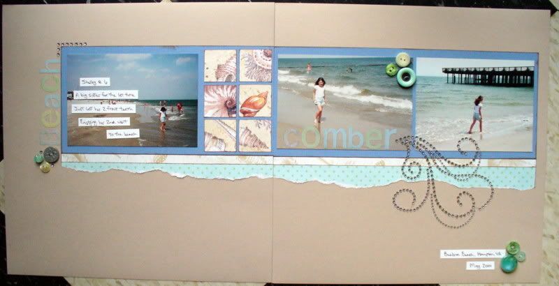
... and by "all" I mean my drama with this particular layout:


At first the layout's problem was that it was overly simple. (Read: b-o-r-i-n-g.) It seemed very pale and washed out. I didn't take a picture of it during that stage because I didn't want to embarrass it in front of all the other layouts. I added the 
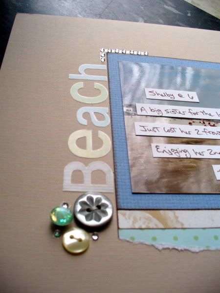
turquoise felt embellishments by Fancy Pants, but I felt that it needed one more piece of felt to make a visual triangle. I couldn't figure out where to put it, though, so I just gave up. (I know, I know, I'm a terrible design team member, but it just didn't look good anywhere. I promise.)

Anyway, Kim (Bartram) and I were cropping at ScrapbooksPlus on Wednesday (we do this most Wednesdays that they don't have classes) and Pam was looking at our projects. Which was fine. Until she brought up the two felt pieces and the lack of visual triangle. Sigh. It can't be avoided any longer. I must find a place to put a third piece of felt. I will not rest until I have a visual triangle!

First I put the felt here:


But I really didn't like it there, so I moved it here:


Which still didn't look right, so I pushed it around until it ended up here:


There! I think that's the winner. Whew. Thank goodness that's finally settled. Now if I could just get the monkeys to be a little more helpful ....


... unfortunately, they make more of mess than anything else! I'd love to stick around and show you some sneak peeks of my mini book, but I have some furry friends to untangle.

Friday, March 7, 2008

all aboard


Thanks so much, Deborah, for hosting this communal site for our Scrapbooks Plus Design Team. Welcome, ladies, to our very own forum for scrapbook design and sharing the love! Although we would all enjoy seeing each other more IRL, I'm sure this will be a great stimulus and support in the meantime.

Please show us your work, even while in progress, and highlight your special techniques. In return, we'll congratulate you and ask all sorts of questions. Show us your scrap space and great storage ideas, and we'll invite you to look at ours, too. Anything scrap related is fair game, but let's remember that we want this to be a Design Team blog that we are proud to open up to our scrapping friends as we progress. So strut your stuff!
.